❮
❯
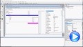
Improved Coding Experience with ExHelper/JS:
![]()
The following movie demonstrates the improvements made to ExHelper/JS, including IntelliSense support and integrated online help. These enhancements make it easier to write, understand, and integrate code snippets into your application, while providing quick access to relevant information directly as you code. If you are already a customer or have previously evaluated the library, please clear your browser cache/history to ensure the latest library files are loaded instead of cached versions. Otherwise, the page may appear empty or display errors.
Easy Hierarchy Editing with Undo and Redo Support:
![]()
This movie highlights the Undo and Redo functionality, allowing you to quickly reverse or repeat recent actions and making editing faster and safer. It also demonstrates how Copy, Cut, Paste, and Indent can be used to easily create and manage a hierarchical structure using keyboard shortcuts or the context menu. These features will be supported in the eXGrid and eXG2antt controls.
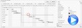
PDF Scaling Options, such as page-fit ([w] x [h]) and percentage (p%):
![]()
The following movie shows the PDF scaling options in action. The page-fit mode ([w] x [h]) automatically adjusts the page so that its entire content fits within the available width and height, keeping the correct proportions and possibly leaving margins. The percentage mode (p%) instead applies a fixed zoom factor, such as 100% for actual size, 50% for half size, or 200% for double size, regardless of the output page dimensions. The features will be supported by ExCascadeTree, ExFileView, ExG2antt, ExGauge, ExGrid, ExOrgChart, ExPivot, ExPropertiesList, ExSchedule and ExTree.
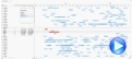
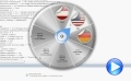
Graph availability for the eXPivot/JS version:
![]()
The eXPivot divides its area into four sections: one for applying aggregate functions to the pivot's cells, sections for pivot rows and columns that define the table structure, and a table section that can display either tabular data or graphical charts. The custom-view feature allows integration with any custom controls. In this example, eXGraph is used to enhance eXPivot with graphical capabilities. eXGraph visualizes the summarized information as columns, displaying aggregated data from eXPivot rather than raw values, which makes it easier to interpret trends and comparisons graphically. Click here to try or more sample here
The following video demonstrates how eXGraph adds graphical functionality to eXPivot:
![]()
The movie demonstrates how to display various types of charts based on the summarized data within the pivot control. The control can divide its area into four sections: one for applying aggregate functions to the pivot's cells, the pivot rows and columns that define the table structure, and the table section that can display either tabular data or graphical charts. The custom-view feature supports any type of custom controls. In this sample, the eXGraph is used to provide graphical features for eXPivot. The feature will be supported in the /COM, /NET, /WPF, and /JS versions as well.
|
|
|
changes and additions for 2016, so far |
| 12-28-2016 |
ExButton, 14.0.0.3
*Fixed: A GPF may occur if the application is started from design mode ( demo / evaluation / trial version only )
*Fixed: Prevents a memory leak when loading icons, pictures, from BASE64 encoded strings (Images method, HTMLPicture picture).
|
| 12-28-2016 |
ExTreeCube, 10.0.0.2
*Added: `MIN` and `MAX` binary-operators to get the MIN and MAX value. For instance, the expression `value MIN 10 MAX 100` returns always a value between 10 and 100.
*Added: `sin`, `asin`, `cos`, `acos` unary-operators to get the associated trigonometric functions. For instance `2 * asin(1)` returns the value of PI
*Added: `sqrt` unary-operator returns the square root of the element, so sqrt(81) returns 9, as 9^2 is 81
*Added: date(`now`) unary-operator returns the current date-time ( as double ), while the date(``) returns the current date ( no time included )
|
| 12-26-2016 |
EXMLGrid, 12.0.0.2
*NEW: Ability to specify ANY color to an EBN object, so you can use one EBN object to display it in any nuance, without embossing the shape and look of the EBN ( including transparent regions, and so on )
*Added: Significant improvements for control's performance while using a large number of EBN objects.
*Added: The EBN can be displayed using ANY color ( not only FF for rgb ). For instance, 0x1A88A5D indicates that EBN with the identifier 1 is displaying in Air Force blue color (#5D8AA8).
*Added: TemplateDef property allows defining inside variables for the Template feature ( available for /COM only, and useful to assign properties with multiple parameters, which is not supported in dBASE )
*Fixed: The show message is shown on the debugger ( dbgview ), when the tooltip is about to be shown.
|
| 12-26-2016 |
ExPivot, 11.0.0.4
*Added: lfind binary-operator for format/expression. The a lfind b searches the first occurrence of the string b within string a, and returns -1 if not found, or the position of the result ( zero-index ). For instance,
`ABCABC` lfind `D` returns -1, while `ABCABC` lfind `C` returns 2.
*Added: rfind binary-operator for format/expression. The a rfind b searches the last occurrence of the string b within string a, and returns -1 if not found, or the position of the result ( zero-index ). For instance,
`ABCABC` rfind `D` returns -1, while `ABCABC` rfind `C` returns 5.
*Added: reverse unary-operator for format/expression. The reverse(a) reverses the order of the characters in the string a, For instance, the
reverse("Mihai") returns "iahiM"
*Fixed: The DataColumn.SortType property has no effect if changing it after the Import / DataSource call.
|
| 12-21-2016 |
ExHelper, 17.0.0.1
*Added: Exontrol.SplitBar component to the controls list.
*Fixed: Adds an extra EOL when generating the manifest file ("Generate Assembly Manifest")
*Fixed: Prevents a memory leak when loading icons, pictures, from BASE64 encoded strings (Images method, HTMLPicture picture).
|
| 12-21-2016 |
ExG2antt, 13.0.0.6
*NEW: Ability to Print and Print-Preview the selected items only.
*Added: Print.Options("Print = Selection") indicates that the component is printing the selected items only, rather the whole items. If Print option is missing, the entire chart is being printed.
*Fixed: The Horizontal parameter of OffsetChanged event is of short type ( 0, 1 ), instead boolean values (0, -1)
*Fixed: Shows the Editor.Option(exEditDecimalSymbol) character, instead the current decimal symbol, when a floating-point editor is shown. ( EditType, Numeric, exFloat, exFloatInteger )
*Fixed: Can't resize the bar, from the right, if it's length is less than chart's resizing time scale ( Chart.ResizeUnitScale, Chart.ResizeUnitCount property )
*Fixed: A GPF occurs if the application is started from design mode ( demo / evaluation / trial version only )
|
| 12-21-2016 |
ExGrid, 11.0.0.4
*Added: EditingText property specifies the caption of the editor while the control is in edit mode.
*Added: Invokes the ValidateValue/Change event when the user presses the Enter key or selecting a new value from the drop down, if the CauseValidateValue property is set
*Added: "Clear Visual Design" and "Edit Visual Design" are available for /NET version on design mode.
*Fixed: Sometimes, the DateType, MemoDropDownType, ColorType, CalculatorType,
FontType, PictureType editors require clicking twice to reopen the drop down portion.
*Fixed: Typing characters on a caret field editor is delayed, if the CauseValidateValue property is not
exNoValidate.
|
| 12-19-2016 |
ExEdit, 11.1.0.2
*NEW: Ability to show the item on the control's context panel with a different foreground color when they do not fit the typed characters.
*Added: Background(exContextForeColorUnmatch), specifies the context's item foreground color when it does not match the typed characters.
*Added: Displays items that match the typed characters as more as possible on the control's context panel.
*Fixed: Adjusts correctly the control's drop down context panel, to fit all its content.
|
| 12-19-2016 |
ExFileView, 10.0.0.5
*Added: The Event(EventID) event occurs once the control fires an event (available for /COM version only)
*Added: The CopyTo property copies the control's content to BMP, PNG, JPG, TIF or GIF format. Previously, the CopyTo property can save the control's content to EMF format only. The extension of the File argument indicates the graphical format to be saved. For instance, the
CopyTo("c:\temp\snapshot.png") property saves the control's content in PNG format to
snapshot.png. If File parameter provides an unknown extension, the control's content is saved in EMF format ( Enhanced Metafile Format ). The control's content is serialized as it would have no scroll bars.
*Fixed: "Error executing code: FormActiveXControl (data source), method ... called with invalid parameters" on Dynamics AX environment is fired, if the application handles events with parameters passed by reference. On X++ you should use the Event event and EventParams method to handle this exception. The X++ is not able to handle the events with parameters passed by reference.
|
| 12-14-2016 |
ExG2antt, 13.0.0.5
*NEW: Sorting and Incremental-Seach for control's Columns Floating Panel
*Added: ColumnsFloatBarSortOrder property specifies the order to display the
columns on the Columns Floating Panel ( ColumnsFloatBarVisible property ).
For instance, ColumnsFloatBarSortOrder property on SortAscending, makes the
columns floating panel to display the columns alphabetically in ascending
order.
*Fixed: The Copy/CopyTo method does not shows the expandable columns.
*Fixed: The Items.SchedulePDM method returns -4 error, when scheduling a
single SS (Start-Start) / FF (Finish-Finish) link
*Fixed: Prevents a memory leak when loading icons, pictures, from BASE64
encoded strings (Images method, HTMLPicture picture).
|
| 12-14-2016 |
ExGantt, 12.1.0.1
*NEW: Native Print and Print-Preview support in Microsoft Office Applications, such as Access, Excel or Word (/COM version)
*Added: Ability to print the control's content on Access's forms directly, using the DoCmd.PrintOut command.
*Added: Ability to print the control's content on Word applications, using the Word's print and print preview mainframe.
*Added: Ability to print the control's content on Excel applications, using the Excel's print and print preview mainframe.
|
| 12-13-2016 |
The following movie shows the first-look of the newly eXSplitBar
component:
 The Exontrol's eXSplitBar component, helps you to automatically resizes the left/right or top/bottom components, while user drags the split bar to a new position. The eXSplitBar control provides automatic resizing /positioning of controls/windows on your form/dialog/window. When the Mode property is set to exSplitBarHorz, the control resizes any controls that lie above or below it, and when the Mode is set to exSplitBarVert, it resizes controls that lie to its left or right. The difference between the eXSplitBar control and other components of the same type, is that the eXSplitBar control works for any programming environments such as Microsoft Office ( Microsoft Access, Microsoft Excel, Microsoft Word ), Visual Basic, Visual Fox Pro, /NET Framework, Delphi, C++, and more. As usual, there are no dependencies to MFC, VB, VCL, or anything else.
Available as /COM or /NET assembly.
The Exontrol's eXSplitBar component, helps you to automatically resizes the left/right or top/bottom components, while user drags the split bar to a new position. The eXSplitBar control provides automatic resizing /positioning of controls/windows on your form/dialog/window. When the Mode property is set to exSplitBarHorz, the control resizes any controls that lie above or below it, and when the Mode is set to exSplitBarVert, it resizes controls that lie to its left or right. The difference between the eXSplitBar control and other components of the same type, is that the eXSplitBar control works for any programming environments such as Microsoft Office ( Microsoft Access, Microsoft Excel, Microsoft Word ), Visual Basic, Visual Fox Pro, /NET Framework, Delphi, C++, and more. As usual, there are no dependencies to MFC, VB, VCL, or anything else.
Available as /COM or /NET assembly.
Here's a few shortcuts:
- Complete documentation here
- How-To questions here
- Several samples, by downloading and installing the setup
here, or run the eXInstaller, and select the exsplitbar.beta
or exsplitbar.net.beta from online list.
We hope you to enjoy it!
|
| 12-12-2016 |
ExTab, 12.0.0.1
*NEW: /NET Version
*Added: ExETB tool to create, edit or view any ETB file ( TAB skin files )
*Added: Multiple improvements to the TABBuilder object
*Fixed: Prevents showing the control's view in design mode, while running on FORTH system ( /COM version )
|
| 12-12-2016 |
ExPrint, 12.0.0.2
*Fixed: Prevents a memory leak when loading icons, pictures, from BASE64 encoded strings (Images method, HTMLPicture picture).
*Fixed: A GPF occurs if the application is started from design mode ( demo / evaluation / trial version only )
|
| 12-09-2016 |
ExGantt, 12.0.0.1
*NEW: MSAA, UI Automation, IAccessible support.
*Added: Microsoft Active Accessibility�(MSAA) is designed to help�Assistive Technology�(AT) products interact with standard and custom�user interface�(UI) elements of an application (or the operating system), as well as to access, identify, and manipulate an application's UI elements. AT products work with MSAA enabled applications in order to provide better access for individuals who have physical or cognitive difficulties, impairments, or disabilities.
*Fixed: The OLEStartDrag event is fired differentially based on the SingleSel and AutoDrag properties as follows: True/=0, click anywhere on the item and move the mouse, True/<>0 click on item's caption and move the mouse ( click anywhere excepts the item's caption performs the AutoDrag operation, like moving the item's position, scrolling and so on ), False/=0, click anywhere on the item and wait for a short period of time ( 256 ms, click and move performs select by dragging ), False/<>0 click on item's caption and wait for a short period of time ( 256 ms, click and move performs select by dragging, click anywhere excepts the item's caption and wait for a short period of time, performs the AutoDrag operation, like moving the item's position, scrolling and so on )
*Fixed: Columns.Clear method does not release the column until the control is destroyed ( memory leak if clear and adding columns several times, /NET and /WPF versions only )
*Fixed: A black area is shown on the control's chart panel, while user resizes the component.
|
| 12-09-2016 |
ExGauge, 13.0.0.3
*NEW: Support for EBN 1003 version.
*Added: EBN 1003 implements Colorable Region Support which defines a portion/region of the EBN object where the color of the EBN is applied. For instance, at runtime the identifier 0x1FF0000 applies blue color to all colorable parts that compose the EBN object. The EBN color is not applied to not-colorable portions of the EBNs.
*Added: `MIN` and `MAX` binary-operators to get the MIN and MAX value. For instance, the expression `value MIN 10 MAX 100` returns always a value between 10 and 100.
*Added: `sin`, `asin`, `cos`, `acos` unary-operators to get the associated trigonometric functions. For instance `2 * asin(1)` returns the value of PI
|
| 12-07-2016 |
ExG2antt, 13.0.0.4
*NEW: Touch Scrolling Support for Chart section, if the AutoDrag property is
exAutoDragScroll. Click the chart section and waits for a second, until the hand cursor is shown. Next move the cursor anywhere to get scrolling the chart
*Added: Includes the Chart.Picture on the chart while scrolling the chart using the AutoDrag property
*Fixed: Updates the vertical/horizontal scrolling position while the user is scrolling the control's content using the AutoDrag property on exAutoDragScroll
*Fixed: The non-working part of the chart causes flickering once the control is scrolled using the AutoDrag property.
*Fixed: A black area is shown on the control's chart panel, while user resizes the component.
|
| 12-07-2016 |
ExCalendar, 12.1.0.1
*Added: "Clear Visual Design" and "Edit Visual Design" are available for /NET version on design mode.
*Fixed: Prevents a memory leak when loading icons, pictures, from BASE64 encoded strings (Images method, HTMLPicture picture).
|
| 12-07-2016 |
ExToolBar, 11.1.0.1
*Added: The Item.X, Y properties support the iwidthof (unary operator), that returns the width in pixels, of the item with the specified identifier. For instance "iwidthof(10)" returns the width of the item with the identifier 10. Currently, you can use the iwidth keyword, that returns the width of the currently item, or iwidthof (unary operator) to retrieve the width of a specified item.
*Added: The Item.X, Y properties support the iheightof (unary operator), that returns the height in pixels, of the item with the specified identifier. For instance "iheightof(10)" returns the height of the item with the identifier 10. Currently, you can use the iheight keyword, that returns the height of the currently item, or iheightof (unary operator) to retrieve the height of a specified item.
*Fixed: The toolbar's buttons are not size correctly, with the Windows set to Classic theme.
|
| 12-07-2016 |
ExOrgChart, 13.1.0.3
*Added: `MIN` and `MAX` binary-operators to get the MIN and MAX value. For instance, the expression `value MIN 10 MAX 100` returns always a value between 10 and 100.
*Added: `sin`, `asin`, `cos`, `acos` unary-operators to get the associated trigonometric functions. For instance `2 * asin(1)` returns the value of PI
*Added: `sqrt` unary-operator returns the square root of the element, so sqrt(81) returns 9, as 9^2 is 81
*Added: date(`now`) unary-operator returns the current date-time ( as double ), while the date(``) returns the current date ( no time included )
|
| 12-06-2016 |
The following movie shows the eXG2antt's
Overview-Time-Scale support:: 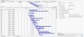 The�Overview/Layout/Map panel of the
eXG2antt component is a view that's displayed at the top of the control and shows the whole timeline, with all objects within its view (a high-level view). It displays a 'select' box (the light blue box) that the user can drag to any location within the overview and then that area of the chart is shown at normal scale within the chart view. The following movie shows how you will be able to customize the chart's overview so it can display the time-scale, with or without the bars inside, how you can resize the overview at runtime, and so on. This feature will be implemented in
the future versions. The�Overview/Layout/Map panel of the
eXG2antt component is a view that's displayed at the top of the control and shows the whole timeline, with all objects within its view (a high-level view). It displays a 'select' box (the light blue box) that the user can drag to any location within the overview and then that area of the chart is shown at normal scale within the chart view. The following movie shows how you will be able to customize the chart's overview so it can display the time-scale, with or without the bars inside, how you can resize the overview at runtime, and so on. This feature will be implemented in
the future versions.
|
| 12-05-2016 |
ExSurface, 12.0.0.9
*Fixed: The pictures of a disabled element are not visible or shown at a different position, while the cursor hovers the element.
*Fixed: Prevents showing the control's view in design mode, while running on FORTH system ( /COM version )
*Fixed: The the context's menu copy, paste, etc buttons are not size correctly, with the Windows set to Classic theme
|
| 12-05-2016 |
ExSwimLane, 12.1.0.1
*Added: "Clear Visual Design" and "Edit Visual Design" are available for /NET version on design mode.
*Fixed: Can't select a word that contains accented(acute, circumflexm umlaut and dieresis) characters, if the user double clicks it, or using the CTRL + SHIFT + Right key.
*Fixed: The the context's menu copy, paste, etc buttons are not size correctly, with the Windows set to Classic theme
|
| 11-28-2016 |
ExG2antt, 13.0.0.3
*NEW: Improvements to allow OLE Drag and Drop operations (OLEDropMode property) to work with control's AutoDrag property (/COM)
*Added: AllowAutoDrag( Item, NewParent, InsertA, InsertB, ref Cancel ) event occurs when the user drags the Item between InsertA and InsertB items, as child of NewParent item. The Cancel parameter can be used to prevent dropping items to certain items, while control's AutoDrag property is any of exAutoDragPosition values.
*Fixed: The user can't select a new item with a short click, only if moving the mouse, while SingleSel property is False, AutoDrag property is exAutoDragPosition... and the OLEDropMode property is OLEDropManual.
*Fixed: Can't toggle the selection state of the item from the cursor ( CTRL + short click ), while SingleSel property is False, AutoDrag property is exAutoDragPosition...
*Fixed: The user can't move the selected item to a new position ( AutoDrag property is exAutoDragPosition...), if the OLEDropMode property is
OLEDropManual.
|
| 11-28-2016 |
ExList, 11.0.0.1
*NEW: Data Binding support for /NET assembly
*Added: DataSource property gets or sets the data source that the control is displaying data for. The DataSource property can be:
DataTable, DataView, DataSet, DataViewManager, any component that implements the IListSource interface, or any component that implements the IList interface.
*Added: DataMember property gets or sets the specific list in a DataSource for which the control displays a list.
*Fixed: Prevents flickering of the vertical scroll bar when a DataSource property is re-assigned.
*Fixed: Items.EnsureVisibleItem can be called between BeginUpdate/EndUpdate statement.
*Fixed: The /NET assembly, fails it trying to the VisualDesign's editor at design mode
|
| 11-23-2016 |
ExG2antt, 13.0.0.2
*NEW: Ability to horizontally/vertically scroll the control's content while the AutoDrag property is exAutoDragScroll (touch screen scrolling)
*Added: "Clear Visual Design" and "Edit Visual Design" are available for /NET version on design mode.
*Fixed: "Visual C++ Runtime Error!" occurs if using the <fgcolor> or <bgcolor> with no indicating the color. Correct is <fgcolor
RRGGBB>, instead <fgcolor>
*Fixed: Prevents showing the control's Picture on dragging items while AutoDrag property is set
*Fixed: Shows the grid-lines / background-alternate colors for non-items part of the control while the user drags items using the AutoDrag property.
*Fixed: Can't indent the dragging item(s) when it hovers the last visible item in the list, while the AutoDrag property is exAutoDragPositionAny
|
| 11-23-2016 |
ExGantt, 11.0.0.6
*NEW: Ability to Print and Print-Preview the selected items only.
*Added: Print.Options("Print = Selection") indicates that the component is printing the selected items only, rather the whole items. If Print option is missing, the entire chart is being printed.
*Added: "Clear Visual Design" and "Edit Visual Design" are available for /NET version on design mode.
*Fixed: The Horizontal parameter of OffsetChanged event is of short type ( 0, 1 ), instead boolean values (0, -1)
*Fixed: The cell's picture ( Items.CellPicture ) is not properly aligned when Items.CellVAlignment is set on
exTop/exBottom
|
| 11-21-2016 |
ExRibbon, 11.0.0.1
*Added: DPI-Aware Support
*NEW: Support for EBN 1004 version ( DPI-Aware support ).
*Added: The exClientExt attribute of the EBN/BackgroundExt/BackgroundExtValue supports DPI values, if the number is followed by a D character. For instance, if the DPI scaling is 100%, the 16d is 16, while for a 150% DPI scaling, the 16d is 24. In other words, "top[4,back=RGB(0,0,255)]", draws a blue line on the top side of the object's background, of 4-pixels wide, no matter of DPI scaling, while "top[4D,back=RGB(0,0,255)]", draws the line of 4-pixels wide if DPI scaling is 100%, or 6-pixels wide if DPI scaling is 150% )
*Added: The coordinates of the CP clause of the Skin parameter of VisualAppearance.Add method can be followed by a D character, which indicates the value according to the current DPI settings. For instance, "CP:1 -2 -2 2 2", copies the EBN with the identifier 1, and displays it on a 2-pixels wider rectangle no matter of the DPI settings, while "CP:1 -2D -2D 2D 2D" displays it on a 2-pixels wider rectangle if DPI settings is 100%, and on on a 3-pixels wider rectangle if DPI settings is 150%.
*Added: The expression properties support `dpi`, `dpix` and `dpiy` constants that returns the current DPI setting on x/y scale. For instance, the "value * dpi" returns the value if the DPI setting is 100%, or value * 1.5 in case, the DPI setting is 150%
*Added: The Handle parameter of Images method can be a string that specifies the ICO file to be loaded. The ICO file format is an image file format for computer icons in Microsoft Windows. ICO files contain one or more small images at multiple sizes and color depths, such that they may be scaled appropriately. For instance,
Images("e:\working\sync.ico") method adds the sync.ico file to the control's Images collection.
*Added: The number parameter of the Item.ShowPopupOffset property, can be followed by a D character which indicates that the coordinate is giving in dots, rather than pixels, and depends on the current DPI settings. For instance, ShowPopupOffset = "12D,12D", indicates that the inner popup is moved by 18,18 pixels if the DPI settings is 150%, while if DPI settings is 100% the popup is moved by 12,12 pixels, relative to its current position. The numberD converted in pixels is number * DPI / 100.
|
| 11-21-2016 |
ExGrid, 11.0.0.3
*Added: Focuses the last visible child of the user editor field, if the Editor.EditType is
UserEditorType. For instance, if the inside user editor is�the ExComboBox, focuses the control's label rather than window that hosts the user editor inside the control.
*Added: Ability to use and show a custom tooltip using the ShowToolTip property even if any of the mouse buttons is pressed or not.
*Fixed: Prevents showing the tooltip's shadow if the current theme is applied on the tooltip
*Fixed: Sometimes, the first partially visible column gets selected if the FullRowSelect property is exRectSel
*Fixed: Click and wait the locked area of the control starts scrolling up or down the control, while SingleSel property is false
|
| 11-17-2016 |
The following movie shows the first look of newly eXTab/NET component:: 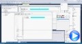 The Exontrol ExTab component is a SKIN based TAB control. A
TAB control is analogous to the dividers in a notebook or the labels in a file cabinet. By using a tab control, an application can define multiple pages for the same area of a form or dialog box. Each page consists of a certain type of information or a group of controls that the application displays when the user selects the corresponding tab. The Exontrol ExTab
component provides WYSIWYG visual appearance editor that helps you to change
the TAB's visual appearance. Also, you can you the ExETB
tool to provide ETB files. Generally, the ETB is a set of UI elements that are built as a tree where each element is anchored to its parent element. The ETB object includes two inner objects, Focus and Normal, that defines the visual aspect of the focused / normal page of a TAB control. The Exontrol ExTab component is a SKIN based TAB control. A
TAB control is analogous to the dividers in a notebook or the labels in a file cabinet. By using a tab control, an application can define multiple pages for the same area of a form or dialog box. Each page consists of a certain type of information or a group of controls that the application displays when the user selects the corresponding tab. The Exontrol ExTab
component provides WYSIWYG visual appearance editor that helps you to change
the TAB's visual appearance. Also, you can you the ExETB
tool to provide ETB files. Generally, the ETB is a set of UI elements that are built as a tree where each element is anchored to its parent element. The ETB object includes two inner objects, Focus and Normal, that defines the visual aspect of the focused / normal page of a TAB control.
You can download the beta version here, or run the
eXInstaller, and select the extab.net.beta
(/NET Type) from online list.
|
| 11-16-2016 |
ExSwimLane, 12.0.0.3
*Added: `MIN` and `MAX` binary-operators to get the MIN and MAX value. For instance, the expression `value MIN 10 MAX 100` returns always a value between 10 and 100.
*Added: `sin`, `asin`, `cos`, `acos` unary-operators to get the associated trigonometric functions. For instance `2 * asin(1)` returns the value of PI
*Added: `sqrt` unary-operator returns the square root of the element, so sqrt(81) returns 9, as 9^2 is 81
*Added: date(`now`) unary-operator returns the current date-time ( as double ), while the date(``) returns the current date ( no time included )
|
| 11-16-2016 |
ExTree, 11.1.0.2
*Added: Appearance.RenderType property specifies the way colored EBN objects are displayed on the component. For instance use the RenderType on -3 (0xFFFFFFFD), no color is applied, -2, for OR-color scheme (0xFFFFFFFE), -1 (0xFFFFFFFF) for AND-color scheme, ( older EBN color schemes ). The RenderType property is 0 by default, which indicates an A-color scheme. The first significant byte indicates the transparency while the other bytes indicates the RGB value.
*Added: Shows the pictures in the control as grayed, if the Enabled property is False ( the control is disabled )
*Added: The HTML tags are case insensitive, so the < b > is equivalent with < B >
*Fixed: Printing the control with thousand of EBN objects may increase the GDI handles indefinitely.
|
| 11-14-2016 |
ExPlorerTree, 12.0.0.4
*Added: </solidline>, </upline>, </dotline> HTML tags ends the solid, up or dotted line
*Added: Prevents showing the ,.;!?'")}] characters at the beginning of a new line, when html text is word-wrapping.
*Added: The HTML tags are case insensitive, so the < b > is equivalent with < B >
*Fixed: The last italic character of a HTML caption may be shown as clipped
|
| 11-14-2016 |
ExPropertiesList, 11.0.0.3
*Added: Checked/Unchecked Items to Visual Design Page, to change the visual appearance of the control's check-boxes.
*Added: The Background(exCheckBoxState0) / Background(exCheckBoxState1) property changes the visual appearance of the control's check-boxes.
*Fixed: Ensures that the last scrollable property fits the control's client area when user scrolls to the end ( using the Property.Height property )
*Fixed: The BackgroundPartEnum.exSpyWidget value changed from 70 to 92
|
| 11-10-2016 |
ExG2antt, 13.0.0.1
*NEW: Windows 8.1, Windows 10 64-bit compatibility
*Added: The /COM 64-bit version is compatible with Microsoft Office Applications: Excel 2013, Access 2013,...
*Added: The /NET(/WPF) 64-bit version is compatible with Microsoft NET Framework 4, 4.5, 4.5.1, ...
*Fixed: Sometimes, the control is flickering while the user is dragging items to new positions ( AutoDrag property is exAutoDragPosition ), if the "Desktop Window Manager Session Manager" service is not running, AEOR is turn off.
*Fixed: Prevents starting auto-drag or selecting the items when the cursor hovers the cells of button-type
(AutoDrag, SingleSel, Items.CellHasButton property )
|
| 11-10-2016 |
ExGauge, 13.0.0.2
*NEW: Ability to make the control's form transparent, such as a widget (using layered windows)
*Added: LayerUpdate property specifies where the control updates its content. For instance, LayerUpdate property on
exLayerUpdateScreen, makes the control to draw itself on the screen ( no form behind, form transparent )
*Added: AllowMoveOnClick property allows moving the window that contains the control to a new position, as you would do by clicking the form's title/caption.
|
| 11-09-2016 |
ExHTML, 11.0.0.1
*NEW: Built-in ToolBar Support, or ability to format text using the control's toolbar
*Added: ToolBarItems property specifies the control's toolbar format
*Added: ToolBarAnchor property gets or sets the edge of the control to which the toolbar is bound and determines how the toolbar is resized with its control.
*Added: The CTRL + B, I or U, toggles the Bold, Italic or Underline attribute, while changes, or until the user selects a new caret position.
*Fixed: The SHIFT + Click selects randomly the text, instead selecting the text from the current caret position to clicked position.
|
| 11-09-2016 |
ExSchedule, 12.0.0.4
*Fixed: The pictures of a disabled event are not visible or shown at a different position, while the cursor hovers the event.
*Added: lfind binary-operator for format/expression. The a lfind b searches the first occurrence of the string b within string a, and returns -1 if not found, or the position of the result ( zero-index ). For instance,
`ABCABC` lfind `D` returns -1, while `ABCABC` lfind `C` returns 2.
*Added: rfind binary-operator for format/expression. The a rfind b searches the last occurrence of the string b within string a, and returns -1 if not found, or the position of the result ( zero-index ). For instance,
`ABCABC` rfind `D` returns -1, while `ABCABC` rfind `C` returns 5.
*Added: reverse unary-operator for format/expression. The reverse(a) reverses the order of the characters in the string a, For instance, the
reverse("Mihai") returns "iahiM"
*Fixed: Prevents extending the B,I,U,S attributes (Type category) once A,G,O or S attribute is selected, in the context-menu of HTML editor.
|
| 11-07-2016 |
ExComboBox, 11.0.0.3
*NEW: New text decorations support for HTML captions, like outlined characters, shadow, ....
*Added: <gra>, </gra> built-in HTML tags define a gradient text ( the <gra> supports color, mode and blending, like <gra
rrggbb;mode;blend>, where, rr/gg/bb represents the red/green/blue values of the ending color, 808080 if missing as gray, mode a value between 0 and 4, 1 if missing, and blend 0 or 1, 0 if missing )
*Added: <out>, </out> built-in HTML tags define a text to show with outlined characters ( the <out> supports color and width, like <out
rrggbb;width>, where rr/gg/bb represents the red/green/blue values of the outline color, 808080 if missing as gray, width indicates the size of outline, 1 if missing.
*Added: <sha>, </sha> built-in HTML tags define a text with a shadow ( the <sha> supports color, width and offset, like <out
rrggbb;width;offset>, where rr/gg/bb represents the red/green/blue values of the shadow color, 808080 if missing as gray, width indicates the size of shadow, 4 if missing, and offset indicates the offset from the origin to display the text's shadow, 2 if missing.
*Added: Increases the performance of parsing HTML captions.
|
| 11-07-2016 |
ExContextMenu, 11.0.0.9
*NEW: Tabbed View Support, or ability to display information in pages of a tab
*Added: Item.Tab property specifies the identifier of the item that displays the current submenu ( grouping items ). For instance
"[group=0x103]([group](P1[rad=1][group=3][spchk][tab=999][show=1](1,2,3),P2[rad][group=3][spchk][tab=999][show=1](4,5,6)),[id=999])" displays two pages, and each page displays 1, 2, 3, while the other displays 4 5 and 6.
*Added: Item.Padding property specifies the padding (space between the menu border and the item content) to display the item.
*Added: Item.HotBackColor property specifies the visual appearance / background color of the item, when the cursor hovers it.
*Added: Item.SelBackColor property specifies the visual appearance / background color of the item, when it is selected.
*Added: Item.SelHotBackColor property specifies the visual appearance / background color of the selected item, when the cursor hovers it.
|
| 11-04-2016 |
The following movie shows eXG2antt's
ShowCollapsedBars feature:
 The ShowCollapsedBars feature, allows displaying bars/activities of collapsed items, to parent items. Currently, the ShowCollapsedBars property displays bars/activities of all child items of collapsed item. The bars on the collapsed item, are selectable / moveable / resizable as they would be hosted by their own items.
In other words, the ShowCollapsedBars feature allows you to display the dispersion of activities in the same
group along the time-scale. The following movie, shows the ShowCollapsedBars feature in combination with
Group-By feature of the control.
More details here. The ShowCollapsedBars feature, allows displaying bars/activities of collapsed items, to parent items. Currently, the ShowCollapsedBars property displays bars/activities of all child items of collapsed item. The bars on the collapsed item, are selectable / moveable / resizable as they would be hosted by their own items.
In other words, the ShowCollapsedBars feature allows you to display the dispersion of activities in the same
group along the time-scale. The following movie, shows the ShowCollapsedBars feature in combination with
Group-By feature of the control.
More details here.
|
| 11-02-2016 |
ExGrid, 11.0.0.2
*Added: NumericEnum.exFloatInteger, allows editing floating point numbers, without using the exponent characters such as e/E/d/D. The format of the floating point number is:
[+/-]digit[.digit], where digit is any combination of digit characters.
*Added: NumericEnum.exDisableSigns, prevents using the +/- signs when editing numbers. For instance exFloatInteger + exDisableSigns allows editing floating points numbers without using the exponent and plus/minus characters, so the allowed format is
digit[.digit]
*Added: EditorOptionEnum.exPickAllowEmpty of Boolean type, specifies whether the editor of PickEditType supports empty value.
*Fixed: Prevents showing the focusing rectangle around a disabled cell.
*Fixed: Click and drag or double click the empty area of the control, while SingleSel property is false, select the last item
|
| 10-31-2016 |
ExPivot, 11.0.0.3
*Added: Description property changes descriptions for control objects.
*Added: Prevents showing the ,.;!?'")}] characters at the beginning of a new line, when html text is word-wrapping.
*Fixed: The last italic character of a HTML caption may be shown as clipped
*Fixed: The Copy/CopyTo method does not shows the grouped/expandable columns.
|
| 10-31-2016 |
ExGantt, 11.0.0.5
*NEW: Sorting and Incremental-Seach for control's Columns Floating Panel
*Added: ColumnsFloatBarSortOrder property specifies the order to display the columns on the Columns Floating Panel ( ColumnsFloatBarVisible property ). For instance, ColumnsFloatBarSortOrder property on
SortAscending, makes the columns floating panel to display the columns alphabetically in ascending order.
*Fixed: The Copy/CopyTo method does not shows the expandable columns.
*Fixed: Prevents starting auto-drag or selecting the items when the cursor hovers the cells of button-type
(AutoDrag, SingleSel, Items.CellHasButton property )
|
| 10-26-2016 |
ExList, 10.1.0.1
*NEW: Easy way to define the control's visual appearance in design mode, using XP-Theme elements or EBN objects.
*Added: VisualDesign property specifies the control's visual appearance. The VisualDesign value is a BASE64 encoded string, that can be defined using the control's WYSWYG Visual Design Editor, which can be invoked by selecting the control in Design Mode, select Properties, go to the VisualDesign property and click the ... in the Properties browser. The value for this property can be used on /COM, /NET or /WPF. The /WPF version does not have the inside editor, instead any you can use the /COM or /NET to generate the BASE64 encoded strings for this property.
*Fixed: On Windows 7, the user can not open the open file dialog on MSDEV using the ShowImageList property ( VC 6.0 )
*Fixed: The Template property shows no ... button in the properties browser.
|
| 10-26-2016 |
ExFileView, 10.0.0.4
*NEW: Ability to save/load automatically the control's layout.
*NEW: BMP, JPG, GIF, PNG, TIFF, EMF Support ( �Ability to save the control's content to BMP, JPG, GIF, PNG, TIFF, EMF formats )
*Added: Layout property, saves or loads the control's layout, an that means, the position, width, visibility, sort order of the control's columns and the scroll position, filtering, selection, and so on. The Layout property saves/loads almost all properties of the columns, that user can change at runtime, using the control's user interface.
|
| 10-24-2016 |
EXMLGrid, 12.0.0.1
*NEW: Major/Radical improvements for XMLGrid component
*Added: AllowDuplicateEntries property, returns or sets a value that specifies whether the control supports nodes with the same key ( duplicates ). The property can be changed at runtime, while the control's nodes collection is empty.
*Added: Appearance.RenderType property specifies the way colored EBN objects are displayed on the component. For instance use the RenderType on -3 (0xFFFFFFFD), no color is applied, -2, for OR-color scheme (0xFFFFFFFE), -1 (0xFFFFFFFF) for AND-color scheme, ( older EBN color schemes ). The RenderType property is 0 by default, which indicates an A-color scheme. The first significant byte indicates the transparency while the other bytes indicates the RGB value.
*Added: Ability to specify the node's editor without calling the Editors.Add before, by specify the Node.Editor property to a EditTypeEnum value. For instance,
Nodes.Add("Date", Date).Editor =
EXMLGRIDLibCtl.EditTypeEnum.DateType, adds a node with a DateType editor.
*Added: Shows the pictures in the control as grayed, if the Enabled property is False ( the control is disabled )
*Fixed: The control fails if you click and hold the left mouse button on the thumb of the scrollbar itself and drag up and down and then click the right mouse button whilst the left button is still pressed
|
| 10-24-2016 |
ExToolBar.CRD, 11.0.0.1
*Added: DPI-Aware Support
*NEW: Support for EBN 1004 version ( DPI-Aware support ).
*Added: The exClientExt attribute of the EBN/BackgroundExt/BackgroundExtValue supports DPI values, if the number is followed by a D character. For instance, if the DPI scaling is 100%, the 16d is 16, while for a 150% DPI scaling, the 16d is 24. In other words, "top[4,back=RGB(0,0,255)]", draws a blue line on the top side of the object's background, of 4-pixels wide, no matter of DPI scaling, while "top[4D,back=RGB(0,0,255)]", draws the line of 4-pixels wide if DPI scaling is 100%, or 6-pixels wide if DPI scaling is 150% )
*Added: The coordinates of the CP clause of the Skin parameter of VisualAppearance.Add method can be followed by a D character, which indicates the value according to the current DPI settings. For instance, "CP:1 -2 -2 2 2", copies the EBN with the identifier 1, and displays it on a 2-pixels wider rectangle no matter of the DPI settings, while "CP:1 -2D -2D 2D 2D" displays it on a 2-pixels wider rectangle if DPI settings is 100%, and on on a 3-pixels wider rectangle if DPI settings is 150%.
|
| 10-19-2016 |
ExEdit, 11.1.0.1
*NEW: Ability to apply different HTML tags to wild expressions.
*Added: AddWild(expression) adds a HTML expression that contains wild characters such as * or ?. For instance,
AddWild("<u>(*)</u>") underlines everything between () brackets ( including brackets) , or
AddWild("(<b>*<b>)") bolds just the part between () brackets ( not including the brackets ), while
AddWild("(<u><b>?</b></u>*)"), underlines and bolds just the first character between brackets.
*Added: Ability to highlight the word from double-click while the cursor hovers the control's content.
*Added: Wild sample
|
| 10-19-2016 |
ExLabel, 14.0.0.2
*NEW: Ability to show the HTML caption vertically, or mirrored.
*Added: Rotate property rotates the HTML caption. For instance, Rotate property on
exHTMLVertical, displays vertically the HTML control from the left-bottom to the top-right, while the exHTMLVertical or
exHTMLMirror, displays vertically the HTML control from top-right to left-bottom
*Added: The Handle parameter of Images method can be a string that specifies the ICO file to be loaded. The ICO file format is an image file format for computer icons in Microsoft Windows. ICO files contain one or more small images at multiple sizes and color depths, such that they may be scaled appropriately. For instance,
Images("e:\working\sync.ico") method adds the sync.ico file to the control's Images collection.
|
| 10-17-2016 |
The following movie shows the type of links the XG2antt
supports: 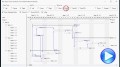 The following movie shows what type of links you can connect the activities. Currently, you specify rectangular, direct, straight and round links. The rectangular type can be start-end horizontally, start vertically, end vertically, and start-end vertically.
The start vertically, end vertically, and start-end vertically are new, so
they are not available in previously versions.
Any link can be of different color, style, size, different arrow, and so
on. Any link can start from the left, center, right-side of the starting bar to
left, center, right-side of the ending bar. More details here. The following movie shows what type of links you can connect the activities. Currently, you specify rectangular, direct, straight and round links. The rectangular type can be start-end horizontally, start vertically, end vertically, and start-end vertically.
The start vertically, end vertically, and start-end vertically are new, so
they are not available in previously versions.
Any link can be of different color, style, size, different arrow, and so
on. Any link can start from the left, center, right-side of the starting bar to
left, center, right-side of the ending bar. More details here.
|
| 10-17-2016 |
ExSurface, 12.0.0.8
*Added: lfind binary-operator for format/expression. The a lfind b searches the first occurrence of the string b within string a, and returns -1 if not found, or the position of the result ( zero-index ). For instance,
`ABCABC` lfind `D` returns -1, while `ABCABC` lfind `C` returns 2.
*Added: rfind binary-operator for format/expression. The a rfind b searches the last occurrence of the string b within string a, and returns -1 if not found, or the position of the result ( zero-index ). For instance,
`ABCABC` rfind `D` returns -1, while `ABCABC` rfind `C` returns 5.
*Added: reverse unary-operator for format/expression. The reverse(a) reverses the order of the characters in the string a, For instance, the
reverse("Mihai") returns "iahiM"
*Fixed: Ensures that the control's context menu fits the screen ( prevents showing partially )
|
| 10-17-2016 |
ExG2antt, 12.3.0.6
*Added: Improving drastically the time to load large XML files using the LoadXML method, when it contains items with Items.ItemNonworkingUnits / Items.ItemBar(exBarKeepWorkingCount ) property set
*Added: Items.FindBar(BarKey,-1) searches for specified task into locked-top, unlocked and locked-bottom items ( all-items ), and returns the handle of the item that holds the specified bar.
*Added: Items.FindBar(BarKey,-2) searches for specified task into locked-top, and locked-bottom items ( locked-items ), and returns the handle of the item that holds the specified bar.
*Added: Items.FindBar(BarKey,-3) searches for specified task into locked-top items, and returns the handle of the item that holds the specified bar.
*Added: Items.FindBar(BarKey,-4) searches for specified task into locked-bottom items, and returns the handle of the item that holds the specified bar.
|
| 10-12-2016 |
ExOrgChart, 13.1.0.2
*Added: FrameFromPoint property returns the Frame object from the cursor.
*Added: Frame.Index property indicates the index of the Frame object within the Frames collection
*Added: Ability to highlight and locate the Frame object by spying it using the eXPropertiesList control ( /COM version )
*Fixed: Prevents showing the control's view in design mode, while running on FORTH system ( /COM version )
|
| 10-12-2016 |
ExHTML, 10.0.0.3
*Added: The Handle parameter of Images method can be a string that specifies the ICO file to be loaded. The ICO file format is an image file format for computer icons in Microsoft Windows. ICO files contain one or more small images at multiple sizes and color depths, such that they may be scaled appropriately. For instance,
Images("e:\working\sync.ico") method adds the sync.ico file to the control's Images collection.
*Added: lfind binary-operator for format/expression. The a lfind b searches the first occurrence of the string b within string a, and returns -1 if not found, or the position of the result ( zero-index ). For instance,
`ABCABC` lfind `D` returns -1, while `ABCABC` lfind `C` returns 2.
*Added: rfind binary-operator for format/expression. The a rfind b searches the last occurrence of the string b within string a, and returns -1 if not found, or the position of the result ( zero-index ). For instance,
`ABCABC` rfind `D` returns -1, while `ABCABC` rfind `C` returns 5.
*Added: reverse unary-operator for format/expression. The reverse(a) reverses the order of the characters in the string a, For instance, the
reverse("Mihai") returns "iahiM"
*Fixed: The the context's menu copy, paste, etc buttons are not size correctly, with the Windows set to Classic theme.
|
| 10-10-2016 |
ExGantt, 11.0.0.4
*NEW: Ability to horizontally/vertically scroll the control's content while the AutoDrag property is exAutoDragScroll (touch screen scrolling)
*Added: Includes the Chart.Picture on the chart while scrolling the chart using the AutoDrag property
*Fixed: Updates the vertical/horizontal scrolling position while the user is scrolling the control's content using the AutoDrag property on exAutoDragScroll
*Fixed: The non-working part of the chart causes flickering once the control is scrolled using the AutoDrag property.
|
| 10-10-2016 |
ExScrollBar, 12.0.0.2
*Added: `MIN` and `MAX` binary-operators to get the MIN and MAX value. For instance, the expression `value MIN 10 MAX 100` returns always a value between 10 and 100.
*Added: `sin`, `asin`, `cos`, `acos` unary-operators to get the associated trigonometric functions. For instance `2 * asin(1)` returns the value of PI
*Added: `sqrt` unary-operator returns the square root of the element, so sqrt(81) returns 9, as 9^2 is 81
*Added: date(`now`) unary-operator returns the current date-time ( as double ), while the date(``) returns the current date ( no time included )
*Added: The Handle parameter of Images method can be a string that specifies the ICO file to be loaded. The ICO file format is an image file format for computer icons in Microsoft Windows. ICO files contain one or more small images at multiple sizes and color depths, such that they may be scaled appropriately. For instance,
Images("e:\working\sync.ico") method adds the sync.ico file to the control's Images collection.
|
| 10-05-2016 |
The following movie shows the SchedulePDM - RuntimeLag feature:
 By default, the
SchedulePDM�method arrange the activities on the plan based on the links / relationships / dependencies. The SchedulePDM calculates early and late dates, based on bar's position, link types and link lag. The SchedulePDM starts from the giving bar, and continue arranging related bars, till done. If a bar has no related bars ( no incoming or outgoing links ) the procedure still looking for grouped or summary bars, till found some relative bars. The SchedulePDM method keeps count on the grouping bars, limited bars ( the bars that have margins, or range ), summary bars, non-working units, and so on. The RuntimeLag procedure allows you to include the distance between linked bars, before performing the SchedulePDM method.
More details here. By default, the
SchedulePDM�method arrange the activities on the plan based on the links / relationships / dependencies. The SchedulePDM calculates early and late dates, based on bar's position, link types and link lag. The SchedulePDM starts from the giving bar, and continue arranging related bars, till done. If a bar has no related bars ( no incoming or outgoing links ) the procedure still looking for grouped or summary bars, till found some relative bars. The SchedulePDM method keeps count on the grouping bars, limited bars ( the bars that have margins, or range ), summary bars, non-working units, and so on. The RuntimeLag procedure allows you to include the distance between linked bars, before performing the SchedulePDM method.
More details here.
|
| 10-05-2016 |
ExSchedule, 12.0.0.3
*Added: The Version property for /NET or /WPF version returns more information about the component/assembly/file.
*Added: Background(exScheduleAllDayHeaderBackColor) property specifies the background color ( EBN color ) to be shown on the control's all heady header ( ShowAllDayHeader property is True )
*Fixed: An ICO file shows as 18x18 instead of 16x16 pixels if it is loaded using the HTMLPicture method.
*Fixed: The a mod b expression fails, if b is zero or negative.
|
| 10-05-2016 |
Expression, 10.0.0.2
*NEW: Support for EBN 1003 version.
*Added: EBN 1003 implements Colorable Region Support which defines a portion/region of the EBN object where the color of the EBN is applied. For instance, at runtime the identifier 0x1FF0000 applies blue color to all colorable parts that compose the EBN object. The EBN color is not applied to not-colorable portions of the
EBNs.
*Added: The Handle parameter of Images method can be a string that specifies the ICO file to be loaded. The ICO file format is an image file format for computer icons in Microsoft Windows. ICO files contain one or more small images at multiple sizes and color depths, such that they may be scaled appropriately. For instance,
Images("e:\working\sync.ico") method adds the sync.ico file to the control's Images collection.
|
| 10-03-2016 |
ExG2antt, 12.3.0.5
*NEW: Ability to align/clip/hide the bar's caption based on its size/length/width
*Added: If the Items.ItemBar(exBarHAlignCaption) is 6, 7 or 8 the bar's caption is hidden if its size is less or equal with Chart.MinUnitWidth property, else if it does not fit the bar's client are, gets clipped or else fully aligned to left, center or right side of the bar.
*Added: If the Items.ItemBar(exBarHAlignCaption) is 9, 10 or 11 the bar's caption is hidden if it does not fit entirely into the bar's client area, else it is fully displayed aligned to the left, center or right side of the bar.
*Added: If the Items.ItemBar(exBarHAlignCaption) is 12, 13 or 14 the bar's caption is displayed inside of the bar's client area if it fits entirely, else it is displayed outside of the bar aligned to the left, center or right.
*Fixed: Selects the cell's font when the FontType editor is shown.
|
| 10-03-2016 |
ExTab, 11.0.0.1
*Added: DPI-Aware Support
*Added: The Handle parameter of Images method can be a string that specifies the ICO file to be loaded. The ICO file format is an image file format for computer icons in Microsoft Windows. ICO files contain one or more small images at multiple sizes and color depths, such that they may be scaled appropriately. For instance,
Images("e:\working\sync.ico") method adds the sync.ico file to the control's Images collection.
*Added: The X, Y, CX, CY fields of the object that composes the EBT file, supports DPI values, if the number is followed by a D character. For instance, if the DPI scaling is 100%, the 16d is 16, while for a 150% DPI scaling, the 16d is 24.
|
| 09-28-2016 |
ExETB, 10.0.0.1 (initial release)
The ExETB tool helps you to create, edit or view ETB files ( the ETB provides skin capabilities for
eXTab component ). Generally, the ETB is a set of UI elements that are built as a tree where each element is anchored to its parent element. The ETB object includes two inner objects, Focus and Normal, that defines the visual aspect of the focused / normal page of a TAB control. A TAB control is analogous to the dividers in a notebook or the labels in a file cabinet. By using a tab control, an application can define multiple pages for the same area of a form or dialog box. Each page consists of a certain type of information or a group of controls that the application displays when the user selects the corresponding
tab.
|
| 09-28-2016 |
ExTree, 11.1.0.1
*NEW: Expandable Header
Support, or ability to expand the columns in the control's header
*Added: Column.ExpandColumns property specifies the list of columns to be shown when the current column is expanded.
*Added: Column.Expanded property expands or collapses the column.
*Added: Column.DisplayExpandButton property shows or hides the expanding/collapsing button in the column's header.
*Added: The LayoutChanged event is fired if changing the Column.Visible property by code.
|
| 09-28-2016 |
ExSlider, 13.0.0.2
*Added: `MIN` and `MAX` binary-operators to get the MIN and MAX value. For instance, the expression `value MIN 10 MAX 100` returns always a value between 10 and 100.
*Added: `sin`, `asin`, `cos`, `acos` unary-operators to get the associated trigonometric functions. For instance `2 * asin(1)` returns the value of PI
*Added: `sqrt` unary-operator returns the square root of the element, so sqrt(81) returns 9, as 9^2 is 81
*Added: date(`now`) unary-operator returns the current date-time ( as double ), while the date(``) returns the current date ( no time included )
*Added: The Handle parameter of Images method can be a string that specifies the ICO file to be loaded. The ICO file format is an image file format for computer icons in Microsoft Windows. ICO files contain one or more small images at multiple sizes and color depths, such that they may be scaled appropriately. For instance,
Images("e:\working\sync.ico") method adds the sync.ico file to the control's Images collection.
|
| 09-26-2016 |
ExG2antt, 12.3.0.4
*NEW: Ability to serialize the control's content as a text using the SaveXML method
*Added: The SaveXML method exports the control's content as a string, if the Destination parameter is a reference to a string. For instance, The syntax Dim s As String: G2antt1.SaveXML s: MsgBox (s), saves and displays the control's content in XML format as a string.
*Added: The LoadXML method loads the control's content from a string, previously saved using the SaveXML to a string.
*Fixed: Memory leaks detected when using grouping items multiple times ( AllowGroupBy property, Ungroup method )
*Fixed: Resets the column's filter if the user empties the Filter For field a drop down numeric filter ( Column.FilterType property is exNumeric )
*Fixed: No TAB character is included between empty cells, when data is dragged using the AutoDrag property on
exAutoDragCopyText.
|
| 09-26-2016 |
ExPropertiesList, 11.0.0.2
*NEW: MSAA, UI Automation, IAccessible support.
*Added: Microsoft Active Accessibility (MSAA) is designed to help Assistive Technology�(AT) products interact with standard and custom�user interface�(UI) elements of an application (or the operating system), as well as to access, identify, and manipulate an application's UI elements. AT products work with MSAA enabled applications in order to provide better access for individuals who have physical or cognitive difficulties, impairments, or disabilities.
*Added: Template\New contains all code required to spy any exontrol component on the form. Just place the
eXPropertiesList/COM next to any exontrol component on your form, right click, select Template page, click New, Apply, OK, and then run the form. Click the Spy icon, and drag over the exontrol component you want to browse. The eXPropertisList will browse all properties and objects of the component being selected. You can change at runtime, any property of the browsed object, without any other code.
*Fixed: A Click event occurs right after DblClick event.
*Fixed: Removes the space before "Start Filter..." prompt, if the FilterBarPromptVisible property is
exFilterBarAlwaysVisible.
|
| 09-22-2016 |
ExSkinBox, 12.0.0.2
*Added: Sample\Skins\Visballoon\visballoon.esk
*Fixed: The message box is not closed, if a skin is applied and the user clicks the Close button, if using the x64 version on Windows 64-bit version
*Fixed: The buttons of the message box / input box, shows a black background for x64 version
|
| 09-22-2016 |
ExplorerTree, 12.0.0.3
*NEW: Subscript and Superscript implementation in HTML captions, using the
<off> HTML tag
*Added: <off>, </off> built-in HTML tags defines the vertical offset to display the element, relative to the current position. This tag is inheritable. The <off pixels>, where, pixels indicates the vertical offset to be applied ). For instance, the following text displays a text with Subscript and Superscript such as: "Text <off 4>with subscript</off> <off -4>and superscript</off> support"
*Added: The <fgcolor=0000FF> and <fgcolor FF>, or <bgcolor=00FF00> and <bgcolor FF00>, so no = or full 6 hexa-digits are required to define the color to be applied
*Fixed: The <font> HTML tag is not overwritten when using inside another <font> tag
*Fixed: The parts of the line with different fonts in the HTML caption are vertically aligned ( instead aligning to the font's baseline ) if the line displays a picture or an icon using the <img> HTML tag.
|
| 09-21-2016 |
ExComboBox, 11.0.0.2
*NEW: Subscript and Superscript implementation in HTML captions, using the
<off> HTML tag
*Added: <off>, </off> built-in HTML tags defines the vertical offset to display the element, relative to the current position. This tag is inheritable. The <off pixels>, where, pixels indicates the vertical offset to be applied ). For instance, the following text displays a text with Subscript and Superscript such as: "Text <off 4>with subscript</off> <off -4>and superscript</off> support"
*Added: The <fgcolor=0000FF> and <fgcolor FF>, or <bgcolor=00FF00> and <bgcolor FF00>, so no = or full 6
hexa-digits are required to define the color to be applied
*Fixed: The <font> HTML tag is not overwritten when using inside another <font> tag
*Fixed: Prevents closing the drop down portion of the control, if the user accidentally releases the mouse over the item, while it scrolls the control's content using the mouse ( Change event )
|
| 09-21-2016 |
ExContextMenu, 11.0.0.8
*NEW: Ability to arrange vertically the grouping items. Previously, the grouping items may be arranged horizontally only.
*Added: GroupPopupEnum.exGroupPopupVertical flag arranges vertically the items that compose the group.
*Added: Background(exGroupPopupFrameVStart) specifies the visual appearance/solid color of the frame around the first item ( vertically arranged ), when the its group includes more items.
*Added: Background(exGroupPopupFrameVIntermediate) specifies the visual appearance/solid color of the frame around an intermediate item ( not start or end item, vertically arranged ), when the its group includes more items.
*Added: Background(exGroupPopupFrameVEnd) specifies the visual appearance/solid color of the frame around the last item ( not intermediate or end item, vertically arranged ), when the its group includes more items.
|
| 09-19-2016 |
ExRadialMenu, 10.0.0.1 (initial release)
 The eXRadialMenu ( radial or pie menu) component is similar to the Microsoft's OneNote radial menu with ability to customize the appearance and functionality. The component is designed using tree structure so an item can hold none or more children, and so any item can be browsed, and show its children around it. An item can display a collection of child items, as well as a radial slider, or any other gauge / knob control. The eXRadialMenu is written from scratch, and does not depend on Windows 7, 8, 10 and so requires no dependencies to any other third party library.
Features include: built-in radial slider, ability to display/edit data
using the
eXGauge component, Picture/Image support,
built-in HTML support, ToolTip support, and more. Available as:
COM/ActiveX, /NET Assembly, /WPF Component, ANSI or UNICODE, 32 or 64-bit
edition. The eXRadialMenu ( radial or pie menu) component is similar to the Microsoft's OneNote radial menu with ability to customize the appearance and functionality. The component is designed using tree structure so an item can hold none or more children, and so any item can be browsed, and show its children around it. An item can display a collection of child items, as well as a radial slider, or any other gauge / knob control. The eXRadialMenu is written from scratch, and does not depend on Windows 7, 8, 10 and so requires no dependencies to any other third party library.
Features include: built-in radial slider, ability to display/edit data
using the
eXGauge component, Picture/Image support,
built-in HTML support, ToolTip support, and more. Available as:
COM/ActiveX, /NET Assembly, /WPF Component, ANSI or UNICODE, 32 or 64-bit
edition.
Here's a few shortcuts:
- Complete documentation here
- How-To questions here.
- Several samples, by downloading and installing the setup here.
We hope you to enjoy it!
|
| 09-19-2016 |
ExRibbon, 10.0.0.9
*Added: `MIN` and `MAX` binary-operators to get the MIN and MAX value. For instance, the expression `value MIN 10 MAX 100` returns always a value between 10 and 100.
*Added: `sin`, `asin`, `cos`, `acos` unary-operators to get the associated trigonometric functions. For instance `2 * asin(1)` returns the value of PI
*Added: `sqrt` unary-operator returns the square root of the element, so sqrt(81) returns 9, as 9^2 is 81
*Added: date(`now`) unary-operator returns the current date-time ( as double ), while the date(``) returns the current date ( no time included )
|
| 09-19-2016 |
ExGauge, 13.0.0.1
*NEW: Inplace support for eXRadialMenu component ( eXRadialMenu component can host the eXGauge component )
*Added: The Handle parameter of Images method can be a string that specifies the ICO file to be loaded. The ICO file format is an image file format for computer icons in Microsoft Windows. ICO files contain one or more small images at multiple sizes and color depths, such that they may be scaled appropriately. For instance,
Images("e:\working\sync.ico") method adds the sync.ico file to the control's Images collection.
*Fixed: Captions on layers are not clearly displayed (Layer.Foreground.Caption property)
|
| 09-14-2016 |
ExToolBar, 11.0.0.1
*Added: DPI-Aware Support
*NEW: Support for EBN 1004 version ( DPI-Aware support ).
*Added: The exClientExt attribute of the EBN/BackgroundExt/BackgroundExtValue supports DPI values, if the number is followed by a D character. For instance, if the DPI scaling is 100%, the 16d is 16, while for a 150% DPI scaling, the 16d is 24. In other words, "top[4,back=RGB(0,0,255)]", draws a blue line on the top side of the object's background, of 4-pixels wide, no matter of DPI scaling, while "top[4D,back=RGB(0,0,255)]", draws the line of 4-pixels wide if DPI scaling is 100%, or 6-pixels wide if DPI scaling is 150% )
*Added: The coordinates of the CP clause of the Skin parameter of VisualAppearance.Add method can be followed by a D character, which indicates the value according to the current DPI settings. For instance, "CP:1 -2 -2 2 2", copies the EBN with the identifier 1, and displays it on a 2-pixels wider rectangle no matter of the DPI settings, while "CP:1 -2D -2D 2D 2D" displays it on a 2-pixels wider rectangle if DPI settings is 100%, and on on a 3-pixels wider rectangle if DPI settings is 150%.
|
| 09-14-2016 |
ExCalendar, 12.0.0.2
*NEW: Support for EBN 1003 version.
*Added: EBN 1003 implements Colorable Region Support which defines a portion/region of the EBN object where the color of the EBN is applied. For instance, at runtime the identifier 0x1FF0000 applies blue color to all colorable parts that compose the EBN object. The EBN color is not applied to not-colorable portions of the
EBNs.
*Added: The Handle parameter of Images method can be a string that specifies the ICO file to be loaded. The ICO file format is an image file format for computer icons in Microsoft Windows. ICO files contain one or more small images at multiple sizes and color depths, such that they may be scaled appropriately. For instance,
Images("e:\working\sync.ico") method adds the sync.ico file to the control's Images collection.
*Fixed: TodayCaption property of the exontrol.EXCALENDARLib.excalendarcombo is empty at initialization time.
|
| 09-14-2016 |
ExHelper, 16.0.0.1
*Added: Exontrol.ToolBar component to the controls list.
*Added: Exontrol.RadialMenu component to the controls list.
*Added: ExPropertiesList 11.0
|
| 09-12-2016 |
ExG2antt, 12.3.0.3
*NEW: Exontrol Print Scale Support, Adjust To and Fit to Page Wide by Tall Support
*Added: Print.Options = "FitToPage = 75%", adjusts and prints the control's content to 75% of normal size.
*Added: Print.Options = "FitToPage = 2 x 3", indicates that the control's content is print to fit 2 pages wide by 3 tall.
*Added: Print.Options = "FitToPage = 2 x", indicates that the control's content is print to fit 2 pages wide by how many pages tall are required.
*Added: Print.Options = "FitToPage = x 3", indicates that the control's content is print to fit 3 pages tall to how many pages wide are required.
|
| 09-12-2016 |
ExPivot, 11.0.0.2
*Added: PivotTotalDefaultFormatContent property specifies the default format (key of FormatContent object) to be applied on the Total field when it is displayed in the pivot-table. For instance, PivotTotalDefaultFormatContent property on "numeric" specifies that the Total displays it's data in numeric-format.
*Added: PivotTotalDefaultFormatAppearances property specifies the list of format-appearances ( key of FormatAppearance object), separated by comma, to be applied on the Total field when it is displayed in the pivot-table. For instance, PivotTableDefaultFormatAppearances property on
"bold,italic" specifies that the Total field is displayed in bold and italic
*Added: Column.DefaultFormatContent property specifies the default format (key of FormatContent object) to be applied on the column when it is displayed in the pivot-table. For instance, Column.DefaultFormatContent property on "numeric" specifies that the column is displayed in numeric-format.
*Added: Column.DefaultFormatAppearances property specifies the list of format-appearances ( key of FormatAppearance object), separated by comma, to be applied on the column when it is displayed in the pivot-table. For instance, Column.DefaultFormatAppearances property on
"bold,italic" specifies that the column is displayed in bold and italic.
|
| 09-07-2016 |
ExFileView, 10.0.0.3
*NEW: PDF (Portable Document Format) Support, or ability to export directly the control's content to a PDF file
*Added: The CopyTo property copies the control's content to PDF format, if the extension of the File argument indicates a pdf extension. For instance, the
CopyTo("c:\temp\snapshot.pdf") property saves the control's content in PDF format to
snapshot.pdf. The control's content is serialized as it would have no scroll bars. The File argument could indicates more parameters separated by | character, in the following order: filename.pdf | paper size | margins | options where the filename indicates the name of the pdf to be saved, the paper size indicates the size of the paper to be used ( by default A4 paper, 8.27 in x 11.69 in ), margins defines the paper's margins ( by default, 0.5 in 0.5 in 0.5 in 0.5 in ) and options currently can be single which indicates that whole control is saved to a single paged PDF document. For instance, the
CopyTo("c:\temp\snapshot.pdf|||single") exports the control's content to single page.
*Fixed: "Visual C++ Runtime Error!" occurs if using the <fgcolor> or <bgcolor> with no indicating the color. Correct is <fgcolor
RRGGBB>, instead <fgcolor>
|
| 09-07-2016 |
ExStatusBar, 9.1.0.4
*Added: The Version property for /NET or /WPF version returns more information about the component/assembly/file.
*Fixed: An ICO file shows as 18x18 instead of 16x16 pixels if it is loaded using the HTMLPicture method.
*Fixed: Prevents showing the control's view in design mode, while running on FORTH system ( /COM version )
|
| 09-05-2016 |
ExGrid, 11.0.0.1
*NEW: Expandable Header Support, or ability to expand the columns in the control's header
*Added: Column.ExpandColumns property specifies the list of columns to be shown when the current column is expanded.
*Added: Column.Expanded property expands or collapses the column.
*Added: Column.DisplayExpandButton property shows or hides the expanding/collapsing button in the column's header.
*Added: The LayoutChanged event is fired if changing the Column.Visible property by code.
*Added: Expandable-Header sample
|
| 09-05-2016 |
ExG2antt, 12.3.0.2
*NEW: Incremental Search and Filter Support for the Columns Floating Bar ( ColumnsFloatBarVisible property )
*NEW: Incremental Search and Filter Support for the drop down filter panel. The Incremental search/filter feature for the drop down filter panel is valid while the Filter For field is not displayed. For instance, if the drop down filter list displays hundreds of items, you can start typing and it includes just the items that match your typing characters.
*Added: Column.DisplayFilterPattern on False hides the Filter For: field in the drop down filter panel, and so the incremental search/filter is allowed on the drop down filter panel. As soon as you type, the drop down list includes the items that match the typed characters only.
*Added: Ability to use the Editor.AddItem to add just a collection of fonts to FontType editor.
*Added: Editor.SortItems method sorts the fonts to be shown on the FontType editor.
|
| 09-01-2016 |
ExList, 10.0.0.2
*NEW: Scroll Line by Line support allows smooth scrolling when displaying items of different heights.
*Added: Ability to vertically scroll the control's content line by line, if the ScrollBySingleLine property is True, such the Items.FirstVisibleItem can be partially visible. Previously, the FirstVisibleItem can not be viewed partially visible. The smooth scrolling has effect if pressing the vertical up or down scroll buttons.
*Added: Shows NO cursor if the smooth scrolling by drag is not possible
*Added: Erases the header's background with the control's BackColor, when the control's BackColorHeader property reffers an EBN object.
|
| 09-01-2016 |
ExPropertiesList, 11.0.0.1
*NEW: BMP, JPG, GIF, PNG, TIFF, EMF Support ( �Ability to save the control's content to BMP,
JPG, GIF, PNG, TIFF, EMF formats )
*NEW: PDF (Portable Document Format) Support, or ability to export directly the control's content to a PDF file
*Added: The CopyTo property copies the control's content to BMP, PNG, JPG, TIF or GIF format. Previously, the CopyTo property can save the control's content to EMF format only. The extension of the File argument indicates the graphical format to be saved. For instance, the
CopyTo("c:\temp\snapshot.png") property saves the control's content in PNG format to
snapshot.png. If File parameter provides an unknown extension, the control's content is saved in EMF format ( Enhanced Metafile Format ). The control's content is serialized as it would have no scroll bars.
*Added: The CopyTo property copies the control's content to PDF format, if the extension of the File argument indicates a pdf extension. For instance, the
CopyTo("c:\temp\snapshot.pdf") property saves the control's content in PDF format to
snapshot.pdf. The control's content is serialized as it would have no scroll bars. The File argument could indicates more parameters separated by | character, in the following order: filename.pdf | paper size | margins | options where the filename indicates the name of the pdf to be saved, the paper size indicates the size of the paper to be used ( by default A4 paper, 8.27 in x 11.69 in ), margins defines the paper's margins ( by default, 0.5 in 0.5 in 0.5 in 0.5 in ) and options currently can be single which indicates that whole control is saved to a single paged PDF document. For instance, the
CopyTo("c:\temp\snapshot.pdf|||single") exports the control's content to single page.
|
| 08-31-2016 |
ExGantt, 11.0.0.3
*NEW: Improvements to allow OLE Drag and Drop operations (OLEDropMode property) to work with control's AutoDrag property (/COM)
*Fixed: The user can't select a new item with a short click, only if moving the mouse, while SingleSel property is False, AutoDrag property is
exAutoDragPosition... and the OLEDropMode property is OLEDropManual.
*Fixed: Can't toggle the selection state of the item from the cursor ( CTRL + short click ), while SingleSel property is False, AutoDrag property is
exAutoDragPosition...
*Fixed: The user can't move the selected item to a new position ( AutoDrag property is
exAutoDragPosition...), if the OLEDropMode property is OLEDropManual.
|
| 08-31-2016 |
ExGrid, 10.3.0.5
*NEW: Subscript and Superscript implementation in HTML captions, using the <off> HTML tag
*Added: <off>, </off> built-in HTML tags defines the vertical offset to display the
elemenet, relative to the current position. This tag is inheritable. The <off pixels>, where, pixels indicates the vertical offset to be applied ). For instance, the following text displays a text with Subscript and Superscript such as: "Text <off 4>with subscript</off> <off -4>and superscript</off> support"
*Added: The <fgcolor=0000FF> and <fgcolor FF>, or <bgcolor=00FF00> and <bgcolor FF00>, so no = or full 6
hexa-digits are required to define the color to be applied
*Fixed: The <font> HTML tag is not overwritten when using inside another <font> tag
|
| 08-29-2016 |
ExG2antt, 12.3.0.1
*NEW: The time to execute the Items.SchedulePDM method is radically improved, when using thousand of tasks/links in scheduling.
*Added: The AutoDrag property drags the child items of dragging item, if the item is expanded and there is no other selected item ( none or one selected item ). If multiple items are selected and dragged, no child items are included in the dragging operation
*Added: Includes the expandable columns to dragging data if using the AutoDrag property on exAutoDragCopyText
*Fixed: The Items.SchedulePDM method fails to schedule task with SS or FF links when hosted by a summary bar.
*Fixed: Sometimes, the insensitive-case filter does not apply correctly to items that contain accented letters ( French Accents Characters ) like:
������, ... ( /COM Ansi version only )
*Fixed: No TAB character is included between empty cells, when data is dragged using the AutoDrag property on
exAutoDragCopyText.
|
| 08-29-2016 |
EXMLGrid, 11.0.0.8
*NEW: Ability to specify the key of the predefined value of a DropDownListType editor, as a string, rather than a numeric value, to be used in the Items.CellValue property.
*Added: Support for ActiveX over the /NET Framework ( ActiveX control written in C#, VB/NET, Regasm - Assembly Registration Tool,
CSActiveX)
*Added: The Caption parameter of the Editor.AddItem method can include the item's key to be used to identify the value in the DropDownListType editor. The | character divides the Caption parameter in Key and HTML caption to be displayed. If the | is missing, the Value parameter indicates the key of the item. For instance, Editor.AddItem(1,"NYC|<b>New York</b> City ") adds a predefined value with the key of "NYC" and displays "New York City" when the cell's CellValue property is "NYC".
*Fixed: An ICO file shows as 18x18 instead of 16x16 pixels if it is loaded using the HTMLPicture method.
|
| 08-26-2016 |
The following movie shows the first look of newly eXRadialMenu component:
The eXRadialMenu ( radial or pie menu) component is similar to the Microsoft's OneNote radial menu with ability to customize the appearance and functionality. The component is designed using tree structure so an item can hold none or more children, and so any item can be browsed, and show its children around it. An item can display a collection of child items, as well as a radial slider, or any other gauge / knob control. The eXRadialMenu is written from scratch, and does not depend on Windows 7, 8, 10 and so requires no dependencies to any other third party library. Features include: built-in radial slider, ability to display/edit data using the
eXGauge component, Picture/Image support, built-in HTML support, ToolTip support, and more. Available as: COM/ActiveX, /NET Assembly, /WPF Component, ANSI or UNICODE, 32 or 64-bit
edition.
You can download the beta version here, or run the
eXInstaller, and select the exradialmenu.beta from online list.
|
| 08-24-2016 |
ExG2antt, 12.2.0.1
*NEW: Support for EBN 1002 version.
*Added: The EBN 1002 allows using skin objects with horizontal, vertical stretch and colorable/not-colorable parts of the
EBNs.
*Added: Event(EventID) event occurs once the control fires an event. The EventID parameter specifies the identifier of the occurred event ( /NET Assembly )
*Added: get_EventParam(Parameter) returns the value of the event's parameter. This property returns a valid value during the Event handler only. The
get_EventParam(-1) property returns the number of parameters of the current event. The
get_EventParam(-2) returns a string representation of the current event. ( /NET Assembly )
*Added: set_EventParam(Parameter,Value) changes the value of the event's parameter. This property is valid during the Event handler only. The parameter's value can be changed only if the event's parameter is passed by reference. ( /NET Assembly )
*Fixed: The control fails if the user presses the enter key, on the Filter For field of a drop down filter with an empty content ( Column.FilterType property is exNumeric )
*Fixed: Can't use the control's vertical bar for a target component, being updated by
PutRes(,EXG2ANTTLibCtl.PutResEnum.exPutResLoad) method
|
| 08-24-2016 |
ExOrgChart, 13.1.0.1
*NEW: Support for EBN 1003 version.
*NEW: Padding support ( padding properties are used to generate space around content )
*Added: EBN 1003 implements Colorable Region Support which defines a portion/region of the EBN object where the color of the EBN is applied. For instance, at runtime the identifier 0x1FF0000 applies blue color to all colorable parts that compose the EBN object. The EBN color is not applied to not-colorable portions of the
EBNs.
*Added: DefaultNodePadding property defines the padding for all nodes in the chart. By default, the
DefaultNodePadding(exPaddingAll) property is 0, so no padding is applied to node. Use the Node.Padding property to specify a different padding for a particular node.
*Added: Node.Padding property defines the padding for a particular node. By default, the
Node.Padding(exPaddingAll) returns the value of
DefaultNodePadding(exPaddingAll) property.
|
| 08-24-2016 |
ExLabel, 14.0.0.1
*Added: DPI-Aware Support
*NEW: Support for EBN 1004 version ( DPI-Aware support ).
*Added: The exClientExt attribute of the EBN/BackgroundExt/BackgroundExtValue supports DPI values, if the number is followed by a D character. For instance, if the DPI scaling is 100%, the 16d is 16, while for a 150% DPI scaling, the 16d is 24. In other words, "top[4,back=RGB(0,0,255)]", draws a blue line on the top side of the object's background, of 4-pixels wide, no matter of DPI scaling, while "top[4D,back=RGB(0,0,255)]", draws the line of 4-pixels wide if DPI scaling is 100%, or 6-pixels wide if DPI scaling is 150% )
*Added: The coordinates of the CP clause of the Skin parameter of VisualAppearance.Add method can be followed by a D character, which indicates the value according to the current DPI settings. For instance, "CP:1 -2 -2 2 2", copies the EBN with the identifier 1, and displays it on a 2-pixels wider rectangle no matter of the DPI settings, while "CP:1 -2D -2D 2D 2D" displays it on a 2-pixels wider rectangle if DPI settings is 100%, and on on a 3-pixels wider rectangle if DPI settings is 150%.
|
| 08-22-2016 |
ExButton, 14.0.0.2
*Added: ExEBN Tool ( standalone tool ) for /COM or /NET version, that helps you to view or edit EBN files
*Added: The Handle parameter of Images method can be a string that specifies the ICO file to be loaded. The ICO file format is an image file format for computer icons in Microsoft Windows. ICO files contain one or more small images at multiple sizes and color depths, such that they may be scaled appropriately. For instance,
Images("e:\working\sync.ico") method adds the sync.ico file to the control's Images collection.
*Fixed: Prevents showing the control's view in design mode, while running on FORTH system ( /COM version )
*Fixed: The object's background is shown for a not-colorable object ( that shows a picture with transparency-colors ), when a color is applied to the entire EBN object
(EBN 1002)
|
| 08-22-2016 |
ExHTML, 10.0.0.2
*Added: `MIN` and `MAX` binary-operators to get the MIN and MAX value. For instance, the expression `value MIN 10 MAX 100` returns always a value between 10 and 100.
*Added: `sin`, `asin`, `cos`, `acos` unary-operators to get the associated trigonometric functions. For instance `2 * asin(1)` returns the value of PI
*Added: `sqrt` unary-operator returns the square root of the element, so sqrt(81) returns 9, as 9^2 is 81
*Added: date(`now`) unary-operator returns the current date-time ( as double ), while the date(``) returns the current date ( no time included )
|
| 08-16-2016 |
ExG2antt, 12.1.0.7
*NEW: Ability to specify different options in the Editor.Mask property
*Added: The Items.CellEditorVisible property can hide, show all the time, or show on focus the cell's editor. The property is of EditorVisibleEnum type instead of Boolean type. For instance, the Items.CellEditorVisible property on exEditorVisible specifies that the cell's editor is shown all the time, not only when the cell receives the focus
*Added: Editor.Option(exProgressBarMarkTicker) property specifies the background color or the visual appearance of the progress bar. If value is 0 (false), no background is shown. If -1(true), the progress's background is shown using the current visual theme, else the color or the EBN object is applied on the progress's background.
*Fixed: In MS Access, can't use the CTRL+C, CTRL+V or CTRL+X key to copy, paste or cut the editing text.
*Fixed: The tooltip associated with the column's filter ( pattern or list ), is not shown even if the Column.FilterList property includes the exEnableToolTip flag.
|
| 08-16-2016 |
ExGantt, 11.0.0.2
*Fixed: Prevents showing the control's Picture on dragging items while AutoDrag property is set
*Fixed: Shows the grid-lines / background-alternate colors for non-items part of the control while the user drags items using the AutoDrag property.
*Fixed: Can't indent the dragging item(s) when it hovers the last visible item in the list, while the AutoDrag property is exAutoDragPositionAny
*Fixed: "Visual C++ Runtime Error!" occurs if using the <fgcolor> or <bgcolor> with no indicating the color. Correct is <fgcolor RRGGBB>, instead <fgcolor>
|
| 08-16-2016 |
ExComboBox, 11.0.0.1
*NEW: Multiple improvements for RTL support ( Right-To-Left Layout ).
*NEW: /WPF assembly
*Added: Aligns the locked columns to the right, if the RightToLeft property is True. ( CountLockedColumns property )
*Added: Aligns the control's group-by bar / sort bar to the right, if the RightToLeft property is True. ( SortBarVisible property )
*Added: The control's filter bar/prompt/close is aligned to the right, RightToLeft property is True. ( FilterBarPromptVisible property )
*Added: Call the EnsureVisibleColumn on the last visible column if RightToLeft property is True, else on the first visible column
|
| 08-15-2016 |
ExG2antt, 12.1.0.6
*NEW: Ability to specify the key of the predefined value of a DropDownListType editor, as a string, rather than a numeric value, to be used in the Items.CellValue property.
*Added: The Caption parameter of the Editor.AddItem method can include the item's key to be used to identify the value in the DropDownListType editor. The | character divides the Caption parameter in Key and HTML caption to be displayed. If the | is missing, the Value parameter indicates the key of the item. For instance, Editor.AddItem(1,"NYC|<b>New York</b> City ") adds a predefined value with the key of "NYC" and displays "New York City" when the cell's CellValue property is "NYC".
*Added: Ability to use and show a custom tooltip using the ShowToolTip property even if any of the mouse buttons is pressed or not.
*Fixed: Prevents showing the tooltip's shadow if the current theme is applied on the tooltip
*Fixed: An unhandled exception of type 'System.InvalidCastException' occurred in exontrol.exg2antt.dll (Additional information: Specified cast is not valid) occurs, when using the MarkNowColor and DateTimeChanged event. (/NET assembly)
*Fixed: The Items.SchedulePDM method returns -4 error code of when two summary bars are linked and no other physical links between any bar ( empty InBars collection )
|
| 08-15-2016 |
ExEdit, 11.0.0.5
*Added: Prevents adding new characters to current incremental search field, while the current search is not found.
*Fixed: Prevents scrolling the last visible line to the top when rotating the mouse wheel.
*Fixed: Sometimes, the control fails if opening the control's context on an empty line.
|
| 08-08-2016 |
ExPropertiesList, 10.1.0.2
*Added: Property.EditType property can be changed at runtime. Previously, the Property.EditType property was read-only.
*Fixed: The controls hangs up for a while if the user clicks contiguously any button on the control's scroll bars.
*Fixed: The control's scroll bar is not updated while clicking contiguously any button on the control's scroll bars.
*Fixed: The tooltip message is shown on the debugger ( dbgview ), when the tooltip is about to be shown.
|
| 08-08-2016 |
Expression, 10.0.0.1
*Added: DPI-Aware Support
*NEW: Support for EBN 1004 version ( DPI-Aware support ).
*Added: The expression properties support `dpi`, `dpix` and `dpiy` constants that returns the current DPI setting on x/y scale. For instance, the "value * dpi" returns the value if the DPI setting is 100%, or value * 1.5 in case, the DPI setting is 150%
|
| 08-04-2016 |
ExToolBar, 10.0.0.1 (initial release)
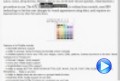 The eXToolBar component arranges / groups as rows or columns, any kind of graphical control elements such as buttons, icons, drop downs, editors, and so on, to let user choose quickly, what function / procedure to run. The eXToolBar component is written from scratch, uses EBN technology to let the user changes its visual appearance using skins, and requires no dependencies to any other third party library. As usual, the eXToolTip component is part of the eXSuite package. Available as: COM/ActiveX, /NET Assembly, /WPF Component, ANSI or UNICODE, 32 or 64-bit edition.
Here's a few shortcuts:
- Complete documentation here
- How-To questions here.
- Several samples, by downloading and installing the setup here.
We hope you to enjoy it!
|
| 08-03-2016 |
ExG2antt, 12.1.0.5
*Added: Ability to specify the mask's value with or without literals. For instance, having (####) ###-###, the mask field is completed if setting 0744845287, (0744)845287, (0744) 845 287, or (0744) 845-287, and so on
*Added: Invokes the ValidateValue/Change event when the user presses the Enter key or selecting a new value from the drop down, if the CauseValidateValue property is set
*Fixed: Sometimes, the DateType, MemoDropDownType, ColorType, CalculatorType,
FontType, PictureType editors require clicking twice to reopen the drop down portion.
*Fixed: The tooltip's appearance is not updated for Editor.ItemToolTip property
(Background(exToolTipAppearance) property)
*Fixed: Typing characters on a caret field editor is delayed, if the CauseValidateValue property is not
exNoValidate.
|
| 08-03-2016 |
ExFolderView, 9.0.0.1
*Added: DPI-Aware Support
*Fixed: Prevents showing the control's view in design mode, while running on FORTH system ( /COM version )
|
| 08-03-2016 |
ExShellView, 9.0.0.1
*Added: DPI-Aware Support
*Fixed: Prevents showing the control's view in design mode, while running on FORTH system ( /COM version )
|
| 08-01-2016 |
ExTree, 11.0.0.2
*NEW: Data Binding support for /NET assembly
*Added: DataSource property gets or sets the data source that the control is displaying data for. The DataSource property can be:
DataTable, DataView, DataSet, DataViewManager, any component that implements the IListSource interface, or any component that implements the IList interface.
*Added: DataMember property gets or sets the specific list in a DataSource for which the control displays a list.
*Fixed: Prevents flickering of the vertical scroll bar when a DataSource property is re-assigned.
*Fixed: Items.EnsureVisibleItem can be called between BeginUpdate/EndUpdate statement.
|
| 08-01-2016 |
ExScrollBar, 12.0.0.1
*Added: DPI-Aware Support
*NEW: Support for EBN 1004 version ( DPI-Aware support ).
*Added: The coordinates of the CP clause of the Skin parameter of VisualAppearance.Add method can be followed by a D character, which indicates the value according to the current DPI settings. For instance, "CP:1 -2 -2 2 2", copies the EBN with the identifier 1, and displays it on a 2-pixels wider rectangle no matter of the DPI settings, while "CP:1 -2D -2D 2D 2D" displays it on a 2-pixels wider rectangle if DPI settings is 100%, and on on a 3-pixels wider rectangle if DPI settings is 150%.
*Fixed: Prevents showing the control's view in design mode, while running on FORTH system ( /COM version )
|
| 07-30-2016 |
ExPrint, 12.0.0.1
*Added: DPI-Aware Support
*Added: Foreground property supports values such as 0, 1, -1 and -2 to specify the z-order of the Preview window as: top, bottom, always on top, and not on top (behind all topmost windows)
|
| 07-30-2016 |
ExSlider, 13.0.0.1
*Added: DPI-Aware Support
*NEW: Support for EBN 1004 version ( DPI-Aware support ).
*Added: The coordinates of the CP clause of the Skin parameter of VisualAppearance.Add method can be followed by a D character, which indicates the value according to the current DPI settings. For instance, "CP:1 -2 -2 2 2", copies the EBN with the identifier 1, and displays it on a 2-pixels wider rectangle no matter of the DPI settings, while "CP:1 -2D -2D 2D 2D" displays it on a 2-pixels wider rectangle if DPI settings is 100%, and on on a 3-pixels wider rectangle if DPI settings is 150%.
*Added: Restores the slider's position, once the user presses the ESC key while dragging the thumb.
*Fixed: Prevents showing the control's view in design mode, while running on FORTH system ( /COM version )
|
| 07-30-2016 |
ExCalendar, 12.0.0.1
*Added: DPI-Aware Support
*NEW: Support for EBN 1004 version ( DPI-Aware support ).
*Added: The exClientExt attribute of the
EBN/BackgroundExt/BackgroundExtValue supports DPI values, if the number is followed by a D character. For instance, if the DPI scaling is 100%, the 16d is 16, while for a 150% DPI scaling, the 16d is 24. In other words, "top[4,back=RGB(0,0,255)]", draws a blue line on the top side of the object's background, of 4-pixels wide, no matter of DPI scaling, while "top[4D,back=RGB(0,0,255)]", draws the line of 4-pixels wide if DPI scaling is 100%, or 6-pixels wide if DPI scaling is 150% )
*Added: The coordinates of the CP clause of the Skin parameter of VisualAppearance.Add method can be followed by a D character, which indicates the value according to the current DPI settings. For instance, "CP:1 -2 -2 2 2", copies the EBN with the identifier 1, and displays it on a 2-pixels wider rectangle no matter of the DPI settings, while "CP:1 -2D -2D 2D 2D" displays it on a 2-pixels wider rectangle if DPI settings is 100%, and on on a 3-pixels wider rectangle if DPI settings is 150%.
*Added: The expression properties support `dpi`, `dpix` and `dpiy` constants that returns the current DPI setting on x/y scale. For instance, the "value * dpi" returns the value if the DPI setting is 100%, or value * 1.5 in case, the DPI setting is 150%
|
| 07-30-2016 |
EXMLGrid, 11.0.0.7
*NEW: Ability to specify different options in the Editor.Mask property
*Added: The Editor.Mask property, supports up to four parts, separated by a semicolon (;). For instance, "`Time: `00:00:00;;0;overtype,warning=<fgcolor FF0000>invalid
character,beep", indicates the pattern "00:00" with the prefix Time:, the masking character being the 0, instead _, the field enters in over-type mode, insert-type mode is not allowed, and the field beeps and displays a tooltip in red with the message invalid character when the user enters an invalid character.
*Added: The first part (pattern) is mandatory. It includes the mask characters or string (series of characters) along with placeholders and literal data such as, parentheses, periods, and hyphens. Characters enclosed in double quotation ("" or ``) marks will be displayed literally. If this part should display/use the semicolon (;) character is should be included between double quotation ("" or ``) characters or as \; ( escape ). Currently, the special characters separated by space are: # 0 9 x X A a L ? & C > < * { } , [ ] - \ � �
*Added: The second part is optional and refers to the embedded mask characters and how they are stored within the field. If the second part is set to 0 ( default ), all characters are stored with the data, and if it is set to 1, the literals are stored, not including the masking/placeholder characters, if 2, just typed characters are stored, if 3, optional, required, editable and escaped entities are included (no double quoted text is included).
*Added: The third part of the input mask is also optional and indicates a single character or space that is used as a placeholder. By default, the field uses the underscore (_). If you want to use another character, enter it in the third part of your mask. Only the first character is considered. If this part should display/use the semicolon (;) character is should be \; ( escape )
*Added: The forth part of the input, indicates a list of options that can be applied to input mask, separated by comma(,) character as follow: float,grouping,decimal,negative,digits,password,right,readonly,inserttype,overtype,nocontext,beep,warning,select,empty,validate
|
| 07-29-2016 |
ExGrid, 10.3.0.4
*Added: Background(exCursorHoverCellButton) property. Specifies the visual appearance of the cell's button when the cursor hovers it. The hover/hot state of the cell's button is not applied if the cell is disabled, or the Background(exCursorHoverCellButton) property is -1 ( Items.CellHasButton, Column.Def(exCellhasButton) property )
*Added: The exMatchIncludeParent flag of the FilterInclude property specifies whether the parent item is checking if the current value is not matching. In other words, if the value on the current item is not matching the filter, the control check the parent item's value and so on. If any match, the current item is included.
*Fixed: Sometimes, the FocusChanged event is not fired if clicking the cell's white area ( no text ), and so the previously editing cell is not changed.
*Fixed: The control fails if loading data several times with no using the
BeginUpdate/EndUpdate methods.
|
| 07-29-2016 |
ExG2antt, 12.1.0.4
*Added: The Editor.DropDownAlignment property aligns the drop down portion too. The valid values are 0(right,left), 1(right,center), 2(right,right), 16(center,left), 17(center,center), 18(center,right), 32(left,left), 33(left,center) and 34(left,right), where the first element in the pair indicates the drop down alignment, while the second indicates the, caption's alignment. For instance, the Editor.DropDownAlignment on 33, indicates that the drop down portion of the field shows aligned to the left, and the inside items shows the caption aligned in center.
*Added: Editor.Option(exDropDownBackColor) and Editor.Option(exDropDownForeColor) specify the background and foreground colors to show items in a drop down editor.
*Fixed: The Editor.DropDownAlignment property specifies the alignment of the days in a DateType editor (Editor.DropDownAlignment property has no effect for a DateType editor)
*Fixed: Prevents showing the today date in a DateType editor on the NewValue parameter of the ValidateValue event if the CauseValidateValue property is True.
|
| 07-29-2016 |
ExHTML, 10.0.0.1
*Added: DPI-Aware Support
*NEW: Support for EBN 1004 version ( DPI-Aware support ).
*Added: The exClientExt attribute of the EBN/BackgroundExt/BackgroundExtValue supports DPI values, if the number is followed by a D character. For instance, if the DPI scaling is 100%, the 16d is 16, while for a 150% DPI scaling, the 16d is 24. In other words, "top[4,back=RGB(0,0,255)]", draws a blue line on the top side of the object's background, of 4-pixels wide, no matter of DPI scaling, while "top[4D,back=RGB(0,0,255)]", draws the line of 4-pixels wide if DPI scaling is 100%, or 6-pixels wide if DPI scaling is 150% )
*Added: The coordinates of the CP clause of the Skin parameter of VisualAppearance.Add method can be followed by a D character, which indicates the value according to the current DPI settings. For instance, "CP:1 -2 -2 2 2", copies the EBN with the identifier 1, and displays it on a 2-pixels wider rectangle no matter of the DPI settings, while "CP:1 -2D -2D 2D 2D" displays it on a 2-pixels wider rectangle if DPI settings is 100%, and on on a 3-pixels wider rectangle if DPI settings is 150%.
|
| 07-29-2016 |
ExPivot, 11.0.0.1
*NEW: Exontrol Print Scale Support, Adjust To and Fit to Page Wide by Tall Support
*Added: Print.Options = "FitToPage = 75%", adjusts and prints the control's content to 75% of normal size.
*Added: Print.Options = "FitToPage = 2 x 3", indicates that the control's content is print to fit 2 pages wide by 3 tall.
*Added: Print.Options = "FitToPage = 2 x", indicates that the control's content is print to fit 2 pages wide by how many pages tall are required.
*Added: Print.Options = "FitToPage = x 3", indicates that the control's content is print to fit 3 pages tall to how many pages wide are required.
|
| 07-28-2016 |
ExG2antt, 12.1.0.3
*NEW: Restrict data input by using validation rule for input-mask fields ( CauseValidateValue and Editor.Mask )
*Added: The Editor.Mask property supports "invalid=value" ( in forth part of the
Imput-Mask ), which indicates the html message to be displayed when the user enters an inappropriate value for the field. If the control's CauseValidateValue property is not exNoValidate and value of the invalid keyword is not empty, the field is keep opened until the user enters an appropriate value ( ValidateValue event is failed with the Cancel parameter on True ). If the value is single space, no message is displayed and the field is keep opened while the value is inappropriate. For instance, "!(999) 000 0000;;;invalid=The value you entered isn't appropriate for the input mask <b>'<%mask%>'</b> specified for this field." displays the message "The value you entered isn't appropriate for the input mask '...' specified for this field." tooltip once the user leaves the field and it is not-valid ( for instance, the field includes entities required and uncompleted ). The <%mask%> keyword in value, substitute the current mask of the field, while the <%value%> keyword substitutes the current value ( including the literals ).
*Added: Ability to change/define the default mask for the ColorType field, using the Editor.Mask property. For instance, if the Editor.Mask property is "`RGB(`{0,255}\,{0,255}\,{0,255}`)`;;0", the colors are displayed/edited in RGB format.
*Added: The default mask for the ColorType field is "`&H`XXXXXXXX`&`;;0;overtype,insertype", which shows color using
ABGR/RGBA format
|
| 07-28-2016 |
ExGantt, 11.0.0.1
*NEW: Windows 8.1 64-bit compatibility
*Added: The /COM 64-bit version is compatible with Microsoft Office Applications: Excel 2013, Access 2013,...
*Added: The /NET(/WPF) 64-bit version is compatible with Microsoft NET Framework 4, 4.5, 4.5.1, ...
*Added: The Items.ItemMinHeight/ItemMaxHeight properties specify the item's height if the item contains cells with Items.CellSingleLine property on False ( By default, the ItemHeight property has no effect if the Items.CellSingleLine property on False )
*Fixed: Sometimes, the control is flickering while the user is dragging items to new positions ( AutoDrag property is exAutoDragPosition ), if the "Desktop Window Manager Session Manager" service is not running, AEOR is turn off.
|
| 07-28-2016 |
ExGauge, 12.0.0.1
*Added: DPI-Aware Support
*NEW: Support for EBN 1004 version ( DPI-Aware support ).
*Added: The exClientExt attribute of the EBN/BackgroundExt/BackgroundExtValue supports DPI values, if the number is followed by a D character. For instance, if the DPI scaling is 100%, the 16d is 16, while for a 150% DPI scaling, the 16d is 24. In other words, "top[4,back=RGB(0,0,255)]", draws a blue line on the top side of the object's background, of 4-pixels wide, no matter of DPI scaling, while "top[4D,back=RGB(0,0,255)]", draws the line of 4-pixels wide if DPI scaling is 100%, or 6-pixels wide if DPI scaling is 150% )
*Added: The coordinates of the CP clause of the Skin parameter of VisualAppearance.Add method can be followed by a D character, which indicates the value according to the current DPI settings. For instance, "CP:1 -2 -2 2 2", copies the EBN with the identifier 1, and displays it on a 2-pixels wider rectangle no matter of the DPI settings, while "CP:1 -2D -2D 2D 2D" displays it on a 2-pixels wider rectangle if DPI settings is 100%, and on on a 3-pixels wider rectangle if DPI settings is 150%.
*Added: The expression properties support `dpi`, `dpix` and `dpiy` constants that returns the current DPI setting on x/y scale. For instance, the "value * dpi" returns the value if the DPI setting is 100%, or value * 1.5 in case, the DPI setting is 150%
|
| 07-28-2016 |
ExList, 10.0.0.1
*NEW: AutoDrag or ability to change automatically the rows position, copy and paste to OLE compliant application, and more.
*Added: AutoDrag on exAutoDragNone, by default, disables the AutoDrag feature.
*Added: AutoDrag on exAutoDragPosition, allows items to be dragged from a position to another, but not outside of its group.
*Added: AutoDrag on exAutoDragCopy, allows selected items to be dragged to a target application, and paste them as image or text.
*Added: AutoDrag on exAutoDragCopyText, allows selected items to be dragged to a target application, and paste them as text.
*Added: AutoDrag on exAutoDragCopyImage, allows selected items to be dragged to a target application, and paste them as image only.
*Added: AutoDrag on exAutoDragCopySnapShot, allows the current view to be dragged to a target application, and paste them as a snap shot.
*Added: AutoDrag on exAutoDragScroll, the component scrolls its content by clicking the object and dragging to a new position.
*Added: The control's content is smoothly scrolled if the AutoDrag property is
exAutoDragScroll, and the user clicks the Top or Bottom scroll buttons.
|
| 06-29-2016 |
ExHTML, 9.0.0.5
*NEW: Support for EBN 1003 version.
*Added: EBN 1003 implements Colorable Region Support which defines a portion/region of the EBN object where the color of the EBN is applied. For instance, at runtime the identifier 0x1FF0000 applies blue color to all colorable parts that compose the EBN object. The EBN color is not applied to not-colorable portions of the
EBNs.
*Fixed: The line's height is not updated once you paste lines with different heights
|
| 06-29-2016 |
ExplorerTree, 12.0.0.2
*NEW: New text decorations support for HTML captions, like outlined characters, shadow, ....
*Added: <gra>, </gra> built-in HTML tags define a gradient text ( the <gra> supports color, mode and blending, like <gra
rrggbb;mode;blend>, where, rr/gg/bb represents the red/green/blue values of the ending color, 808080 if missing as gray, mode a value between 0 and 4, 1 if missing, and blend 0 or 1, 0 if missing )
*Added: <out>, </out> built-in HTML tags define a text to show with outlined characters ( the <out> supports color and width, like <out
rrggbb;width>, where rr/gg/bb represents the red/green/blue values of the outline color, 808080 if missing as gray, width indicates the size of outline, 1 if missing.
*Added: <sha>, </sha> built-in HTML tags define a text with a shadow ( the <sha> supports color, width and offset, like <out
rrggbb;width;offset>, where rr/gg/bb represents the red/green/blue values of the shadow color, 808080 if missing as gray, width indicates the size of shadow, 4 if missing, and offset indicates the offset from the origin to display the text's shadow, 2 if missing.
*Added: Increases the performance of parsing HTML captions.
|
| 06-27-2016 |
ExFileView, 10.0.0.2
*NEW: MSAA, UI Automation, IAccessible support.
*Added: Microsoft Active Accessibility (MSAA) is designed to help Assistive Technology�(AT) products interact with standard and custom�user interface�(UI) elements of an application (or the operating system), as well as to access, identify, and manipulate an application's UI elements. AT products work with MSAA enabled applications in order to provide better access for individuals who have physical or cognitive difficulties, impairments, or disabilities.
*Fixed: The last italic character of a HTML caption may be shown as clipped
|
| 06-27-2016 |
ExDialog, 8.0.0.1
*Added: DPI-Aware Support
*NEW: Support for EBN 1004 version ( DPI-Aware support ).
*NEW: Support for EBN 1003 version ( implements Colorable Region Support which defines a portion/region of the EBN object where the color of the EBN is applied. For instance, at runtime the identifier 0x1FF0000 applies blue color to all colorable parts that compose the EBN object. The EBN color is not applied to not-colorable portions of the EBNs )
|
| 06-24-2016 |
ExGauge, 11.0.0.1
*NEW: Ability to make the control's form transparent, such as a widget
(using regions)
*NEW: Ability to include transparency of a picture in the clipping region.
Previously, all transparent pixels of the picture are clipped off
*Added: LayerClipToParent property indicates if the LayerClipTo method clips
the control itself, parent or the root/owner of the control.
*Added: Layer.LayerClipToAlpha
property returns or sets a value that indicates the value of the alpha
channel to be included in the LayerClipTo region.
*Added: ClipPicture.AlphaFrom
property Gets or sets a value that specifies the alpha-byte to start
clipping the picture from. By default, the AlphaFrom property is 0.
*Added: ClipPicture.AlphaTo
property Gets or sets a value that specifies the alpha-byte to end clipping
the picture to. By default, the AlphaTo property is 254. 255 is an opaque
pixel
|
| 06-24-2016 |
ExTree, 11.0.0.1
*NEW: Easy way to define the control's visual appearance in design mode, using XP-Theme elements or EBN objects.
*Added: VisualDesign property specifies the control's visual appearance. The VisualDesign value is a BASE64 encoded string, that can be defined using the control's WYSWYG Visual Design Editor, which can be invoked by selecting the control in Design Mode, select Properties, go to the VisualDesign property and click the ... in the Properties browser. The value for this property can be used on /COM, /NET or
/WPF. The /WPF version does not have the inside editor, instead any you can use the /COM or /NET to generate the BASE64 encoded strings for this property.
*Fixed: On Windows 7, the user can not open the open file dialog on MSDEV using the ShowImageList property ( VC 6.0 )
*Fixed: The Template property shows no ... button in the properties browser.
*Added: Ability to use or load PNG, TIFF or WMF picture on the control's background ( Picture property for /COM version ) , using the LoadPicture predefined function of the Template property. For instance, the [.Template = "Picture =
LoadPicture(`E:\picture.png`)"] OR [.Picture = .ExecuteTemplate("loadpicture(`E:\picture.png`)")] loads the PNG picture on the control's background.
|
| 06-22-2016 |
The following movie shows the first look of newly eXToolBar component:
The eXToolBar component arranges / groups as rows or columns, any kind of graphical control elements such as buttons, icons, drop downs, editors, and so on, to let user choose quickly, what function / procedure to run. The eXToolBar component is written from scratch, uses EBN technology to let the user changes its visual appearance using skins, and requires no dependencies to any other third party library.
Available as: COM/ActiveX, /NET Assembly, /WPF Component, ANSI or UNICODE, 32 or 64-bit edition.
|
| 06-22-2016 |
ExSchedule, 12.0.0.1
*NEW: Unlimited options to show any HTML text, images, colors, EBNs, patterns, frames anywhere on the pattern's background. Ability to draw additional
EBN/Color/Text/Patterns/Images on the pattern, using the EBN String Format (create and run at runtime EBN objects)
*Added: Pattern.BackgroundExt property indicates additional colors, text, patterns, images that can be displayed on the pattern's background using the EBN string format. For instance, Pattern.BackgroundExt = "bottom[4,back=RGB(0,0,0)],top[4,back=RGB(0,0,0)]" draws a 4-pixels wide line aligned to the top and bottom sides of the pattern.
*Added: Serializes the Pattern.BackgroundExt in XML format, when using the SaveXML / LoadXML methods
*Added: The event's position on the schedule view is determined by the
Event.KnownProperty(exEventID) property.
|
| 06-22-2016 |
ExToolBar.CRD, 10.0.0.2
*NEW: Support for EBN 1003 version.
*Added: EBN 1003 implements Colorable Region Support which defines a portion/region of the EBN object where the color of the EBN is applied. For instance, at runtime the identifier 0x1FF0000 applies blue color to all colorable parts that compose the EBN object. The EBN color is not applied to not-colorable portions of the
EBNs.
*Added: The Handle parameter of Images method can be a string that specifies the ICO file to be loaded. The ICO file format is an image file format for computer icons in Microsoft Windows. ICO files contain one or more small images at multiple sizes and color depths, such that they may be scaled appropriately. For instance,
Images("e:\working\sync.ico") method adds the sync.ico file to the control's Images collection.
|
| 06-20-2016 |
ExGrid, 10.3.0.3
*Added: Associates the last added record during the AddItem event with the item being added to the control, if the DetectAddNew property is True, and the control is bounded to a DAO
recordset.
*Added: Moves the current record to the associated record to be deleted on RemoveItem event, if the DetectDelete property is True, and the control is bounded to a DAO
recordset.
*Fixed: Prevents selecting all locked cells ( CountLockedColumns property ), if the user selects and scrolls the control's content when the FullRowSelect property is exRectSel
*Fixed: Clips the columns' background to lock/un-lock part of the control if the FullRowSelect property is
exRectSel.
|
| 06-20-2016 |
ExG2antt, 12.1.0.2
*NEW: Ability to specify different options in the Editor.Mask property
*Added: The Editor.Mask property, supports up to four parts, separated by a semicolon (;). For instance, "`Time: `00:00:00;;0;overtype,warning=<fgcolor FF0000>invalid
character,beep", indicates the pattern "00:00" with the prefix Time:, the masking character being the 0, instead _, the field enters in over-type mode, insert-type mode is not allowed, and the field beeps and displays a tooltip in red with the message invalid character when the user enters an invalid character.
*Added: The first part (pattern) is mandatory. It includes the mask characters or string (series of characters) along with placeholders and literal data such as, parentheses, periods, and hyphens. Characters enclosed in double quotation ("" or ``) marks will be displayed literally. If this part should display/use the semicolon (;) character is should be included between double quotation ("" or ``) characters or as \; ( escape ). Currently, the special characters separated by space are: # 0 9 x X A a L ? & C > < * { } , [ ] - \ � �
*Added: The second part is optional and refers to the embedded mask characters and how they are stored within the field. If the second part is set to 0 ( default ), all characters are stored with the data, and if it is set to 1, the literals are stored, not including the masking/placeholder characters, if 2, just typed characters are stored, if 3, optional, required, editable and escaped entities are included (no double quoted text is included).
*Added: The third part of the input mask is also optional and indicates a single character or space that is used as a placeholder. By default, the field uses the underscore (_). If you want to use another character, enter it in the third part of your mask. Only the first character is considered. If this part should display/use the semicolon (;) character is should be \; ( escape )
*Added: The forth part of the input, indicates a list of options that can be applied to input mask, separated by comma(,) character as follow: float,grouping,decimal,negative,digits,password,right,readonly,inserttype,overtype,nocontext,beep,warning,select,empty,validate
|
| 06-15-2016 |
ExOrgChart, 13.0.0.1
*NEW: Ability to show frame(s) around any node or group of nodes
*Added: Frames property gets a reference to the Frames collection.
*Added: Appearance.RenderType property specifies the way colored EBN objects are displayed on the component. For instance use the RenderType on -3 (0xFFFFFFFD), no color is applied, -2, for OR-color scheme (0xFFFFFFFE), -1 (0xFFFFFFFF) for AND-color scheme, ( older EBN color schemes ). The RenderType property is 0 by default, which indicates an A-color scheme. The first significant byte indicates the transparency while the other bytes indicates the RGB value.
*Added: Shows the pictures in the control as grayed, if the Enabled property is False ( the control is disabled )
|
| 06-15-2016 |
ExEdit, 11.0.0.4
*Added: Shows the control's caret in incremental search field while it is displayed.
*Added: Displays the current selection in the Incremental Search field, when it begins
*Added: Pressing the CTRL+I several times, looks for next occurrence of selecting text
|
| 06-14-2016 |
ExG2antt, 12.1.0.1
*NEW: Major/Radical improvements for input-mask fields.
*Added: New special characters for the Editor.Mask property as follows # 0 9 x X A a L ? & C > < * {,} [-] \ ! � �. Characters enclosed in double quotation ("" or ``) marks will be displayed literally. For instance, the Editor.Mask on "`Prefix: `(###)", displays Prefix: (___).
*Added: CTRL + A, selects all text in caret-type editor.
*Added: Advances to the next field if the current entity is a number, and there is no other possibility. For instance, having the input mask such as "{0,23}:{0,59}:{0,59}", and user types 12, the cursor is advanced to the next field automatically.
*Added: The mask editor selects the entity from the cursor, when user double clicks it. For instance, having the "10:20", clicking the 2 will highlight 20, instead the entire text
|
| 06-14-2016 |
ExEMail, 7.0.0.2
*Added: Prevents sending the message, if connecting the current host to the mail server refuses the connection ( Connecting, ERROR 554,
ProError: 0x1518 )
*Added: VC\ExPress sample displays more debug information to track sending the email message to the
server
|
| 06-13-2016 |
ExComboBox, 10.0.0.5
*Fixed: The GotFocus/LostFocus events are not properly fired for /NET assembly version.
*Fixed: Sometimes, the insensitive-case filter does not apply correctly to items that contain accented letters ( French Accents Characters ) like:
������, ... ( /COM Ansi version only )
*Fixed: The control fails to display data if a numeric filter is applied to a column, while the Exclude flag is set ( FilterList includes exShowExclude flag, FilterType is exNumeric ).
*Added: DropDownButtonWidth property retrieves or sets the width, in pixels, to display the drop down button of the control.
|
| 06-13-2016 |
ExCalc, 9.0.0.1
*Added: DPI-Aware Support
*Added: The expression properties support `dpi`, `dpix` and `dpiy` constants that returns the current DPI setting on x/y scale. For instance, the "value * dpi" returns the value if the DPI setting is 100%, or value * 1.5 in case, the DPI setting is 150%
*Added: The Handle parameter of Images method can be a string that specifies the ICO file to be loaded. The ICO file format is an image file format for computer icons in Microsoft Windows. ICO files contain one or more small images at multiple sizes and color depths, such that they may be scaled appropriately. For instance,
Images("e:\working\sync.ico") method adds the sync.ico file to the control's Images collection.
*Fixed: Prevents showing the control's view in design mode, while running on FORTH system ( /COM version )
|
| 06-08-2016 |
ExContextMenu, 11.0.0.7
*NEW: Unlimited options to show any HTML text, images, colors, EBNs, patterns, frames anywhere on the
Items/SubMenu's background. Ability to draw additional EBN/Color/Text/Patterns/Images on the
Items/SubMenu, using the EBN String Format (create and run at runtime EBN objects)
*Added: Items.BackgroundExt property indicates additional colors, text, patterns, images that can be displayed on the
Items/SubMenu's background using the EBN string format. For instance, Items.BackgroundExt = "bottom[4,back=RGB(0,0,0)],top[4,back=RGB(0,0,0)]" draws a 4-pixels wide line aligned to the top and bottom sides of the
Items/SubMenu. The Items.BackgroundExt = "bottom[10%+12,back=RGB(255,0,0),text=`<img>alert</img><b>Alert!`,align=0x11]" displays the alert picture and the Alert! caption as bold, on the RED background, on the bottom portion of the
Items/SubMenu (10%+12 pixels-wide from the object's client area).
*Fixed: Safely removing the item(s), during any event of the control.
*Tip: The eXButtons's builder WYSWYG tool provides the To String field, that indicates the EBN string format that can be used by BackgroundExt property.
|
| 06-08-2016 |
ExTree, 10.1.0.3
*NEW: Subscript and Superscript implementation in HTML captions, using the <off> HTML tag
*Added: <off>, </off> built-in HTML tags defines the vertical offset to display the element, relative to the current position. This tag is inheritable. The <off pixels>, where, pixels indicates the vertical offset to be applied ). For instance, the following text displays a text with Subscript and Superscript such as: "Text <off 4>with subscript</off> <off -4>and superscript</off> support"
*Added: The <fgcolor=0000FF> and <fgcolor FF>, or <bgcolor=00FF00> and <bgcolor FF00>, so no = or full 6
hexa-digits are required to define the color to be applied
*Added: Items.FindPath method can search by case sensitive, if the control's ASCIIUpper property is "" ( empty ). Previously, the Items.FindPath method is case insensitive
*Fixed: The <font> HTML tag is not overwritten when using inside another <font> tag
*Fixed: The parts of the line with different fonts in the HTML caption are vertically aligned ( instead aligning to the font's baseline ) if the line displays a picture or an icon using the <img> HTML tag.
|
| 06-07-2016 |
ExGauge, 10.0.0.1 (initial release)
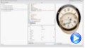 The eXGauge / eXLayers library provides graphics capabilities to visually display and edit the amount, level, or contents of something. The view can show one or more layers, where each layer can display one or more transparent pictures, HTML captions which can be clipped, moved, rotated or combination of them, by dragging the mouse, rolling the mouse wheel, or using the keyboard. Using the eXGauge / eXLayers library you can can easily simulate any gauges, thermometers, meters, clocks, buttons, sliders, scales, knobs, dials, switches, progress, status, indicators,
LEDs, and so on.
Available as: COM/ActiveX, /NET Assembly, /WPF Component, ANSI or UNICODE, 32 or 64-bit edition.
The eXGauge / eXLayers library provides graphics capabilities to visually display and edit the amount, level, or contents of something. The view can show one or more layers, where each layer can display one or more transparent pictures, HTML captions which can be clipped, moved, rotated or combination of them, by dragging the mouse, rolling the mouse wheel, or using the keyboard. Using the eXGauge / eXLayers library you can can easily simulate any gauges, thermometers, meters, clocks, buttons, sliders, scales, knobs, dials, switches, progress, status, indicators,
LEDs, and so on.
Available as: COM/ActiveX, /NET Assembly, /WPF Component, ANSI or UNICODE, 32 or 64-bit edition.
Here's a few shortcuts:
- Complete documentation here
- How-To questions here.
- Several samples, by downloading and installing the setup here.
We hope you to enjoy it!
|
| 06-06-2016 |
ExG2antt, 12.0.0.8
*Added: The HTML tags are case insensitive, so the < b > is equivalent with < B >
*Added: Prevents showing the +/- button for not-selectable items, if the control's AllowGroupBy property is True, or shows the +/- buttons when the AllowGroupBy property is False
(Items.SelectableItem)
*Fixed: A parent item that is not-selectable, shows no expand button, but clicking the starting part of the item expands or collapses the item
(Items.SelectableItem)
*Fixed: MS Access plays a beep, when the user presses the Backspace key on a edit type field.
*Fixed: In MS Access, can't use the CTRL+F4 key to close the current form.
|
| 06-06-2016 |
ExGantt, 10.1.0.1
*NEW: Exontrol Print Scale Support, Adjust To and Fit to Page Wide by Tall Support
*Added: Print.Options = "FitToPage = 75%", adjusts and prints the control's content to 75% of normal size.
*Added: Print.Options = "FitToPage = 2 x 3", indicates that the control's content is print to fit 2 pages wide by 3 tall.
*Added: Print.Options = "FitToPage = 2 x", indicates that the control's content is print to fit 2 pages wide by how many pages tall are required.
*Added: Print.Options = "FitToPage = x 3", indicates that the control's content is print to fit 3 pages tall to how many pages wide are required.
|
| 06-02-2016 |
ExHelper, 15.0.0.1
*Added: Exontrol.Gauge component to the controls list.
*Added: Exontrol.ToolBar.CRD component to the controls list.
*Added: ExTree 10.0
*Added: ExPropertiesList 10.0
*Added: ExEdit 12.1
*Fixed: Prevents changing the tool's font, while rotating the mouse wheel over the right panel ( Running panel ) while pressing the CTRL key
|
| 06-01-2016 |
ExRibbon, 10.0.0.8
*NEW: Support for EBN 1003 version.
*Added: EBN 1003 implements Colorable Region Support which defines a portion/region of the EBN object where the color of the EBN is applied. For instance, at runtime the identifier 0x1FF0000 applies blue color to all colorable parts that compose the EBN object. The EBN color is not applied to not-colorable portions of the
EBNs.
*Fixed: The pictures of a disabled item are not visible, while hovering the item.
*Fixed: Prevents showing the control's view in design mode, while running on FORTH system ( /COM version )
|
| 06-01-2016 |
ExSkin, 6.0.0.1
*Added: DPI-Aware support
*Added: The X, Y, CX, CY fields of the object that composes the ESK file, supports DPI values, if the number is followed by a D character. For instance, if the DPI scaling is 100%, the 16d is 16, while for a 150% DPI scaling, the 16d is 24. In other words, "top[4,back=RGB(0,0,255)]", draws a blue line on the top side of the object's background, of 4-pixels wide, no matter of DPI scaling, while "top[4D,back=RGB(0,0,255)]"
*Added: VC\Builder.DPI runs the WYSWYG Builder as DPI-Aware application
|
| 05-30-2016 |
ExG2antt, 12.0.0.7
*NEW: Ability to highlight the position from the cursor while performing OLE Drag and Drop ( the dropping source is not a known object )
*Added: Background(exListOLEDropPosition) property specifies the visual appearance of the dropping position over the list part of the control, when it is implied in a OLE Drag and Drop operation.
*Added: Background(exChartOLEDropPosition) property specifies the visual appearance of the dropping position over the chart part of the control, when it is implied in a OLE Drag and Drop operation.
*Added: Left/Right scrolling support during OLE Drag and Drop operations while the cursor hovers the chart portion of the control ( changing the Chart.FirstVisibleDate property during the OLE Drag and Drop operations )
*Fixed: The control may be slower than previously versions ( discovered in
Xbase++, but may affect other programming-languages as well )
|
| 05-30-2016 |
ExOrgChart, 12.0.0.4
*Fixed: Prevents extending the B,I,U,S attributes (Type category) once A,G,O or S attribute is selected, in the context-menu of HTML editor.
*Fixed: The SelectNode property fails if using the /NET on a x64 machine.
*Fixed: An unhandled exception of type 'System.OverflowException' occurred in mscorlib.dll (Arithmetic operation resulted in an overflow.), /NET/x64,
/WPF/x64 version
*Fixed: The pictures of a disabled node are not visible or shown at a different position, while the cursor hovers the node.
|
| 05-25-2016 |
ExSurface, 12.0.0.6
*Added: Background(exToolBarAppearance) property specifies the visual appearance of the surface's toolbar panel.
*Added: Background(exToolBarBackColor) property specifies the background color of the surface's toolbar panel.
*Added: Background(exToolBarForeColor) property specifies the foreground color of the surface's toolbar panel.
*Fixed: Prevents extending the B,I,U,S attributes (Type category) once A,G,O or S attribute is selected, in the context-menu of HTML editor.
*Fixed: Can not change the foreground colors for few objects of the control using the its Visual Designer.
|
| 05-25-2016 |
ExList, 9.0.0.3
*Added: Ability to use and show a custom tooltip using the ShowToolTip property even if any of the mouse buttons is pressed or not.
*Added: The Template or ExecuteTemplate properties may contain several commands separated by ; not only cariage returns. For instance the Template = "dim
p;p=CreateObject(`Exontrol.Print`);p.PrintExt=Me;p.Preview()" calls the exontrol's eXPrint to open the contrl's print and print preview.
*Fixed: Prevents showing the tooltip's shadow if the current theme is applied on the tooltip
*Fixed: Printing the control with thousand of EBN objects may increase the GDI handles indefinitely.
*Fixed: On terminal-servers (citrix), CPU-consumption varying from 1-4%, if multiple instances of the control is opened in the same time ( Exontrol.CommentWindow )
|
| 05-23-2016 |
ExPivot, 10.2.0.2
*NEW: Ability to retrieve data/value from the cursor
*Added: ValueFromPoint(-1,-1) retrieves the value from the cursor.
*Added: ColumnFromPoint(-1,-1) returns the column from the cursor.
*Fixed: Prevents horizontal scrolling the control's content if the EnsureVisibleColumn is called for any locked column ( CountLockedColumns property ).
*Fixed: Prevents horizontal scrolling the control's content if the user clicks a locked column ( CountLockedColumns property ).
|
| 05-23-2016 |
EXMLGrid, 11.0.0.6
*NEW: Restrict data input by using validation rule for input-mask fields ( CauseValidateValue and Editor.Mask )
*Added: The Editor.Mask property supports "invalid=value" ( in forth part of the
Imput-Mask ), which indicates the html message to be displayed when the user enters an inappropriate value for the field. If the control's CauseValidateValue property is not exNoValidate and value of the invalid keyword is not empty, the field is keep opened until the user enters an appropriate value ( ValidateValue event is failed with the Cancel parameter on True ). If the value is single space, no message is displayed and the field is keep opened while the value is inappropriate. For instance, "!(999) 000 0000;;;invalid=The value you entered isn't appropriate for the input mask <b>'<%mask%>'</b> specified for this field." displays the message "The value you entered isn't appropriate for the input mask '...' specified for this field." tooltip once the user leaves the field and it is not-valid ( for instance, the field includes entities required and uncompleted ). The <%mask%> keyword in value, substitute the current mask of the field, while the <%value%> keyword substitutes the current value ( including the literals ).
*Added: Ability to change/define the default mask for the ColorType field, using the Editor.Mask property. For instance, if the Editor.Mask property is "`RGB(`{0,255}\,{0,255}\,{0,255}`)`;;0", the colors are displayed/edited in RGB format.
*Added: The default mask for the ColorType field is "`&H`XXXXXXXX`&`;;0;overtype,insertype", which shows color using
ABGR/RGBA format
|
| 05-18-2016 |
ExThumbnail, 10.1.0.1
*NEW: BMP, JPG, GIF, PNG, TIFF, EMF Support ( Ability to save the thumbnail as BMP,
JPG, GIF, PNG, TIFF, EMF formats )
*Added: SaveAs( File, Width, Height ) method saves the current thumbnail as specified picture format. The extension of the File parameter ( characters after last dot) determines the graphical/ format of the file. For instance,
SaveAs( "c:\temp\thumbnail.png" ) saves the current thumbnail to
c:\temp\thumbnail.png file in PNG format.
*Fixed: Prevents showing the control's view in design mode, while running on FORTH system ( /COM version
|
| 05-18-2016 |
ExSkinBox, 12.0.0.1
*Added: DPI-Aware support
*Added: The X, Y, CX, CY fields of the object that composes the ESK file, supports DPI values, if the number is followed by a D character. For instance, if the DPI scaling is 100%, the 16d is 16, while for a 150% DPI scaling, the 16d is 24. In other words, "top[4,back=RGB(0,0,255)]", draws a blue line on the top side of the object's background, of 4-pixels wide, no matter of DPI scaling, while "top[4D,back=RGB(0,0,255)]"
*Fixed: The control's box is not properly resized if contains the <%sec%> HTML tag
*Fixed: Prevents showing the control's view in design mode, while running on FORTH system ( /COM version )
|
| 05-16-2016 |
ExG2antt, 12.0.0.6
*Added: EditingText property specifies the caption of the editor while the control is in edit mode.
*Fixed: Unloading the control may take longer if the control loads hundreds of columns.
*Fixed: In MS Access, can't use the CTRL+F4 key to close the current form.
*Fixed: Prevents showing the focusing rectangle around a disabled cell.
*Fixed: The bar's caption is not clipped off, if the exBarHAlignCaption is 3, 4 or 5, and the bar's width is small
|
| 05-16-2016 |
ExPropertiesList, 10.1.0.1
*Added: Property.DisplayFolder specifies whether the property displays folders.
*Added: Improves the way of scrolling the control's content while moving the objects outside of the control's client area, by drag and drop, and the control's margins are close to margins of the screen/monitor.
*Fixed: The element's tooltip is not shown if the user hovers again the object, if previously its tooltip was automatically hidden by elapsing the time specified by the ToolTipPopDelay property.
*Fixed: The properties of Collection type (VB6 ) do not load its child items ( not seen as Object properties )
|
| 05-11-2016 |
ExButton, 14.0.0.1
*NEW: Implementation of EBN 1004 file version ( DPI-Aware support ).
*Added: The exClientExt attribute of the EBN/BackgroundExt/BackgroundExtValue supports DPI values, if the number is followed by a D character. For instance, if the DPI scaling is 100%, the 16d is 16, while for a 150% DPI scaling, the 16d is 24. In other words, "top[4,back=RGB(0,0,255)]", draws a blue line on the top side of the object's background, of 4-pixels wide, no matter of DPI scaling, while "top[4D,back=RGB(0,0,255)]", draws the line of 4-pixels wide if DPI scaling is 100%, or 6-pixels wide if DPI scaling is 150% )
*Added: The X, Y, CX, CY fields of the object that composes the EBN file, supports DPI values, if the number is followed by a D character. For instance, if the DPI scaling is 100%, the 16d is 16, while for a 150% DPI scaling, the 16d is 24. In other words, "top[4,back=RGB(0,0,255)]", draws a blue line on the top side of the object's background, of 4-pixels wide, no matter of DPI scaling, while "top[4D,back=RGB(0,0,255)]"
*Added: VC\Builder.DPI runs the WYSWYG Builder as DPI-Aware application
*Fixed: Sometime, a message box is shown when running the /NET assembly.
|
| 05-11-2016 |
ExToolTip, 11.0.0.1
*Added: DPI-Aware Support
*Fixed: The inside tooltip may display truncated captions.
*Fixed: Prevents showing the control's view in design mode, while running on FORTH system ( /COM version )
|
| 05-10-2016 |
ExInstaller, 10.1.0.1 (major update)
The ExInstaller is a software component and application programming interface (API) for Microsoft Windows OS used for the installation, maintenance, and removal of our software. The ExInstaller is the base tool that installs / uninstalls any of our software products. The installation information and the files themselves, are packaged in installation packages ( .LZW files ).
Features include: Online / Offline, 32 / 64 bit installation support, ...
|
| 05-09-2016 |
ExGrid, 10.3.0.2
*NEW: Ability to displays the matching items
only, no parent or child, if no match
*Added: The FilterInclude property on
exMatchingItemsOnly, specifies that the control displays the items that match the filter so no parent or child is displayed if no match. For instance, if your control displays a hierarchy the parent or child items are not included, if they do not match the filter. You can use the TreeColumnIndex property on -1 or Indent property on 0, to display no +/- buttons or hierarchy lines.
*Added: Items.VisibleItemCount property returns negative value, if filtering is applied on the control ( the control has a filter applied ). The negative value represents a formula of -( count + 1 ), where count indicates the number of matching items. For instance, if the Items.VisibleItemCount property returns -1, the count of matching items is 0, if -2, 1 matching item, if -3, 2 matching items, and so on.
*Fixed: Sometimes, the selection is lost, once the mouse is released during scrolling, while the user selects several cells by dragging ( FullRowSelect property )
|
| 05-09-2016 |
ExLabel, 13.0.0.1
*NEW: Support for EBN 1003 version.
*Added: EBN 1003 implements Colorable Region Support which defines a portion/region of the EBN object where the color of the EBN is applied. For instance, at runtime the identifier 0x1FF0000 applies blue color to all colorable parts that compose the EBN object. The EBN color is not applied to not-colorable portions of the EBNs.
*Fixed: Prevents showing the control's view in design mode, while running on FORTH system ( /COM version )
|
| 05-04-2016 |
ExG2antt, 12.0.0.5
*Added: NumericEnum.exFloatInteger, allows editing floating point numbers, without using the exponent characters such as e/E/d/D. The format of the floating point number is:
[+/-]digit[.digit], where digit is any combination of digit characters.
*Added: NumericEnum.exDisableSigns, prevents using the +/- signs when editing numbers. For instance exFloatInteger + exDisableSigns allows editing floating points numbers without using the exponent and plus/minus characters, so the allowed format is
digit[.digit]
*Added: EditorOptionEnum.exPickAllowEmpty of Boolean type, specifies whether the editor of PickEditType supports empty value.
*Fixed: The ShowFocusRect shows shifted if the column's FormatLevel property includes the column's itself in the CRD
defintion.
|
| 05-04-2016 |
ExGantt, 10.0.0.2
*NEW: Incremental Search and Filter Support for the drop down filter panel. The Incremental search/filter feature for the drop down filter panel is valid while the Filter For field is not displayed. For instance, if the drop down filter list displays hundreds of items, you can start typing and it includes just the items that match your typing characters.
*Added: Column.DisplayFilterPattern on False hides the Filter For: field in the drop down filter panel, and so the incremental search/filter is allowed on the drop down filter panel. As soon as you type, the drop down list includes the items that match the typed characters only.
*Fixed: No TAB character is included between empty cells, when data is dragged using the AutoDrag property on
exAutoDragCopyText.
*Fixed: Sometimes, the insensitive-case filter does not apply correctly to items that contain accented letters ( French Accents Characters ) like:
������, ... ( /COM Ansi version only )
|
| 05-03-2016 |
ExEBN, 10.0.0.1
The ExEBN tool helps you to create, edit or view EBN files ( the EBN provides skin capabilities for almost all of our UI components ), or create, edit, view EBN String Format ( the EBN String Format adds unlimited options to show any HTML text, images, colors,
EBNs, patterns, frames anywhere on the object's background ). The EBN is a set of UI elements that are built as a tree where each element is anchored to its parent element.
|
| 04-29-2016 |
ExImages, 10.0.0.1 (major update)
The ExImages tool is a BASE64 encoder/decoder tool, which helps you to generate encoded-BASE64 strings for Images, VisualAppearance.Add, HTMLPicture, ... methods from icons, EBN or any picture files. The ExImages compresses the data before generating the encoded-BASE64 string, when encoding is performed, and decodes the encoded-BASE64 string, decompresses the data, when decoding is performed.
Drag and drop your files from Windows Explorer to one of the two leftmost panels of the ExImages tool, so you get the encoded-BASE64 string, or you can decode any encoded-BASE64 string you select and copy ( CTRL + C ), so as soon as the tool recognizes the data, it will display it in any of the two leftmost panels of the ExImages tool.
|
| 04-27-2016 |
ExScrollBar, 12.0.0.1
*Added: `MIN` and `MAX` binary-operators to get the MIN and MAX value. For instance, the expression `value MIN 10 MAX 100` returns always a value between 10 and 100.
*Added: `sin`, `asin`, `cos`, `acos` unary-operators to get the associated trigonometric functions. For instance `2 * asin(1)` returns the value of PI
*Added: `sqrt` unary-operator returns the square root of the element, so sqrt(81) returns 9, as 9^2 is 81
*Added: date(`now`) unary-operator returns the current date-time ( as double ), while the date(``) returns the current date ( no time included )
*Fixed: Prevents showing the control's view in design mode, while running on FORTH system ( /COM version )
|
| 04-27-2016 |
ExStatusBar, 9.1.0.3
*Added: </solidline>, </upline>, </dotline> HTML tags ends the solid, up or dotted line
*Added: Prevents showing the ,.;!?'")}] characters at the beginning of a new line, when html text is word-wrapping.
*Fixed: The last italic character of a HTML caption may be shown as clipped
|
| 04-25-2016 |
Expression, 9.0.0.4
*Added: `MIN` and `MAX` binary-operators to get the MIN and MAX value. For instance, the expression `value MIN 10 MAX 100` returns always a value between 10 and 100.
*Added: `sin`, `asin`, `cos`, `acos` unary-operators to get the associated trigonometric functions. For instance `2 * asin(1)` returns the value of PI
*Added: `sqrt` unary-operator returns the square root of the element, so sqrt(81) returns 9, as 9^2 is 81
*Added: date(`now`) unary-operator returns the current date-time ( as double ), while the date(``) returns the current date ( no time included )
|
| 04-25-2016 |
ExMenu, 9.0.0.5
*Added: Toggling the open/close state of the drop down item's submenu when the user clicks the same item ( has effect for items of the menu control, not items of sub-menus )
*Fixed: An ICO file shows as 18x18 instead of 16x16 pixels if it is loaded using the HTMLPicture method.
*Fixed: Prevents showing the control's view in design mode, while running on FORTH system ( /COM version )
|
| 04-20-2016 |
ExG2antt, 12.0.0.4
*NEW: Ability to display extended links, so when two, or more links start or end on the the same point/bar, show them distinctly, rather then showing one over to another.
*Added: Chart.ShowLinks property of ShowExtendedLinksEnum type, instead Boolean. The Chart.ShowLinks property on exShowExtendedLinks shows extended links, so when two, or more links start or end on the the same point/bar, show them distinctly, rather then showing one over to another.
*Added: The ShowExtendedLinksEnum.exShowLinksFront flag on the Chart.ShowLinks property specifies to bring the links in front of the chart, else the links are shown on the back.
*Added: The ShowExtendedLinksEnum.exShowDefaultLinks flag indicates the default links to be shown ( compatibility usage ).
*Added: ShowLinksEnum.exUpdateColorLinksOnly flag indicates that the Chart.ShowLinksColor property updates the color for incoming/outgoing links of the selected bar, so the color is not applied to incoming/outgoing bars. For instance, Chart.ShowLinksColor(exShowLinksEndTo +
exUpdateColorLinksOnly) = RGB(128,128,128) shows the incoming links in gray, while the colors of incoming bars remain unchanged. The
Chart.ShowLinksColor(exShowLinksEndTo) = RGB(128,128,128), shows the incoming links and bars in gray.
*Fixed: Sometimes the control displays no items, but still showing the vertical scroll bar, when the user deletes multiple items ( Items.RemoveItem method )
|
| 04-20-2016 |
ExSlider, 12.0.0.2
*Added: lfind binary-operator for format/expression. The a lfind b searches the first occurrence of the string b within string a, and returns -1 if not found, or the position of the result ( zero-index ). For instance,
`ABCABC` lfind `D` returns -1, while `ABCABC` lfind `C` returns 2.
*Added: rfind binary-operator for format/expression. The a rfind b searches the last occurrence of the string b within string a, and returns -1 if not found, or the position of the result ( zero-index ). For instance,
`ABCABC` rfind `D` returns -1, while `ABCABC` rfind `C` returns 5.
*Added: reverse unary-operator for format/expression. The reverse(a) reverses the order of the characters in the string a, For instance, the
reverse("Mihai") returns
"iahiM"
|
| 04-19-2016 |
The following movie shows the first look of newly eXGauge component:
The eXGauge / eXLayers library provides graphics capabilities to visually display and edit the amount, level, or contents of something. The view can show one or more layers, where each layer can display one or more transparent pictures, HTML captions which can be clipped, moved, rotated or combination of them, by dragging the mouse, rolling the mouse wheel, or using the keyboard. Using the eXGauge / eXLayers library you can can easily simulate any gauges, thermometers, meters, clocks, buttons, sliders, scales, knobs, dials, switches, progress, status, indicators, LEDs, and so on
|
| 04-18-2016 |
ExCalendar, 11.0.0.3
*Fixed: The pictures of a disabled date are not visible or shown at a different position, while the cursor hovers the date.
*Fixed: Removes the fade effect when the user selects a new date
*Fixed: Prevents showing the control's view in design mode, while running on FORTH system ( /COM version )
|
| 04-18-2016 |
ExHTML, 9.0.0.4
*Added: The FormatSelection property retrieves the value of the font's attribute from the cursor, in case there is no selection available ( Previously, the FormatSelection property retrieves empty, in case no selection is available, SelLength property is 0)
*Fixed: Prevents extending the B,I,U,S attributes (Type category) once A,G,O or S attribute is selected, in the context-menu of HTML editor.
*Fixed: Prevents showing the control's view in design mode, while running on FORTH system ( /COM version )
|
| 04-13-2016 |
ExPropertiesList, 10.0.0.2
*NEW: Ability to edit field using a multiple-lines editors
*Added: Property.Option(exEditSingleLine) property specifies if the property is being edited using a single or multiple lines editor.
*Added: Property.Option(exEditMaxMultipleLines) property specifies the number of lines that a multiple-lines editor may display.
*Added: Property.Option(exEditAutoSizeMultipleLines) property specifies if the multiple-lines editor is auto-sizing once the user alters the property's field.
|
| 04-13-2016 |
ExPlorerTree, 12.0.0.1
*NEW: Inheritance for HTML attributes on multiple line ( for instance, the < b > is inherited on multiple lines, until the < /b > tag is found)
*NEW: The < font > or < img > can change the height of the HTML line, so HTML captions can display lines with different heights.
*Added: The HTML captions allow using not-nested elements to be used. (for instance the sequence "< b >1< s >23< /b >4< /s>" displays 123 in bold while the 234 are shown in strikeout )
*Added: The < c > HTML tag centers the line. Similar with < r > HTML tag.
*Fixed: Extra characters are inserted in the next line if the breaking element is a picture that does not fit the current line.
*Fixed: Ignores the ending HTML tags, if they are not used previously ( for instance, the < /b > is not displayed in the sequence "ABC< /b >" )
|
| 04-11-2016 |
ExTree, 10.1.0.2
*NEW: New text decorations support for HTML captions, like outlined characters, shadow, ....
*Added: <gra>, </gra> built-in HTML tags define a gradient text ( the <gra> supports color, mode and blending, like <gra
rrggbb;mode;blend>, where, rr/gg/bb represents the red/green/blue values of the ending color, 808080 if missing as gray, mode a value between 0 and 4, 1 if missing, and blend 0 or 1, 0 if missing )
*Added: <out>, </out> built-in HTML tags define a text to show with outlined characters ( the <out> supports color and width, like <out
rrggbb;width>, where rr/gg/bb represents the red/green/blue values of the outline color, 808080 if missing as gray, width indicates the size of outline, 1 if missing.
*Added: <sha>, </sha> built-in HTML tags define a text with a shadow ( the <sha> supports color, width and offset, like <out
rrggbb;width;offset>, where rr/gg/bb represents the red/green/blue values of the shadow color, 808080 if missing as gray, width indicates the size of shadow, 4 if missing, and offset indicates the offset from the origin to display the text's shadow, 2 if missing.
*Fixed: Extra characters are inserted in the next line if the breaking element is a picture that does not fit the current line.
|
| 04-11-2016 |
ExFileView, 10.0.0.1
*NEW: Exontrol Print Scale Support, Adjust To and Fit to Page Wide by Tall Support
*Added: Print.Options = "FitToPage = 75%", adjusts and prints the control's content to 75% of normal size.
*Added: Print.Options = "FitToPage = 2 x 3", indicates that the control's content is print to fit 2 pages wide by 3 tall.
*Added: Print.Options = "FitToPage = 2 x", indicates that the control's content is print to fit 2 pages wide by how many pages tall are required.
*Added: Print.Options = "FitToPage = x 3", indicates that the control's content is print to fit 3 pages tall to how many pages wide are required.
|
| 04-06-2016 |
ExEdit, 11.0.0.3
*Added: The key's tooltip supports new HTML attributes like: <gra>,<out>, <sha> (text decorations), <off> (subscript and superscript)
*Added: Closes the current incremental searching operation in current state, when user presses the ENTER or ESCAPE key.
*Added: A short beep is sent once the user can not find any more occurrences during the incremental search.
|
| 04-06-2016 |
ExPivot, 10.2.0.1
*NEW: Ability to import/load/handle/display built-HTML within the columns
*Added: The Column.HTML property indicates whether the column handles/displays built-in HTML format.
*Added: The Version property for /NET or /WPF version returns more information about the component/assembly/file.
*Fixed: The control selects items to the cursor, if a short click occurs ( AutoDrag property is not empty, and the SingleSel property is False )
|
| 04-04-2016 |
ExGantt, 10.0.0.1
*NEW: Support for EBN 1002 version.
*Added: The EBN 1002 allows using skin objects with horizontal, vertical stretch and colorable/not-colorable parts of the
EBNs.
*Added: The AutoDrag property drags the child items of dragging item, if the item is expanded and there is no other selected item ( none or one selected item ). If multiple items are selected and dragged, no child items are included in the dragging operation
*Added: Includes the expandable columns to dragging data if using the AutoDrag property on exAutoDragCopyText
|
| 04-04-2016 |
ExSchedule, 11.0.0.2
*NEW: Ability to change the control's content menu visual appearance using EBN objects
*Added: Background(exContextMenuSelBackColor) property specifies the solid/EBN selection's background color in the control's context menu. The
Background(exContextMenuSelBackColor) is valid while it is not zero.
*Added: Background(exContextMenuSelBorderColor) property specifies the solid color to show the selection in the control's context menu. The
Background(exContextMenuSelBorderColor) is valid while it is not zero.
*Added: Background(exContextMenuSelForeColor) property specifies the selection's text foreground color in the control's context menu. The
Background(exContextMenuSelForeColor) is valid while it is not zero.
|
| 03-30-2016 |
ExHelper, 14.0.0.1
*Added: Exontrol.ToolBar.CRD component to the controls list.
*Added: ExTree 10.0
*Added: ExPropertiesList 10.0
*Added: ExEdit 12.1
*Fixed: Prevents changing the tool's font, while rotating the mouse wheel over the right panel ( Running panel ) while pressing the CTRL key
|
| 03-30-2016 |
ExComboBox, 10.0.0.4
*Fixed: MS Access plays a beep, when the user presses the Backspace key while the control has the focus.
*Fixed: In MS Access, can't use the CTRL+F4 key to close the current form.
*Fixed: The tooltip associated with the column's filter ( pattern or list ), is not shown even if the Column.FilterList property includes the exEnableToolTip flag.
*Fixed: On terminal-servers (citrix), CPU-consumption varying from 1-4%, if multiple instances of the control is opened in the same time ( Exontrol.CommentWindow )
|
| 03-28-2016 |
ExGrid, 10.3.0.1
*NEW: Ability to save/load automatically the control's layout.
*Added: Layout property, saves or loads the control's layout, an that means, the position, width, visibility, sort order of the control's columns and the scroll position, filtering, selection, and so on. The Layout property saves/loads almost all properties of the columns, that user can change at runtime, using the control's user interface.
*Added: Background(exCursorHoverColumn) on -1 ( 0xFFFFFFFF), prevents changing the column's visual appearance when the cursor hovers the column's header.
*Fixed: Prevents expanding items with the Items.HasChildren property On True, if the Column.FilterList property includes the FilterListEnum.exRootItems
*Fixed: The parts of the line with different fonts in the HTML caption are vertically aligned ( instead aligning to the font's baseline ) if the line displays a picture or an icon using the <img> HTML tag.
*Fixed: Shows the Editor.Option(exEditDecimalSymbol) character, instead the current decimal symbol, when a floating-point editor is shown. (
EditType, Numeric, exFloat, exFloatInteger )
|
| 03-28-2016 |
EXMLGrid, 11.0.0.5
*Added: The Editor.DropDownAlignment property aligns the drop down portion too. The valid values are 0(right,left), 1(right,center), 2(right,right), 16(center,left), 17(center,center), 18(center,right), 32(left,left), 33(left,center) and 34(left,right), where the first element in the pair indicates the drop down alignment, while the second indicates the, caption's alignment. For instance, the Editor.DropDownAlignment on 33, indicates that the drop down portion of the field shows aligned to the left, and the inside items shows the caption aligned in center.
*Added: Editor.Option(exDropDownBackColor) and
Editor.Option(exDropDownForeColor) specify the background and foreground colors to show items in a drop down editor.
*Fixed: The Editor.DropDownAlignment property specifies the alignment of the days in a DateType editor
(Editor.DropDownAlignment property has no effect for a DateType editor)
*Fixed: Prevents showing the today date in a DateType editor on the NewValue parameter of the ValidateValue event if the CauseValidateValue property is True.
*Fixed: "Visual C++ Runtime Error!" occurs if using the <fgcolor> or <bgcolor> with no indicating the color. Correct is <fgcolor
RRGGBB>, instead <fgcolor>
|
| 03-23-2016 |
ExContextMenu, 11.0.0.6
*NEW: Ability to define the padding and the visual appearance for items when displayed as a menu/group
*Added: Items.Padding property specifies the padding (space between the menu border and the item content) to display the items.
*Added: Items.BackColor property specifies the visual appearance / background color of the items/sub-menu.
*Added: Items.HotBackColor property specifies the visual appearance / background color of the items/sub-menu, when cursor hovers it
|
| 03-23-2016 |
ExG2antt, 12.0.0.3
*NEW: Ability to defines/un-defines the bars of a summary bar using a mask/pattern for the key of the bars, all, child items, leafs or all recursively child items, with a single call.
*Added: The KeyAdd parameter of Items.DefineSummaryBars method supports pattern if specified such as "<pattern>", where the pattern may contain wild card characters such as '?' for any single character, '*' for zero or more occurrences of any character, '#' for any digit character. For instance,
DefineSummaryBars(,,,"<K*>") defines the summary bar to include bars whose key starts with character K.
*Added: The ItemAdd parameter of Items.DefineSummaryBars method can be 0, -1, -2 or -3 with the following specifications. 0 means all items, -1 indicates the direct descendents/children items of the SummaryItem ( child items of the SummaryItem ), -2 means leaf descendents/items of
SummaryItem, where a leaf or terminal item is an item with no child items and -3 means all descendents/children items of the SummaryItem ( recursively). For instance,
DefineSummaryBars(SummaryItem,SummaryKey,-1,"<K*>") defines the summary bar to include bars of SummaryItem descendents, whose key starts with character K, where the DefineSummaryBars(SummaryItem,SummaryKey,0,"K") defines the summary bar to include all bars with the key K from the entire chart.
*Added: The KeyRemove of UndefineSummaryBars method supports pattern if specified such as "<pattern>", with the same meaning as KeyAdd parameter of the Items.DefineSummaryBars method
*Added: The ItemRemove of UndefineSummaryBars method supports 0, -1, -2 or -3 as ItemAdd parameter of the Items.DefineSummaryBars method with the same meaning.
*Added: DefSchedulePDMEnum.exPDMCriticalPathLenMethod determines the way how the lenght of the path is computed.
*Fixed: The Items.SchedulePDM is not able to arrange properly the bars if they are linked with negative lags (
Item.Link(exLinkPDMWorkingDelay/exLinkPDMDelay property )
|
| 03-21-2016 |
ExSwimLane, 12.0.0.2
*Fixed: The pictures of a disabled element are not visible or shown at a different position, while the cursor hovers the element.
*Added: lfind binary-operator for format/expression. The a lfind b searches the first occurrence of the string b within string a, and returns -1 if not found, or the position of the result ( zero-index ). For instance,
`ABCABC` lfind `D` returns -1, while `ABCABC` lfind `C` returns 2.
*Added: rfind binary-operator for format/expression. The a rfind b searches the last occurrence of the string b within string a, and returns -1 if not found, or the position of the result ( zero-index ). For instance,
`ABCABC` rfind `D` returns -1, while `ABCABC` rfind `C` returns 5.
*Added: reverse unary-operator for format/expression. The
reverse(a) reverses the order of the characters in the string a, For instance, the
reverse("Mihai") returns "iahiM"
*Fixed: Prevents showing the control's view in design mode, while running on FORTH system ( /COM version )
|
| 03-21-2016 |
ExRibbon, 10.0.0.7
*Added: lfind binary-operator for format/expression. The a lfind b searches the first occurrence of the string b within string a, and returns -1 if not found, or the position of the result ( zero-index ). For instance,
`ABCABC` lfind `D` returns -1, while `ABCABC` lfind `C` returns 2.
*Added: rfind binary-operator for format/expression. The a rfind b searches the last occurrence of the string b within string a, and returns -1 if not found, or the position of the result ( zero-index ). For instance,
`ABCABC` rfind `D` returns -1, while `ABCABC` rfind `C` returns 5.
*Added: reverse unary-operator for format/expression. The
reverse(a) reverses the order of the characters in the string a, For instance, the
reverse("Mihai") returns
"iahiM"
|
| 03-18-2016 |
ExToolBar.CRD,
10.0.0.1 (initial release)
 The
eXToolBar.CRD component is a graphical
control element on which on-screen buttons, icons, menus, or other input or
output elements are placed. The eXTolBar.CRD component lets the user changes
its visual appearance using skins, each one providing an additional visual
experience that enhances viewing pleasure. The eXToolBar.CRD component it's
free to use so no nag screens, no limitation, no evaluation message. Enjoy
it. The
eXToolBar.CRD component is a graphical
control element on which on-screen buttons, icons, menus, or other input or
output elements are placed. The eXTolBar.CRD component lets the user changes
its visual appearance using skins, each one providing an additional visual
experience that enhances viewing pleasure. The eXToolBar.CRD component it's
free to use so no nag screens, no limitation, no evaluation message. Enjoy
it.
|
| 03-16-2016 |
ExG2antt, 12.0.0.2
*Added: AddGroupItem event if fired only during grouping and notifies your application once a new group item has been added, so you can customize the grouping by adding new footer or header items.
*Added: IsGrouping property indicates whether the control is grouping the items.
*Added: Columns.SortBarColumnsCount property indicates the number of Columns in the control's
SortBar/GroupBy.
*Added: Columns.SortBarColumnColumn(Position) property returns the Column in the control's
SortBar/GroupBy, giving its position.
*Added: Group method forces the control to do a regrouping of the columns.
*Added: Ungroup method ungroups the columns, if they have been previously grouped.
|
| 03-16-2016 |
ExOrgChart, 12.0.0.3
*Added: The Version property for /NET or /WPF version returns more information about the component/assembly/file.
*Fixed: On Windows 8.1 Tablet, the chart stops scrolling as soon as other object gets scrolled using the fingers.
*Fixed: Can't scroll the control if touching with fingers the buttons of the scroll bar.
*Fixed: An ICO file shows as 18x18 instead of 16x16 pixels if it is loaded using the HTMLPicture method.
|
| 03-14-2016 |
ExEMail, 7.0.0.1
*NEW: BASE64 encoding format for the message's body
*Added: Message.BodyEncoding property specifies the way the message's body is encoded. Available formats are: BASE64, 7BIT or 8BIT. By default, the Message.BodyEncoding is BodyEncodingBASE64
*Added: Message-ID header field
*Fixed: Updates the Date header field with the current date-time, if the same message is sent multiple times, unless the Date property has not being specified
|
| 03-14-2016 |
ExHelper, 13.0.0.1
*Added: Exontrol.TreeCube component to the controls list.
*Added: The tool's title displays version of each component it uses.
*Added: The tool's title shows in the right part, the time in ms to run the current template ( xxxx ms )
*Added: Allow using multiple lines on the Call Custom Template dialog.
*Added: Shows the line's error while hovering the bookmark part only, so the tooltips for other keywords in the line are available, when the cursor hovers them.
|
| 03-09-2016 |
ExList, 9.0.0.2
*NEW: Ability to specify any COLOR for the control's frame/border/appearance if using EBN objects.
*Added: The Appearance property may specify any color to apply the EBN object to define the control's border. In other words, you can define the color and the visual aspect of the control's border/appearance.
*Added: The Background(exToolTipAppearance) property may specify any color to apply to tooltip's EBN so the control's tooltip can be shown using different colors.
*Added: The EBN can be displayed using ANY color ( not only FF for rgb ). For instance, 0x1A88A5D indicates that EBN with the identifier 1 is displaying in Air Force blue color (#5D8AA8).
*Fixed: The control plays a beep when the user presses the ENTER/ESCAPE/TAB key, while editing the cell.
|
| 03-09-2016 |
ExGantt, 9.0.0.6
*NEW: Fit-To-Page Print and Print Preview support
*Added: Print.Options("FitToPage = On") indicates that the component is using one page to show its content on Print and Print Preview ( Exontrol.eXPrint version must be 5.2, or greater )
*Added: The HTML tags are case insensitive, so the < b > is equivalent with < B >
*Fixed: The tooltip associated with the column's filter ( pattern or list ), is not shown even if the Column.FilterList property includes the exEnableToolTip flag.
|
| 03-07-2016 |
ExButton, 13.0.0.2
*NEW: Ability to show the HTML caption vertically, or mirrored.
*Added: Rotate property rotates the HTML caption. For instance, Rotate property on
exHTMLVertical, displays vertically the HTML control from the left-bottom to the top-right, while the exHTMLVertical or
exHTMLMirror, displays vertically the HTML control from top-right to left-bottom
*Fixed: The button's State property may be keep on exHot, while the mouse leaves quickly the button
*Fixed: "Attempted to read and write protected memory" exception may occur when using the
eXButton/NET assembly on VS 2008
|
| 03-07-2016 |
ExSchedule, 11.0.0.1
*NEW: WYSIWYG Built-In HTML Editor ( Event's ShortLabel, LongLabel or ExtraLabel allows HTML editing, while Caption or Repetitive plain text editing )
*Added: Background(exContextMenuAppearance) property indicates the visual appearance of the borders / inside of the control's context menu. For instance,
Background(exContextMenuAppearance) = 0x2000000, indicates that the control's context menu shows the EBN (borders and client area) with the identifier 2 in the control's VisualAppearance collection. The
Background(exContextMenuAppearance) is valid while it is not zero.
*Added: Background(exContextMenuBackColor) property specifies the solid background color for the control's context menu. The
Background(exContextMenuBackColor) is valid while it is not zero.
*Added: Background(exContextMenuForeColor) property specifies the text foreground color for the control's context menu. The
Background(exContextMenuForeColor) is valid while it is not zero.
|
| 03-02-2016 |
The following movie shows the first look of newly eXTreeCube component:
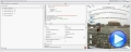 The eXTreeCube library provides fisheye representation / cube map texturing of different components such as calendar, multiple - columns tree view and so on. Fish-eye lenses magnify the center of the field of view, while the scale being reduced towards the edge. Cube map texturing is a form of environment texture mapping that uses a viewing direction (3D vector) to map into a view plane the six 2D textures arranged like the faces of a cube. You have unlimited options to show any HTML text, images, colors, EBNs, patterns, frames anywhere on any face of the cube. The eXTreeCube component lets the user changes its visual appearance using skins, each one providing an additional visual experience that enhances viewing pleasure. As usual, there are no dependencies to MFC, VB, VCL, and of course, no Open GL required.
|
| 03-02-2016 |
ExSurface, 12.0.0.5
*Added: The Version property for /NET or /WPF version returns more information about the component/assembly/file.
*Fixed: An ICO file shows as 18x18 instead of 16x16 pixels if it is loaded using the HTMLPicture method.
*Fixed: The a mod b expression fails, if b is zero or negative.
*Fixed: The a mid b expression fails, if b expression is greater than the length of the
a
|
| 03-02-2016 |
ExFileView, 9.0.0.1
*NEW: Native Print and Print-Preview support in Microsoft Office Applications, such as Access, Excel or Word (/COM version)
*Added: Ability to print the control's content on Access's forms directly, using the DoCmd.PrintOut command.
*Added: Ability to print the control's content on Word applications, using the Word's print and print preview mainframe.
*Added: Ability to print the control's content on Excel applications, using the Excel's print and print preview mainframe.
|
| 02-29-2016 |
ExTree, 10.1.0.1
*NEW: Inheritance for HTML attributes on multiple line ( for instance, the < b > is inherited on multiple lines, until the < /b > tag is found)
*NEW: The < font > or < img > can change the height of the HTML line, so HTML captions can display lines with different heights.
*Added: The HTML captions allow using not-nested elements to be used. (for instance the sequence "< b >1< s >23< /b >4< /s>" displays 123 in bold while the 234 are shown in strikeout )
*Added: The < c > HTML tag centers the line. Similar with < r > HTML tag.
*Fixed: The control's BackColorAlternate is shown incorrectly, after calling the Items.RemoveAllItems or Columns.Clear method
*Fixed: The tooltip associated with the column's filter ( pattern or list ), is not shown even if the Column.FilterList property includes the exEnableToolTip flag
*Fixed: 'Edit' is not at member of 'exontrol.EXTREELib.Items' ( /NET and /WPF version )
|
| 02-29-2016 |
ExHTML, 9.0.0.3
*NEW: Ability to programmatically format the selection
*Added: FormatSelection(HTMLAttributeEnum) as Variant property formats the selection giving the attribute, with specified value. For instance,
FormatSelection(exFormatBold) property on True, bolds the selection, while
FormatSelection(exFormatBold) property on False, removes any bold attribute from the selection. The
Debug.Print(FormatSelection(exFormatBold)) displays True, if the entire selection is shown in bold, else False is returned.
*Added: The Version property for /NET or /WPF version returns more information about the component/assembly/file.
*Fixed: An ICO file shows as 18x18 instead of 16x16 pixels if it is loaded using the HTMLPicture method.
|
| 02-24-2016 |
ExCalendar, 11.0.0.2
*Added: The Click event occurs ONLY if the user presses and releases the left mouse button on the same location, inside the control. If any mouse movement is detected between press/release no Click event is fired. Previously, the Click event is fired once the user releases the left mouse button over the control. You can use the MouseUp(1) event to notify your application once the user releases the left mouse button within the control.
*Added: The RClick event occurs ONLY if the user presses and releases the right mouse button on the same location, inside the control. If any mouse movement is detected between press/release no RClick event is fired. Previously, the RClick event is fired once the user releases the right mouse button over the control. You can use the MouseUp(2) event to notify your application once the user releases the right mouse button within the control.
*Added: The Version property for /NET or /WPF version returns more information about the component/assembly/file.
|
| 02-24-2016 |
ExRibbon, 10.0.0.6
*NEW: Ability to display the drop down menu ( popup menus ) aligned to sides of the control or screen, rather than its item.
*Added: Item.ShowPopupOffset property indicates a pair of values separated by comma, such as
"x,y", where x or/and y can be a number that specifies the offset relative to its default position, a number followed by :control keyword, which indicates the offset relative to the control, or a number followed by :screen keyword, where the number indicates the absolute screen position. For instance, "10,10" shows the drop down with a relative offset of 10, 10 pixels. The "0,4:control", specifies that the y-coordinate of the drop down panel, is aligned to the control, by applying a 4 pixel offset to that. In other words, the drop down will be shown bellow the control, rather that showing it right under the item itself. The "0:screen,0:screen", specifies that the drop down panel, is shown at absolute-screen position (0,0).
*Fixed: Shows the item's drop down panel as close as the control, when its size exceeds the control's client area.
|
| 02-23-2016 |
ExG2antt, 12.0.0.1
*NEW: Group-By support. The user can drag and drop one or more columns to the sort bar or group-by bar so the columns get sorted and grouped accordingly.
*Added: AllowGroupBy property indicates whether the control supports Group-By. Use the SortBarVisible property to display the control's sort bar, so the user can drop columns to it, and so the items get grouped by the columns in the sort bar.
*Added: Column.AllowGroupBy property indicates whether a specific column can be part of the group-by.
*Added: Column.GroupByFormatCell property indicates the format of the cell to be displayed when the column gets grouped by. If empty, the default caption is being displayed, with no other information.
*Added: Items.GroupItem(Item) property indicates a group item if positive, and the value specifies the index of the column that has been grouped.
*Added: The Sort event is called also when the last sorted columns is removed from the control's SortBar ( in other words, when no columns has been found on the control's SortBar )
|
| 02-23-2016 |
ExPropertiesList, 10.0.0.1
*NEW: Windows 8.1 64-bit compatibility
*Added: The /COM 64-bit version is compatible with Microsoft Office Applications: Excel 2013, Access 2013,...
*Added: Updates the properties/items of the Object type ( including the child-properties ), that changes its runtime type
(TypeString), when the user changes any property in the browser.
*Fixed: The CellBackColor(0) property overrides the selected background color.
*Fixed: The EditDropDown field does not accept values that are not in the list and thus acts like a standard dropdown
(EditEnum).
|
| 02-22-2016 |
EXMLGrid, 11.0.0.4
*Added: Ability to specify the mask's value with or without literals. For instance, having (####) ###-###, the mask field is completed if setting
0123456789, (0123)456789, (0123) 456 789, or (0123) 456-789, and so on
*Added: Invokes the ValidateValue/Change event when the user presses the Enter key or selecting a new value from the drop down, if the CauseValidateValue property is set
*Fixed: Sometimes, the DateType, MemoDropDownType, ColorType, CalculatorType,
FontType, PictureType editors require clicking twice to reopen the drop down portion.
*Fixed: The tooltip's appearance is not updated for Editor.ItemToolTip property
(Background(exToolTipAppearance) property)
*Fixed: Typing characters on a caret field editor is delayed, if the CauseValidateValue property is not
exNoValidate.
|
| 02-22-2016 |
ExLabel, 12.0.0.2
*Added: The Version property for /NET version returns more information about the component/assembly/file.
*Fixed: An ICO file shows as 18x18 instead of 16x16 pixels if it is loaded using the HTMLPicture method.
*Fixed: The bold/italic parts of the HTML captions may be slightly vertically-misaligned, if the control's default font is large ( 16.5 or greater )
|
| 02-17-2016 |
ExGantt, 9.0.0.5
*NEW: Ability to highlight the position from the cursor while performing OLE Drag and Drop ( the dropping source is not a known object )
*Added: Background(exListOLEDropPosition) property specifies the visual appearance of the dropping position over the list part of the control, when it is implied in a OLE Drag and Drop operation.
*Added: Background(exChartOLEDropPosition) property specifies the visual appearance of the dropping position over the chart part of the control, when it is implied in a OLE Drag and Drop operation.
*Added: Left/Right scrolling support during OLE Drag and Drop operations while the cursor hovers the chart portion of the control ( changing the Chart.FirstVisibleDate property during the OLE Drag and Drop operations )
|
| 02-17-2016 |
ExPrint, 11.0.0.1
*NEW: Support for EBN 1003 version.
*Added: EBN 1003 implements Colorable Region Support which defines a portion/region of the EBN object where the color of the EBN is applied. For instance, at runtime the identifier 0x1FF0000 applies blue color to all colorable parts that compose the EBN object. The EBN color is not applied to not-colorable portions of the
EBNs.
|
| 02-15-2016 |
The following movie shows the Group-By support for
eXG2antt component:
 The user can drag and drop one or more columns to the sort bar or group-by bar so the columns get sorted and grouped accordingly. In the same manner, task-bars being shown in the chart part will be grouped accordingly. While grouping, you can easily define summary bars to show the period of the group-bars in the chart.
|
| 02-15-2016 |
ExStatusBar, 9.1.0.2
*NEW: Unlimited options to show any HTML text, images, colors, EBNs, patterns, frames anywhere on the panel's background. Ability to draw additional
EBN/Color/Text/Patterns/Images on the panel, using the EBN String Format (create and run at runtime EBN objects)
*Added: Panel.BackgroundExt property indicates additional colors, text, patterns, images that can be displayed on the panel's background using the EBN string format. For instance, Panel.BackgroundExt = "bottom[4,back=RGB(0,0,0)],top[4,back=RGB(0,0,0)]" draws a 4-pixels wide line aligned to the top and bottom sides of the panel. The Panel.BackgroundExt = "bottom[10%+12,back=RGB(255,0,0),text=`<img>alert</img><b>Alert!`,align=0x11]" displays the alert picture and the Alert! caption as bold, on the RED background, on the bottom portion of the panel (10%+12 pixels-wide from the object's client area).
*Added: Panel.BackgroundExtValue(Index,Property) property gets or sets a value that indicates the value of giving property for the object with indicated index. This property has effect only if the BackgroundExt property is set. The BackgroundExtValue property allows you to change programmatically, the properties of the parts that composes the EBN object. For instance, BackgroundExtValue(0,exFrameColorExt) = RGB(255,0,0) draws a red frame around the root part of the object. For instance, you can use this property to change properties ( like colors ) of the EBN without having to assign a new EBN string format
*Tip: The EBN is a set of UI elements that are built as a tree where each element is anchored to its parent element. The BackgroundExtValue property can change properties like: exBackColorExt (element's background color, including other EBN objects), exClientExt (position/size of the element), exAnchorExt (element's alignment relative to its parent), exTextExt (associates a HTML text on the element), exTextExtWordWrap (word wrapping of the elements text), exTextExtAlignment (alignment of the element's text), exPatternExt (pattern to be shown on the element), exPatternColorExt ( color of the pattern on the element ), exFrameColorExt (color to show the border-frame on the element), exFrameThickExt (shows a thick-frame around the element), exUserDataExt (associates an extra-data with the element)
*Tip: The eXButtons's builder WYSWYG tool provides the To String field, that indicates the EBN string format that can be used by
BackgroundExt/BackgroundExtValue properties.
|
| 02-15-2016 |
Expression, 9.0.0.3
*Added: The result panel displays the time to evaluate the expression, in ms
*Added: EvaluationTime property indicates the time in ms, to evaluate the expression
*Fixed: Prevents showing the control's view in design mode, while running on FORTH system ( /COM version )
|
| 02-10-2016 |
ExPlorerBar, ExListBar 11.0.0.1
*NEW: Support for EBN 1003 version.
*Added: EBN 1003 implements Colorable Region Support which defines a portion/region of the EBN object where the color of the EBN is applied. For instance, at runtime the identifier 0x1FF0000 applies blue color to all colorable parts that compose the EBN object. The EBN color is not applied to not-colorable portions of the
EBNs.
*Fixed: Prevents showing the control's view in design mode, while running on FORTH system ( /COM version )
|
| 02-10-2016 |
ExMenu, 9.0.0.4
*Added: </solidline>, </upline>, </dotline> HTML tags ends the solid, up or dotted line
*Added: Prevents showing the ,.;!?'")}] characters at the beginning of a new line, when html text is word-wrapping.
*Fixed: The last italic character of a HTML caption may be shown as clipped
|
| 02-08-2016 |
ExList, 9.0.0.1
*NEW: Ability to specify ANY color to an EBN object, so you can use one EBN object to display it in any nuance, without embossing the shape and look of the EBN ( including transparent regions, and so on )
*Added: Significant improvements for control's performance while using a large number of EBN objects.
*Added: Appearance.RenderType property specifies the way colored EBN objects are displayed on the component. For instance use the RenderType on -3 (0xFFFFFFFD), no color is applied, -2, for OR-color scheme (0xFFFFFFFE), -1 (0xFFFFFFFF) for AND-color scheme, ( older EBN color schemes ). The RenderType property is 0 by default, which indicates an A-color scheme. The first significant byte indicates the transparency while the other bytes indicates the RGB value.
*Added: Shows the pictures in the control as grayed, if the Enabled property is False ( the control is disabled )
*Added: Ability to use or load PNG, TIFF or WMF picture on the control's background ( Picture property for /COM version ) , using the LoadPicture predefined function of the Template property. For instance, the [.Template = "Picture =
LoadPicture(`E:\picture.png`)"] OR [.Picture = .ExecuteTemplate("loadpicture(`E:\picture.png`)")] loads the PNG picture on the control's background.
|
| 02-08-2016 |
ExDialog, 7.0.0.1
*Added: </solidline>, </upline>, </dotline> HTML tags ends the solid, up or dotted line
*Added: Prevents showing the ,.;!?'")}] characters at the beginning of a new line, when html text is word-wrapping.
*Fixed: The last italic character of a HTML caption may be shown as clipped
*Fixed: Prevents showing the control's view in design mode, while running on FORTH system ( /COM version )
|
| 02-03-2016 |
ExHelper, 12.1.0.1
*Added: Includes the miscStatusContent attribute to comClass element of the manifest file being generate by "Generate Assembly Manifest".
*Added: Displays inline documentation of the property/method being edited.
*Fixed: Prevents closing the eXHelper tool, while the template is running.
|
| 02-03-2016 |
ExPlorerTree, 11.0.0.1
*Added: lfind binary-operator for format/expression. The a lfind b searches the first occurrence of the string b within string a, and returns -1 if not found, or the position of the result ( zero-index ). For instance,
`ABCABC` lfind `D` returns -1, while `ABCABC` lfind `C` returns 2.
*Added: rfind binary-operator for format/expression. The a rfind b searches the last occurrence of the string b within string a, and returns -1 if not found, or the position of the result ( zero-index ). For instance,
`ABCABC` rfind `D` returns -1, while `ABCABC` rfind `C` returns 5.
*Added: reverse unary-operator for format/expression. The reverse(a) reverses the order of the characters in the string a, For instance, the
reverse("Mihai") returns "iahiM"
*Fixed: Prevents showing the control's view in design mode, while running on FORTH system ( /COM version )
*Fixed: The pictures of a disabled item are not visible or shown at a different position, while the cursor hovers the item.
|
| 02-01-2016 |
ExG2antt, 11.0.0.6
*NEW: Easy way to define the control's visual appearance in design mode, using XP-Theme elements or EBN objects.
*Added: VisualDesign property specifies the control's visual appearance. The VisualDesign value is a BASE64 encoded string, that can be defined using the control's WYSWYG Visual Design Editor, which can be invoked by selecting the control in Design Mode, select Properties, go to the VisualDesign property and click the ... in the Properties browser. The value for this property can be used on /COM, /NET or
/WPF. The /WPF version does not have the inside editor, instead any you can use the /COM or /NET to generate the BASE64 encoded strings for this property.
*Fixed: On Windows 7, the user can not open the open file dialog on MSDEV using the ShowImageList property ( VC 6.0 )
*Fixed: The Template property shows no ... button in the properties browser.
*Fixed: Sometimes, the Items.SchedulePDM is not able to arrange properly the bars, if they are linked with negative lags (
Item.Link(exLinkPDMWorkingDelay/exLinkPDMDelay property )
|
| 02-01-2016 |
ExEdit, 11.0.0.2
*Added: The Version property for /NET or /WPF version returns more information about the component/assembly/file.
*Added: The ClientToCursor(-1,-1, x, y ) gets the coordinates of the caret based on the current mouse position.
*Fixed: Aligns the control's context list-box to the current caret position ( prevents overriding the control's line )
|
| 01-27-2016 |
ExComboBox, 10.0.0.3
*NEW: Ability to filter items by dates using an UI interactive calendar control in the drop down filter window ( is, is before, is after, range of dates ).
*Added: The calendar control is shown in the drop down filter window, if the Column.DisplayFilterDate property is True, and Column.DisplayFilterPattern property is False.
*Added: If the Column.Filter property lists a single date, the control filters items that match exactly the date ( no TO clause included ).
*Fixed: Prevents changing the label's foreground color to black/gray when the control's Enabled property is False ( disabled control )
|
| 01-27-2016 |
ExThumbnail, 10.0.0.1
*Fixed: Nothing happens if the user drops a file into the control, on Windows 8/10 systems
*Fixed: The space after text is not highlighted if incremental search is on, and cell displays built-in HTML decorative text (
sha, out, gra )
*Fixed: An ICO file shows as 18x18 instead of 16x16 pixels if it is loaded using the HTMLPicture method.
*Fixed: The bold/italic parts of the HTML captions may be slightly vertically-misaligned, if the control's default font is large ( 16.5 or greater )
|
| 01-25-2016 |
The following movie shows the Frames
feature of the eXOrgChart component:
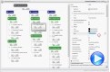 Using frames you can highlight any node, or group
of nodes, with a different border, pattern, EBN,
solid back color, and so on. You can specify to highlight the entire node,
which includes all child, group and assistant nodes, child node only,
assistant node, and so on. For instance, Frames.Add("root(child)") draws a border around all child nodes of the root node, while the
Frames.Add("root(assistant)") draws a border around all assistant nodes of the root node.
The Frames.Add("AK1,AK1(all)") defines all
children, assistant, group of the node with the key "AK1", including the node itself, so a border is shown around all these nodes.
Using frames you can highlight any node, or group
of nodes, with a different border, pattern, EBN,
solid back color, and so on. You can specify to highlight the entire node,
which includes all child, group and assistant nodes, child node only,
assistant node, and so on. For instance, Frames.Add("root(child)") draws a border around all child nodes of the root node, while the
Frames.Add("root(assistant)") draws a border around all assistant nodes of the root node.
The Frames.Add("AK1,AK1(all)") defines all
children, assistant, group of the node with the key "AK1", including the node itself, so a border is shown around all these nodes.
|
| 01-25-2016 |
ExGrid, 10.2.0.5
*NEW: The Expression of the ConditionalFormat/ComputedField/FormatColumn
supports %C0, %C1, .... which indicates the caption of the cell as
displayed, while the %0, %1, gets the value of the cell. The cell's value
may be different than what the cell displays as a string. For instance,
let's say a cell display HTML format. The %0 returns the html format
including the HTML tags, while %C0 returns the cell's content as string
without HTML tags.
*Added: The Items.FormatCell
or
Column.FormatColumn
property supports %C0, %C1, ... which indicates the content of the cell as
string, on the column with the index 0, 1, and so on... For instance the,
"%C0 + %C1" concatenates the first two cells, which is similar
with a computed field per cell. In other words, you can have computed field
per cells, using the Items.FormatCell, not only using the
Column.ComputedField
property which is applied to the entire column.
*Added: The Edit event is fired when the user clicks or presses the space
key on a cell of EditTypeEnum.CheckValueType type. You can prevent changing
the cell's value/state by setting the Cancel parameter of Edit event on
True.
*Fixed: The column's visibility is not restored once the user drags back the
column from the group-by bar to the control, if the list contains no items (
AllowGroupBy on True, SortBarVisible on True )
*Fixed: Prevents showing the control's view in design mode, while running on FORTH system ( /COM version )
|
| 01-25-2016 |
ExSlider, 12.0.0.1
*NEW: Support for EBN 1003 version.
*Added: EBN 1003 implements Colorable Region Support which defines a portion/region of the EBN object where the color of the EBN is applied. For instance, at runtime the identifier 0x1FF0000 applies blue color to all colorable parts that compose the EBN object. The EBN color is not applied to not-colorable portions of the
EBNs.
|
| 01-20-2016 |
ExContextMenu, 11.0.0.5
*NEW: Ability to specify different visual appearance for any sub-menu.
*Added: LocalAppearance property specifies the visual appearance of the local popup, if not -1, else it inherits the menu's appearance
(Item.ShowLocalPopup property)
*Added: Items.PopupAppearance property specifies the visual appearance of the giving popup ( that hosts the items ).
*Added: Background(exMenuSeparatorSelectButton) property specifies the visual appearance/color to show the separator between select and drop down button.
*Added: Background(exMenuSeparatorSelectButtonBottom) property specifies the visual appearance/color to show the separator between select and drop down button ( show the drop-down button to the bottom )
|
| 01-20-2016 |
ExPivot, 10.1.0.1
*NEW: Windows 8 Touch/Pointer Support ( ability to scroll the control's content by touching and dragging )
*Added: AutoDrag property can specify distinct actions for left/right mouse buttons and short/long touch actions. For instance, AutoDrag property on exAutoDragScroll + exAutoDragScrollOnShortTouch indicates that the user can scroll the control's content by clicking the left mouse button, or by short touching the screen.
*Fixed: Can't scroll the control if touching with fingers the buttons of the scroll bar.
*Fixed: The Options parameter of the Import method does not takes the correct value for eor field.
|
| 01-18-2016 |
ExG2antt, 11.0.0.5
*NEW: Subscript and Superscript implementation in HTML captions, using the <off> HTML tag
*Added: <off>, </off> built-in HTML tags defines the vertical offset to display the element, relative to the current position. This tag is inheritable. The <off pixels>, where, pixels indicates the vertical offset to be applied ). For instance, the following text displays a text with Subscript and Superscript such as: "Text <off 4>with subscript</off> <off -4>and superscript</off> support"
*Added: The <fgcolor=0000FF> and <fgcolor FF>, or <bgcolor=00FF00> and <bgcolor FF00>, so no = or full 6
hexa-digits are required to define the color to be applied
*Fixed: The <font> HTML tag is not overwritten when using inside another <font> tag
*Fixed: The parts of the line with different fonts in the HTML caption are vertically aligned ( instead aligning to the font's baseline ) if the line displays a picture or an icon using the <img> HTML tag.
|
| 01-18-2016 |
ExTree, 10.0.0.3
*NEW: Ability to save/load automatically the control's layout.
*Added: Layout property, saves or loads the control's layout, an that means, the position, width, visibility, sort order of the control's columns and the scroll position, filtering, selection, and so on. The Layout property saves/loads almost all properties of the columns, that user can change at runtime, using the control's user interface.
*Fixed: Ignores the ending HTML tags, if they are not used previously ( for instance, the < /b > is not displayed in the sequence "ABC< /b >" )
*Added: Increases the performance of parsing HTML captions.
|
| 01-17-2016 |
Here's a collection of EBN
files you can choose from:
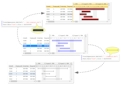 The EBN file provides skin capabilities for almost all of our UI components. The Exontrol's
eXButton/COM installs a WYSWYG Builder ( Builder.exe ) that helps creating and editing EBN files. The skin file ( EBN ) is organized as a hierarchical list of objects. Each object can display a portion of picture with attributes like tile, stretch or transparent or a background color. The position for each child object is relative to its parent, and can be aligned to any side of the parent's client area.
You can find a collection of EBN files here.
The EBN file provides skin capabilities for almost all of our UI components. The Exontrol's
eXButton/COM installs a WYSWYG Builder ( Builder.exe ) that helps creating and editing EBN files. The skin file ( EBN ) is organized as a hierarchical list of objects. Each object can display a portion of picture with attributes like tile, stretch or transparent or a background color. The position for each child object is relative to its parent, and can be aligned to any side of the parent's client area.
You can find a collection of EBN files here.
|
| 01-13-2016 |
ExGrid, 10.2.0.4
*Added: Several improvements for Selection, while control is running in virtual mode ( VirtualMode property )
*Added: Items.Selection property selects the items by index. The Items.Selection property should be of long / numeric type if the control's SingleSel property is False. The Items.Selection property should be of safe array of long/ numeric type if the control's SingleSel property is True.
*Fixed: The selection is lost if scrolling the control, while running in virtual mode ( VirtualMode property )
*Fixed: The control fails if the user selects multiple items by dragging, when control is running in virtual mode ( VirtualMode property )
|
| 01-13-2016 |
ExGantt, 9.0.0.4
*Added: Ability to use and show a custom tooltip using the ShowToolTip property even if any of the mouse buttons is pressed or not.
*Added: The LayoutChanged event is fired if changing the Column.Visible property by code.
*Fixed: Prevents showing the tooltip's shadow if the current theme is applied on the tooltip
*Fixed: The ColIndex parameter of the Change event is -1
|
| 01-12-2016 |
The following movie shows the Conditional
Formating support for eXPivot component:
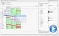 Conditional formatting quickly highlights important information in a pivot table. In other words, it allows you to highlight values in the chart, based on the expression. For instance,
"len(value) != 0" marks all cells that displays a value, while
"( dbl(value) != 0 ) ? (value > 0) : 0" highlights positive numbers. Using Conditional formatting you can apply or change font attributes, background/foreground colors using solid or
EBN technology, decorative text as outlined, shadow or gradient. Previously, the
eXPivot allows highlight the entire column/row no matter of what values it displays. The
conditional-expression contains a lot of built-in functions that makes the Conditional formatting very
customizable.
Conditional formatting quickly highlights important information in a pivot table. In other words, it allows you to highlight values in the chart, based on the expression. For instance,
"len(value) != 0" marks all cells that displays a value, while
"( dbl(value) != 0 ) ? (value > 0) : 0" highlights positive numbers. Using Conditional formatting you can apply or change font attributes, background/foreground colors using solid or
EBN technology, decorative text as outlined, shadow or gradient. Previously, the
eXPivot allows highlight the entire column/row no matter of what values it displays. The
conditional-expression contains a lot of built-in functions that makes the Conditional formatting very
customizable.
|
| 01-11-2016 |
ExSchedule, 10.0.0.3
*Fixed: Prevents showing the today date when the control is refreshed in exhelper.
*Fixed: Rotating the mouse wheel scrolls the control's content by 1 pixel, if the control's ScrollBars property is 0 ( exNoScroll )
*Fixed: Sometimes the user still can create multi-days events, even if the AllowMultiDaysEvent property is False
*Fixed: An unhandled exception of type 'System.AccessViolationException' occurred when user presses the ALT+F4 key while editing a node ( /NET or
/WPF version )
*Fixed: A Click event occurs right after DblClick event.
*Fixed: The Events.Remove does not remove the event giving its handle, on Windows 10 64-bit
|
| 01-11-2016 |
ExToolTip, 10.0.0.1
*NEW: Support for EBN 1003 version.
*Added: EBN 1003 implements Colorable Region Support which defines a portion/region of the EBN object where the color of the EBN is applied. For instance, at runtime the identifier 0x1FF0000 applies blue color to all colorable parts that compose the EBN object. The EBN color is not applied to not-colorable portions of the
EBNs.
|
| 01-06-2016 |
ExButton, 13.0.0.1
*NEW: Implementation of EBN 1003 file version.
*Added: Colorable Region Support which defines a portion/region of the
EBN object where the color of the EBN is applied. For instance, at runtime the identifier 0x1FF0000 applies blue color to all colorable parts that compose the EBN object. The EBN color is not applied to not-colorable portions of the EBNs
(EBN 1003).
*Added: The Colorable Region Start and Colorable Region End buttons are available for the EBN Builder tool in the Background/Picture panel. The Colorable Region is defined by all points with the color between Start and End values
(EBN 1003).
*Added: The Background\Picture panels marks transparent-region with greeen color, while the colorable-region with black color.
*Added: Keep the SHIFT while clicking the Test button on the EBN Builder, and you get the test window with a color applied, in the following order: red, green, blue, ...
|
| 01-06-2016 |
ExOrgChart, 12.0.0.2
*NEW: Ability to change the control's content menu visual appearance using
EBN objects
*Added: Background(exContextMenuSelBackColor) property specifies the solid/EBN selection's background color in the control's context menu. The
Background(exContextMenuSelBackColor) is valid while it is not zero.
*Added: Background(exContextMenuSelBorderColor) property specifies the solid color to show the selection in the control's context menu. The
Background(exContextMenuSelBorderColor) is valid while it is not zero.
*Added: Background(exContextMenuSelForeColor) property specifies the selection's text foreground color in the control's context menu. The
Background(exContextMenuSelForeColor) is valid while it is not zero.
|
| 01-04-2016 |
ExG2antt, 11.0.0.4
*NEW: Ability to change the visual appearance of the Columns float bar, using EBN objects
*Added: Background(exColumnsFloatBackColor) property specifies the background color for the Columns float bar.
*Added: Background(exColumnsFloatScrollBackColor) property specifies the background color for the scroll bars in the Columns float bar.
*Added: Background(exColumnsFloatScrollPressBackColor) property specifies the background color for the scroll bars in the Columns float bar, when the user clicks the scroll bars.
*Added: Background(exColumnsFloatScrollUp) property specifies the visual appearance of the up scroll bar.
*Added: Background(exColumnsFloatScrollDown) property specifies the visual appearance of the down scroll bar.
*Added: Background(exColumnsFloatAppearance) property specifies the visual appearance for the frame/borders of the Column's float bar.
*Added: Background(exColumnsFloatCaptionBackColor) property specifies the visual appearance of the caption's background, if the
Background(exColumnsFloatAppearance) property is specified.
*Added: Background(exColumnsFloatCaptionForeColor) property specifies the foreground color for the caption, if the
Background(exColumnsFloatAppearance) property is specified.
*Added: Background(exColumnsFloatCloseButton) property specifies the visual appearance for the closing button, if the
Background(exColumnsFloatAppearance) property is specified.
|
| 01-04-2016 |
ExFileView, 8.0.0.3
*Added: </solidline>, </upline>, </dotline> HTML tags ends the solid, up or dotted line
*Added: Prevents showing the ,.;!?'")}] characters at the beginning of a new line, when html text is word-wrapping.
*Fixed: Can't scroll the control if touching with fingers the buttons of the scroll bar.
*Fixed: No item is shown in the print and print-preview ( using the
Exontrol.Print component ).
|
|
