Use the
Link
property to access a specified link. The
AddLink
method can be used to add links programmatically. The
AllowLinkBars
property indicates whether the user can link bars at runtime. The
AllowLink
event notifies your application when the user creates a link at runtime. The
AddLink
event notifies your application once the user adds a link between two bars.
The
ShowLinksColor property specifies
the color for links that starts or ends on selected bars. The
ShowLinksStyle
property specifies the width to show the links when the link starts from
selected bar, ends on selected bar, or when it is not related to any of
selected bars. The
SelBarColor property
specifies the color to display the selected bars.
The /NET Assembly version defines get/set shortcut properties as follow (
they start with get_ or set_ keywords ):
- LinkStartItem : Integer, retrieves or sets a value that indicates the handle of the item where the link start
- LinkStartBar : Object, retrieves or sets a value that indicates the key of the bar where the link starts
- LinkEndItem : Integer, retrieves or sets a value that indicates the handle of the item where the link ends
- LinkEndBar : Object, retrieves or sets a value that indicates the key of the bar where the link ends
- LinkVisible : Boolean, specifies whether the link is visible or hidden
- LinkUserData : Object, specifies an extra data associated with the link
- LinkStartPos : AlignmentEnum, specifies the position where the link starts in the source item
- LinkEndPos : AlignmentEnum, specifies the position where the link ends in the target item
- LinkColor : Color, specifies the color to paint the link
- LinkArrowColor : Color, specifies the color to paint the arrow of
the link
- LinkArrowColor32 : Color, specifies the color to paint the arrow
of the link
- LinkStyle : LinkStyleEnum, specifies the style to paint the link
- LinkWidth : Integer, specifies the width in pixels of the link
- LinkShowDir : Boolean, specifies whether the link shows the direction
- LinkShowRound : Boolean, specifies whether the link is round or
rectangular
- LinkText : String, specifies the HTML text being displayed on the link
- LinkToolTip : String, specifies the HTML text being shown when the cursor hovers the link
- LinkSelected : Boolean, specifies whether the link is selected or unselected
- LinkGroupBars : GroupBarsOptionsEnum, groups or ungroups the bars being linked with the specified options
- LinkKey : renames the link's key
- LinkType : defines the link's type as SF, FS, FF or SS
- LinksCount : Integer, specifies the number of the links within the chart
The
link between two bars supports the following properties:
| | Name | Value | Description | |
| |
exLinkStartItem | 0
|
Retrieves or sets a value that indicates the handle of the item where the link start.
A HITEM expression ( long ), that indicates the handle of the item where the
link starts.
(Long/HITEM expression)
| |
| |
exLinkStartBar | 1
|
Retrieves or sets a value that indicates the key of the bar where the link starts.
A String expression that indicates the key of the bar where the link starts.
(Variant expression)
| |
| |
exLinkEndItem | 2
|
Retrieves or sets a value that indicates the handle of the item where the link ends.
A HITEM expression ( long ), that indicates the handle of the item where the
link ends.
(Long/HITEM expression)
| |
| |
exLinkEndBar | 3
|
Retrieves or sets a value that indicates the key of the bar where the link ends.
A String expression that indicates the key of the bar where the link ends.
(Variant expression)
| |
| |
exLinkVisible | 4
|
By default, the exLinkVisible
property is True. Specifies whether the link is visible or hidden. A Boolean expression that
indicates whether the link is visible or hidden. Use the ShowLinks
property to hide all links in the control.
(Boolean expression)
| |
| |
exLinkUserData | 5
|
Specifies an extra data associated with the link. Use the exLinkUserData option
to associate an extra data to your link.
(Variant expression)
| |
| |
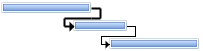
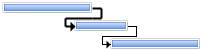
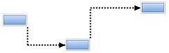
exLinkStartPos | 6
|
By default, the exLinkStartPos property is 2(RightAlignment). Specifies the position where the link starts in the source item. An AlignmentEnum
expression that indicates the position where the link starts. The exLinkType
property defines the link's type as SF, FS(default), FF or SS. The
exLinkShowRound property specifies whether the link is shown as round,
rectangular, direct or straight.
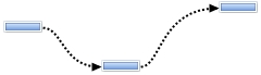
Links start from right and end on
the left part of the bar:
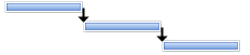
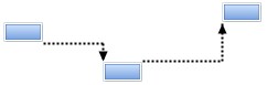
Links start from center and end on
right part of the bar:
A link between two bars is:
- SF (Start-Finish), if the exLinkStartPos
is 0(Left) and
exLinkEndPos is 2(Right)
- FS (Finish-Start), if the exLinkStartPos
is 2(Right) and
exLinkEndPos is 0(Left) (default)
- FF (Finish-Finish), if the exLinkStartPos
is 2(Right) and
exLinkEndPos is 2(Right)
- SS (Start-Start), if the exLinkStartPos
is 0(Left) and
exLinkEndPos is 0(Left)
The SchedulePDM method arranges the activities on the plan
based on the links / relationships / dependencies.
(AlignmentEnum expression)
| |
| |
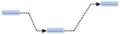
exLinkEndPos | 7
|
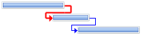
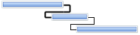
By default, the
exLinkEndPos property is 0 (LeftAlignment). Specifies the position where the link ends in the target item. An AlignmentEnum
expression that indicates the position where the link ends. The exLinkType
property defines the link's type as SF, FS(default), FF or SS. The
exLinkShowRound property specifies whether the link is shown as round,
rectangular, direct or straight.
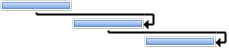
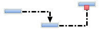
Links start on right and end on the left part of the bar( default ):
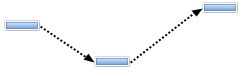
Links start on right
and end on the center part of the bar:
A link between two bars is:
- SF (Start-Finish), if the exLinkStartPos
is 0(Left) and
exLinkEndPos is 2(Right)
- FS (Finish-Start), by default, if the exLinkStartPos
is 2(Right) and
exLinkEndPos is 0(Left)
- FF (Finish-Finish), if the exLinkStartPos
is 2(Right) and
exLinkEndPos is 2(Right)
- SS (Start-Start), if the exLinkStartPos
is 0(Left) and
exLinkEndPos is 0(Left)
The SchedulePDM method arranges the activities on the plan
based on the links / relationships / dependencies.
(AlignmentEnum expression)
| |
| |
exLinkColor | 8
|
By default, the exLinkColor property is
-1 (0xFFFFFFFF). Specifies the color to paint the link.If the exLinkColor property is -1, the control uses the LinksColor
property to show the link. If the exLinkColor property is not -1, it indicates
the color to draw the link. Use the
exLinkArrowColor property to specify a different color to show the link's arrow. The ShowLinksColor
property specifies the color to show the links when a bar is being selected.
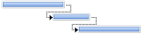
Links show same color:
Links show different colors:
(Long/Color expression)
| |
| |
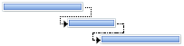
exLinkStyle | 9
|
By default,
the exLinkStyle property is -1.
Specifies the style to paint the link. A LinkStyleEnum
expression that indicates the style of the link between two bars. If the exLinkStyle property is -1, the LinksStyle
property specifies the style of the link. The ShowLinksStyle
property specifies the width to show the links when the link starts from
selected bar, ends on selected bar, or when it is not related to any of
selected bars.
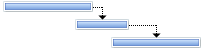
Links show default style:
Links show different styles:
(LinkStyleEnum expression)
| |
| |
exLinkWidth | 10
|
By default, the
exLinkWidth property is -1.
Specifies the width in pixels of the link. A long expression that indicates the
width of the pen, in pixels, to draw the link between two bars. If the exLinkWidth property is -1, the LinksWidth
property indicates the width of the link. The ShowLinksWidth
property specifies the width to show the links when the link starts from
selected bar, ends on selected bar, or when it is not related to any of
selected bars.
Links show with different widths:
(Long/Color expression)
| |
| |
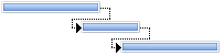
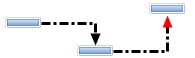
exLinkShowDir | 11
|
By default, the exLinkShowDir property is True. Specifies whether the link shows the direction. A Boolean expression that indicates
whether the arrow in the link that specifies the direction, is visible or
hidden.
Links show no direction ( no arrow, False ):
(Boolean expression)
| |
| |
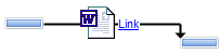
exLinkText | 12
|
By default, the exLinkText
property is empty, and so the link displays no text or picture. Specifies the HTML text being displayed on the link. Use the <img> tag to
display an icon or a custom size picture on the link. Use the HTMLPicture
property to include custom size picture to HTML captions.
The link shows a caption on: (<img>word</img> <bgcolor=FFFFFF><a>Link</a></bgcolor>):
(String expression)
| |
| |
exLinkToolTip | 13
|
By default, the exLinkToolTip
property is empty, and so nothing is shown when cursor is hovering the link. Specifies the HTML text being shown when the cursor hovers the link. Use the
<font> element to specify a different font or size for the tooltip, or use
the ToolTipFont property to specify a
different font or size for all tooltips in the control. The Tooltip(0, -3,
, , , , ) event occurs once the link's tooltip (exLinkToolTip) is about to be shown (-3 if the mouse pointer hovers the links of the chart).
(String expression)
| |
| |
exLinkArrowColor | 14
|
By default, the exLinkArrowColor
is -1 ( 0xFFFFFFFF ) which indicates that the exLinkColor property indicates the
color to show the link's arrow ( same color as the link itself). Specifies the color to show the link's arrow. If the exLinkArrowColor is not -1, it indicates
the color to display the arrow of the link or if the the last 7 bits in the high
significant byte of the color indicates the identifier of the skin being used to
show the arrow. Use the Add method to add new
skins to the control.
The arrow or the direction of the Link is displayed with a solid color:
The arrow or the direction of the Link is displayed with an EBN color:
(Long/Color/EBN expression)
| |
| |
exLinkShowRound | 15
|
By default, the
exLinkShowRound property is 0, which indicates that the link is displayed rectangular. Specifies whether the link is shown as round,
rectangular, direct or straight. The exLinkStartPos and
exLinkEndPos defines the position/side of the bar where the link starts/ends. The exLinkType property defines the link's type as SF,
FS(default), FF or SS.
The
exLinkShowRound property supports the following values/types:
- -1 (round)
0 (rectangular, starts horizontally, ends horizontally, default)
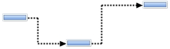
3 (rectangular EV, starts horizontally, ends vertically)
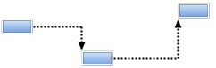
-
4 (rectangular SV, starts vertically, ends horizontally)
5 (rectangular SEV, starts vertically, ends vertically)
1 (direct)
-
2 (straight)
(Long expression, valid values are -1, 0, 1, 2, 3, 4 and 5)
| |
| |
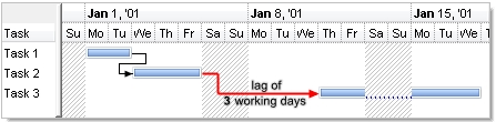
exLinkPDMWorkingDelay | 16
|
By default, the
exLinkPDMWorkingDelay is 0. Specifies the working delay for the activity during PDM scheduling.
This property specifies the number of working days between two linked bars. The
property keeps count on the non-working area of the chart. The SchedulePDM
method uses the
exLinkPDMWorkingDelay property when arranging bars, if it is not zero. For
instance, if the bar A links to bar B using a FS ( Finish-Start type ), and the
exLinkPDMWorkingDelay property is 2 ( working days ), it means the bar B starts
2 working days after activity A ends. Use the
exLinkPDMDelay proeprty to specify the LAG in days, rather than working days.
Only one of these 2 properties have effect at once. The first non-zero value in
order of exLinkPDMWorkingDelay, exLinkPDMDelay is used by SchedulePDM method.
For instance, if both properties are set to 2, the SchedulePDM takes/considers
exLinkPDMWorkingDelay as primary, and ignores the other.
The following screen shot shows a LAG of 3 working days:
(Double expression)
| |
| |
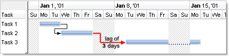
exLinkPDMDelay | 17
|
By default, the exLinkPDMDelay is 0. Specifies the delay for the activity during PDM scheduling. Specifies the delay for the activity during PDM scheduling.
This property specifies the number of days between two linked bars. The property
does not keeps count on the non-working area of the chart. The SchedulePDM
method uses the exLinkPDMDelay property when arranging bars, if it is not zero.
For instance, if the bar A links to bar B using a FS ( Finish-Start type ), and
the exLinkPDMWorkingDelay property is 2 ( days ), it means the bar B starts 2
days after activity A ends. The first non-zero value in order of
exLinkPDMWorkingDelay, exLinkPDMDelay is used by SchedulePDM method. For
instance, if both properties are set to 2, the SchedulePDM takes/considers
exLinkPDMWorkingDelay as primary, and ignores the other.
The following screen shot shows a LAG of 3 days:
(Double expression)
| |
| |
exLinkSelected | 257
|
By default, the
exLinkSelected is False.
Specifies whether the link is selected or unselected.The
AllowSelectObjects property allows users to select at runtime the bars and
links in the chart area. The ChartSelectionChanged
event is fired when the selection in the chart is changed. The ShowLinksColor
property specifies the color to show the links when a bar is being selected. The ShowLinksWidth
property specifies the width to show the links when the link starts from
selected bar, ends on selected bar, or when it is not related to any of
selected bars. The ShowLinksStyle
property specifies the width to show the links when the link starts from
selected bar, ends on selected bar, or when it is not related to any of
selected bars.
(Boolean expression)
| |
| |
exLinkGroupBars | 258
|
Groups or ungroup the bars being linked with the specified options . For
instance. this option is equivalent with grouping the end of starting bar with
the start of the ending bar of the link. For instance, the .Link(LinkKey, exLinkGroupBars) = GroupBarsOptionsEnum.exPreserveBarLength + GroupBarsOptionsEnum.exFlexibleInterval + GroupBarsOptionsEnum.exIgnoreOriginalInterval
is equivalent with .GroupBars .Link(LinkKey, exLinkStartItem), .Link(LinkKey, exLinkStartBar), False, .Link(LinkKey, exLinkEndItem), .Link(LinkKey, exLinkEndBar), True, GroupBarsOptionsEnum.exPreserveBarLength + GroupBarsOptionsEnum.exFlexibleInterval + GroupBarsOptionsEnum.exIgnoreOriginalInterval.
The GroupBars method groups two bars. If
calling the set property, the value of the exLinkGroupBars option can be a a
long expression that specifies a combination of GroupBarsOptionsEnum
type, or a string expression in format groupbarsoptions;options, where the
first argument indicates the value of GroupBarsOptionsEnum
type, since the rest of asguments, are passed to Options parameter of the
GroupBars method to specify a fixed interval, a minimum interval value and so
on. The AddLink
event notifies your application once the user adds a link between two bars.
The following VB sample groups the bars being linked:
Private Sub G2antt1_AddLink(ByVal LinkKey As String)
    With G2antt1.Items
        .Link(LinkKey, exLinkGroupBars) = GroupBarsOptionsEnum.exFlexibleInterval Or GroupBarsOptionsEnum.exPreserveBarLength Or GroupBarsOptionsEnum.exIgnoreOriginalInterval
    End With
End Sub
The following C# sample groups the bars being linked:
private void exg2antt1_AddLink(object sender, string LinkKey)
{
    exg2antt1.Items.set_LinkGroupBars(LinkKey, exontrol.EXG2ANTTLib.GroupBarsOptionsEnum.exFlexibleInterval |
        exontrol.EXG2ANTTLib.GroupBarsOptionsEnum.exIgnoreOriginalInterval |
        exontrol.EXG2ANTTLib.GroupBarsOptionsEnum.exPreserveBarLength);
}
Once the user moves a grouped bar, the relative bar is moved resized accordingly
with the grouping options.
(GroupBarsOptionsEnum
expression)
| |
| |
exLinkKey | 259
|
Changes the key of the giving link. The get function retrieves the link's key
if the link is found, else it returns an empty string. You can use the
get_LinkKey function to check if a specified link is found or not. The set
function may be used to rename the key of the link, when AddLink
event is fired. The key of the link may be changed if the new key is available,
in other words, if there is no other link with the new key.
(String expression)
| |
| |
exLinkType | 260
|
By default the exLinkType property is 2 (FS or Finish-Start). The
exLinkStartPos / exLinkEndPos defines the position/side of the bar the link
starts or ends. The
exLinkType property depends on exLinkStartPos / exLinkEndPos properties, to
define the link's type as one of the following values:
- 1 (Start to Finish (SF), the exLinkStartPos
is 0(Left) and
exLinkEndPos is 2(Right))
- 2 (Finish to Start (FS), the exLinkStartPos
is 2(Right) and
exLinkEndPos is 0(Left))
- 4 (Finish to Finish (FF), the exLinkStartPos
is 2(Right) and
exLinkEndPos is 2(Right))
- 8 (Start to Start (SS), the exLinkStartPos
is 0(Left) and
exLinkEndPos is 0(Left))
Tasks may have multiple predecessors or multiple successors. Before you begin establishing dependencies, it’s important to understand that there are four types:
- Finish to Start (FS), the predecessor ends before the successor can begin
- Start to Start (SS), the predecessor begins before the successor can begin
- Finish to Finish (FF), the predecessor ends before the successor can end
- Start to Finish (SF), the predecessor begins before the successor can end
The SchedulePDM method arranges the activities on the plan
based on the links / relationships / dependencies.
The Link(exLinkType) = value changes the link's type to value,
where value can be any of the following values:
- 1 or "SF" to define a Start to Finish (SF) link,
changes the exLinkStartPos to 0(Left) and
exLinkEndPos to 2(Right)
- 2 or "FS" to define a Finish to Start (FS) link,
changes the exLinkStartPos to 2(Right) and
exLinkEndPos to 0(Left)
- 4 or "FF" to define a Finish to Finish (FF)
link, changes the exLinkStartPos to 2(Right) and
exLinkEndPos to 2(Right)
- 8 or "SS" to define a Start to Start (SS)
link, changes the exLinkStartPos to 0(Left) and
exLinkEndPos to 0(Left)
(Long expression)
| |
| |
exLinksCount | 512
|
Specifies the number of the links within the chart. This property requires no
key to be invoked, so it counts the number of links in your chart. Use the FirstLink and NextLink
properties to enumerate the links in the control. For instance,
Items.Link(Nothing,exLinksCount) gets the number of links in the chart.
(Long expression)
| |

