The ExHTML component includes a built-in engine for rendering and editing ex-HTML content, without requiring any external browser. Developed from scratch in C++/C#, it offers rendering and editing capabilities similar to a web browser while remaining independent of external browser components. ExHTML is designed to support a custom HTML format and can be used to build highly flexible, dynamically generated user interfaces, making it suitable for applications that require rich, adaptable UI content.
Currently, the built-in HTML format supports the following HTML tags:
<b>.</b> displays the text in bold.
<i>.</i> displays the text in italics.
<u>.</u>underlines the text.
<s>.</s>Strike-through text.
<a id;options>.</a> displays an anchor element that can be clicked. An
anchor is a piece of text or some other object (for example an image) which marks the beginning and/or the end of a hypertext link.
The <a> element is used to mark that piece of text (or inline image), and to give its
hypertextual relationship to other documents. Use the FormatAnchor
property to specify the visual effect for anchor elements.
<font face;size>.</font> displays portions of text with a different font and/or different
size. For instance, the <font Tahoma;12>bit</font>
draws the bit text using the Tahoma font, on size 12 pt. If the name of the
font is missing, and instead size is present, the current font is used with
a different size. For instance, <font ;12>bit</font>
displays the bit text using the current font, but with a different size.
<fgcolor=RRGGBB>.</fgcolor> displays text with a specified foreground
color. The RR, GG or BB should be hexa values and indicates red, green and blue values.
<bgcolor=RRGGBB>.</bgcolor> displays text with a specified background
color. The RR, GG or BB should be hexa values and indicates red, green and blue values.
<br> a forced line-break
<solidline>.</solidline>The marked text shows a solid-line on top/bottom side.
<dotline>.</dotline>The marked text shows a dot-line on top/bottom side.
<upline>.</upline>The marked text shows a solid/dot-line on top side.
<r> Right aligns the text
<c> Centers the text
<img>number[:width]</img> inserts an icon inside the text. The number indicates the index of the
icon being inserted. Use the Images method to assign a list of icons to your control. The last 7 bits in the high significant byte of the number
expression indicates the identifier of the skin being used to paint the
object. Use the Add method to add new skins to the control. If you need to remove the skin appearance from a part of the control you need to reset the last 7
bits in the high significant byte of the color being applied to the part. The width is optional and indicates the width of the icon being inserted. Using
the width option you can overwrite multiple icons getting a nice effect. By
default, if the width field is missing, the width is 18 pixels.
<img>key[:width]</img> inserts a custom size picture into the text being previously loaded
using the HTMLPicture property. The Key parameter indicates the key of the picture
being displayed. The Width parameter indicates a custom size, if you require
to stretch the picture, else the original size of the picture is used.
& glyph characters as & ( & ), <
( < ), > ( > ), &qout; ( " ) and &#number
( the character with specified code ), For instance, the € displays
the EUR character, in UNICODE configuration. The & ampersand is
only recognized as markup when it is followed by a known letter or a #
character and a digit. For instance if you want to display <b>bold</b> in HTML caption you can use
<b>bold</b>
<off offset> ... </off> defines the vertical offset to
display the text/element. The offset parameter defines the offset to display
the element. This tag is inheritable, so the offset is keep while the
associated </off> tag is found. You can use the <off offset>
HTML tag in combination with the <font face;size> to define a smaller
or a larger font to be displayed. For instance: "Text with <font ;7><off
6>subscript" displays the text such as: Text with subscriptThe "Text with <font ;7><off -6>superscript"
displays the text such as: Text with subscript
<gra rrggbb;mode;blend> ... </gra> defines a gradient text.
The text color or <fgcolor> defines the starting gradient color, while
the rr/gg/bb represents the red/green/blue values of the ending color, 808080 if missing as
gray. The mode is a value between 0 and 4, 1 if missing, and blend could be 0 or 1, 0 if missing.
The <font> HTML tag can be used to define the height of the font. Any
of the rrggbb, mode or blend field may not be specified. The <gra>
with no fields, shows a vertical gradient color from the current text color
to gray (808080). For instance the "<font ;18><gra FFFFFF;1;1>gradient-center</gra></font>"
generates the following picture:
<out rrggbb;width> ... </out> shows the text with outlined characters,
where rr/gg/bb represents the red/green/blue values of the outline color, 808080 if missing as gray, width indicates the size of
the outline, 1 if missing. The text color or <fgcolor> defines the
color to show the inside text. The <font> HTML tag can be used to define the height of the font. For
instance the "<font ;31><out 000000><fgcolor=FFFFFF>outlined</fgcolor></out></font>"
generates the following picture:
<sha rrggbb;width;offset> ... </sha> define a text with a shadow,
where rr/gg/bb represents the red/green/blue values of the shadow color, 808080 if missing as gray, width indicates the size of shadow, 4 if
missing, and offset indicates the offset from the origin to display the text's shadow, 2 if missing.
The text color or <fgcolor> defines the color to show the inside text. The <font> HTML tag can be used to define the height of the
font. For instance the "<font ;31><sha>shadow</sha></font>" generates the following picture:
or "<font ;31><sha
404040;5;0><fgcolor=FFFFFF>outline anti-aliasing</fgcolor></sha></font>" gets:
The control's ContextMenuItems property specifies the items to be shown
in the control's context menu.
By default the ContextMenuItems property is:
It
looks complicated but once you get the point it would be easy to provide
your own context menu. Shortly, each item is followed by its options,
and its sub-items between () parentheses. For instance, the
ContextMenuItems = "Item(Item 1,Item
2,Item 3)" provides a single popup Item with its
sub-items Item 1, Item 2 and Item 3. The control fires the
ExecuteContextMenu( Item, ID ) event when the user selects an unknown
command from the control's context menu. Use the ExecuteContextMenu
event to provide actions on your custom items. The id option for
each command specifies the identifier of the item. Any ID that's not
listed in the default ContextMenuItems, is defined as an unknown
command. For instance, 57625, 57643, .... are known commands, and should
not be used for your own items.
By default, the control's context menu
shows as following:
Let's say we want to remove all that grouping, and shows
as a regular context menu ( just remove all the [group] from the
ContextMenuItems property, and you should get something like:
where the <CAPTION> is the HTML caption to be shown on the context menu
item. The <VALUE> indicates the value of giving property.
img=<VALUE>, where <VALUE> is an integer expression,
that indicates the index of the icon being displayed for the item.
himg=<VALUE>, where <VALUE> indicates the key of the picture to be displayed for the item.
sep, specifies an separator item
id=<VALUE>, where <VALUE> is an integer expression,
that indicates the identifier of the item.
typ=<VALUE>, where <VALUE> could be
one of the following:
0 for regular items,
1 for items that display a check/box (chk)
2 to display radio buttons (rad)
group=<VALUE>, where <VALUE> could be a bit-or
combination (+) of the following values:
0 (exNoGroupPopup), No grouping is performed on the sub-menu,
so the sub-items are shown to a float popup,
1 (exGroupPopup), Groups and displays the sub-menu items on the current item, arranged from left to
right
2 (exNoGroupPopupFrame), Prevents showing the frame around each grouping item.
4 (exGroupPopupCenter), Shows the grouping popup aligned to the center of the current item.
8 (exGroupPopupRight), Shows the grouping popup aligned to the right of the current item.
16 (exGroupPopupEqualSize), Shows the items that make the group of the same size
chk[=<VALUE>], where <VALUE> could be
0 for unchecked, or not zero for checked. The chk option makes the item to
display a check box. If the <VALUE> is missing the item still
displays an un-checked check box.
button=<VALUE>, where <VALUE> could
be 0 for regular or not zero to show the item as a button.
align=<VALUE>, where <VALUE> could be
one of the following:
0 ( left ), to align the item's caption to the left
1 ( center ), to center the item's caption
2 ( right ), to align the item's caption to the right
spchk=<VALUE>,
where <VALUE> could be 0 for regular or not zero to
specify whether the item's sub menu is shown only if the item is checked.
show=<VALUE>,
where <VALUE> could be 0 for regular or not zero to
specify whether the checked item shows as selected
rad=<VALUE>,
where <VALUE> could be 0 for unchecked radio button or not
zero to for checked radio button. Use the grp option to define the
group of radio where this button should be associated, If no group of
radio buttons is required, the grp could be ignored.
dis, specifies a disabled item
showdis=<VALUE>,
where <VALUE> could be 0 for regular or not zero to
specify whether the item shows as disabled, but it is still enabled
bld, specifies that the item appears in
bold
itl, specifies that the item appears in italics
stk, specifies that the item appears as
strikeout
und, specifies that the item is underlined
bg=<VALUE>,
specifies the item's background color, where <VALUE>
could be a RGB expression ( RGB(RR,GG,BB), where RR is the red value, the
GG is the green value, and the BB is the blue value), or a long
expression.
fg=<VALUE>,
specifies the item's foreground color,
where <VALUE>
could be a RGB expression ( RGB(RR,GG,BB), where RR is the red value, the
GG is the green value, and the BB is the blue value), or a long
expression.
edittype=<VALUE>,
associates an edit field to the item, where <VALUE> could be one of the
following values:
0 ( exItemDisableEdit ), No editor is assigned to the current item.
1 ( exItemEditText ), A text-box editor is assigned to the current item.
2 ( exItemEditMask ), A masked text-box editor is assigned to the current item.
3 ( exItemEditSlider ), A slider editor is assigned to the current item.
4 ( exItemEditProgress ), A progress editor is assigned to the current item.
5 ( exItemEditScrollBar ), A scrollbar editor is assigned to the current item.
6 ( exItemEditColor), A color editor is assigned to the current item.
7 ( exItemEditFont ), A font editor is assigned to the current item.
256 (exItemEditReadOnly), specifies that the item's editor is shown
as disabled. This value could be combined with one of the values from
0 to 7, 512
512 ( exItemEditSpin ), A spin editor is assigned to the current item.
This value could be combined with one of the values from 0 to 7, 256
edit=<VALUE>, specifies the caption to
be shown in the item's edit field, where <VALUE> could be any string
mask=<VALUE>, specifies the mask to be
applied on a masked editor. This option is valid for exItemEditMask edit.
Use the float option to allow masking floating point numbers. See Masking
for more information about <VALUE> of the mask option. See Masking
Float for more information about <VALUE> if the float option is
used.
border=<VALUE>,
specifies the border to be shown on the item's edit field,
where <VALUE> could be one of the following:
0 ( exEditBorderNone), No border is shown.
-1 (exEditBorderInset), shows an inset border
1 (exEditBorderSingle), shows a frame border
editwidth=<VALUE>, specifies the width
to show the edit field inside the item. where <VALUE> could be a long
expression. A negative value indicates that the field goes to the end of
the item
captionwidth=<VALUE>,
specifies the width to show the HTML caption of the item.
where <VALUE> could be a long expression. A negative value indicates that
no limitation is applied to the item's caption, so no truncate caption is
shown
height=<VALUE>, specifies the height to
show the item, where <VALUE> could be a positive long expression
grp=<VALUE>,
defines the radio group. It should be used when you define more groups of
radio buttons. A group of radio buttons means that only one item could be
checked at one time. The rad option specifies that the item displays a
radio button. Use the grp option to define the group of radio where this
button should be associated, If no group of radio buttons is required, the
grp could be ignored. The <VALUE> could be any long expression.
ttp=<VALUE>,
defines the item's tooltip. The <VALUE> could be any HTML string
expression. The item's tooltip is shown when the user hovers the item.
min=<VALUE>, defines the minimum value
of the edit field. The <VALUE> could be any long expression, and
specifies the minimum value for any slider, progress, scroll, spin, or
range editor.
max=<VALUE>,
defines the maximum value of the edit field. The <VALUE> could be
any long expression, and specifies the maximum value for any slider,
progress, scroll, spin, or range editor.
tick=<VALUE>,
defines where the ticks of the slider edit appear. This option is valid
for exItemEditSlider edit. The <VALUE> could be one of the following
values:
0 ( exBottomRight ), The ticks are displayed on the bottom/right side.
1 ( exTopLeft ), The ticks are displayed on the top/left side.
2 ( exBoth ), The ticks are displayed on the both side.
3 ( exNoTicks ), No ticks are displayed.
freq=<VALUE>, indicates the ratio of ticks on the
slider edit. This option is valid for exItemEditSlider edit. The
<VALUE> could be a positive long expression.
ticklabel=<VALUE>,
indicates the HTML label to be displayed on slider's ticks. This option is
valid for exItemEditSlider edit. See Tick Label
Expression for more information about <VALUE> of the ticklabel
option.
small=<VALUE>, indicates
the amount by which the edit's position changes when the user presses the arrow
key ( left, right, or button ). This option is valid for exItemEditSlider,
exItemEditScrollBar edit. The <VALUE> could be a positive long
expression.
large=<VALUE>, indicates
the amount by which the edit's position changes when the user presses the
CTRL + arrow key ( CTRL + left, CTRL + right). This option is valid for exItemEditSlider,
exItemEditScrollBar edit. The <VALUE> could be a positive long
expression.
spin=<VALUE>, specifies the step to advance when user clicks the editor's spin..
This option is valid for exItemEditSpin edit. The <VALUE> could be a
positive long expression.
ettp=<VALUE>,
specifies the HTML tooltip to be shown when the item's value is changed.
This option is valid for exItemEditSlider/exItemEditScrollBar edit. The
<VALUE> could be any string expression.
float=<VALUE>,
Specifies whether the mask field masks a floating point number. This
option is valid for exItemEditMask edit. See Masking
Float for more information about <VALUE> of mask option, if the
float option is used. The <VALUE> could be 0 for standard
masking field or not zero to
specify that the field is masking a floating point.
close=<VALUE>, Specifies the way the hosting menu is closed when the user clicks the item. If the close flag is missing, the <VALUE> is 3 (exCloseOnNonClickable), by default. The <VALUE> could be one of the following values:
0 ( exCloseOnClick ), The popup menu is closing when the user clicks the item.
1 ( exCloseOnDblClick ), The popup menu is closing when the user double clicks the item.
2 ( exCloseOnClickOutside ), The popup menu is closing when the user clicks outside of the menu.
3 ( exCloseOnNonClickable ), The popup menu is closing when the user clicks a non-clickable item ( regular items ). The non-clickable items is any item that's not a separator, popup, disabled or check or radio items, clicking a check-box item will makes the check box to change its state instead closing the context menu.
For instance, the following input-mask ( ext-phone )
!(999) 000
0000;1;;select=1,empty,overtype,warning=invalid character,invalid=The
value you entered isn't appropriate for the input mask
<b>'<%mask%>'</b> specified for this field."
indicates the following:
The pattern should contain 3 optional digits 999,
and 7 required digits 000 0000,
aligned to the right, !.
The second part of the input mask indicates 1,
which means that all literals are included when the user leaves the
field.
The entire field is selected when it receives the focus, select=1
The field supports empty
value, so the user can leave the field with no content
The field enters in overtype
mode, and insert-type mode is not allowed when user pressed the
Insert key
If the user enters any invalid character, a warning
tooltip with the message "invalid
character" is displayed.
If the user tries to leave the field, while the field is not
validated ( all 7 required digits completed ), the invalid
tooltip is shown with the message "The
value you entered isn't appropriate for the input mask
<b>'<%mask%>'</b> specified for this field."
The <%mask%> is replaced
with the first part of the input mask !(999) 000 0000
The four parts of an input mask, or the Mask property supports up to
four parts, separated by a semicolon (;). For instance, "`Time:
`00:00:00;;0;overtype,warning=<fgcolor FF0000>invalid
character,beep", indicates the pattern "00:00" with the
prefix Time:, the masking character being the 0, instead _, the field
enters in over-type mode, insert-type mode is not allowed, and the field
beeps and displays a tooltip in red with the message invalid character
when the user enters an invalid character.
Input masks are made up one mandatory part and three optional parts,
and each part is separated by a semicolon (;). If a part should use the
semicolon (;) it must uses the \; instead
The purpose of each part is as follows:
The first part (pattern) is mandatory. It includes the mask
characters or string (series of characters) along with placeholders
and literal data such as, parentheses, periods, and hyphens.
The following table lists the placeholder and literal characters
for an input mask and explains how it controls data entry:
#, a digit, +, - or space (entry not required).
0, a digit (0 through 9, entry required; plus [+]
and minus [-] signs not allowed).
9, a digit or space (entry not required; plus and
minus signs not allowed).
x, a lower case hexa character, [0-9],[a-f] ( entry
required )
X, an upper case hexa character, [0-9],[A-F] ( entry
required )
A, any letter, digit (entry required).
a, any letter, digit or space (entry optional).
L, any letter (entry require).
?, any letter or space (entry optional).
&, any character or a space (entry required).
C, any character or a space (entry optional).
>, any letter, converted to uppercase (entry
required).
<, any letter, converted to lowercase (entry
required).
*, any characters combinations
{ min,max } (Range), indicates a number range. The
syntax {min,max} (Range), masks a number in the giving range.
The min and max values should be positive integers. For instance
the mask {0,255} masks any number between 0 and 255.
[...] (Alternative), masks any characters that are
contained in the [] brackets. For instance, the [abcdA-D] mask
any character: a,b,c,d,A,B,C,D
\, indicates the escape character
�, ( ALT + 175 ) causes the characters that follow
to be converted to uppercase, until �( ALT + 174 ) is found.
�, ( ALT + 174 ) causes the characters that follow
to be converted to lowercase, until �( ALT + 175 ) is found.
!, causes the input mask to fill from right to left
instead of from left to right.
Characters enclosed in double quotation ("" or ``)
marks will be displayed literally. If this part should display/use
the semicolon (;) character is should be included between double
quotation ("" or ``) characters or as \; ( escape ).
The second part is optional and refers to the embedded mask
characters and how they are stored within the field. If the second
part is set to 0 ( default, exClipModeLiteralsNone ), all characters
are stored with the data, and if it is set to 1 (exClipModeLiteralsInclude),
the literals are stored, not including the masking/placeholder
characters, if 2 (exClipModeLiteralsExclude), just typed characters
are stored, if 3(exClipModeLiteralsEscape), optional, required,
editable and escaped entities are included. No double quoted text is
included.
The third part of the input mask is also optional and indicates a
single character or space that is used as a placeholder. By default,
the field uses the underscore (_). If you want to use another
character, enter it in the third part of your mask. Only the first
character is considered. If this part should display/use the
semicolon (;) character is should be \; ( escape )
The forth part of the input, indicates a list of options that can
be applied to input mask, separated by comma(,) character.
The known options for the forth part are:
float, indicates that the field is
edited as a decimal number, integer. The first part of the input
mask specifies the pattern to be used for grouping and decimal
separators, and - if negative numbers are supported. If the
first part is empty, the float is formatted as indicated by
current regional settings. For instance, "##;;;float"
specifies a 2 digit number in float format. The grouping,
decimal, negative and digits options are valid if the float
option is present.
grouping=value, Character used to separate groups of
digits to the left of the decimal. Valid only if float is
present. For instance ";;;float,grouping=" indicates
that no grouping is applied to the decimal number (LOCALE_STHOUSAND)
decimal=value, Character used for the decimal
separator. Valid only if float is present. For instance
";;;float,grouping= ,decimal=\," indicates that the
decimal number uses the space for grouping digits to the left,
while for decimal separator the comma character is used (LOCALE_SDECIMAL)
negative=value, indicates whether the decimal number
supports negative numbers. The value should be 0 or 1. 1 means
negative numbers are allowed. Else 0 or missing, the negative
numbers are not accepted. Valid only if float is present.
digits=value, indicates the max number of fractional
digits placed after the decimal separator. Valid only if float
is present. For instance, ";;;float,digits=4"
indicates a max 4 digits after decimal separator (LOCALE_IDIGITS)
password[=value], displays a black circle for any
shown character. For instance, ";;;password",
specifies that the field to be displayed as a password. If the
value parameter is present, the first character in the value
indicates the password character to be used. By default, the *
password character is used for non-TrueType fonts, else the
black circle character is used. For instance,
";;;password=*", specifies that the field to be
displayed as a password, and use the * for password character.
If the value parameter is missing, the default password
character is used.
right, aligns the characters to the right. For
instance, "(999) 999-9999;;;right" displays and masks
a telephone number aligned to the right. readonly, the
editor is locked, user can not update the content, the caret is
available, so user can copy the text, excepts the password
fields.
inserttype, indicates that the field enters in
insert-type mode, if this is the first option found. If the
forth part includes also the overtype option, it indicates that
the user can toggle the insert/over-type mode using the Insert
key. For instance, the "##:##;;0;inserttype,overtype",
indicates that the field enter in insert-type mode, and
over-type mode is allowed. The "##:##;;0;inserttype",
indicates that the field enter in insert-type mode, and
over-type mode is not allowed.
overtype, indicates that the field enters in
over-type mode, if this is the first option found. If the forth
part includes also the inserttype option, it indicates that the
user can toggle the insert/over-type mode using the Insert key.
For instance, the "##:##;;0;overtype,inserttype",
indicates that the field enter in over-type mode, and
insert-type mode is allowed. The "##:##;;0;overtype",
indicates that the field enter in over-type mode, and
insert-type mode is not allowed.
nocontext, indicates that the field provides no
context menu when user right clicks the field. For instance,
";;;password,nocontext" displays a password field,
where the user can not invoke the default context menu, usually
when a right click occurs.
beep, indicates whether a beep is played once the
user enters an invalid character. For instance,
"00:00;;;beep" plays a beep once the user types in
invalid character, in this case any character that's not a
digit.
warning=value, indicates the html message to be
shown when the user enters an invalid character. For instance,
"00:00:00;;;warning=invalid character" displays a
"invalid character" tooltip once the user types in
invalid character, in this case any character that's not a
digit. The <%mask%> keyword in value, substitute the
current mask of the field, while the <%value%> keyword
substitutes the current value ( including the literals ). If
this option should display/use the semicolon (;) character is
should be \; ( escape )
invalid=value, indicates the html message to be
displayed when the user enters an inappropriate value for the
field. If the value is missing or empty, the option has no
effect, so no validation is performed. If the value is a
not-empty value, the validation is performed. If the value is
single space, no message is displayed and the field is keep
opened while the value is inappropriate. For instance,
"!(999) 000 0000;;;invalid=The value you entered isn't
appropriate for the input mask
<b>'<%mask%>'</b> specified for this
field." displays the "The value you entered isn't
appropriate for the input mask '...' specified for this
field." tooltip once the user leaves the field and it is
not-valid ( for instance, the field includes entities required
and uncompleted ). The <%mask%> keyword in value,
substitute the current mask of the field, while the
<%value%> keyword substitutes the current value (
including the literals ). If this option should display/use the
semicolon (;) character is should be \; ( escape ). This option
can be combined with empty, validateas.
validateas=value, specifies the additional
validation is done for the current field. If value is missing or
0 (exValidateAsNone), the option has no effect. The validateas
option has effect only if the invalid option specifies a
not-empty value. Currently, the value can be 1 (exValidateAsDate),
which indicates that the field is validated as a date. For
instance, having the mask
"!00/00/0000;;0;empty,validateas=1,invalid=Invalid
date!,warning=Invalid character!,select=4,overtype",
indicates that the field is validate as date ( validateas=1
).
empty, indicates whether the field supports empty
values. This option can be used with invalid flag, which
indicates that the user can leave the field if it is empty. If
empty flag is present, the field displays nothing if no entity
is completed ( empty ). Once the user starts typing characters
the current mask is displayed. For instance, having the mask
"!(999) 000 0000;;;empty,select=4,overtype,invalid=invalid
phone number,beep", it specifies an empty or valid phone to
be entered.
select=value, indicates what to select from the
field when it got the focus. The value could be 0 ( nothing,
exSelectNoGotFocus ), 1 ( select all, exSelectAllGotFocus ), 2 (
select the first empty and editable entity of the field,
exSelectEditableGotFocus ), 3 ( moves the cursor to the
beginning of the first empty and editable entity of the field,
exMoveEditableGotFocus ), 4 ( select the first empty, required
and editable entity of the field,
exSelectRequiredEditableGotFocus ), 5 ( moves the cursor to the
beginning of the first empty, required and editable entity of
the field, exMoveRequiredEditableGotFocus ). For modes 2 and 4
the entire field is selected if no matching entity is found. For
instance, "`Time:`XX:XX;;;select=1" indicates that the
entire field ( including the Time: prefix ) is selected once it
get the focus. The "`Time:`XX:XX;;;select=3", moves
the cursor to first X, if empty, the second if empty, and so on
Experimental: multiline, specifies that the field supports multiple lines. rich, specifies that the field displays a rich type editor. By
default, the standard edit field is shown disabled, shows as disabled the field.
The [mask=<VALUE>] property may indicate the followings, if the
[float=-1] is present
negative number: if the first character in the mask is - (
minus ) the control supports negative numbers. Pressing the - key
will toggle the sign of the number. The + sign is never displayed.
decimal symbol: the last character that's different than #
( digit ), or 0 (zero) indicates the decimal symbol. If it is not
present the control mask a floating point number without decimals.
thousand symbol: the thousand symbol is the last character
that's not a # ( digit ), 0 (zero) or it is not the decimal symbol
as explained earlier, if present.
the maximum number of decimals in the number ( the # or 0
character after the decimal symbol )
the maximum number of digits in the integer part ( the number of #
or 0 character before decimal symbol )
the 0 character indicates a leading-zero. The count
of 0 (zero) characters before decimal character indicates the
leading-zero for integer part of the control, while the count of 0
(zero) characters after the decimal separator indicates the
leading-zero for decimal part of the control. For instance, the Mask
on "-###,###,##0.00", while the control's Text
property is 1, the control displays 1.00, if 1.1 if displays 1.10,
and if empty, the 0.00 is displayed.
If the <VALUE> property is empty, the control takes the
settings for the regional options like: Decimal Symbol , No. of digits
after decimal, Digit grouping symbol.
Here are few samples:
The <VALUE>"-###.###.##0,00" filter floating
point numbers a number for German settings ( "," is the
decimal sign, "." is the thousands separator ). This format
displays leading-zeros.
The <VALUE>"-###.###.###,##" filter floating
point numbers a number for German settings ( "," is the
decimal sign, "." is the thousands separator )
The <VALUE>"-###,###,###.##" filter floating
point numbers a number for English settings ( "." is the
decimal sign, "," is the thousands separator )
The <VALUE>"####" indicates a max-4 digit
number ( positive ) without a decimal symbol and without digit grouping
The <VALUE>"-##.#" filters a floating point
number from the -99.9 to 99.9 ( "." is the decimal sign,
no thousands separator )
The <VALUE>"#,###.##" filters a floating point
number from the 0 to 9,999.99 with digit grouping ( "." is the
decimal sign, "," is the thousands separator ).
" (value=current ? '<font
;12><fgcolor=FF0000>' : '' ) + value", shows
the current slider's position with a different color and font.
"value = current ? value : ''",
shows the value for the current tick only.
"( value = current ? '<b><font
;10>' : '' ) + (value array 'ab bc cd de ef fg gh hi ij jk kl'
split ' ')" displays different captions for slider's
values.
The The <VALUE> of [ticklabel] option is a formatted expression
which result may include the HTML tags.
The The <VALUE> of [ticklabel] option indicates a formatting
expression that may use the following predefined keywords:
value gets the slider's position to be displayed
current gets the current slider's value.
vmin gets the slider's minimum value.
vmax gets the slider's maximum value.
smin gets the slider's selection minimum value.
smax gets the slider's selection maximum value.
The supported binary arithmetic operators are:
* ( multiplicity operator ), priority 5
/ ( divide operator ), priority 5
mod ( reminder operator ), priority 5
+ ( addition operator ), priority 4 ( concatenates two
strings, if one of the operands is of string type )
- ( subtraction operator ), priority 4
The supported unary boolean operators are:
not ( not operator ), priority 3 ( high priority )
The supported binary boolean operators are:
or ( or operator ), priority 2
and ( or operator ), priority 1
The supported binary boolean operators, all these with the same
priority 0, are :
< ( less operator )
<= ( less or equal operator )
= ( equal operator )
!= ( not equal operator )
>= ( greater or equal operator )
> ( greater operator )
The supported ternary operators, all these with the same priority
0, are :
? ( Immediate If operator ), returns and executes
one of two expressions, depending on the evaluation of an
expression. The syntax for is
"expression ?
true_part : false_part"
, while it executes and returns the true_part if the expression is
true, else it executes and returns the false_part. For instance, the "%0
= 1 ? 'One' : (%0 = 2 ? 'Two' : 'not found')" returns 'One'
if the value is 1, 'Two' if the value is 2, and 'not found' for any
other value. A n-ary equivalent operation is the case() statement,
which is available in newer versions of the component.
The supported n-ary operators are (with priority 5):
array (at operator), returns the element from an
array giving its index ( 0 base ). The array operator returns
empty if the element is found, else the associated element in the
collection if it is found. The syntax for array operator is
"expression array
(c1,c2,c3,...cn)"
, where the c1, c2, ... are constant elements. The constant
elements could be numeric, date or string expressions. For instance
the "month(value)-1 array ('J','F','M','A','M','Jun','J','A','S','O','N','D')"
is equivalent with "month(value)-1 case (default:'';
0:'J';1:'F';2:'M';3:'A';4:'M';5:'Jun';6:'J';7:'A';8:'S';9:'O';10:'N';11:'D')".
in (include operator), specifies whether an element
is found in a set of constant elements. The in operator
returns -1 ( True ) if the element is found, else 0 (false) is
retrieved. The syntax for in operator is
"expression in
(c1,c2,c3,...cn)"
, where the c1, c2, ... are constant elements. The constant
elements could be numeric, date or string expressions. For instance
the "value in (11,22,33,44,13)" is equivalent with "(expression
= 11) or (expression = 22) or (expression = 33) or (expression = 44)
or (expression = 13)". The in operator is not a time
consuming as the equivalent or version is, so when you have
large number of constant elements it is recommended using the in
operator. Shortly, if the collection of elements has 1000 elements the
in operator could take up to 8 operations in order to find if
an element fits the set, else if the or statement is used, it
could take up to 1000 operations to check, so by far, the in
operator could save time on finding elements within a collection.
switch (switch operator), returns the value being
found in the collection, or a predefined value if the element is not
found (default). The syntax for switch operator is
"expression switch
(default,c1,c2,c3,...,cn)"
, where the c1, c2, ... are constant elements, and the default is a
constant element being returned when the element is not found in the
collection. The constant elements could be numeric, date or string
expressions. The equivalent syntax is "%0 = c 1 ? c 1 : (
%0 = c 2 ? c 2 : ( ... ? . : default) )". The switch operator
is very similar with the in operator excepts that the first
element in the switch is always returned by the statement if the
element is not found, while the returned value is the value
itself instead -1. For instance, the "%0 switch ('not
found',1,4,7,9,11)" gets 1, 4, 7, 9 or 11, or 'not found' for any
other value. As the in operator the switch operator uses
binary searches for fitting the element, so it is quicker that iif
(immediate if operator) alterative.
case() (case operator) returns and executes one of n
expressions, depending on the evaluation of the expression ( IIF -
immediate IF operator is a binary case() operator ). The syntax for case()
operator is:
If the default part is missing, the case() operator returns the
value of the expression if it is not found in the collection of cases
( c1, c2, ...). For instance, if the value of expression is not any of
c1, c2, .... the default_expression is executed and returned. If the
value of the expression is c1, then the case() operator
executes and returns the expression1. The default, c1, c2,
c3, ... must be constant elements as numbers, dates or strings.
For instance, the "date(shortdate(value)) case (default:0 ;
#1/1/2002#:1 ; #2/1/2002#:1; #4/1/2002#:1; #5/1/2002#:1)"
indicates that only #1/1/2002#, #2/1/2002#, #4/1/2002# and
#5/1/2002# dates returns 1, since the others returns 0. For
instance the following sample specifies the hour being non-working for
specified dates: "date(shortdate(value))
case(default:0;#4/1/2009# : hour(value) >= 6 and hour(value) <=
12 ; #4/5/2009# : hour(value) >= 7 and hour(value) <= 10 or
hour(value) in(15,16,18,22); #5/1/2009# : hour(value) <= 8)"
statement indicates the working hours for dates as follows:
#4/1/2009#, from hours 06:00 AM to 12:00 PM
#4/5/2009#, from hours 07:00 AM to 10:00 AM and hours
03:00PM, 04:00PM, 06:00PM and 10:00PM
#5/1/2009#, from hours 12:00 AM to 08:00 AM
The in, switch and case() use binary search to
look for elements so they are faster then using iif and or expressions.
Obviously, the priority of the operations inside the expression is
determined by ( ) parenthesis and the priority for each operator.
The supported conversion unary operators are:
type (unary operator) retrieves the type of the object. For
instance type(%0) = 8 specifies the cells that contains string
values.
Here's few predefined types:
0 - empty ( not initialized )
1 - null
2 - short
3 - long
4 - float
5 - double
6 - currency
7 - date
8 - string
9 - object
10 - error
11 - boolean
12 - variant
13 - any
14 - decimal
16 - char
17 - byte
18 - unsigned short
19 - unsigned long
20 - long on 64 bits
21 - unsigned long on 64 bites
str (unary operator) converts the expression to a string
dbl (unary operator) converts the expression to a number
date (unary operator) converts the expression to a date,
based on your regional settings
dateS (unary operator) converts the string expression to a
date using the format MM/DD/YYYY HH:MM:SS.
Other known operators for numbers are:
int (unary operator) retrieves the integer part of the
number
round (unary operator) rounds the number ie 1.2 gets 1,
since 1.8 gets 2
floor (unary operator) returns the largest number with no
fraction part that is not greater than the value of its argument
abs (unary operator) retrieves the absolute part of the
number ie -1 gets 1, 2 gets 2
value format 'flags' (binary operator) formats the value
with specified flags. If flags is empty, the number is displayed as
shown in the field "Number" in the "Regional and
Language Options" from the Control Panel. For instance the 1000
format '' displays 1,000.00 for English format, while 1.000,00 is
displayed for German format. 1000 format '2|.|3|,' will always
displays 1,000.00 no matter of settings in the control panel. If
formatting the number fails for some invalid parameter, the value is
displayed with no formatting.
The ' flags' for format operator is a list of values separated by
| character such as 'NumDigits|DecimalSep|Grouping|ThousandSep|NegativeOrder|LeadingZero'
with the following meanings:
NumDigits - specifies the number of fractional digits,
If the flag is missing, the field "No. of digits after
decimal" from "Regional and Language Options" is
using.
DecimalSep - specifies the decimal separator. If the
flag is missing, the field "Decimal symbol" from
"Regional and Language Options" is using.
Grouping - indicates the number of digits in each group of
numbers to the left of the decimal separator. Values in the
range 0 through 9 and 32 are valid. The most significant
grouping digit indicates the number of digits in the least
significant group immediately to the left of the decimal
separator. Each subsequent grouping digit indicates the next
significant group of digits to the left of the previous group.
If the last value supplied is not 0, the remaining groups repeat
the last group. Typical examples of settings for this member
are: 0 to group digits as in 123456789.00; 3 to group digits as
in 123,456,789.00; and 32 to group digits as in 12,34,56,789.00.
If the flag is missing, the field "Digit grouping"
from "Regional and Language Options" indicates the
grouping flag.
ThousandSep - specifies the thousand separator. If the
flag is missing, the field "Digit grouping symbol"
from "Regional and Language Options" is using.
NegativeOrder - indicates the negative number mode. If
the flag is missing, the field "Negative number
format" from "Regional and Language Options" is
using. The valid values are 0, 1, 2, 3 and 4 with the following
meanings:
0 - Left parenthesis, number, right parenthesis; for
example, (1.1)
1 - Negative sign, number; for example, -1.1
2 - Negative sign, space, number; for example, - 1.1
3 - Number, negative sign; for example, 1.1-
4 - Number, space, negative sign; for example, 1.1 -
LeadingZero - indicates if leading zeros should be used
in decimal fields. If the flag is missing, the field
"Display leading zeros" from "Regional and
Language Options" is using. The valid values are 0, 1
Other known operators for strings are:
len (unary operator) retrieves the number of characters in
the string
lower (unary operator) returns a string expression in
lowercase letters
upper (unary operator) returns a string expression in
uppercase letters
proper (unary operator) returns from a character expression
a string capitalized as appropriate for proper names
ltrim (unary operator) removes spaces on the left side of a
string
rtrim (unary operator) removes spaces on the right side of
a string
trim (unary operator) removes spaces on both sides of a
string
startwith (binary operator) specifies whether a string
starts with specified string
endwith (binary operator) specifies whether a string ends
with specified string
contains (binary operator) specifies whether a string
contains another specified string
left (binary operator) retrieves the left part of the
string
right (binary operator) retrieves the right part of the
string
a mid b (binary operator) retrieves the middle part of the
string a starting from b ( 1 means first position, and so on )
a count b (binary operator) retrieves the number of
occurrences of the b in a
a replace b with c (double binary operator) replaces
in a the b with c, and gets the result.
a split b, splits the a using the separator b, and returns
an array. For instance, the "weekday(value) array 'Sun Mon Thu
Wed Thu Fri Sat' split ' '" gets the weekday as string.
This operator can be used with the array
Other known operators for dates are:
time (unary operator) retrieves the time of the date in
string format, as specified in the control's panel.
timeF (unary operator) retrieves the time of the date in
string format, as "HH:MM:SS". For instance the timeF(1:23
PM) returns "13:23:00"
shortdate (unary operator) formats a date as a date string
using the short date format, as specified in the control's panel.
shortdateF (unary operator) formats a date as a date string
using the "MM/DD/YYYY" format. For instance the
shortdateF(December 31, 1971 11:00 AM) returns
"12/31/1971".
dateF (unary operator) converts the date expression to a
string expression in "MM/DD/YYYY HH:MM:SS" format.
longdate (unary operator) formats a date as a date string
using the long date format, as specified in the control's panel.
year (unary operator) retrieves the year of the date
(100,...,9999)
month (unary operator) retrieves the month of the date ( 1,
2,...,12 )
day (unary operator) retrieves the day of the date ( 1,
2,...,31 )
yearday (unary operator) retrieves the number of the day in
the year, or the days since January 1st ( 0, 1,...,365 )
weekday (unary operator) retrieves the number of days since
Sunday ( 0 - Sunday, 1 - Monday,..., 6 - Saturday )
hour (unary operator) retrieves the hour of the date ( 0,
1, ..., 23 )
min (unary operator) retrieves the minute of the date ( 0,
1, ..., 59 )
sec (unary operator) retrieves the second of the date ( 0,
1, ..., 59 )
The The <VALUE> of [ticklabel] option can display labels using the
following built-in HTML tags:
<b>?</b> displays the text in bold.
<i>?</i> displays the text in italics.
<u>?</u>underlines the text.
<s>?</s>Strike-through text
<font face;size>?</font> displays portions of
text with a different font and/or different size. For instance, the
<font Tahoma;12>bit</font>
draws the bit text using the Tahoma font, on size 12 pt. If the name
of the font is missing, and instead size is present, the current
font is used with a different size. For instance, <font ;12>bit</font>
displays the bit text using the current font, but with a different
size.
<fgcolor=RRGGBB>?</fgcolor> displays text
with a specified foreground color. The
RR, GG or BB should be hexa values and indicates red, green and blue
values.
<bgcolor=RRGGBB>?</bgcolor> displays text
with a specified background
color. The RR, GG or BB should be hexa values and indicates red,
green and blue values.
<br> a forced line-break
<solidline> The next line shows a solid-line on
top/bottom side. If has no effect for a single line caption.
<dotline> The next line shows a dot-line on
top/bottom side. If has no effect for a single line caption.
<upline> The next line shows a solid/dot-line on top
side. If has no effect for a single line caption.
<r> Right aligns the text
<c> Centers the text
<img>number[:width]</img> inserts an icon
inside the text. The number indicates the index of the icon being
inserted. Use the Images method to assign a list of icons to your
chart. The last 7 bits in the high significant byte of the number
expression indicates the identifier of the skin being used to paint
the object. Use the Add method to add new skins to the control. If
you need to remove the skin appearance from a part of the control
you need to reset the last 7 bits in the high significant byte of
the color being applied to the part. The width is optional and
indicates the width of the icon being inserted. Using the width
option you can overwrite multiple icons getting a nice effect. By
default, if the width field is missing, the width is 18 pixels.
<img>key[:width]</img> inserts a custom size
picture into the text being previously loaded using the HTMLPicture
property. The Key parameter indicates the key of the picture being
displayed. The Width parameter indicates a custom size, if you
require to stretch the picture, else the original size of the
picture is used.
& glyph characters as & ( & ), <
( < ), > ( > ), &qout; ( "
) and &#number ( the character with specified code ), For
instance, the € displays the EUR character, in UNICODE
configuration. The & ampersand is only recognized as
markup when it is followed by a known letter or a # character and a
digit. For instance if you want to display <b>bold</b>
in HTML caption you can use <b>bold</b>
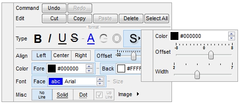
The control provides the CanUndo/CanRedo properties that determines
whether the control can undo/redo that last operation.
The following VB sample shows how you can implement the Undo command:
Private Const WM_COMMAND = &H111
Private Declare Function SendMessage Lib "user32" Alias "SendMessageA" (ByVal hwnd As Long, ByVal wMsg As Long, ByVal wParam As Long, lParam As Any) As Long

Private Sub Undo()
    With HTML1
        If .CanUndo Then
            SendMessage .hwnd, WM_COMMAND, &HE12B * 65536, 0
        End If
    End With
End Sub
The following VB sample shows how you can implement the Redo command:
Private Const WM_COMMAND = &H111
Private Declare Function SendMessage Lib "user32" Alias "SendMessageA" (ByVal hwnd As Long, ByVal wMsg As Long, ByVal wParam As Long, lParam As Any) As Long

Private Sub Redo()
    With HTML1
        If .CanRedo Then
            SendMessage .hwnd, WM_COMMAND, &HE12C * 65536, 0
        End If
    End With
End Sub
The control provides the FormatSelection property that formats the
current selection. The SelStart property returns or sets the starting
point of text selected. The SelLength property specifies the length of
the selection.
The following samples formats programmatically the selection:
/*
	Copy and paste the following directives to your header file as
	it defines the namespace 'EXHTMLLib' for the library: 'ExHTML 1.0 Control Library'

	#import <ExHTML.dll>
	using namespace EXHTMLLib;
*/
EXHTMLLib::IHTMLPtr spHTML1 = GetDlgItem(IDC_HTML1)->GetControlUnknown();
spHTML1->PutText(L"first line<br>second line<br>third line");
spHTML1->PutSelStart(spHTML1->GetXYToPosition(0,1));
spHTML1->PutSelLength(11);
spHTML1->PutHideSelection(VARIANT_FALSE);
spHTML1->PutFormatSelection(EXHTMLLib::exHTMLFormatBold,VARIANT_TRUE);
spHTML1->PutFormatSelection(EXHTMLLib::exHTMLFormatAlign,long(1));
OutputDebugStringW( _bstr_t(spHTML1->GetFormatSelection(EXHTMLLib::exHTMLFormatBold)) );
spHTML1->PutSelStart(spHTML1->GetXYToPosition(0,2));
spHTML1->PutSelLength(-1);
spHTML1->PutFormatSelection(EXHTMLLib::exHTMLFormatUnderline,VARIANT_TRUE);
spHTML1->PutFormatSelection(EXHTMLLib::exHTMLFormatAlign,long(2));
Procedure OnCreate
	Forward Send OnCreate
	Set ComText to "first line<br>second line<br>third line"
	Set ComSelStart to (ComXYToPosition(Self,0,1))
	Set ComSelLength to 11
	Set ComHideSelection to False
	Set ComFormatSelection OLEexHTMLFormatBold to True
	Set ComFormatSelection OLEexHTMLFormatAlign to 1
	Showln (ComFormatSelection(Self,OLEexHTMLFormatBold))
	Set ComSelStart to (ComXYToPosition(Self,0,2))
	Set ComSelLength to -1
	Set ComFormatSelection OLEexHTMLFormatUnderline to True
	Set ComFormatSelection OLEexHTMLFormatAlign to 2
End_Procedure
where "size" is an icon being inserted in the project's Resources. In order to insert a image, icon or picture to your application's resources, you need to select the Properties of the application, and select Add Resource\Add Existing File...