![]() 1:
1:
|
The control's release notes can be found on our web site, looking for the
Release Notes column in the control's main page. Click here
for direct link.
|
![]() 2:
2:
|
By default, the setup installs a chm file in your system folder. You can access the help file by pressing F1 key when in VB and the control is selected. You can also access the help file by typing ControlName.chm in the START menu RUN box. For instance, type excombobox.chm and the help file for ExComboBox component will be opened.?
|
![]() 3:
3:
|
The control provides a Columns property that helps you to add, remove or
changes the columns of the control. By default, the control has no columns. The
following code shows you how to add two columns to the control:
With ComboBox1
	.BeginUpdate
		With .Columns
			With .Add("Column 1")
				.Width = 164
			End With
			With .Add("Column 2")
				.HeaderImage = 1
			End With
		End With
	.EndUpdate
End With
When many changes are made to the control , you should invoke the BeginUpdate
method to temporarily freeze the drawing of the control. This results in less
distraction to the user, and a performance gain. After all updates have been
made, invoke the EndUpdate method to resume drawing of the control.
|
![]() 4:
4:
|
The control provides an Items property that helps you to add, remove or
changes the items in the control. Before adding any new item to the control make
sure that your control has at least one column. There are 4 methods to load
items to the control.
Because control can load a list as well as a hierarchy each item is specified
by a handle HITEM not by index. Each property that refers a cell requires a
handle and an index to a column.
By default, the control has no columns, so before
adding new items you need to add columns like in the following sample
With ComboBox1.Columns
        .Add "Column 1"
        With .Add("Column 2")
            .HTMLCaption = "Column <b>2</b>"
        End With
End With
The following sample uses the first method to add few items to the Items
collection.
With ComboBox1.Items
    Dim h As HITEM, hChild As HITEM
    h = .AddItem("Group 1")
    .CellCaption(h, 1) = "Information about Group 1"
    hChild = .InsertItem(h, , "Child 1")
    .CellCaption(hChild, 1) = "Information about Child 1"
    hChild = .InsertItem(h, , "Child 2")
    .CellCaption(hChild, 1) = "Information about Child 2"

    h = .AddItem("Group 2")
    .CellCaption(h, 1) = "Information about Group 2"
    hChild = .InsertItem(h, , "Child 1")
    .CellCaption(hChild, 1) = "Information about Child 1"
    hChild = .InsertItem(h, , "Child 2")
    .CellCaption(hChild, 1) = "Information about Child 2"
End With
When many changes are made to the control , you should invoke the BeginUpdate
method to temporarily freeze the drawing of the control. This results in less
distraction to the user, and a performance gain. After all updates have been
made, invoke the EndUpdate method to resume drawing of the control.
The following sample uses the VB Array function to insert items to a multiple
columns control:
Private Sub Form_Load()
With ComboBox1
    .BeginUpdate

    .Columns.Add "Column 1"
    .Columns.Add "Column 2"
    .Columns.Add "Column 3"

    With .Items
        Dim h As HITEM
        h = .AddItem(Array("Item 1", "Item 2", "Item 3"))
        .InsertItem h, , Array("Item 1.1", "Item 2.1", "Item 3.1")
        .InsertItem h, , Array("Item 1.2", "Item 2.2", "Item 3.2")
        .ExpandItem(h) = True
    End With

    .EndUpdate
End With
The following sample insert items to a multiple columns controls:
Private Sub Form_Load()
With ComboBox1
    .BeginUpdate

    .Columns.Add "Column 1"
    .Columns.Add "Column 2"
    .Columns.Add "Column 3"

    With .Items
        Dim h As HITEM, h2 As HITEM
        h = .AddItem("Item 1")
        .CellCaption(h, 1) = "Item 2"
        .CellCaption(h, 2) = "Item 3"
        h2 = .InsertItem(h, , "Item 1.1")
        .CellCaption(h2, 1) = "Item 1.2"
        .CellCaption(h2, 2) = "Item 1.3"
        h2 = .InsertItem(h, , "Item 2.1")
        .CellCaption(h2, 1) = "Item 2.2"
        .CellCaption(h2, 2) = "Item 2.3"
        .ExpandItem(h) = True
    End With

    .EndUpdate
End With
|
![]() 5:
5:
|
By default, the control contains no columns so at least one column
should be added before using it as in the following sample:
With ComboBox1
	.BeginUpdate
		.AutoComplete = False
		.ColumnAutoResize = True
.Columns.Add "Default"
	.EndUpdate
End With
The AutoComplete
property specifies that the control does complete the control's
label area based on the selected item. Setting this property on
False, will let you type any character inside.
|
![]() 6:
6:
|
Yes. A prompt is a label or short instruction placed inside an editable
drop-down list as its default value. Unlike static text, prompts
disappear from the screen once users type something into the combo
box or it gets input focus. The Prompt
property of the column provides this functionality. The following
snippet of code displays a prompt for the control:
With ComboBox1
	.BeginUpdate
		.ColumnAutoResize = True
		.AutoComplete = False
		.Columns.Add("Default").Prompt = "<i><fgcolor=808080>prompt</fgcolor></i>"
	.EndUpdate
End With
|
![]() 7:
7:
|
That's nothing strange in that sample. The sample shows data hierarchical.
When the component applies the filter it looks for all items that match the
criteria and includes the parent items as well, else the filtered items will be
hidden. You can comment the code that uses SetParent method to let control
displays data as a simple list.
|
![]() 8:
8:
|
The
CellTooltip property of
Items object specifies the cell's tool tip. The
cell's tool tip appears when the cursor is over the cell. If you set the
CellTooltip ="..." ( three dots ), the control displays the cell's
caption in a tool tip when it doesn't fit the cell's client area.
|
![]() 9:
9:
|
Once that you have the handle of the added item you have to change the
ItemPosition property to specify the item's position.
|
![]() 10:
10:
|
The control provides a property ShowImageList that shows or hides that images
list. By default, the property is True, to let new customers know that they can
drag images without using an ImageList control. If you are going to add icons at
runtime the control provides Images and
ReplaceIcon methods. The Images method
takes the handle to an ImageList control. The ReplaceIcon method works like
follows:
- ( Icon, -1) method. Adds a new icon to control's image list, and retrieves the index of the image. Sample: .ReplaceIcon Image1.Picture.Handle, adds a new icon to the end of the control's image list, .ReplaceIcon LoadPicture("D:\Icons\help.ico").Handle adds a new icon, loads the icon from a file, and adds it to control's image list
- ReplaceIcon( Icon, n ) ( where n >= 0 ) method. Replaces an icon to control's image list. Sample: .ReplaceIcon Image1.Picture.Handle, 0 replaces the first icon in the control's image list
- ReplaceIcon( 0, n ) (where n>= 0 ) method. Removes an icon given its index. Sample: .ReplaceIcon 0, 0 removes the first icon in the control's image list
- ReplaceIcon( 0, -1) method. Clears the images collection. Sample: .ReplaceIcon, clears the entire image list.
|
![]() 11:
11:
|
You can delete an icon from the images list window in design mode by
selecting the icon and pressing the BackSpace key. You can delete the icon using
the Delete key but some containers delete the object when Delete key is
used.
|
![]() 12:
12:
|
The control provides several options to select an item or a value. The Select
and Value
properties selects a value on a specified column.
For instance, the following sample
looks for an item that has in the column "Column 1" the "Child 2",
and selects it, if the value is found:
ComboBox1.Select(0) = "Child 2"
or
ComboBox1.Select("Column 1") = "Child 2"
Also, the Items object provides properties like: Items.SelectCount,
Items.SelectItem,
Items.SelectedItem that helps you to access the selected
items. The control fires SelectionChanged event when user changes the selection.
The following sample uses the FindItem method to looks for an item that contains
in the column "Column 1" the value "Child 2"
ComboBox1.Items.SelectItem(ComboBox1.Items.FindItem("Child 2", "Column 1")) = True
or
ComboBox1.Items.SelectItem(ComboBox1.Items.FindItem("Child 2", 0)) = True
The following sample selects the first visible item:
ComboBox1.Items.SelectItem(ComboBox1.Items.FirstVisibleItem) = True
The following sample displays the selected items. Only the caption on the first
column are displayed. If you want to display more columns you have to change the
0 with index of column being displayed.
With ComboBox1.Items
	Dim i As Long
	For i = 0 To .SelectCount - 1
		Debug.Print .CellCaption(.SelectedItem(i), 0)
	Next
End With
|
![]() 13:
13:
|
There Items object provides few methods like
FindItem,
FindPath in order to
find an item. The FindItem method looks for the first item that has in a column
the giving value. For instance the following sample gets the handle of the item
that contains in the first column ( "Column 1" ) the value
"Child 2":
Debug.Print ComboBox1.Items.FindItem("Child 2", "Column 1")
If the FindItem method fails to locate the item the 0 is returned. If a non 0
value is returned that means that the control was able to locate the item.
The FindPath method looks for a path in the control's hierarchy using the
SearchColumnIndex property as being the searching column . The method requires
the full path separated by the "/".
Debug.Print ComboBox1.Items.FindPath("Group 2\Child 2")
Once that we have found the searched item all that we need to call
EnsureVisibleItem method in order to ensure that the item is visible. If the
item was a child of an item that was collapsed the EnsureVisibleItem method
expands that item too.
|
![]() 14:
14:
|
The control provides multiple ways to do that. If you only need to alternate
the background color for items you should use the BackColorAlternate property.
If only a particular item needs to be colorized, you have to use properties
like: ItemForeColor,
ItemBackColor,
CellForeColor or
CellBackColor. Remember
that control fires the InsertItem event when a new item is inserted to the
Items
collection. You can use the InsertItem event to apply different colors for the
newly added items and cells.
|
![]() 15:
15:
|
The InsertItem event is called each time when a new item is inserted to the
Items collection. We can use this event to color a column like in the following
sample:
Private Sub ComboBox1_InsertItem(ByVal Item As EXCOMBOBOXLibCtl.HITEM)
    With ComboBox1.Items
        .CellBackColor(Item, 1) = vbRed
    End With
End Sub
Another option that you have to color a column is if you are using the
CountLockedColumns property. The CountLockedColumn property specifies the number
of visible columns that are frozen on the left side. A frozen column is not
scrollable. The control provides in that case a property called BackColorLock
that specifies the background color for frozen area of the control. The same
thing is for ForeColorLock property except that it specifies the foreground
color for the frozen area. In case that CountLockedColumn > 0 the BackColor
and ForeColor properties are applicable to the scrollable area of the control.
|
![]() 16:
16:
|
|
![]() 17:
17:
|
The
IntegralHeight property helps you to do that. If the control's
Style
property is DropDown or DropDownList the IntegralHeight property resizes the
drop down window to avoid displaying partial items. The control uses the
DefaultItemHeight , Items.ItemCount and the
HeightList properties to to compute
the size of the drop down window. If the AllowSizeGrip property is True, the end
user can resizes the drop down window at runtime. If the IntegralHeight property
is True no partial items are displayed. You can use AllowHResize and
AllowVResize to allow user resizes only the width or the height of the control
by dragging the control's size grip.
|
![]() 18:
18:
|
By default, the control automatically sort a column when the user clicks the column's
header. If the SortOnClick
property is exNoSort the control doesn't sort the items when user clicks the
column's header. There are two methods to get items sorted like follows:
Using the SortOrder
property of the Column
object. The SortOrder property displays the sorting icon in the column's
header if the DisplaySortIcon
property is True:
ComboBox1.Columns(ColIndex).SortOrder = SortAscending
Using the SortChildren
method of the Items
object. The SortChildren sorts the items.
The SortChildren method sorts the child items of the given parent item in the control. SortChildren will not
recourse through the tree, only the immediate children of Item will be sorted.
The following sample sort descending the list of root items on the "Column
1"( if your control displays a list, all items are considered being root
items ).
ComboBox1.Items.SortChildren 0, "Column 1", False
|
![]() 19:
19:
|
Yes, you can. The following method uses a for each statement.. In the sample
h variable specifies a handle to an item.
With ComboBox1
        Dim h As Variant
        For Each h In .Items
            Debug.Print .Items.CellCaption(h, 0)
        Next
End With
The second method to iterate the items can be the following:
With ComboBox1
	Dim i As Long
	For i = 0 To .Items.ItemCount - 1
		Debug.Print .Items.CellCaption(.Items.ItemByIndex(i), 0)
	Next
End With
|
![]() 20:
20:
|
Yes. The following function displays all child items ( recursively )
Sub RecItem(ByVal c As EXCOMBOBOXLibCtl.ComboBox, ByVal h As HITEM)
    If Not (h = 0) Then
        Dim hChild As HITEM
        With c.Items
            Debug.Print .CellCaption(h, 0)
            hChild = .ItemChild(h)
            While Not (hChild = 0)
                RecItem c, hChild
                hChild = .NextSiblingItem(hChild)
            Wend
        End With
    End If
end sub
|
![]() 21:
21:
|
The NotInList event occurs when the user
enters a value in the text box portion of a combo box that isn't in the combo
box list. The control doesn't fire this event if the FireNotInList property is
False, so make sure that the property is set to True. The following sample shows
how to add a new entry to the items list when NotInList event is fired:
Private Sub ComboBox1_NotInList()
    If MsgBox("Do you want to add it?", vbYesNo) = vbYes Then
        With ComboBox1
            Debug.Print .EditText(.SearchColumnIndex)
            Dim h As HITEM
            h = .Items.AddItem(.EditText(0))
            .Items.CellCaption(h, 1) = .EditText(1)
            .Items.SelectItem(h) = True
            .Items.EnsureVisibleItem h
        End With
    End If
End Sub
|
![]() 22:
22:
|
Yes, the control provides a property called
SingleEdit. The SingleEdit
property specifies whether the control's label display one or all visible
columns in the control. If the SingleEdit property is True, the
SearchColumnIndex property determines the column being displayed on the
control's label. The control uses the TAB key to navigate through the visible
columns. Actually when TAB key ( or SHIFT + TAB combination ) , the control
changes the SearchColumnIndex property to point to next visible column. If you
want to avoid changing the searching column you have to use the UseTabKey
property.
|
![]() 23:
23:
|
If TypeOf ComboBox1 Is EXCOMBOBOXLibCtl.ComboBox Then
	Debug.Print "ExComboBox"
End If
|
![]() 24:
24:
|
The ColumnAutoResize property is what you are looking for. If the control's
ColumnAutoResize property is True, the control arranges all visible columns to
fit the control's client area. In this case no horizontal scroll bar is
displayed. If the ColumnAutoResize property if False, control displays a
horizontal scroll bar if the width of visible columns doesn't fit the width of
the client area.
|
![]() 25:
25:
|
To programmatically drop down the window you can use the following trick:
Private Sub Command1_Click()
	ComboBox1.SetFocus
	SendKeys "{F4}"
End Sub
or the following ( it is recommended using this one ):
Private Sub Command1_Click()
	ComboBox1.DropDown() = True
End Sub
The AutoDropDown property allows control to drop down automatically it's window
when user start typing characters.
|
![]() 26:
26:
|
Yes. You need to implement a simple interface called IUnboundHandler. The
setup program installs few samples about implementing the unbound handler. Using
notification interface it's easy and quicker than using events.
|
![]() 27:
27:
|
All control properties that specifies a size or a coordinate are measured in
pixels. Uses TwipsPerPixelX and TwipsPerPixelY properties to convert twips
coordinates to pixel coordinates. The control's mouse events receive coordinates
in twips, and they need to be converted if they are passed to one of the
control's properties or methods. See ItemFromPoint method.
|
![]() 28:
28:
|
Yes. You can find UNICODE versions here.
|
![]() 29:
29:
|
Actually, the control does more than access2000 combobox does. You can see nice features in the control like: colors, font, pictures, hierarchy, filters and so on.
|
![]() 30:
30:
|
Changing the Name property of the Font object doesn't notify the control that the used font has been changed, so calling ComboBox1.Font.Name = "Arial Unicode MS" has effect only for the control's drop-down window, but it doesn't change the font for control inside text editors. Remember that Font is a system object, and it is not implemented by the control, so that's the
reason why the control is not notified that the user has changed the font's name.
The following sample changes the font used by inside text editors as well for the drop-down window :
Dim f As New StdFont
f.Name = "Arial Unicode MS"
ComboBox1.Font = f
|
![]() 31:
31:
|
You have to use the SelectItem property. If the control's
Style is DropDown,
you have to reset the text in the label using the EditText property.
With ComboBox1.Items
	if .SelectCount > 0 then
		.SelectItem(.SelectedItem(0)) = False
	end if
End With
|
![]() 32:
32:
|
Yes. please set the
CloseOnDblClk property. The CloseOnDblClk property
specifies whether the user closes the drop down window by dbl click.
|
![]() 33:
33:
|
Yes. Place the control to your toolbar and then call:
Private Sub Form_Load()
    ComboBox1.Height = 128 * Screen.TwipsPerPixelY
End Sub
|
![]() 34:
34:
|
If you are going to resize the control at runtime, the HeightList property
can be used to set the height of the dropdown window. The LabelHeight property helps
you to specify the control's label height. You can resize the size of the drop
down portion of the control at design time by doing the followings:
- select the control ( the focused rectangle shows that the control is
selected )
- resize the control to the desired height and width
- save the project
Another way to resize your control at design mode is:
- set the control's Style property to Simple ( by default, the control's
Style is DropDown )
- select the control and resize its list until you have the desired width
and height for the list portion.
- set the control's Style property to DropDown or DropDownList.
- save the project
If your control requires the size greater than the size of the form, you can
resize the form, resize the control, and then resize back the form.
|
![]() 35:
35:
|
The control provides properties like
CheckImage and
RadioImage properties
that help you to set your desired icons for check or radio buttons.
|
![]() 36:
36:
|
When you expect performance you have to be carefully to each line of code in
your project. Here's few hints about improving performance when you are using
the control:
- The Items property performs a QueryInterface each time when it is called.
It is recommended using a variable that holds the Items property
instead calling the property itself. For instance call set its =
ComboBox1.Items when form is loaded, and use 'its' variable each time when
you need to access the Items collection.
- Use With .. End With statements each time you can. It avoids calling too
many times a QueryInterface by the control.
- Holds an column to a variable instead calling Item property. For instance,
the Item property of the
Columns object looks for a column. The
Add method
of Columns object retrieves the added Column object. For instance use code
like follows to add and initialize a column:
With ComboBox1.Columns
    With .Add("Column 1")
        .Width = 128
        .AllowSizing = False
        .AllowDragging = False
        .DisplaySortIcon = False
    End With
End With
or
With ComboBox1.Columns
    Dim c As EXCOMBOBOXLibCtl.Column
    Set c = .Add("Column 1")
    c.Width = 128
    c.AllowSizing = False
    c.AllowDragging = False
    c.DisplaySortIcon = False
End With
|
![]() 37:
37:
|
The control's
Description property helps you to change descriptions used by
the control. For instance: the .Description( exFilterBarAll ) = "(Alle)"
changes the description for the first item in the drop down filter list, or the
Description( exFilterBarPatternTooltip ) = "Geben Sie hier das Muster nach dem Sie filtern wollen an. Als Platzhalter k?nnen *,? oder # benutzt werden. Zum Filtern dr?cken Sie ENTER Durch dr?cken der Strg ? Taste k?nnen Sie mehrere Begriffe aus der Liste selektieren und danach filtern
" changes the tooltip when the cursor is over the drop down list.
You can run the following code to see the identifiers for the
control's descriptions that you might want to change:
Private Sub Form_Load()
    With ComboBox1
        For i = 0 To 15
            .Description(i) = i
        Next
    End With
End Sub
|
![]() 38:
38:
|
|
![]() 39:
39:
|
The Items object provides properties like
ItemDivider,
ItemDividerLine helps
you to merge cells of the row into a single cell. The setup installs a sample
VB\Divider that helps you to understand how ItemDivider works. Also, the
ItemDivider property helps you to group items in the control. The divider items
are not scrolled when the user drags the horizontal scroll bar so the groups
titles will be visible most of the time. The ItemDivider property specifies the
index of cell being displayed instead displaying the entire item.
|
![]() 40:
40:
|
The CellPicture property of the Items object helps you to attach a picture
file ( bmp, gif, whatever ) to a cell. The following sample shows how to attach a
picture to the first visible cell of the control:
With ComboBox1.Items
	.CellPicture(.FirstVisibleItem, 0) = LoadPicture("c:\winnt\Zapotec.bmp")
End With
or you can use the following way as well:
Dim p As IPictureDisp
Set p = LoadPicture("c:\winnt\Zapotec.bmp")
With ComboBox1.Items
	.CellPicture(.FirstVisibleItem, 0) = p
End With
If the picture's height is larger than item's height you can use the
ItemHeight property to let picture fits the item's client area. The .CellPicture
accepts objects of IPictureDisp type. The LoadPicture function retrieves an
IPictureDisp object.
|
![]() 41:
41:
|
The version 1.0.4.2 includes the built-in HTML format inside cells. The
CellCaptionFormat property specifies how the cell's caption ( CellCaption
property ) is displayed. If the CellCaptionFormat property is exText no HTML
formatting is applied. Else, if the CellCaptionFormat property is exHTML the
CellCaption is formatted using HTML tags. The list of valid tags are:
- <b> tag - draws a text bolded until </b> is
reached.
- <br> tag - breaks the line.
- <i> tag - draws the text using italic font attribute
until </i> is reached.
- <s> tag - draws the text using strikeout font
attribute until </s> is reached.
- <u> tag - draws the text using underline font
attribute until </u> is reached.
- <fgcolor=RRGGBB> tag - draws the text using the
RGB(RR,GG,BB) foreground color. </u>, until </fgcolor>
is reached. RR, GG and BB should be hexa values.
- <bgcolor=RRGGBB> tag - draws the text using the
RGB(RR,GG,BB) background color. </u>, until </bgcolor>
is reached. RR, GG and BB should be hexa values.
- < dotline > - draws a dotted line.
- < solidline > - draws a dotted line
- < upline > - draws up the line
- < r > - right aligns the line
For instance: the HTML formatting
"<b>Inbox</b> <fgcolor=0000FF>(78)</fgcolor>"
draws the Inbox using bold font attributes, and (78) using the
blue color, like: Inbox (78)
|
![]() 42:
42:
|
Usually, it's happen if the control's UseTabKey property is True. If the
UseTabKey property is True, the control uses the TAB key to
navigate through visible columns. If the UseTabKey is False, the
control doesn't handle the TAB key, and so you will be able to
move the focus to next control in the form, by pressing the TAB
key.
|
![]() 43:
43:
|
You have to put
ColumnAutoResize property on False. By default, the control's
ColumnAutoResize property is True. If the ControlAutoResize is True, the sum of
visible columns widths is equal with the width of the client area.
|
![]() 44:
44:
|
We recommend using #import directive to import the control's type library
into your VC project. You don't need the control's TLB file. The dll file
installed in your system folder exports the control's type library as well. For
instance, the #import "c:\winnt\system32\excombobox.dll"
imports the control's type library to your project. By default, the #import
directive creates a namespace EXCOMBOBOXLib.
|
![]() 45:
45:
|
The following snippet unselects the selected item:
With ComboBox1.Items
        If .SelectCount > 0 Then
            .SelectItem(.SelectedItem(0)) = False
        End If
End With
|
![]() 46:
46:
|
The control provides the
ASCIILower and
ASCIIUpper properties that helps you
to specify the set of characters that are converted by the auto search feature.
For instance if you have the set ?/? ?/? Ā/ā Ă/ă Ą/ą
Ć/ć Ĉ/ĉ Ċ/ċ Č/č Ď/ď Ē/ē
Ĕ/ĕ Ė/ė Ę/ę Ě/ě Ĝ/ĝ Ğ/ğ
Ġ/ġ Ģ/ģ Ĥ/ĥ Ō/ō Ŏ/ŏ Ŕ/ŕ
Ŗ/ŗ Ř/ř Ś/ś, you have to call something like:
ASCIILower like "abcdefghijklmnopqrstuvwxyz??ā....", and
ASCIIUpper like "ABCDEFGHIJKLMNOPQRSTUVWXYZ??A...."
|
![]() 47:
47:
|
|
![]() 48:
48:
|
The Data property of the column holds an extra data. The Data value is not
used by the control, it is of Variant type, and it can be used to store extra
values for your columns.
|
![]() 49:
49:
|
The EditText property gets the text in the edit control. If you have multiple
columns the EditText( ColIndex ) gives the edit's text at the specified column.
|
![]() 50:
50:
|
The Key property of the Column object associates a key to a column. The Key
and Caption properties are used by functions like Items.CellCaption,
Items.CellBold, ... and so on. For instance, the CellCaption( hItem,
"ABC" ) gets the cell's caption for the item hItem on the column that
has the caption "ABC" or it has the key = "ABC".
|
![]() 51:
51:
|
The CellImage property assign a single icon to the cell. Instead if multiple
icons need to be assigned to a single cell you have to use the CellImages
property. The CellImages property takes a list of additional icons and display
them in the cell. The list is separated by ',' and should contain numbers
that represent indexes to Images list collection. The following sample assign
first and third icon to a cell:
With ComboBox.Items
        .CellImages(.ItemByIndex(0), 1) = "1,3"
End With
|
![]() 52:
52:
|
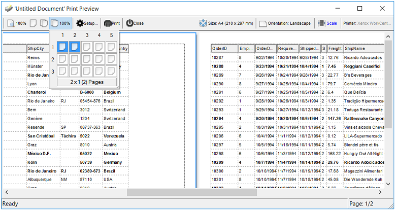
Yes, the Exontrol ExPrint component ( exprint.dll ) provides Print and Print
Preview capabilities for the exComboBox component. Once that you can have the
exPrint component in your Components list, insert a new instance of "ExPrint
1.0 Control Library" to your form and add the following code:
Private Sub Command1_Click()
    With Print1
        Set .PrintExt = ComboBox1.Object
        .Preview
    End With
End Sub
The Exontrol Print Preview mainframe looks like follows:
|
![]() 53:
53:
|
The control provides the SortOnClick property that helps you to handle how
the control sorts the columns when user clicks the column's header. The
following sample shows how to sort a column using SortOrder property.
Private Sub Form_Load()
    ComboBox1.SortOnClick = exNoSort
End Sub

Private Sub ComboBox1_ColumnClick(ByVal Column As EXCOMBOBOXLibCtl.IColumn)
    Column.SortOrder = (Column.SortOrder + 1) Mod 3
End Sub
In this case if an user clicks a column, the column gets sorted like follows:
- if the column was unsorted, it is sorted ascending
- if the column was sorted ascendant, the control sorts the column
descendent
- if the column is descendent, the column becomes unsorted ( no sorting icon
displayed on the column's header bar )
You can simulate the exDefaultSort by using the following handler:
Private Sub ComboBox1_ColumnClick(ByVal Column As EXCOMBOBOXLibCtl.IColumn)
    Column.SortOrder = (Column.SortOrder + 1) Mod 3 + 1
End Sub
|
![]() 54:
54:
|
You can use Items.ChildCount or
Items.ItemChild property like follows:
If (ComboBox1.Items.ChildCount(h) <> 0) Then
End If
or
If (ComboBox1.Items.ItemChild(h) <> 0) Then
End If
The Items.ItemHasChildren property adds an expand
button to the left side of the cell, no matter if the item contains child items.
It is useful to build your virtual tree.
|
![]() 55:
55:
|
The Style property can be changed at runtime, starting with the version
1.0.5.7. If you are creating and removing the control dynamically and you need
to set the appropriate Style property at runtime make sure that you are loading
data after setting the Style property. The Style property clears the columns and
items collections.
|
![]() 56:
56:
|
The Key property replaces a virtual key that's used by the control.
The following sample disables the PageUp and PageDown keys:
ComboBox1.Key(vbKeyPageUp) = 0
ComboBox1.Key(vbKeyPageDown) = 0
The following sample shows how to open the drop down
window when user hits the F2 key: ( by default, the control opens the drop down
window if the user presses the F4 key )
ComboBox1.Key(vbKeyF4) = 0
ComboBox1.Key(vbKeyF2) = vbKeyF4
|
![]() 57:
57:
|
The EditText property has effect only if the control's
Style property is
DropDown or Simple. The following sample shows how to change the control's
label.
With ComboBox1
        Dim bAutoSelect As Boolean
        Dim bAutoSearch As Boolean

        bAutoSelect = .AutoSelect
        bAutoSearch = .AutoSearch
        .AutoSelect = False
        .AutoSearch = False

        .EditText(0) = "new label"

        .AutoSelect = bAutoSelect
        .AutoSearch = bAutoSearch
End With
|
![]() 58:
58:
|
The following sample shows how you can remove the selected item when user hits the Delete key:
Private Sub ComboBox1_KeyDown(KeyCode As Integer, Shift As Integer)
    If (KeyCode = vbKeyDelete) Then
        With ComboBox1
            If .Items.SelectCount() > 0 Then

                ' Removes the selected item, if there is one
                .Items.RemoveItem .Items.SelectedItem(0)

                If (.Style <> DropDownList) Then
                    ' Clears the control's label if it is required
                    Dim i As Long
                    For i = 0 To .Columns.Count - 1
                        .EditText(i) = vbNullString
                    Next
                End If

            End If
        End With
    End If
End Sub
|
![]() 59:
59:
|
Yes. The EditImage property assign an icon to the column's edit box. If the
icon doesn't exist no icon is displayed. The AssignEditImageOnSelect property
automatically assigns the icon for the column's edit when the selection is changed.
|
![]() 60:
60:
|
The SortOrder
property of the Column
object specifies the column's sort order. The following function
retrieves the index of column that's sorted, or-1 if there is no sorted
column:
Private Function getSortingColumn(ByVal g As EXCOMBOBOXLibCtl.ComboBox) As Long
    Dim c As EXCOMBOBOXLibCtl.Column
    For Each c In g.Columns
        If Not c.SortOrder = EXCOMBOBOXLibCtl.SortNone Then
            getSortingColumn = c.Index
            Exit Function
        End If
    Next
    getSortingColumn = -1
End Function
|
![]() 61:
61:
|
Yes.
The control supports 'start with' and 'contains' incremental
search feature. The AutoSearch
property specifies whether the incremental search is supported.
The AutoSearch property of the Column object defines the type of
incremental searching.
|
![]() 62:
62:
|
The
SearchColumnIndex
property resets the searching string, so you can use a sample like
follows:
Private Sub ComboBox1_LostFocus()
    Dim i As Long
    With ComboBox1
        i = .SearchColumnIndex
        .SearchColumnIndex = -1
        .SearchColumnIndex = i
    End With
End Sub
|
![]() 63:
63:
|
Call
the DropDown
property to show the drop down portion of the control. Use the
DropDown property to show the drop down portion of the control
when it gains the focus like in the following sample:
Private Declare Function SetCursorPos Lib "user32" (ByVal x As Long, ByVal y As Long) As Long
Private Declare Function GetCursorPos Lib "user32" (lpPoint As POINTAPI) As Long
Private Type POINTAPI
        x As Long
        y As Long
End Type
Dim p As POINTAPI

Private Sub ComboBox1_GotFocus()
    ComboBox1.DropDown() = True
    GetCursorPos p
    SetCursorPos p.x - 16, p.y
End Sub
|
![]() 64:
64:
|
You
can use a code like follows:
Private Sub ComboBox1_DropDown()
    ComboBox1.Key(vbKeyDown) = vbKeyDown
End Sub

Private Sub ComboBox1_DropUp()
  ComboBox1.Key(vbKeyDown) = vbKeyF4
End Sub

Private Sub ComboBox1_GotFocus()
    ComboBox1.Key(vbKeyDown) = vbKeyF4
End Sub
Thanks to Calvin Shields, who shared the note.
|
![]() 65:
65:
|
Starting
with the version 2.0.0.6, the control provides the SelectableItem
property. The SelectableItem property specifies whether an item is
selectable. A not selectable item is not focusable item. Use the EnableItem
property to enable or disable an item.
|
![]() 66:
66:
|
Yes.
It is possible. The AdjustSearchColumn
property specifies whether the SearchColumnIndex
property could refer a hidden column. Use the SingleEdit
property to display a single column in the control's label. So, you need to set the
AdjustSearchColumn property on False, and to specify the index of
column being displayed on the control's label using the
SearchColumnIndex property. For instance, let's say that the drop
down window contains some information and we need to display other
information when selecting an item. You can do it by drawing your self
the control's label, or you can have a hidden column with the information
that should be displayed on the control's label. Another case,
could be if you would like to display single line item in the
control's label even if the drop down portion of the control
contains items using multiple lines.
|
![]() 67:
67:
|
The Click
event is not fired when user the control's label, so you might
want to check one of the following methods. If the Style
property is DropDownList and the AutoDropDown
property is True, the control shows the drop down portion of the
control when user clicks the control's label area. The following samples use the DropDown
method to programmatically show the drop down portion of the
control.The following samples uses different methods to drop down the
control when user clicks the control's label area. In order to run any of the
following sample, please insert the control to a form/dialog, and apply its
default template ( so we have loaded columns and items ).
The following
VB sample drops down the control when it receives the focus by clicking:
Private Declare Function GetMessagePos Lib "user32" () As Long
Private Declare Function WindowFromPoint Lib "user32" (ByVal xPoint As Long, ByVal yPoint As Long) As Long
Private Declare Function IsChild Lib "user32" (ByVal hWndParent As Long, ByVal hwnd As Long) As Long

Private Sub ComboBox1_GotFocus()
    With ComboBox1
        If (IsChild(.hwnd, WindowFromPoint(GetMessagePos() And &HFFF, GetMessagePos() / 65536))) Then
            .DropDown("") = True
        End If
    End With
End Sub
The sample calls the DropDown method when the control
gains the focus. The
following VC sample shows the drop down portion of the control when the user
clicks the control's label area ( WM_PARENTNOTIFY method ):
void OnParentNotify(UINT message, LPARAM lParam)
{
	CDialog::OnParentNotify(message, lParam);

	if ( LOWORD( message ) == WM_LBUTTONDOWN )
	{
		CRect rtClient;
		m_combobox.GetClientRect( &rtClient );
		m_combobox.ClientToScreen( &rtClient );
		ScreenToClient( &rtClient );
		POINT ptCursor = { ((long)(short)LOWORD(lParam)), ((long)(short)HIWORD(lParam)) };
		if ( PtInRect( &rtClient, ptCursor ) )
		{
			COleVariant vtMissing; V_VT( &vtMissing )= VT_ERROR;
			m_combobox.SetDropDown( vtMissing, TRUE );
		}
	}

}
The OnParentNotify method handles the WM_PARENTNOTIFY
message of the Dialog class. A parent's OnParentNotify member function is
called by the framework when its child window is created or destroyed, or when
the user clicks a mouse button while the cursor is over the child window. The
m_combobox wraps the control, and it is a member of the dialog class. The
sample calls the DropDown method only if the user clicks the control's label
area. The following C# sample displays the drop down portion of
the control when user clicks the control's label area:
protected override void DefWndProc( ref Message msg )
{
	base.DefWndProc( ref msg );

	if ( msg.Msg == 0x210 /*WM_PARENTNOTIFY*/ )
	{
		Point pt = new Point( msg.LParam.ToInt32() & 0xFFFF, msg.LParam.ToInt32() >> 16 );
		PointToScreen( pt );
		Control c = GetChildAtPoint(pt);
		if ( c != null )
			if ( c == axComboBox1 )
				axComboBox1.set_DropDown( "", true );
	}
}
The following VB.NET sample displays the drop down portion of the control
when the user clicks the control's label area:
Protected Overrides Sub DefWndProc(ByRef m As Message)
    MyBase.DefWndProc(m)

    If (m.Msg = &H210) Then 'WM_PARENTNOTIFY
        Dim pt As Point
        pt.X = m.LParam.ToInt32() And &HFFFF
        pt.Y = m.LParam.ToInt32() / 65536
        Dim c As Control
        c = GetChildAtPoint(pt)
        If Not (c Is Nothing) Then
            If c Is AxComboBox1 Then
                AxComboBox1.set_DropDown("", True)
            End If
        End If
    End If
End Sub
The following VFP sample displays the drop down message when the control
gains the focus by clicking the control's label area:
DECLARE LONG GetMessagePos IN user32

DECLARE LONG WindowFromPoint IN user32;
	LONG   x,;
	LONG   y

DECLARE LONG IsChild IN user32;
	LONG   hWndParent,;
	LONG   hWnd

local x, y
x = Bitand(GetMessagePos(),4095)
y = Int(GetMessagePos() / 65536)
with thisform.ComboBox1
	if ( 0 # IsChild( .hWnd(), WindowFromPoint( x, y ) ) )
		.Object.DropDown("") = .t.
	endif
endwith
|
![]() 68:
68:
|
If the control has no columns, there is no edit control in the label
area, so cursor can't show up. Use the Add
method to insert new columns to the control.
|
![]() 69:
69:
|
The component supports skinning parts of the control,
including the selected item. Please check the control's help
file for the Add method of the Appearance object. There you
will find almost everything you need to change the visual
appearance for most of the UI parts of the control. Shortly,
the idea is that identifier of the skin being added to the
Appearance collection is stored in the first significant
byte of property of the color type. In our case, we know
that the SelBackColor property changes the background color
for the selected item. This is what we need to change. In
other words, we need to
change the visual appearance for the selected item, and that
means changing the background color of the selected item.
So, the following code ( blue code ) changes the appearance
for the selected item:
With ComboBox1
    .VisualAppearance.Add &H34, App.Path + "\aqua.ebn"
    .SelBackColor = &H34000000
End With
Please notice that the 34 hexa value is arbitrary chosen,
it is not a predefined value. Shortly, we have added a skin
with the identifier 34, and we specified that the SelBackColor
property should use that skin, in order to change the visual
appearance for the selected item. Also, please notice that
the 34 value is stored in the first significant byte, not in other position. For instance, the following sample
doesn't use any skin when displaying the selected item:
With ComboBox1
    .VisualAppearance.Add &H34, App.Path + "\aqua.ebn"
    .SelBackColor = &H34
End With
This code ( red code ) DOESN'T use any skin, because the
34 value is not stored in the higher byte of the color
value. The sample just changes the background color for the
selected item to some black color ( RGB(0,0,34 ) ). So,
please pay attention when you want to use a skin and when to
use a color. Simple, if you are calling &H34000000,
you have 34 followed by 6 ( six ) zeros, and that means the
first significant byte of the color expression. Now, back to
the problem. The next step is how we are creating skins? or
EBN files? The Exontrol's exbutton
component includes a builder tool that saves skins to EBN
files. So, if you want to create new skin files, you need to
download and install the exbutton component from our web
site. Once that the exbutton component is installed, please
follow the steps.
Let's say that we have a BMP file, that we want to
stretch on the selected item's background.
- Open the VB\Builder or VC\Builder sample
- Click the New File button ( on the left side in
the toolbar ), an empty skin is created.
- Locate the Background tool window and select
the Picture\Add New item in the menu, the Open
file dialog is opened.
- Select the picture file ( GIF, BMP, JPG, JPEG ). You
will notice that the visual appearance of the focused
object in the skin is changed, actually the picture you
have selected is tiled on the object's background.
- Select the None item, in the Background tool
window, so the focused object in the skin is not
displaying anymore the picture being added.
- Select the Root item in the skin builder window
( in the left side you can find the hierarchy of the
objects that composes the skin ), so the Root item is
selected, and so focused.
- Select the picture file you have added at the step 4,
so the Root object is filled with the picture you have
chosen.
- Resize the picture in the Background tool
window, until you reach the view you want to have, no
black area, or change the CX and CY fields in the
Background tool window, so no black area is displayed.
- Select Stretch button in the Background tool
window, so the Root object stretches the picture you
have selected.
- Click the Save a file button, and select a name
for the new skin, click the Save button after you typed
the name of the skin file. Add the .ebn extension.
- Close the builder
You can always open the skin with the builder and change
it later, in case you want to change it.
Now, create a new project, and insert the component where
you want to use the skin, and add the skin file to the
Appearance collection of the object, using blue code, by
changing the name of the file or the path where you have
selected the skin. Once that you have added the skin file to the
Appearance collection,
you can change the visual appearance for parts of the
controls that supports skinning. Usually the properties
that changes the background color for a part of the control
supports skinning as well.
|
![]() 70:
70:
|
|
![]() 71:
71:
|
|
![]() 72:
72:
|
There are several options in order to display a different content for the
column. By default, the Items.CellCaption property indicates the value being shown
in the cell.
- Column.FormatColumn property specifies a formula to display the column's
new content, using predefined functions for numbers, strings, dates and so
on.
- Change the Value parameter of the FormatColumn event which is fired if the
Column.FireFormatColumn property is True. For instance the following sample
displays the second column using current currency format with 2
decimals. The Item parameter of the FormatColumn event indicates the item
where the cell is hosted, the ColIndex indicates the column where the cell
belongs, while the Value parameter indicates the cell's value before
formatting and after. In case you need formatting multiple columns, you
can distingue them using the ColIndex parameter.
Private Sub ComboBox1_FormatColumn(ByVal Item As EXCOMBOBOXLibCtl.HITEM, ByVal ColIndex As Long, Value As Variant)
    Value = FormatCurrency(Value, 2, vbUseDefault)
End Sub

Private Sub Form_Load()
    With ComboBox1
        .BeginUpdate
        .Columns.Add "A"
        .Columns.Add("B").FireFormatColumn = True ' Index of it is 1
        With .Items
            .AddItem Array("One", 1)
            .AddItem Array("Two", 2)
        End With
        .EndUpdate
    End With
End Sub
- Items.CellOwnerDraw property indicates an object that perform owner draw
on cells.
|
![]() 73:
73:
|
There are the several ways of enumerating the
items/cells in the control. The following samples
are in VB, but they can be easily converted to any other
programming language. This samples shows you an idea how
easily you can enumerate through the items.
A). Using the GetItems method of the control. The
GetItems method gets the items as they are displayed,
sorted and filtered to an array or vector. Also, the GetItems method collect
the child items as well, no matter if the parent item is
collapsed. The GetItems method returns an array. For
instance, if your control contains 1 column, the
GetItems will retrieves a one-dimensional
array. A 2 columns will get a two-dimensional
array, an so on. You can use the PutItems method to
insert the array to the control.
B). Using the for each statement for Items
property of the control. The Items property gets a
collection of items as they were added. This method lists
the items by index not by their positions. The items is represented
by handles, so the handle can be used in the Cell properties
to refer the cell. For instance,
Items.CellCaption(Handle,Column) gets the cell from the Item
with the specified handle on specified column. The following
sample displays the cells in the first column as they were
added:
With ComboBox1
        Dim h As Variant
        For Each h In .Items
            Debug.Print .Items.CellCaption(h, 0)
        Next
End With
If you need to access multiple columns add the Debug.Print
.Items.CellCaption(h, 1), Debug.Print .Items.CellCaption(h,
2) ... for each column you require.
C). A similar approach to B is using the
Items.ItemCount and Items.ItemByIndex properties. This method
lists the items by index not by their positions.
With ComboBox1
    Dim i As Long
    With .Items
        For i = 0 To .ItemCount - 1
            Debug.Print .CellCaption(.ItemByIndex(i), 0)
        Next
    End With
End With
The Items. ItemByIndex retrieves the handle of the item
giving its index. For instance, the first added item has the
index 0, the second added item has the index 1, and so on.
D). Using the Items.NextVisibleItem property. This
method gets the items as they are displayed, sorted and
filtered.
With ComboBox1
    With .Items
        Dim h As Long
        h = .RootItem(0)
        While Not h = 0
            Debug.Print .CellCaption(h, 0)
            h = .NextVisibleItem(h)
        Wend
    End With
End With
E). Using the Items.ItemChild and
Items.NextSiblingItem property. This method enumerates recursively
the items and its children. This
method gets the items as they are displayed, sorted and
filtered, including the children items that are not visible
aka parent item is collapsed.
With ComboBox1
    With .Items
        For i = 0 To .RootCount - 1
            RecItem ComboBox1, .RootItem(i)
        Next
    End With
End With

Sub RecItem(ByVal c As Object, ByVal h As Long)
    If Not (h = 0) Then
        Dim hChild As Long
        With c.Items
            Debug.Print .CellCaption(h, 0)
            hChild = .ItemChild(h)
            While Not (hChild = 0)
                RecItem c, hChild
                hChild = .NextSiblingItem(hChild)
            Wend
        End With
    End If
End Sub
|
![]() 74:
74:
|
Here's some ideas on how you can use arrays with the
control.
A). Using the GetItems/PutItems to get or put the
items/cells using arrays. The GetItems method gets the
items/cells of the control to a safe array. The PutItems
inserts the array of values to the control. For instance the
following sample adds 3 columns and 1001 items from an
array:
With ComboBox1
    .Columns.Add "C1"
    .Columns.Add "C2"
    .Columns.Add "C3"
    Dim v(2, 1000) As String
    v(1, 10) = "zece"
    .PutItems v
End With
In VB the arrays is zero-based, so 2 indicates actually
0, 1 and 2 ( 3 columns ).
B). You can use the PutItems method to insert a
hierarchy, for single-column control. The following sample
adds a hierarchy as Root\Child 1, Child 2\SubChild 1,
SubChild 2
With ComboBox1
    .LinesAtRoot = exLinesAtRoot
    .Columns.Add "Nodes"
    .PutItems Array("Root", Array("Child 1", "Child 2", Array("SubChild 1", "SubChild 2")))
End With
C). You can use the arrays to fill a
multiple-columns control in Items.AddItem/Items.InsertItem
methods as in the following sample:
With ComboBox1
    .Columns.Add "C1"
    .Columns.Add "C2"
    .Columns.Add "C3"
    With .Items
        .AddItem Array("Cell 1.1", "Cell 1.2", "Cell 1.3")
        .AddItem Array("Cell 2.1", "Cell 2.2", "Cell 2.3")
    End With
End With
|
![]() 75:
75:
|
The idea is to handle the KeyDown event, and to use the
UseTabKey property on False like in the following VB6
sample:
Private Sub ComboBox1_KeyDown(KeyCode As Integer, Shift As Integer)
    If (KeyCode = vbKeyReturn) Then
        SendKeys "{TAB}"
        KeyCode = 0
    End If
End Sub

Private Sub Form_Load()
    ComboBox1.UseTabKey = False
End Sub
The sample sends the TAB key when user presses the ENTER
key, so the form will jump to another control in the form.
The sample uses the VB6's SendKeys method to send a key to
the focused control ( as the KeyDown is called, the control
has the focus, so also itself receives the new key being
sent by the SendKeys method )
In VFP you can use the following alternative for KeyDown
event of the control:
*** ActiveX Control Event ***
LPARAMETERS keycode, shift

IF ( keycode = 13 ) then
	keycode = 0
	KEYBOARD '{TAB}'
ENDIF
The equivalent of VB's SendKeys method in VFP is KEYBOARD
method as used in the previously sample.
|
![]() 76:
76:
|
The AutoDrag property indicates what the control does when the user clicks an item and starts dragging it. For instance, using the AutoDrag feature you can automatically lets the user to drag and drop the data to OLE compliant applications like Microsoft Word, Excel and so on.
In order to let user scrolls the control's content set the AutoDrag property on:
- AutoDragEnum.exAutoDragScrollOnShortTouch + AutoDragEnum.exAutoDragScroll
|
![]() 77:
77:
|
Usually it is happen when you load data from a record set. When you call
CellCaption() = rs("Field") the CellCaption property holds a reference to a Field
object not to the field's value. In order to fix that you have to pass the
rs("Field").Value to the CellCaption property as shown in the following sample:
The following code enumerates the records within a recordset, and adds a new item for each record found:
rs.MoveFirst
While Not rs.EOF()
    .AddItem rs(0)
rs.MoveNext
Wend
The list shows nothing, so you need to use a code as follows:
rs.MoveFirst
While Not rs.EOF()
    .AddItem rs(0).Value
rs.MoveNext
Wend
In conclusion, the rs("Field") returns a reference to an object of Field type, while rs("Field").Value returns the value of the field itself.
|
![]() 78:
78:
|
The following code shows how you can limit the number of checked items to 1(one):
Dim itemChecked As Long

Private Sub ComboBox1_CellStateChanged(ByVal Cell As EXCOMBOBOXLibCtl.HCELL)
    With ComboBox1.Items
        If Not (itemChecked = 0) Then
            .CellState(itemChecked, 0) = 0
        End If
        If (.CellState(, Cell)) Then
            itemChecked = .CellItem(Cell)
        End If
    End With
End Sub
The code allows only one check-box to be checked.
The following snippet of code shows how you can check the item once it gets selected:
Private Sub ComboBox1_SelectionChanged()
    With ComboBox1.Items
        .CellState(.FocusItem, 0) = 1
    End With
End Sub
|
![]() 79:
79:
|
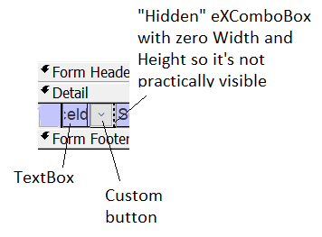
Find below the steps for implementing the eXComboBox in a detail continuous Access form/subform:
Thanks to Yannis Dimitroulias, ADASOFT, Greece who submitted the note.
|
![]() 80:
80:
|
The control fires the FilterChange
event when the the user applies a new filter or closes the filter bar. The
FilterType
property of the Column determines whether a new filter is applied or if the
property is set to exAll for all columns, the filter bar has been closed.
The following VB sample displays a message when the user closes the control's
filter bar:
Private Sub ComboBox1_FilterChange()
    For Each c In ComboBox1.Columns
        If (c.FilterType <> exAll) Then
            Debug.Print "Apply Filter"
            Exit Sub
        End If
    Next
    Debug.Print "Close Filter"
End Sub
|
