Add to your applicaton an easy-to-use edit control that supports built-in HTML format, and syntax highlighting as well. You can define your own keywords and expressions using HTML tags.
The control provides a collection called Context that helps you to add new
items to context drop down portion. You can invoke the drop down context window,
by pressing CTRL+SPACE. If you want to provide icons for items in the drop down
portion, you have to use the Images method. The following sample adds few items
to drop down portion:
With .Context("")
    .Add "<fgcolor=FF0000>class</fgcolor>", , 1
    .Add "<fgcolor=0000FF><b>public</fgcolor>", , 2
    .Add "<fgcolor=0000FF><b>protected</fgcolor>"
    .Add "<fgcolor=0000FF><b>private</fgcolor>", , 3
End With
The AddKeyword method adds new entries to control's keywords collection. When
using AddKeyword method you have to use built-in HTML tags to highlight your
keyword.
For instance, if you have a keyword, let's say, 'public', and you want to
have it blue, you have to use the code like follows:
.AddKeyword "<fgcolor=000080>public</fgcolor>"
As you can see the 'public' keyword is delimited by <fgcolor> and </fgcolor>
built-in HTML tags. The <fgcolor> and </fgcolor> built-in HTML tags
will be used by the control when 'public' keyword will be reached in the
control's text.
If you have a keyword, let's say 'protected', and you want to have it bolded
and red, you have to use the code like follows:
The AddExpression method adds new entries to control's expressions
collection. An expression is composed by beginning part, middle part and ending
part. The beginning part defines the start of the expression. The ending part
defines the end of the expression. The middle part defines the built-in HTML
tags that will be applied to expression excluding the beginning and ending
parts. The beginning and ending parts may contain also built-in HTML tags.
For instance let's say that we want to have green all expressions that start
with '// characters', then we should use code like follows:
In this case, the <fgcolor> built-in HTML tag will be used for the
entire expression. For instance, the line like 'class
A //Defines the class A ', will look like
'class A //Defines the
class A '. The <fgcolor> built-in HTML format is applied to the
entire expression because the middle part is missing ( empty ). If you have an
expression like follows:
The line will look like follows: 'class A
//Defines the class A '. As you can see the
beginning part is green, and the middle part gets bolded but no green. If you
want to have the middle part also been green, you have to append a new <fgcolor>
HTML format to the middle part like follows:
The beginning and ending parts contains two "" characters because
that means only one when they are included in other string expression. So,
string like: "blabla" will look like: "blabla".
As you can see that the red color is used for all parts. If you need any
of the expression parts you need to add/remove built in HTML tags when adding
the expression. Let's say that we want to have a red string, but everything
that's in the " characters we need it underlined, so the expression should
be like:
The FormatNumbers property specifies the HTML format for numbers. By default, the FormatNumbers property is "<fgcolor=0000FF> </fgcolor>".
The following sample bolds and colorizes the numbers:
With Edit1
        .FormatNumbers = "<b><fgcolor=0000FF> </fgcolor></b>"
End With
The ' ' blank character inside the expression is required. If it is missing
the property has no effect.
The control provides an image list window, that's displayed at design time. Use the
ShowImageList property to hide the image list window, at design time. At design time, the user can add new icons to the control's Images collection, by dragging icon files, exe files, etc, to the images list window. At runtime, the user can use the
Images and
ReplaceIcon method to change the Images collection. The Images collection is 1 based.
The following sample shows how to replace the entire list of icons, using a Microsoft Image List control ( ImageList1 ):
The control provides a property ShowImageList that shows or hides that images
list. By default, the property is True, to let new customers know that they can
drag images without using an ImageList control. If you are going to add icons at
runtime the control provides Images and
ReplaceIcon methods. The Images method
takes the handle to an ImageList control. The ReplaceIcon method works like
follows:
( Icon, -1) method. Adds a new icon to control's image list, and retrieves
the index of the image. Sample: .ReplaceIcon Image1.Picture.Handle, adds a
new icon to the end of the control's image list, .ReplaceIcon
LoadPicture("D:\Icons\help.ico").Handle adds a new icon, loads the
icon from a file, and adds it to control's image list
ReplaceIcon( Icon, n ) ( where n >= 0 ) method. Replaces an icon to
control's image list. Sample: .ReplaceIcon Image1.Picture.Handle, 0 replaces
the first icon in the control's image list
ReplaceIcon( 0, n ) (where n>= 0 ) method. Removes an icon given its
index. Sample: .ReplaceIcon 0, 0 removes the first icon in the control's
image list
ReplaceIcon( 0, -1) method. Clears the images collection. Sample: .ReplaceIcon,
clears the entire image list.
You can delete an icon from the images list window in design mode by selecting the icon and pressing the BackSpace key. You can delete the icon using the Delete key but some containers delete the object when Delete key is used.
The control provides the LineNumberWidth property that specifies the width of
the line number bar. By default, the width of the line number bar is 0, and no
line number bar is displayed. Use the LineNumberWidth = 0 to hide the line
number bar. The LineNumberWidth is available at design time also.
The TextLine property gets the line based on its index. The
Text property
gets the all lines of the control's text. The following statement enumerates the
lines in the control:
With Edit1
        For i = 0 To .Count - 1
            Debug.Print .TextLine(i)
        Next
End With
The Exontrol ExPrint component ( exprint.dll ) provides Print and Print
Preview capabilities for the exEdit component. Once that you can have the
exPrint component in your Components list, insert a new instance of "ExPrint
1.0 Control Library" to your form and add the following code:
Private Sub Command1_Click()
    With Print1
        Set .PrintExt = Edit1.Object
        .Preview
    End With
End Sub
The exEdit control supports the following options when using
the Options
property of the exPrint component:
break option. Specifies the characters that breaks
a longer line. For instance, Option("break: |#") specifies that
' ', '|' or '#' character breaks the line when it doesn't fit in the page.
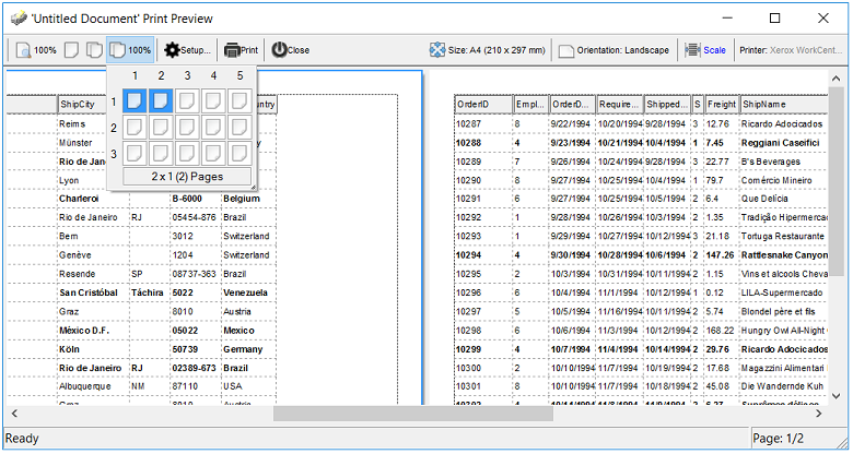
The following VB sample opens the Print Preview frame:
With Print1
    .Options = "break: |#_"
    Set .PrintExt = Edit1.Object
    .Preview
End With
The following C++ sample opens the Print Preview frame:
If you are using C++, with MFC support, the GetControlUnknown property of
CWnd class gets the object hosted by a window, and it should be passed to
SetPrintExt method:
The Picture and
PictureDisplay properties help add and arrange a picture to
the control's background. The following sample puts a picture on the
bottom-right corner of the control:
With Edit1
        .PictureDisplay = exLowerRight
        .Picture = LoadPicture(App.Path + "\exontrol.gif")
End With
If you are a VC developer, you can use the LoadPicture function described here.
The properties like
SelStart and
SelLenght should be used to highlight your
text. The control hides the selection if the HideSelection property is True.
Change the HideSelection property to false, and you will be able to see the
changes.
You can use the SelectLine
property or you can use the SelLenght
property. The following snippet of code shows how to highlight the current line ( the
CaretLine property retrieves the position of the current line. The current line
always contains the caret ):
With Edit1
        .CaretPos = 0
        .SelLength = Len(.TextLine(.CaretLine))
End With
If you need to highlight a specific line you have to
call:
With Edit1
        .CaretPos = 0
        .CaretLine = 0
        .SelLength = Len(.TextLine(.CaretLine))
End With
The AddKeyword method allows specifying the description of the keyword's
tooltip and its title. The tooltip appears when the user moves the cursor over
the keyword. The following sample assigns a tooltip to "public"
keyword:
With Edit1
        .Text = "public class A"
        .InsertText "{"
        .InsertText "}"
        .AddKeyword "<b>public</b>", "The public keyword specifies that those members are accessible from any function. ", "public keyword"
        .Refresh
End With
Starting with version 1.0.0.9 the exEdit components supports multi levels
Undo/Redo support. The AllowUndoRedo property specifies whether the control's
Undo/Redo support is enabled or disabled.
You can invoke any of the following commands: Delete, Copy, Cut, Find,
FindNext, FindPrev, Paste,
Select All, Undo and Redo. Each command has an unique identifier like follows:
The sample requires the definition for SendMessage API function. For
instance, the following VB sample shows how to call Undo command when user
clicks a button.
Private Declare Function SendMessage Lib "user32" Alias "SendMessageA" (ByVal hwnd As Long, ByVal wMsg As Long, ByVal wParam As Long, lParam As Any) As Long
Private Const WM_COMMAND = &H111

Private Sub Command1_Click()
    SendMessage Edit1.hwnd, WM_COMMAND, &HE12B * 65536, 0
End Sub
The wParam parameter of SendMessage API function needs to be Command's Identifier * 65536.
The following C++ sample shows how to call Redo command when user clicks a button:
The HideSelection property of the control specifies whether the selection in
a edit control is hidden when the control loses the focus. By default, the
HideSelection property is True.
The control provides
Find and Replace support. The
AllowFind property
specifies whether the control can search for a string using the built-in Find
dialog. By default, the AllowFind property is True. The control displays the
Find dialog if the user presses CTRL+F key. If you need to change the key
combination that invokes the Find dialog, you have to handle the KeyDown event
and to call Find command like explained in " How do I implement menu functions such as Cut, Copy, Find, Paste, Undo or Redo?".
The F3 key finds the next occurrence of the previous search text. The Shift + F3
finds the previous occurrence of the search text. The control's Find method
finds and highlights a string.
BackColorCaretLine property that retrieves or sets the background color used to display the cursor line.
The property BackColorCaretLine has effect only if it is different than
0.
The control provides a WYSWYG Layout editor that helps you to call any of
control properties or methods at design time. Select 'Properties' item from
control's context menu, when you are at design mode. Select 'Template' page from
control's Properties dialog. The 'Template' page can be used to initialize the
control, by calling its properties or methods.
For instance the following sample adds few keywords to the edit control:
AddKeyword("<fgcolor=008080>LPCTSTR</fgcolor>")
AddKeyword("<fgcolor=008080><u>using</u></fgcolor>","The using declaration introduces a name into the declarative region in which the using declaration appears.","using keyword")
AddKeyword("<fgcolor=008080><u>namespace</u></fgcolor>","A namespace declaration identifies and assigns a unique name to a user-declared namespace.","namespace keyword")
AddKeyword("<fgcolor=000080>public</fgcolor>")
AddKeyword("<fgcolor=000080>protected</fgcolor>")
AddKeyword("<fgcolor=000080>friend</fgcolor>")
The following samples adds items to the control's
context list window:
For instance, the following sample changes the control's background and
foreground colors by using the Template property.
Private Sub Form_Load()
    Dim t As String
    t = "BackColor = RGB(0,0,123)" & vbCrLf & "ForeColor = RGB(255,255,255)"
    Edit1.Template = t
End Sub
Let's suppose that we have a file with the following content:
AddKeyword("<fgcolor=008080>LPCTSTR</fgcolor>")
AddKeyword("<fgcolor=008080><u>using</u></fgcolor>","The using declaration introduces a name into the declarative region in which the using declaration appears.","using keyword")
AddKeyword("<fgcolor=008080><u>namespace</u></fgcolor>","A namespace declaration identifies and assigns a unique name to a user-declared namespace.","namespace keyword")
AddKeyword("<fgcolor=000080>public</fgcolor>")
AddKeyword("<fgcolor=000080>protected</fgcolor>")
AddKeyword("<fgcolor=000080>friend</fgcolor>")
AddExpression("<fgcolor=008000>//</fgcolor>", "<b><fgcolor=008000> </fgcolor></b>", "")
AddExpression("<fgcolor=800000>'</fgcolor>", "<b><fgcolor=800000> </fgcolor></b>", "<fgcolor=800000>'</fgcolor>")
Lines are separated by the vbCrLf ( \n\r ) characters. You can assign the
keywords and expressions to the control by loading the file to a string
variable, and by passing the string to the Template property.
The control scrolls its content when the user selects lines at the top or the bottom of the control. All that you need to do is to wait 100 ms until auto scroll is enabled.
The CaseSensitive parameter of AddKeyword method defines the type of the keyword. By default, the keywords are case sensitive.
The following sample adds
a case sensitive keyword ( the exCaseSensitiveKeyword is not required, because
the AddKeyword adds by default a case sensitive keyword ) :
With Edit1
        .AddKeyword "<fgcolor=0000FF><b>class</b></fgcolor>", , , exCaseSensitiveKeyword
End With
In this case, if you are tying 'class', 'ClaSs', 'clasS' and so on, it will
be highligted as 'class', 'ClaSs', 'clasS',
and so on. The exCaseSensitiveKeyword constant is 0
The following sample adds
a non case sensitive keyword:
With Edit1
        .AddKeyword "<fgcolor=0000FF><b>class</b></fgcolor>", , , exNonCaseSensitiveKeyword
End With
In this case, if you are tying 'class', 'ClaSs', 'clasS' and so on, it will
be highligted as 'class', 'ClaSs',
'clasS', and so on. The exNonCaseSensitiveKeyword
constant is 1
The following sample adds
a non case sensitive keyword, but any occurrence of the keyword in the text will
be displayed as it is defined:
With Edit1
        .AddKeyword "<fgcolor=0000FF><b>class</b></fgcolor>", , , exReplaceKeyword
End With
In this case, if you are tying 'class', 'ClaSs', 'clasS' and so on, it will
be highlighted as 'class', 'class',
'class', and so on. The exReplaceKeyword
constant is 2
The AddWild method adds an expression that may contain wild characters like
'*' or '?'. For instance the following sample underlines all 'a' in the text:
With Edit1
        .AddWild ("<u>a</u>")
End With
Note that if you are adding a keyword like:
With Edit1
        .AddKeyword ("<u>a</u>")
End With
only 'a' characters that are not in words will be underlined. The wild
characters expression may contain '*' that means any string of characters and
'?' that means a single character. For instance the following sample bolds all
expressions that starts with '<' and ends with the '>' and it has at
least once character inside.
With Edit1
        .AddWild ("<b><?*></b>")
End With
Note that if you are adding an expression that starts
with '<' and ends with '>' the expression will be highlighted even there
is no character between them:
With Edit1
        .AddExpression "<b><</b>", "<b> </b>", "<b>></b>"
End With
If you want to highlight only the part between '<' and '>' then you
should use a sample like follows:
With Edit1
        .AddExpression "<", "<b> </b>", ">"
End With
The BookmarkWidth property specifies the size of the bookmarks border. If the
BookmarkWidth property is 0, no bookmarks border is displayed. If the
BookmarkWidth property is grater than 0 the control sets the width of the
bookmarks border to specified size. If the BookmarkWidth property is less than
0, and the line numbers border is displayed, it displays the line bookmarks too.
The following sample allows you to put the line numbers and bookmarks on the
same column:
With Edit1
        .LineNumberWidth = 32
        .BookmarkWidth = -1
End With
The LineNumberWidth property specifies the width of the line numbers border.
If the LineNumberWidth property is 0 the control displays no line numbers
border. If the LineNumberWidth property is less than 0 the control sets the
width of the line numbers border automatically. If the LineNumberWidth property
is positive the control sets the width of the line numbers border to the
specified size. The following sample displays the line bookmarks and line
numbers on the same column, and the column is automatically sized:
With Edit1
        .LineNumberForeColor = vbWhite
        .LineNumberWidth = -1
        .BookmarkWidth = -1
End With
The
BookmarksList property specifies the list of bookmarks in the control. Use the
Bookmark property to bookmark a specified line. The following sample
prints all lines that are bookmarked:
Dim l As Variant
    With Edit1
        For Each l In .BookmarksList
            Debug.Print .TextLine(l)
        Next
End With
The BookmarksList property can be used also to set the list of bookmarks in
the control like in the following sample ( the old list of bookmarks is cleared
):
Dim l(3) As Long
l(0) = 1
l(1) = 3
l(2) = 5
l(3) = 7
Edit1.BookmarksList = l
The BookmarksList property supports only unidimension arrays of long
elements.
The SelText property returns or sets the string containing the currently selected text.
The following sample displays the selected text as soon as the user changes the
selection:
Private Sub Edit1_SelChange()
    If Not Edit1.SelText = "" Then
        Debug.Print Edit1.SelText
    End If
End Sub
The SelChange event occurs when user selects text in the control. The
SelChange event is called also when the position of the cursor is changed. The
following sample displays the position of the cursor:
Private Sub Edit1_SelChange()
    With Edit1
        Debug.Print "(" & .CaretLine & ", " & .CaretPos & ")"
    End With
End Sub
The Context.Options(exContextAllowChars) as String specifies the list of characters that are allowed to a context list. By default, the Context.Options(exContextAllowChars) property is "_ABCDEFGHIJKLMNOPQRSTUVWXYZabcdefghijklmnopqrstuvwxyz". For instance, if user presses
any of the characters that are not included to
Context.Options(exContextAllowChars) property the context list is closed.
The exContextAllowChars value is 1.
The following sample includes numbers to the Context.Options(exContextAllowChars) property,
and so when user presses any of the number keys the context list is not closed,
instead it tries to search the matching item:
With Edit1.Context
        .Options(exContextAllowChars) = .Options(exContextAllowChars) + "0123456789"
End With
Yes. The
Context.Options( Option as ContextOptionEnum) As Variant property. Specifies an option for the sensitive context
list. The Context.Options(exContextCaseSensitive) as Boolean specifies whether the selection of items into a sensitive context list is case sensitive. By default, the Context.Options(exContextCaseSensitive) is False. For instance, if Context.Options(exContextCaseSensitive) is True, the selection of items from a context list is case sensitive.
The exContextCaseSensitive value is 0.
The Sort method of the
Context object helps you to sort the items in the
list. The items are sorted by SortOrder number. The Sort method sorts
alphabetically the list of items that have the same SortOrder parameter. Use the
Add method of the Context object to specifies the SortOrder number.
The following sample sorts the list of items as follows:
With Edit1.Context
        .Add "<b>a</b>", , , 9
        .Add "<b>b</b>", , , 8
        .Add "<b>c</b>", , , 7

        .Sort True
End With
and the list of items is 'c', 'b', 'a'.
The following sample sorts the list as follows:
With Edit1.Context
        .Add "<b>a</b>"
        .Add "<b>b</b>"
        .Add "<b>c</b>"

        .Sort True
End With
and the list of items is 'a', 'b', 'c'.
With Edit1.Context
        .Add "<b>a</b>"
        .Add "<b>b</b>", , , 9999
        .Add "<b>c</b>"

        .Sort True
End With
and the list of items is 'a', 'c', 'b'.
All items that are added using the Add method without specifying the
SortOrder parameter, have 0 for the SortOrder by default.
The control provides the BookmarkChange event that occurs when user adds or
removes a bookmark. The BookmarkChange event occurs when a change occurs in the
list of control's bookmarks. The following sample displays the line where user
adds a bookmark:
Private Sub Edit1_BookmarkChange(ByVal Index As Long)
    With Edit1
        If .Bookmark(Index) Then
            Debug.Print .TextLine(Index)
        End If
    End With
End Sub
The ContextMenuItems property specifies a list of items that control adds to
its context menu when it is invoked. The AllowContextMenu property specifies
whether the control displays its context menu when user right click the control.
The list of items is separated by 'New Line' (\n or chr(10)) or 'Carriage return'
(\r or chr(13) character. The ExecuteContextMenu event is fired when user
selects an user item from the control's context menu. A separator item is added
if the caption of the item is empty. The following sample adds few items to the
control's context menu:
Private Sub Edit1_ExecuteContextMenu(ByVal Item As String, ByVal Position As Long)
    Debug.Print Position & " " & Item
End Sub

Private Sub Form_Load()
    With Edit1
        .Load "d:\temp\lappy\test.txt"
        .ContextMenuItems = vbCr & "Item 1" & vbCr & "Item 2"
    End With
End Sub
Yes. The BackColorLine property specifies the line's
background color. The following sample shows how to assign an icon and a
background color to the caret line:
Private Sub Command1_Click()
    Dim l As Long
    l = Edit1.CaretLine
    Edit1.BookmarkImageLine(l) = 1
    Edit1.BackColorLine(l) = vbYellow
End Sub
The following sample removes the assigned icon and the
line's background:
Private Sub Command2_Click()
    Dim l As Long
    l = Edit1.CaretLine
    Edit1.BookmarkImageLine(l) = 0
    Edit1.ClearBackColorLine (l)
End Sub
The
BookmarkImage property let's you specify the index of icon being
displayed whether the line is bookmarked. If the icon doesn't exist the control
uses the default shape for drawing bookmarks. Use the Images property to add
icons at runtime, or use the control's panel image list to add new icons at
design time. Use the BookmarkImageLine property to assign an icon for a
particular line.
The
exEdit 1.0.3.1 defines multiple lines expressions using the
AddExpression method. The following sample adds an expression to
define comments between /* and */:
With Edit1
        .AddExpression "<fgcolor=008F00>/*</fgcolor>", _
        "<b><fgcolor=007F00> </fgcolor></b>", _
        "<fgcolor=008F00>*/</fgcolor>", True
End With
For instance, the expression /* just a comment
*/ shows like: /* just
a comment */
The
exEdit 1.0.3.4 introduces the IgnorePrefixInExpression
property that specifies a collection of prefixes that are ignored
inside an expression. For instance if we have defined an
expression for strings like follows:
With Edit1
        .AddExpression "<fgcolor=800000><b>""</b></fgcolor>", _
            "<b><fgcolor=FF0000> </fgcolor></b>", _
            "<fgcolor=800000><b>""</b></fgcolor>", _
            True
End With
In this case we have defined the expression ".
So, if the user types in the control the text:
'This is a string "this is a quote \" bla ... bla \" "'
the control displays the line like follows:
'This is a string "this is a quote
\" bla ... bla
\""'
, but we want to ignore
\" expressions.
In this case we need to use the following code:
With Edit1
        .AddExpression "<fgcolor=800000><b>""</b></fgcolor>", _
            "<b><fgcolor=FF0000> </fgcolor></b>", _
            "<fgcolor=800000><b>""</b></fgcolor>", _
            True
        .IgnorePrefixInExpression("""") = "\"
End With
In this case, if the user types:
'This is a string "this is a quote \" bla ... bla \" "'
the control displays:
''This is a string "this is a quote \" bla ... bla
\""'
, and this is what we need.
The IgnorePrefixInExpression property is cumulative, so you can
add multiple prefixes to be ignored for an expression like in the
following sample:
With Edit1
    .AddExpression "<fgcolor=800000><b>""</b></fgcolor>", _
        "<b><fgcolor=FF0000> </fgcolor></b>", _
        "<fgcolor=800000><b>""</b></fgcolor>", _
        True
    .IgnorePrefixInExpression("""") = "\"
    .IgnorePrefixInExpression("""") = """"
End With
Passing an empty string to the IgnorePrefixInExpression
property clears the collection of the prefixes for the expression,
so the .IgnorePrefixInExpression("""") = "" clears all prefixes
previously defined for an expression (").
The
version 1.0.3.4 introduces the OnContext
event that's fired if the control is not read only, and the user
opens the control's context menu ( pressing the CTRL + SPACE key
combination ). The OnContext event passes the context string and
the position where the context begins. Use the OnContext event to
notify your application that the user asks for a context. For
instance, during the OnContext event you can add a collection of
the items, based on the context you have, using the Add
method of the Context
object. Use the CaretPos
and CaretLine
properties to determine the position of the cursor inside the
text. Use the TextLine
property to retrieve line at the cursor.
The following sample displays the current line when the
OnContext event occurs:
Private Sub Edit1_OnContext(ByVal Start As Long, ByVal Context As String)
    With Edit1
        Debug.Print "Current line: " & .TextLine(.CaretLine)
    End With
End Sub
The
ContextKey
property specifies the key combination to display the control's
context window. By default, the key combination to open the
control's context window is CTRL + SPACE. The low byte of the
ContextKey property specifies the code of the key, and the high
byte of the lowest word of the ContextKey property is a bit
combination of the CTRL, SHIFT and ALT keys state. The following
formula should be used to specify a key combination:
Ctrl is 1 if the CTRL key is pressed, or 0 if the CTRL key
is not pressed
Alt is 1 if the ALT key is pressed, or 0 if the ALT key is
not pressed
Alt is 1 if the SHIFT key is pressed, or 0 if the SHIFT key
is not pressed
For instance, if you need to change the key combination to ALT
+ SPACE you need to define the ContextKey property like bellow:
With Edit1
    .ContextKey = vbKeySpace + 256 * 2
End With
or
With Edit1
    .ContextKey = 32 + 256 * 2
End With
since the code for SPACE key is 32. By default, the ContextKey
property is 288.
If you need to have a combination like SHIFT + CTRL + F1
you need to define the ContextKey property like follows:
With Edit1
    .ContextKey = vbKeyF1 + 256 * (1 + 4)
End With
How can I find the key code? The easiest way to find out the
code for a key is to add a handler for KeyDown
event like follows:
Private Sub Edit1_KeyDown(KeyCode As Integer, Shift As Integer)
    Debug.Print KeyCode
End Sub
Important to notice is that the control's context window
is not the control's context menu. The control's context window is
shown when user presses the ContextKey combination, instead the
control's context menu is displayed when user does a right click.
Use
the MarkColor
property to mark the positions for expressions on the control's
vertical scroll bar. The Expression parameter of the MarkColor
property should not contain the HTML tags. For instance, the
following sample defines /* */ multiple lines expression:
With Edit1
    .AddExpression "<fgcolor=008000>/*</fgcolor>", _
                   "<fgcolor=008000> </fgcolor>", _
                   "<fgcolor=008000>*/</fgcolor>", _
                   True
    .MarkColor("/*") = RGB(0, &H80, 0)
    .AllowMark = True
End With
The
problem is that the MDI frame view app handles the CTRL+C, CTRL+V
keys combinations to update the project's menu. The situation is
similar with a view that contains an edit control, in this case,
the project's form view class is derived the CEditView class. For
instance, you can check the MFC source code, where you will find
the onEditCopy function that looks like following:
As you can see, when user presses the CTRL+C keys combination
the frame calls the Copy method of the edit control. We need to do
something similar if out CFormView class contains an exEdit
control. You need to insert Windows Message handlers for identities
like ID_EDIT_COPY, ID_EDIT_PASTE, ID_EDIT_CUT, and so on.
The
Cursor
property specifies the cursor that control displays when the mouse
pointer hovers a part of the control. The ClientAreaEnum
type defines the parts of the control where the cursor can be
changed.
The following VB sample changes the cursor when the mouse
pointer is over the line number bar:
With Edit1
    .Cursor(exLineNumberArea) = "exCross"
End With
The following VB.NET sample changes the cursor with a value
that Cursors object defines:
The
CTRL + } combination looks for opposite bracket, while the
character at the cursor is '(', '[' or '{'. The following sample
simulates the CTRL + } combination using the CTRL + F1
combination:
Private Sub Edit1_KeyDown(KeyCode As Integer, Shift As Integer)
    If (KeyCode = vbKeyF1) Then
        KeyCode = 221
    End If
End Sub
By
default, when the control performs drag and drop operations, it is
trying to move the block from the source to copy it to the target,
so since the Character Map tool doesn't allow deleting the
dragging character, the control displays no drop cursor. Instead,
if you press the CTRL key while the cursor hovers the control, the
selected character in the Character Map tool can be copied to your
control. Also, you can handle the OLEDragOver
event so, only exOleDropEffectCopy(1) operations are performed
like follows:
Private Sub Edit1_OLEDragOver(ByVal Data As EXEDITLibCtl.IExDataObject, Effect As Long, ByVal Button As Integer, ByVal Shift As Integer, ByVal X As Single, ByVal Y As Single, ByVal State As Integer)
    Effect = 1  'exOLEDropEffectCopy
End Sub
The handler just changes the Effect parameter to 1
which is the identifier for exOLEDropEffectCopy (Drop results in a
copy of data from the source to the target. The original data is
unaltered by the drag operation).
The
LineNumberWidth property specifies the width of the column to
shown the line numbers on the control. In order to hide the
line-numbers from the Print and Print-Preview you have to change
the LineNumberWidth property on 0 before calling the Preview
method of the eXPrint, and restore it back once the Preview method
ends like in the following VB sample:
With Print1
    Dim nLineNumberWidth As Long
    With Edit1
        nLineNumberWidth = .LineNumberWidth
        .LineNumberWidth = 0
    End With
    Set .PrintExt = Edit1.Object
    .Preview
    Edit1.LineNumberWidth = nLineNumberWidth
End With
