

(String expression)
(Date expression)
You can use the exBarEndInclusive to display exBarEnd - 1 when associate a cell with a bar, using the AllowCellValueToItemBar property, so the ending point displayed on the list section is one day less. Changing the exBarEnd value may change the exBarEndInclusive value, or reverse. For instance, a a task bar from 1/1/2001 to 1/3/2001 shows two days, the exBarEnd displays 1/3/2001, while the exBarEndInclusive displays 1/2/2001.
(Date expression)
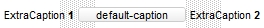
This option supports built-in HTML format including the <%=formula%> tag. The <%=formula%> tag indicates the result of the giving formula. The formula supports value formatting.
The formula supports the following keywords:
- %0, %1, %2, ...{any} specifies the value of the item-bar's property index 0(exBarName), 1(exBarStart), 2(exBarEnd), ... The ItemBar property defines the item-bar's property, such as name/type, start, end and so on. For example, "<%=shortdate(%2)%>" displays the bar's end-margin in short-format. For instance: "<%=((1:=int(0:= (%258))) != 0 ? (=:1 + ' day(s)') : '') + (=:1 ? ' ' : '' ) + ((1:=int(0:=((=:0 - =:1 + 1/24/60/60/2)*24))) != 0 ? =:1 + ' hour(s)' : '' ) + (=:1 ? ' ' : '' ) + ((1:=round((=:0 - =:1)*60)) != 0 ? =:1 + ' min(s)' : '')%>" displays automatically the bar's duration in days, hours and minutes.
- %C0, %C1, %C2, ...{string} specifies the caption of the cell, or the string the cell displays in the column with the index 0, 1 2, ... The CellCaption property gets the cell's formatted caption. The cell's displayed string may differ from its actual value. For example, if a cell displays HTML content, %0 returns the HTML format including the tags, while %C0 returns the cell's content as a plain string without HTML tags. For instance, "upper(%C1)" converts the caption of the cell at index 1 to uppercase, while "%C0 left 2" returns the leftmost two characters of the caption in the cell at index 0.
- %CD0, %CD1, %CD2, ...{any} specifies the cell's extra data in the column with the index 0, 1 2, ... The CellData property associates any extra/user data to a cell. For example, "%CD0 = your user data" specifies all cells in the column with index 0 whose CellData property is equal to your user data.
- %CS0, %CS1, %CS2, ...{number} specifies the cell's state in the column with the index 0, 1 2, ... The CellState property defines the state of a cell, indicating whether it is checked or unchecked. For example, "%CS0" identifies all checked items in the column with index 0, while "not %CS1" identifies all unchecked items in the column with index 1.
- %CT0, %CT1, %CT2, ... {boolean} returns true if the cell displays a total field; otherwise, it returns false. The exTotalField / exTotalColumn flag specifies whether the cell displays a total field. For instance, "%CT1" refers to all cells in the second column that display totals, while "not %CT1" refers to all cells in the second column that do not display totals.
- %CE0, %CE1, %CE2, ... {boolean} returns true if the cell is editable; otherwise, it returns false.. For example, "%CE0" refers to all editable cells in the first column, while "not %CE1" refers to all cells in the second column that are read-only.
- %CC0, %CC1, %CC2, ... {number} retrieve the number of child items (this keyword consistently returns identical results for all cells since it pertains to the item that hosts each cell). The ChildCount property returns the number of child items. For example, "%CC0" identifies all parent items, while "%CC0 = 0" identifies all leaf items.
- %CX0, %CX1, %CX2, ... {boolean} returns true if the item hosting the cell is expanded, or false if it is collapsed (this keyword consistently returns identical results for all cells since it pertains to the item that hosts each cell). The ExpandItem property specifically indicates whether the item is expanded or collapsed. For example, "%CX0" refers to all expanded items, while "not %CX0" identifies all collapsed items
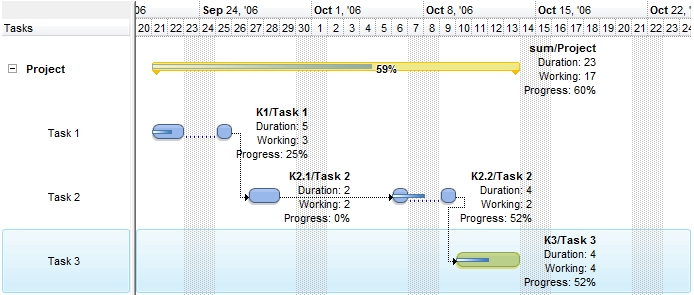
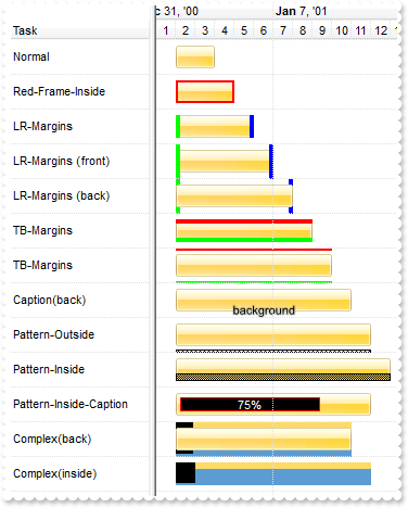
For instance the Items.ItemBar(exBarCaption) = "<b><%=%9 + '/' + %C0%></b><br>Duration: <%=(%2-%1)%><br>Working: <%=%258%><br>Progress: <%=round(100*%12)+'%'%>" defines the bar's caption as in the following screen shot:
The <%=formula%> tag allows you to specify custom HTML format for caption, tooltip or bar's legend based on the properties(%) and the cells in the owner item (%C). Newer versions, allow you to specify additional captions to the same bar using the exBarExtraCaption option.
This property supports auto-numbering (index, pos, ...) expressions as described here. This property/method supports predefined constants and operators/functions as described here.
(HTML String expression)
Use the exBarHAlignCaption property to clip the bar's caption to bar's client area as described bellow.
If the exBarHAlignCaption property is:
- 0,1 or 2 the caption is not clipped and it is aligned to the left, center or right side of the bar ( no clip ).
- 3, 4 or 5 the caption of the bar gets clipped to the bar's client area, else the caption is aligned to the left, center or right side of the bar ( clip, inside ).
- 6, 7 or 8 the bar's caption is hidden if its size is less or equal with MinUnitWidth property, else if it does not fit the bar's client are, gets clipped or else fully aligned to left, center or right side of the bar. ( hide if min, clip if not fit, inside ).
- 9, 10 or 11 the bar's caption is hidden if it does not fit entirely into the bar's client area, else it is fully displayed aligned to the left, center or right side of the bar. ( hide if not fit, no clip, inside ).
- 12, 13 or 14 the bar's caption is displayed inside of the bar's client area if it fits entirely, else it is displayed outside of the bar aligned to the left, center or right. ( no clip, inside, outside ).
- 16, 17, 18, the bar's caption is displayed outside of the bar to the left or to the right. ( no clip, outside ).
Also, the field supports the following flag (OR combination with any other value):
- 32 (0x20), which indicates that the bar's caption fits the bar and view (that bar's caption is aligned relative to the horizontal-intersection of the bar with the view) (for instance, 33 {number}, (1 + 32) the item-bar's caption is always shown within the center (horizontally) of item-bar intersected with the current view)
By default, the exBarHAlignCaption is CenterAlignment (1, no clip, center )
(AlignmentEnum expression)
(VAlignmentEnum expression)
This option supports built-in HTML format including the <%=formula%> tag. The <%=formula%> tag indicates the result of the giving formula. The formula supports value formatting.
The formula supports the following keywords:
- %0, %1, %2, ...{any} specifies the value of the item-bar's property index 0(exBarName), 1(exBarStart), 2(exBarEnd), ... The ItemBar property defines the item-bar's property, such as name/type, start, end and so on. For example, "<%=shortdate(%2)%>" displays the bar's end-margin in short-format. For instance: "<%=((1:=int(0:= (%258))) != 0 ? (=:1 + ' day(s)') : '') + (=:1 ? ' ' : '' ) + ((1:=int(0:=((=:0 - =:1 + 1/24/60/60/2)*24))) != 0 ? =:1 + ' hour(s)' : '' ) + (=:1 ? ' ' : '' ) + ((1:=round((=:0 - =:1)*60)) != 0 ? =:1 + ' min(s)' : '')%>" displays automatically the bar's duration in days, hours and minutes.
- %C0, %C1, %C2, ...{string} specifies the caption of the cell, or the string the cell displays in the column with the index 0, 1 2, ... The CellCaption property gets the cell's formatted caption. The cell's displayed string may differ from its actual value. For example, if a cell displays HTML content, %0 returns the HTML format including the tags, while %C0 returns the cell's content as a plain string without HTML tags. For instance, "upper(%C1)" converts the caption of the cell at index 1 to uppercase, while "%C0 left 2" returns the leftmost two characters of the caption in the cell at index 0.
- %CD0, %CD1, %CD2, ...{any} specifies the cell's extra data in the column with the index 0, 1 2, ... The CellData property associates any extra/user data to a cell. For example, "%CD0 = your user data" specifies all cells in the column with index 0 whose CellData property is equal to your user data.
- %CS0, %CS1, %CS2, ...{number} specifies the cell's state in the column with the index 0, 1 2, ... The CellState property defines the state of a cell, indicating whether it is checked or unchecked. For example, "%CS0" identifies all checked items in the column with index 0, while "not %CS1" identifies all unchecked items in the column with index 1.
- %CT0, %CT1, %CT2, ... {boolean} returns true if the cell displays a total field; otherwise, it returns false. The exTotalField / exTotalColumn flag specifies whether the cell displays a total field. For instance, "%CT1" refers to all cells in the second column that display totals, while "not %CT1" refers to all cells in the second column that do not display totals.
- %CE0, %CE1, %CE2, ... {boolean} returns true if the cell is editable; otherwise, it returns false.. For example, "%CE0" refers to all editable cells in the first column, while "not %CE1" refers to all cells in the second column that are read-only.
- %CC0, %CC1, %CC2, ... {number} retrieve the number of child items (this keyword consistently returns identical results for all cells since it pertains to the item that hosts each cell). The ChildCount property returns the number of child items. For example, "%CC0" identifies all parent items, while "%CC0 = 0" identifies all leaf items.
- %CX0, %CX1, %CX2, ... {boolean} returns true if the item hosting the cell is expanded, or false if it is collapsed (this keyword consistently returns identical results for all cells since it pertains to the item that hosts each cell). The ExpandItem property specifically indicates whether the item is expanded or collapsed. For example, "%CX0" refers to all expanded items, while "not %CX0" identifies all collapsed items
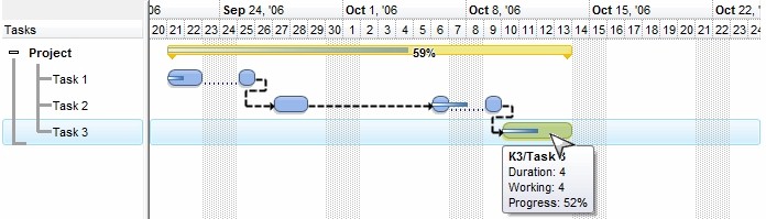
For instance the Items.ItemBar(exBarToolTip) = "<b><%=%9 + '/' + %C0%></b><br>Duration: <%=(%2-%1)%><br>Working: <%=%258%><br>Progress: <%=round(100*%12)+'%'%>" defines the bar's tooltip to show as in the following screen shot:
The <%=formula%> tag allows you to specify custom HTML format for caption or bar's tooltip based on the properties(%) and the cells in the owner item (%C).
(HTML String expression)
(Color expression)
(Color expression)
(Variant expression)
- If the exBarCanResize is 0/False, the bar can not be resized.
- If the exBarCanResize is -1/True, the bar can be resized on both sides.
- If the exBarCanResize is 1, the bar can be resized on left side, and can not be resized on right.
- If the exBarCanResize is 2, the bar can be resized on right side, and can not be resized on left.
The exBarSelectable specifies whether a bar is fixed to its position, in other words if it can be selected or not.
(Boolean/Long expression)
(Boolean expression)
 Specifies the percent from the original bar where the progress bar is
displayed. This float value should be
between 0 and 1 ( 1 means 100% ). You can use also the exBarpercent100 to
specify long expression value from 0 to 100. Use the Add("A%B") to add a
combination of two bars, so the exBarPercent value specifies the percent from
the bar A to be displayed as bar B. For instance, the Add("Task%Progress") adds a combination of Task and Progress bars, so the Task shape is displayed on the full bar, and the Progress shape is displayed only
on the portion determined by the exBarPercent value. When you resize the
original bar (A), the inside bar (B) is shown proportionally. Use the
exBarShowPercentCaption option to show the percent value as caption on the bar.
Use the
exBarPercentCaptionFormat property to define the format of the percent value
being displayed as text. Use the
exBarAlignmentPercentCaption property to specify the alignment of the percent on
the bar. The BarResize event is
fired when the exBarPercent value is changed. You can use the exBarPercent100
option to work with integer values from 0 to 100 for specifying the bar's
percent. The 0 value corresponds to the exBarStart, while 1
corresponds to the exBarEnd, so the formula Items.ItemBar(exBarStart) + (Items.ItemBar(exBarEnd)-Items.ItemBar(exBarStart))*Items.ItemBar(exBarPercent) gives exactly the date
time where progress bar is in the chart.
Specifies the percent from the original bar where the progress bar is
displayed. This float value should be
between 0 and 1 ( 1 means 100% ). You can use also the exBarpercent100 to
specify long expression value from 0 to 100. Use the Add("A%B") to add a
combination of two bars, so the exBarPercent value specifies the percent from
the bar A to be displayed as bar B. For instance, the Add("Task%Progress") adds a combination of Task and Progress bars, so the Task shape is displayed on the full bar, and the Progress shape is displayed only
on the portion determined by the exBarPercent value. When you resize the
original bar (A), the inside bar (B) is shown proportionally. Use the
exBarShowPercentCaption option to show the percent value as caption on the bar.
Use the
exBarPercentCaptionFormat property to define the format of the percent value
being displayed as text. Use the
exBarAlignmentPercentCaption property to specify the alignment of the percent on
the bar. The BarResize event is
fired when the exBarPercent value is changed. You can use the exBarPercent100
option to work with integer values from 0 to 100 for specifying the bar's
percent. The 0 value corresponds to the exBarStart, while 1
corresponds to the exBarEnd, so the formula Items.ItemBar(exBarStart) + (Items.ItemBar(exBarEnd)-Items.ItemBar(exBarStart))*Items.ItemBar(exBarPercent) gives exactly the date
time where progress bar is in the chart.
(Float expression, between 0 and 1, by default it is 0)
(String expression)
(Boolean expression)
If the exBarAlignPercentCaption property is:
- 0, 1 or 2 the percent caption is not clipped and it is aligned to the left, center or right side of the progress bar ( no clip )
- 3, 4 or 5 the percent caption of the progress bar gets clipped to the progress bar's client area, else the percent caption is aligned to the left, center or right side of the progress bar ( clip, inside ).
- 6, 7 or 8 the percent caption of the progress bar is hidden if its size is less or equal with MinUnitWidth property, else if it does not fit the progress bar's client area, gets clipped or else fully aligned to left, center or right side of the progress bar. ( hide if min, clip if not fit, inside ).
- 9, 10 or 11 the percent caption of the progress bar is hidden if it does not fit entirely into the progress bar's client area, else it is fully displayed aligned to the left, center or right side of the progress bar. ( hide if not fit, no clip, inside ).
- 12, 13 or 14 the percent caption of the progress bar is displayed inside of the progress bar's client area if it fits entirely, else it is displayed outside of the progress bar aligned to the left, center or right. ( no clip, inside, outside ).
- 16, 17 or 18, the percent caption of the progress bar is displayed outside of the progress bar to the left or to the right ( no clip, outside ).
By default, the exBarAlignPercentCaption is RightAlignment (2, no clip, right ).
(AlignmentEnum expression)
(Boolean expression)
(Variant expression)
 Specifies the vertical offset where the bar is shown. By default, this property
is 0 and the bar is shown in the center. Use this property to show up or down
the bar. Use the OverlaidType property to
specify how two or more bars that cross over are displayed.
Specifies the vertical offset where the bar is shown. By default, this property
is 0 and the bar is shown in the center. Use this property to show up or down
the bar. Use the OverlaidType property to
specify how two or more bars that cross over are displayed.
(Long expression)
 Specifies the percent of the transparency to display the bar, or to show or
hide a bar and its links. By default, this
property is 0, which means that the bar is opaque. If the property is 50, the
bar is shown semi-transparent. Use the ShowTransparentBars property to draw
all
bars using a semi- transparent color. Use the OverlaidType
property to specify how two or more bars that cross over are displayed. If the
exBarTransparent property is 100, the bar is hidden, along with its links if
any.
Specifies the percent of the transparency to display the bar, or to show or
hide a bar and its links. By default, this
property is 0, which means that the bar is opaque. If the property is 50, the
bar is shown semi-transparent. Use the ShowTransparentBars property to draw
all
bars using a semi- transparent color. Use the OverlaidType
property to specify how two or more bars that cross over are displayed. If the
exBarTransparent property is 100, the bar is hidden, along with its links if
any. (Long expression between 0-opaque, 50-semi-transparent100-hidden)
(Boolean expression)
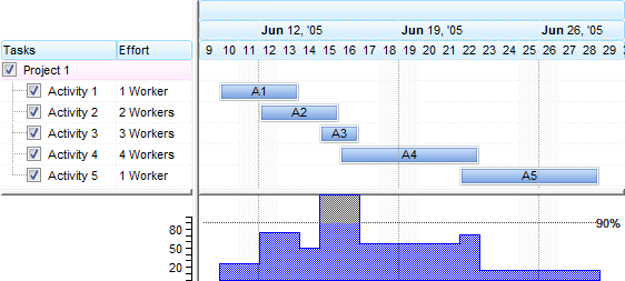
The representation of the exBarEffort value depends on the HistogramType property as follow:
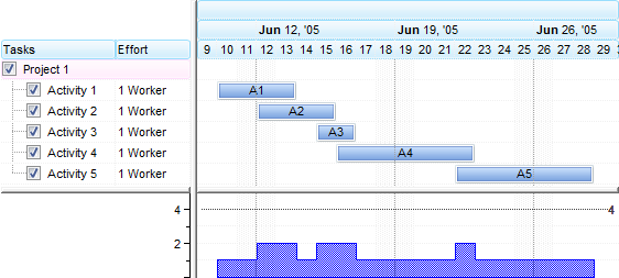
- exHistOverload, the exBarEffort value represents the effort to execute an unit in the bar. For instance, if the bars display activities the exBarEffort value may represent the number of workers for each activity so the overload histogram displays the total number of workers on the activity.
The following screen shot shows the exHistOverload histogram when exBarEffort property is 1 ( by default ):
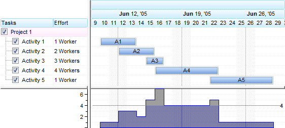
The following screen shot shows the exHistOverload histogram when exBarEffort property is different for bars as seen in the columns section:
- exHistOverAllocation, the exBarEffort value defines the workload to show in the exHistOverAllocation histogram. The work-load for a task is computed as exBarEffort / length of the bar. The work-load for the task is the work effor / task duration. (i.e. If item.exBarEffort = 1 and gantt bar length is 10 days, then the work-load = 0.1 or 10%). The histogram- graph shows the sum of the work-loads (the work-load of each task item is added, unit by unit).
The following screen shot shows the exHistOverallocation histogram when exBarEffort property is 1 ( by default ):
The following screen shot shows the exHistOverallocation histogram when exBarEffort property is different for bars as seen in the columns section:
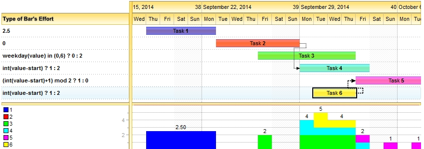
Starting from version 14.0, the exBarEffort could be:
- a numeric value which it is applied for all units in the task
- a string that indicates the expression/formula to get the effort of the bar to be represented on the chart's histogram. The value keyword indicates the date-time being queried, the start and end keywords specify the starting and ending points of the bar as indicated by exBarStart and exBarEnd fields in the ItemBar property. For instance, the exBarEffort on "weekday(value) in (0,6) ? 0 : 2", means that that effort to do the job is 2 for any day in the task, excepts the Sundays(0) and Saturdays(6) (weekend)
Here's a few samples of using the exBarEffort:
- 2.5 means that effort to do the job is 2.5 for any day in the task
- 0 means that the task has no representation on the chart's histogram
- "weekday(value) in (0,6) ? 0 : 2", means that that effort to do the job is 2 for any day, excepts the Sundays(0) and Saturdays(6)
- "weekday(value) = 1 ? 2 : 1" indicates that the effort to do the job is 2 for Mondays(1), else 1
- "month (value) = 7 ? 1 : 0", indicates that the effort to do the job is 1 for any day in July, and 0 for any other
- "(month(value)=month(value+1)) ? 1 : 0", indicates that the effort to do the job is 1 for any day, excepts the last day in the month.
- "int(value-start) ? 1 : 2" indicates that the effort to do the job is 2 for the first day in the task, and 1 for the others.
- "(int(value-start) and int(end-value) != 0 ) ? 1 : 2" indicates that the effort to do the job is 2 for the first and last days in the task, and 1 for the others.
- "int(value-start) in (0,1,2) ? 1 : 2" indicates that the effort to do the job is 1 for the first three (0,1,2) days in the task, and 1 for the others.
- "(int(value-start)+1) mod 2 ? 1 : 0" indicates that the effort to do the job is 1 for the first day, 0 for the second day, 1 for the third day, 0 for the forth day, and so on.
Here's a screen shot of a few exBarEffort samples:
Here's what you can represent with the exBarEffort property:
- Click here
 to watch the movie on how you can use expressions on exBarEffort.
The supported keywords are:
- value which indicates the date-time being queried
- start and end specify the starting and ending points of the bar as indicated by exBarStart and exBarEnd fields in the ItemBar property.
This property supports auto-numbering (index, pos, ...) expressions as described here. This property/method supports predefined constants and operators/functions as described here.
(Float expression [or String expression (starting with version 14.0)])
(Date expression)
(Date expression)
(Date expression)
(Date expression)
(Boolean expression)
(Long expression, from 0 to 100, where 100 means fully transparent)
(Boolean expression)
(Boolean expression)
(Boolean expression)
(Boolean expression)
(Color expression)
By default, the exSummaryBarBackColor property is 0, which means that it has no effect.
If the exSummaryBarBackColor property is set to a non- zero value it indicates the background color for the portion of the summary bar as seen in the following screen shot:
The following screen shot shows the bars that belongs to a summary bars using EBN colors and semi-transparent (exSummaryBarBackColorTransparent = 50):
The exBarBackColor property specifies the background color for the portion occupied by the bar, while the exBarColor property specifies the bar's color.
(Color expression)
The following screen shot displays the bars that belongs to a summary bar using a semi-transparent color ( so the non-working portion is visible )
(Long expression between 0-opaque, 100-transparent)
(Float expression)
This option has effect only if:
- AllowNonworkingBars property is True.
- ItemNonworkingUnits property is not empty, and points to a valid expression. The ItemNonworkingUnits property indicates a repetitive expression to determine the parts of the item being non-working.
In other words, the exBarTreatAsNonworking bars are treated as regular bars if the AllowNonworkingBars property is False, or if ItemNonworkingUnits property is empty
(Boolean expression)
(Color expression)
(Color expression)
The color to specify the bar in the overview area is determined as follows:
- If ItemBar(exBarOverviewColor) property is not 0, the exBarOverviewColor indicates the color to show the bar in the overview area, else
- If OverviewColor property is not 0, the OverviewColor property indicates the color to show the bar in the overview area, else
- If the ItemBar(exBarColor) is not 0, the exBarColor indicates the color to show the bar in the overview area, else
- The Color property of the Bar indicates the color to show the bar in the overview part of the control.
(The bar is represented into the control's overview only if its determined color is not -1)
(Color expression)
(PatternEnum expression)
(VAlignmentEnum expression)
This option supports built-inHTML format including the <%=formula%> tag. The <%=formula%> tag indicates the result of the giving formula. The formula supports value formatting. Inside the formula the %0, %1, ... indicates the value of corresponding property of the bar, such as %0 specifies the exBarName, %1 exBarStart, and so on. The %C0, %C1, ... indicates the cell's values. A bar belongs to an item which displays a cell for each column. The %CIndex indicates the cell on the column with the specified index. For instance, the %C0 indicates the cell on the first column, %C1 specifies the cell in the second column, and so on.
For instance the Items.ItemBar(exBarCaption) = "Duration of <b><%=%9 + ' of ' + %C0%></b> is <%=(%2-%1)%> days" specifies that the bar's caption shows the duration of the bar such as : "Duration of K1 of Task1 is 3 days." where the %9 indicates the exBarKey, while %2 is exBarEnd and %1 is exBarStart. Using the <%=formula%> html TAG, you will be able to format the bar's caption to display its content based on the current properties of the bar, without having to redefine the caption once a bar is updated.
The following VB sample adds a single extra caption in the right side of the bar:
With G2antt1.Items
    .ItemBar(.FocusItem, .FirstItemBar(.FocusItem), exBarExtraCaption) = "right"
    .ItemBar(.FocusItem, .FirstItemBar(.FocusItem), exBarExtraCaptionHAlign) = RightAlignment Or exHOutside
End With
The following VB sample adds two extra captions, one in the left side, and one to the right side:
With G2antt1.Items
    .ItemBar(.FocusItem, .FirstItemBar(.FocusItem), exBarExtraCaption) = Array("left", "right")
    .ItemBar(.FocusItem, .FirstItemBar(.FocusItem), exBarExtraCaptionHAlign) = Array(LeftAlignment Or exHOutside, RightAlignment Or exHOutside)
End With
When retrieving the exBarExtraCaption returns the extra caption, if there is only, one, else it returns a safe arrea ( collection ) of string that indicates the extra captions of the bar.
The following VB/NET sample adds a single extra caption in the right side of the bar:
With Exg2antt1.Items
    .set_BarExtraCaption(.FocusItem, .get_FirstItemBar(.FocusItem), "right")
    .set_BarExtraCaptionHAlign(.FocusItem, .get_FirstItemBar(.FocusItem), exontrol.EXG2ANTTLib.AlignmentEnum.RightAlignment Or exontrol.EXG2ANTTLib.AlignmentEnum.exHOutside)
End With
The following VB/NET sample adds two extra captions, one in the left side, and one to the right side:
With Exg2antt1.Items
    .set_BarExtraCaption(.FocusItem, .get_FirstItemBar(.FocusItem), New String() {"left", "right"})
    .set_BarExtraCaptionHAlign(.FocusItem, .get_FirstItemBar(.FocusItem), _
    New exontrol.EXG2ANTTLib.AlignmentEnum() {exontrol.EXG2ANTTLib.AlignmentEnum.LeftAlignment Or exontrol.EXG2ANTTLib.AlignmentEnum.exHOutside, _
        exontrol.EXG2ANTTLib.AlignmentEnum.RightAlignment Or exontrol.EXG2ANTTLib.AlignmentEnum.exHOutside})
End With
The following C# sample adds a single extra caption in the right side of the bar:
exontrol.EXG2ANTTLib.Items items = exg2antt1.Items;
items.set_BarExtraCaption(items.FocusItem, items.get_FirstItemBar(items.FocusItem), "right");
items.set_BarExtraCaptionHAlign(items.FocusItem, items.get_FirstItemBar(items.FocusItem), exontrol.EXG2ANTTLib.AlignmentEnum.RightAlignment | exontrol.EXG2ANTTLib.AlignmentEnum.exHOutside);
The following C# sample adds two extra captions, one in the left side, and one to the right side:
exontrol.EXG2ANTTLib.Items items = exg2antt1.Items;
items.set_BarExtraCaption(items.FocusItem, items.get_FirstItemBar(items.FocusItem),
    new string[2] { "left", "right" });
items.set_BarExtraCaptionHAlign(items.FocusItem, items.get_FirstItemBar(items.FocusItem),
    new exontrol.EXG2ANTTLib.AlignmentEnum[2] { exontrol.EXG2ANTTLib.AlignmentEnum.LeftAlignment | exontrol.EXG2ANTTLib.AlignmentEnum.exHOutside,
        exontrol.EXG2ANTTLib.AlignmentEnum.RightAlignment | exontrol.EXG2ANTTLib.AlignmentEnum.exHOutside });
The following picture shows a bar with its default caption and two other additional captions.
(HTML string expression or safe array of HTML string expressions)
If the exBarExtraCaptionHAlign property is:
- 0,1 or 2 the caption is not clipped and it is aligned to the left, center or right side of the bar ( no clip ).
- 3, 4 or 5 the caption of the bar gets clipped to the bar's client area, else the caption is aligned to the left, center or right side of the bar ( clip, inside ).
- 6, 7 or 8 the bar's caption is hidden if its size is less or equal with MinUnitWidth property, else if it does not fit the bar's client are, gets clipped or else fully aligned to left, center or right side of the bar. ( hide if min, clip if not fit, inside ).
- 9, 10 or 11 the bar's caption is hidden if it does not fit entirely into the bar's client area, else it is fully displayed aligned to the left, center or right side of the bar. ( hide if not fit, no clip, inside ).
- 12, 13 or 14 the bar's caption is displayed inside of the bar's client area if it fits entirely, else it is displayed outside of the bar aligned to the left, center or right. ( no clip, inside, outside ).
- 16, 17, 18, the bar's caption is displayed outside of the bar to the left or to the right. ( no clip, outside ).
Also, the field supports the following flag (OR combination with any other value):
- 32 (0x20), which indicates that the bar's caption fits the bar and view (that bar's caption is aligned relative to the horizontal-intersection of the bar with the view) (for instance, 33 {number}, (1 + 32) the item-bar's caption is always shown within the center (horizontally) of item-bar intersected with the current view)
By default, the exBarExtraCaptionHAlign is CenterAlignment (1, no clip, center )
The following VB sample adds a single extra caption in the right side of the bar:
With G2antt1.Items
    .ItemBar(.FocusItem, .FirstItemBar(.FocusItem), exBarExtraCaption) = "right"
    .ItemBar(.FocusItem, .FirstItemBar(.FocusItem), exBarExtraCaptionHAlign) = RightAlignment Or exHOutside
    .ItemBar(.FocusItem, .FirstItemBar(.FocusItem), exBarExtraCaptionVAlign) = exBottom Or exVOutside
End With
The following VB sample adds two extra captions, one in the left side, and one to the right side:
With G2antt1.Items
    .ItemBar(.FocusItem, .FirstItemBar(.FocusItem), exBarExtraCaption) = Array("left", "right")
    .ItemBar(.FocusItem, .FirstItemBar(.FocusItem), exBarExtraCaptionHAlign) = Array(LeftAlignment Or exHOutside, RightAlignment Or exHOutside)
    .ItemBar(.FocusItem, .FirstItemBar(.FocusItem), exBarExtraCaptionVAlign) = Array(exTop Or exVOutside, exBottom Or exVOutside)
End With
When retrieving the exBarExtraCaption returns the extra caption, if there is only one, else it returns a safe array ( collection ) of string that indicates the extra captions of the bar.
The following VB/NET sample adds a single extra caption in the right side of the bar:
With Exg2antt1.Items
    .set_BarExtraCaption(.FocusItem, .get_FirstItemBar(.FocusItem), "right")
    .set_BarExtraCaptionHAlign(.FocusItem, .get_FirstItemBar(.FocusItem), exontrol.EXG2ANTTLib.AlignmentEnum.RightAlignment Or exontrol.EXG2ANTTLib.AlignmentEnum.exHOutside)
    .set_BarExtraCaptionVAlign(.FocusItem, .get_FirstItemBar(.FocusItem), exontrol.EXG2ANTTLib.VAlignmentEnum.exBottom Or exontrol.EXG2ANTTLib.VAlignmentEnum.exVOutside)
End With
The following VB/NET sample adds two extra captions, one in the left side, and one to the right side:
With Exg2antt1.Items
    .set_BarExtraCaption(.FocusItem, .get_FirstItemBar(.FocusItem), New String() {"left", "right"})
    .set_BarExtraCaptionHAlign(.FocusItem, .get_FirstItemBar(.FocusItem), _
    New exontrol.EXG2ANTTLib.AlignmentEnum() {exontrol.EXG2ANTTLib.AlignmentEnum.LeftAlignment Or exontrol.EXG2ANTTLib.AlignmentEnum.exHOutside, _
        exontrol.EXG2ANTTLib.AlignmentEnum.RightAlignment Or exontrol.EXG2ANTTLib.AlignmentEnum.exHOutside})
    .set_BarExtraCaptionVAlign(.FocusItem, .get_FirstItemBar(.FocusItem), _
    New exontrol.EXG2ANTTLib.VAlignmentEnum() {exontrol.EXG2ANTTLib.VAlignmentEnum.exTop Or exontrol.EXG2ANTTLib.VAlignmentEnum.exVOutside, _
        exontrol.EXG2ANTTLib.VAlignmentEnum.exBottom Or exontrol.EXG2ANTTLib.VAlignmentEnum.exVOutside})
End With
The following C# sample adds a single extra caption in the right side of the bar:
exontrol.EXG2ANTTLib.Items items = exg2antt1.Items;
items.set_BarExtraCaption(items.FocusItem, items.get_FirstItemBar(items.FocusItem), "right");
items.set_BarExtraCaptionHAlign(items.FocusItem, items.get_FirstItemBar(items.FocusItem), exontrol.EXG2ANTTLib.AlignmentEnum.RightAlignment | exontrol.EXG2ANTTLib.AlignmentEnum.exHOutside);
items.set_BarExtraCaptionVAlign(items.FocusItem, items.get_FirstItemBar(items.FocusItem), exontrol.EXG2ANTTLib.VAlignmentEnum.exBottom | exontrol.EXG2ANTTLib.VAlignmentEnum.exVOutside);
The following C# sample adds two extra captions, one in the left side, and one to the right side:
exontrol.EXG2ANTTLib.Items items = exg2antt1.Items;
items.set_BarExtraCaption(items.FocusItem, items.get_FirstItemBar(items.FocusItem),
    new string[2] { "left", "right" });
items.set_BarExtraCaptionHAlign(items.FocusItem, items.get_FirstItemBar(items.FocusItem),
    new exontrol.EXG2ANTTLib.AlignmentEnum[2] { exontrol.EXG2ANTTLib.AlignmentEnum.LeftAlignment | exontrol.EXG2ANTTLib.AlignmentEnum.exHOutside,
exontrol.EXG2ANTTLib.AlignmentEnum.RightAlignment | exontrol.EXG2ANTTLib.AlignmentEnum.exHOutside });
items.set_BarExtraCaptionVAlign(items.FocusItem, items.get_FirstItemBar(items.FocusItem),
    new exontrol.EXG2ANTTLib.VAlignmentEnum[2] { exontrol.EXG2ANTTLib.VAlignmentEnum.exTop | exontrol.EXG2ANTTLib.VAlignmentEnum.exVOutside,
exontrol.EXG2ANTTLib.VAlignmentEnum.exBottom | exontrol.EXG2ANTTLib.VAlignmentEnum.exVOutside });
( AlignmentEnum expression, or a safe array of AlignmentEnum/long/vt_i4 expression )
The following VB sample adds a single extra caption in the right side of the bar:
With G2antt1.Items
    .ItemBar(.FocusItem, .FirstItemBar(.FocusItem), exBarExtraCaption) = "right"
    .ItemBar(.FocusItem, .FirstItemBar(.FocusItem), exBarExtraCaptionHAlign) = RightAlignment Or exHOutside
    .ItemBar(.FocusItem, .FirstItemBar(.FocusItem), exBarExtraCaptionVAlign) = exBottom Or exVOutside
End With
The following VB sample adds two extra captions, one in the left side, and one to the right side:
With G2antt1.Items
    .ItemBar(.FocusItem, .FirstItemBar(.FocusItem), exBarExtraCaption) = Array("left", "right")
    .ItemBar(.FocusItem, .FirstItemBar(.FocusItem), exBarExtraCaptionHAlign) = Array(LeftAlignment Or exHOutside, RightAlignment Or exHOutside)
    .ItemBar(.FocusItem, .FirstItemBar(.FocusItem), exBarExtraCaptionVAlign) = Array(exTop Or exVOutside, exBottom Or exVOutside)
End With
When retrieving the exBarExtraCaption returns the extra caption, if there is only one, else it returns a safe array ( collection ) of string that indicates the extra captions of the bar.
The following VB/NET sample adds a single extra caption in the right side of the bar:
With Exg2antt1.Items
    .set_BarExtraCaption(.FocusItem, .get_FirstItemBar(.FocusItem), "right")
    .set_BarExtraCaptionHAlign(.FocusItem, .get_FirstItemBar(.FocusItem), exontrol.EXG2ANTTLib.AlignmentEnum.RightAlignment Or exontrol.EXG2ANTTLib.AlignmentEnum.exHOutside)
    .set_BarExtraCaptionVAlign(.FocusItem, .get_FirstItemBar(.FocusItem), exontrol.EXG2ANTTLib.VAlignmentEnum.exBottom Or exontrol.EXG2ANTTLib.VAlignmentEnum.exVOutside)
End With
The following VB/NET sample adds two extra captions, one in the left side, and one to the right side:
With Exg2antt1.Items
    .set_BarExtraCaption(.FocusItem, .get_FirstItemBar(.FocusItem), New String() {"left", "right"})
    .set_BarExtraCaptionHAlign(.FocusItem, .get_FirstItemBar(.FocusItem), _
    New exontrol.EXG2ANTTLib.AlignmentEnum() {exontrol.EXG2ANTTLib.AlignmentEnum.LeftAlignment Or exontrol.EXG2ANTTLib.AlignmentEnum.exHOutside, _
        exontrol.EXG2ANTTLib.AlignmentEnum.RightAlignment Or exontrol.EXG2ANTTLib.AlignmentEnum.exHOutside})
    .set_BarExtraCaptionVAlign(.FocusItem, .get_FirstItemBar(.FocusItem), _
    New exontrol.EXG2ANTTLib.VAlignmentEnum() {exontrol.EXG2ANTTLib.VAlignmentEnum.exTop Or exontrol.EXG2ANTTLib.VAlignmentEnum.exVOutside, _
        exontrol.EXG2ANTTLib.VAlignmentEnum.exBottom Or exontrol.EXG2ANTTLib.VAlignmentEnum.exVOutside})
End With
The following C# sample adds a single extra caption in the right side of the bar:
exontrol.EXG2ANTTLib.Items items = exg2antt1.Items;
items.set_BarExtraCaption(items.FocusItem, items.get_FirstItemBar(items.FocusItem), "right");
items.set_BarExtraCaptionHAlign(items.FocusItem, items.get_FirstItemBar(items.FocusItem), exontrol.EXG2ANTTLib.AlignmentEnum.RightAlignment | exontrol.EXG2ANTTLib.AlignmentEnum.exHOutside);
items.set_BarExtraCaptionVAlign(items.FocusItem, items.get_FirstItemBar(items.FocusItem), exontrol.EXG2ANTTLib.VAlignmentEnum.exBottom | exontrol.EXG2ANTTLib.VAlignmentEnum.exVOutside);
The following C# sample adds two extra captions, one in the left side, and one to the right side:
exontrol.EXG2ANTTLib.Items items = exg2antt1.Items;
items.set_BarExtraCaption(items.FocusItem, items.get_FirstItemBar(items.FocusItem),
    new string[2] { "left", "right" });
items.set_BarExtraCaptionHAlign(items.FocusItem, items.get_FirstItemBar(items.FocusItem),
    new exontrol.EXG2ANTTLib.AlignmentEnum[2] { exontrol.EXG2ANTTLib.AlignmentEnum.LeftAlignment | exontrol.EXG2ANTTLib.AlignmentEnum.exHOutside,
exontrol.EXG2ANTTLib.AlignmentEnum.RightAlignment | exontrol.EXG2ANTTLib.AlignmentEnum.exHOutside });
items.set_BarExtraCaptionVAlign(items.FocusItem, items.get_FirstItemBar(items.FocusItem),
    new exontrol.EXG2ANTTLib.VAlignmentEnum[2] { exontrol.EXG2ANTTLib.VAlignmentEnum.exTop | exontrol.EXG2ANTTLib.VAlignmentEnum.exVOutside,
exontrol.EXG2ANTTLib.VAlignmentEnum.exBottom | exontrol.EXG2ANTTLib.VAlignmentEnum.exVOutside });
( VAlignmentEnum expression, or a safe array of VAlignmentEnum/long/vt_i4 expression)
The following VB sample adds a single extra caption in the right side of the bar:
With G2antt1.Items
    .ItemBar(.FocusItem, .FirstItemBar(.FocusItem), exBarExtraCaption) = "right"
    .ItemBar(.FocusItem, .FirstItemBar(.FocusItem), exBarExtraCaptionHAlign) = RightAlignment Or exHOutside
    .ItemBar(.FocusItem, .FirstItemBar(.FocusItem), exBarExtraCaptionVAlign) = exBottom Or exVOutside
    .ItemBar(.FocusItem, .FirstItemBar(.FocusItem), exBarExtraCaptionHOffset) = 8
End With
The following VB sample adds two extra captions, one in the left side, and one to the right side:
With G2antt1.Items
    .ItemBar(.FocusItem, .FirstItemBar(.FocusItem), exBarExtraCaption) = Array("left", "right")
    .ItemBar(.FocusItem, .FirstItemBar(.FocusItem), exBarExtraCaptionHAlign) = Array(LeftAlignment Or exHOutside, RightAlignment Or exHOutside)
    .ItemBar(.FocusItem, .FirstItemBar(.FocusItem), exBarExtraCaptionVAlign) = Array(exTop Or exVOutside, exBottom Or exVOutside)
    .ItemBar(.FocusItem, .FirstItemBar(.FocusItem), exBarExtraCaptionHOffset) = Array(-8, 8)
End With
When retrieving the exBarExtraCaption returns the extra caption, if there is only one, else it returns a safe array ( collection ) of string that indicates the extra captions of the bar.
The following VB/NET sample adds a single extra caption in the right side of the bar:
With Exg2antt1.Items
    .set_BarExtraCaption(.FocusItem, .get_FirstItemBar(.FocusItem), "right")
    .set_BarExtraCaptionHAlign(.FocusItem, .get_FirstItemBar(.FocusItem), exontrol.EXG2ANTTLib.AlignmentEnum.RightAlignment Or exontrol.EXG2ANTTLib.AlignmentEnum.exHOutside)
    .set_BarExtraCaptionVAlign(.FocusItem, .get_FirstItemBar(.FocusItem), exontrol.EXG2ANTTLib.VAlignmentEnum.exBottom Or exontrol.EXG2ANTTLib.VAlignmentEnum.exVOutside)
    .set_BarExtraCaptionHOffset(.FocusItem, .get_FirstItemBar(.FocusItem), 8)
End With
The following VB/NET sample adds two extra captions, one in the left side, and one to the right side:
With Exg2antt1.Items
    .set_BarExtraCaption(.FocusItem, .get_FirstItemBar(.FocusItem), New String() {"left", "right"})
    .set_BarExtraCaptionHAlign(.FocusItem, .get_FirstItemBar(.FocusItem), _
    New exontrol.EXG2ANTTLib.AlignmentEnum() {exontrol.EXG2ANTTLib.AlignmentEnum.LeftAlignment Or exontrol.EXG2ANTTLib.AlignmentEnum.exHOutside, _
        exontrol.EXG2ANTTLib.AlignmentEnum.RightAlignment Or exontrol.EXG2ANTTLib.AlignmentEnum.exHOutside})
    .set_BarExtraCaptionVAlign(.FocusItem, .get_FirstItemBar(.FocusItem), _
    New exontrol.EXG2ANTTLib.VAlignmentEnum() {exontrol.EXG2ANTTLib.VAlignmentEnum.exTop Or exontrol.EXG2ANTTLib.VAlignmentEnum.exVOutside, _
        exontrol.EXG2ANTTLib.VAlignmentEnum.exBottom Or exontrol.EXG2ANTTLib.VAlignmentEnum.exVOutside})
    .set_BarExtraCaptionHOffset(.FocusItem, .get_FirstItemBar(.FocusItem), _
                New Integer() {-8, 8})
End With
The following C# sample adds a single extra caption in the right side of the bar:
exontrol.EXG2ANTTLib.Items items = exg2antt1.Items;
items.set_BarExtraCaption(items.FocusItem, items.get_FirstItemBar(items.FocusItem), "right");
items.set_BarExtraCaptionHAlign(items.FocusItem, items.get_FirstItemBar(items.FocusItem), exontrol.EXG2ANTTLib.AlignmentEnum.RightAlignment | exontrol.EXG2ANTTLib.AlignmentEnum.exHOutside);
items.set_BarExtraCaptionVAlign(items.FocusItem, items.get_FirstItemBar(items.FocusItem), exontrol.EXG2ANTTLib.VAlignmentEnum.exBottom | exontrol.EXG2ANTTLib.VAlignmentEnum.exVOutside);
items.set_BarExtraCaptionHOffset(items.FocusItem, items.get_FirstItemBar(items.FocusItem), 8);
The following C# sample adds two extra captions, one in the left side, and one to the right side:
exontrol.EXG2ANTTLib.Items items = exg2antt1.Items;
items.set_BarExtraCaption(items.FocusItem, items.get_FirstItemBar(items.FocusItem),
    new string[2] { "left", "right" });
items.set_BarExtraCaptionHAlign(items.FocusItem, items.get_FirstItemBar(items.FocusItem),
    new exontrol.EXG2ANTTLib.AlignmentEnum[2] { exontrol.EXG2ANTTLib.AlignmentEnum.LeftAlignment | exontrol.EXG2ANTTLib.AlignmentEnum.exHOutside,
exontrol.EXG2ANTTLib.AlignmentEnum.RightAlignment | exontrol.EXG2ANTTLib.AlignmentEnum.exHOutside });
items.set_BarExtraCaptionVAlign(items.FocusItem, items.get_FirstItemBar(items.FocusItem),
    new exontrol.EXG2ANTTLib.VAlignmentEnum[2] { exontrol.EXG2ANTTLib.VAlignmentEnum.exTop | exontrol.EXG2ANTTLib.VAlignmentEnum.exVOutside,
exontrol.EXG2ANTTLib.VAlignmentEnum.exBottom | exontrol.EXG2ANTTLib.VAlignmentEnum.exVOutside });
items.set_BarExtraCaptionHOffset(items.FocusItem, items.get_FirstItemBar(items.FocusItem),
    new int[2] { -8, 8 });
(long expression, or a safe array of long/vt_i4 expression)
(long expression, or a safe array of long/vt_i4 expression)
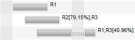
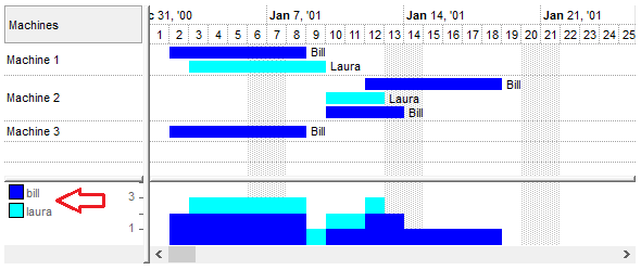
This property specifies the list of resources associated with the bar. The exBarResources property (get/set) defines which resources are assigned to the current bar within the Source. The format for specifying resources is "name[usage%], name[usage%], ...".
Resources are separated by commas (,). Each resource entry consists of two parts:
- name, the name of the resource. It may contain letters (A-Z, a-z), digits (0-9), spaces, or underscore characters (_). The name uniquely identifies the resource.
- usage, a number between 0 and 100 representing the percentage of the resource�s usage allocated to the bar. This value can be a decimal number, where the decimal separator is a dot (.). For example, 75.5 means 75.5%.
If the usage value is omitted, it defaults to 100%, meaning the entire resource is used by the bar.
For instance, "CPU[75.5%], Memory[50%], Disk", the CPU resource is used at 75.5%, Memory at 50%, and Disk resource is used at 100% by default since no usage is specified. This option can be used with the PutRes method.
You can use the exBarCaption to display the bar's resources using the <%=formula%> format, like in the following VB sample:
With G2antt1.Chart.Bars("Task")
    .Def(EXG2ANTTLibCtl.ItemBarPropertyEnum.exBarCaption) = "<%=%" & EXG2ANTTLibCtl.ItemBarPropertyEnum.exBarResources & "%>"
    .Def(EXG2ANTTLibCtl.ItemBarPropertyEnum.exBarHAlignCaption) = 18
End With
In other words, the sample allows you to display the bar's exBarResources property as shown bellow:
The set operation for the exBarResources property supports three formats, determined by the first character of the assigned value:
- If the first character is a plus sign (+), the rest of the expression specifies resources to be added to the current bar�s resources.
For example, if the current exBarResources value is "R1,R2" and you set it to "+R3", the resource R3 is added, resulting in "R1,R2,R3"- If the first character is a minus sign (-), the rest of the expression specifies resources to be removed from the current bar�s resources.
For example, if the current exBarResources value is "R1,R2" and you set it to "-R2", the resource R2 is removed, resulting in "R1"- If the first character is neither + nor -, the entire expression replaces the current exBarResources value.
For example, if the current value is "R1,R2" and you set it to "R3,R4", the new value becomes "R3,R4"
(String expression)
With G2antt1.Chart.Bars("Task")
    .Def(exBarResourceFormat) = "`<b>` + name + `</b><font ;5><fgcolor=404040>` + (percent = 1 ? `` : (round(100*percent) format ``) + `%` ) + `</fgcolor></font>`"
    .Def(EXG2ANTTLibCtl.ItemBarPropertyEnum.exBarCaption) = "<%=%" & EXG2ANTTLibCtl.ItemBarPropertyEnum.exBarResourcesFormat & "%>"
    .Def(EXG2ANTTLibCtl.ItemBarPropertyEnum.exBarHAlignCaption) = 18
End With
In other words, the sample allows you to display the bar's exBarResources property as shown bellow:
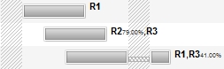
(String expression)
The following screen shot shows a symbol using the exBarFrameColor:
The following sample adds a Task bar with a Red frame:
With G2antt1.Items
	h = .AddItem("Red-Frame")
	.AddBar h,"Task",#1/3/2001#,#1/6/2001#,"K1"
	.ItemBar(h,"K1",exBarFrameColor) = RGB(255,0,0)
End With
The following sample adds a Task bar with an EBN frame:
With G2antt1
	.VisualAppearance.Add 1,".../tickers.ebn"
	With .Items
		h = .AddItem("EBN-Frame")
		.AddBar h,"Task",#1/3/2001#,#1/6/2001#,"K1"
		.ItemBar(h,"K1",exBarFrameColor) = &H1000000
	End With
End Withh
(Color expression)
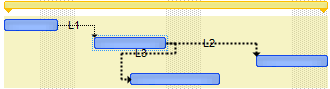
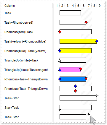
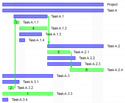
The following screen shot shows the bars arranged on cascade, K1, K2, K3 on the first level, and the T1, T2, T3 on the second level.
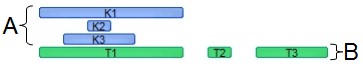
The bars get arranged into a cascade/levels based on the key ( exOverlaidBarsCascade ). The T1, T2, T3 are shown on the same level "B", as they have the same exBarOverlaidCascade key, and does not intersect the K1, K2, K3 level "A".
For instance the following sample:
Items.ItemBar(0,"<K*>",exBarOverlaidKey) = "A"
Items.ItemBar(0,"<T*>",exBarOverlaidKey) = "B"
specifies that the K* bars ( all bars with the key starting with the K character ), should be displayed on the same level "A", and the T* bars on the level "B", which indicates that the A will be displayed as the first level, and the B as the second level. In other words, the cascades/levels are being displayed in their alphabetic order.
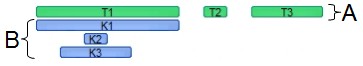
If we exchange the "A" with "B" like in the following sample:
Items.ItemBar(0,"<K*>",exBarOverlaidKey) = "B"
Items.ItemBar(0,"<T*>",exBarOverlaidKey) = "A"
we get the following screen show
(Variant expression)
The following screen shot shows a few options you can have by using the EBN String Format on bars/tasks:
The EBN String Format syntax in BNF notation is defined like follows:
<EBN> ::= <elements> | <root> "(" [<elements>] ")"
<elements> ::= <element> [ "," <elements> ]
<root> ::= "root" [ <attributes> ] | [ <attributes> ]
<element> ::= <anchor> [ <attributes> ] [ "(" [<elements>] ")" ]
<anchor> ::= "none" | "left" | "right" | "client" | "top" | "bottom"
<attributes> ::= "[" [<client> ","] <attribute> [ "," <attributes> ] "]"
<client> ::= <expression> | <expression> "," <expression> "," <expression> "," <expression>
<expression> ::= <number> | <number> "%"
<attribute> ::= <backcolor> | <text> | <wordwrap> | <align> | <pattern> | <patterncolor> | <frame> | <framethick> | <data> | <others>
<equal> ::= "="
<digit> ::= 0 | 1 | 2 | 3 | 4 | 5 | 6 | 7 | 8 | 9
<decimal> ::= <digit><decimal>
<hexadigit> ::= <digit> | "A" | "B"  "C" | "D" | "E"  "F"
<hexa> ::= <hexadigit><hexa>
<number> ::= <decimal> | "0x" <hexa>
<color> ::= <rgbcolor> | number
<rgbcolor> ::= "RGB" "(" <number> "," <number> "," <number> ")"
<string> ::= "`" <characters> "`" | "'" <characters> "'" | " <characters> "
<characters> ::= <char>|<characters>
<char> ::= <any_character_excepts_null>
<backcolor> ::= "back" <equal> <color>
<text> ::= "text" <equal> <string>
<align> ::= "align" <equal> <number>
<pattern> ::= "pattern" <equal> <number>
<patterncolor> ::= "patterncolor" <equal> <color>
<frame> ::= "frame" <equal> <color>
<data> ::= "data" <equal> <number> | <string>
<framethick> ::= "framethick"
<wordwrap> ::= "wordwrap"
Others like: pic, stretch, hstretch, vstretch, transparent, from, to are reserved for future use only.
Here's a few easy samples:
-
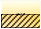
"[pattern=6]", shows the BDiagonal pattern on the object's background.
-
"[frame=RGB(255,0,0),framethick]", draws a red thick-border around the object.
-
"[frame=RGB(255,0,0),framethick,pattern=6,patterncolor=RGB(255,0,0)]", draws a red thick-border around the object, with a patter inside.
-
"[[patterncolor=RGB(255,0,0)](none[(4,4,100%-8,100%-8),pattern=0x006,patterncolor=RGB(255,0,0),frame=RGB(255,0,0),framethick])]", draws a red thick-border around the object, with a patter inside, with a 4-pixels wide padding:
-
"top[4,back=RGB(0,0,255)]", draws a blue line on the top side of the object's background, of 4-pixels wide.
-
"[text=`caption`,align=0x22]", shows the caption string aligned to the bottom-right side of the object's background.
-
"[text=`<img>flag</img>`,align=0x11]" shows the flag picture and the sweden string aligned to the bottom side of the object.
-
"left[10,back=RGB(255,0,0)]", draws a red line on the left side of the object's background, of 10-pixels wide.
-
"bottom[50%,pattern=6,frame]", shows the BDiagonal pattern with a border arround on the lower-half part of the object's background.
-
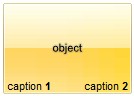
"root[text=`caption <b>2`,align=0x22](client[text=`caption <b>1`,align=0x20])", shows the caption 1 aligned to the bottom-left side, and the caption 2 to the bottom-right side
(String expression)
The exBarBackgroundExtFlagssupports a combination of the following values:
- 0, the exBarBackgroundExt is applied in front, using the bar's client area. The Height of the bar specifies the height of the bar, and so it defines the bar's client area.
- 1, the exBarBackgroundExt is applied on the back of the bar. If missing, the exBarBackgroundExt is applied on front.
- 2, the exBarBackgroundExt is uses the bar's background client are to show the exBarBackgroundExt option. The Height of the item that hosts the bar specifies the client area of the bar's background. If missing, the bar's client area is used instead.
(Long expression, between 0 and 3, by default it is 0)
(Long expression, which indicates that all margins of the extension is increased or decreased with specified value, a String expression such as "left,top,right,bottom", to specify different margins for the portion to show the extension)
(Boolean expression)
(Boolean expression)
(short expression)
(short expression)
This option supports built-in HTML format including the <%=formula%> tag. The <%=formula%> tag indicates the result of the giving formula. The formula supports value formatting.
The formula supports the following keywords:
- %0, %1, %2, ...{any} specifies the value of the item-bar's property index 0(exBarName), 1(exBarStart), 2(exBarEnd), ... The ItemBar property defines the item-bar's property, such as name/type, start, end and so on. For example, "<%=shortdate(%2)%>" displays the bar's end-margin in short-format. For instance: "<%=((1:=int(0:= (%258))) != 0 ? (=:1 + ' day(s)') : '') + (=:1 ? ' ' : '' ) + ((1:=int(0:=((=:0 - =:1 + 1/24/60/60/2)*24))) != 0 ? =:1 + ' hour(s)' : '' ) + (=:1 ? ' ' : '' ) + ((1:=round((=:0 - =:1)*60)) != 0 ? =:1 + ' min(s)' : '')%>" displays automatically the bar's duration in days, hours and minutes.
- %C0, %C1, %C2, ...{string} specifies the caption of the cell, or the string the cell displays in the column with the index 0, 1 2, ... The CellCaption property gets the cell's formatted caption. The cell's displayed string may differ from its actual value. For example, if a cell displays HTML content, %0 returns the HTML format including the tags, while %C0 returns the cell's content as a plain string without HTML tags. For instance, "upper(%C1)" converts the caption of the cell at index 1 to uppercase, while "%C0 left 2" returns the leftmost two characters of the caption in the cell at index 0.
- %CD0, %CD1, %CD2, ...{any} specifies the cell's extra data in the column with the index 0, 1 2, ... The CellData property associates any extra/user data to a cell. For example, "%CD0 = your user data" specifies all cells in the column with index 0 whose CellData property is equal to your user data.
- %CS0, %CS1, %CS2, ...{number} specifies the cell's state in the column with the index 0, 1 2, ... The CellState property defines the state of a cell, indicating whether it is checked or unchecked. For example, "%CS0" identifies all checked items in the column with index 0, while "not %CS1" identifies all unchecked items in the column with index 1.
- %CT0, %CT1, %CT2, ... {boolean} returns true if the cell displays a total field; otherwise, it returns false. The exTotalField / exTotalColumn flag specifies whether the cell displays a total field. For instance, "%CT1" refers to all cells in the second column that display totals, while "not %CT1" refers to all cells in the second column that do not display totals.
- %CE0, %CE1, %CE2, ... {boolean} returns true if the cell is editable; otherwise, it returns false.. For example, "%CE0" refers to all editable cells in the first column, while "not %CE1" refers to all cells in the second column that are read-only.
- %CC0, %CC1, %CC2, ... {number} retrieve the number of child items (this keyword consistently returns identical results for all cells since it pertains to the item that hosts each cell). The ChildCount property returns the number of child items. For example, "%CC0" identifies all parent items, while "%CC0 = 0" identifies all leaf items.
- %CX0, %CX1, %CX2, ... {boolean} returns true if the item hosting the cell is expanded, or false if it is collapsed (this keyword consistently returns identical results for all cells since it pertains to the item that hosts each cell). The ExpandItem property specifically indicates whether the item is expanded or collapsed. For example, "%CX0" refers to all expanded items, while "not %CX0" identifies all collapsed items
For instance the Items.ItemBar(exBarHistLegend) = "<fgcolor=666666><%=lower(%3)%>" defines the bar's histogram-legend as the following screen shot:
This property supports auto-numbering (index, pos, ...) expressions as described here. This property/method supports predefined constants and operators/functions as described here.
(HTML String expression)
- 0 (default), the bar can be resized freely to any value between 0% and 100%
- >0, The bar resizes in fixed steps equal to the specified fraction of 100% of its container. For example:
0.05, the bar moves in 5% increments
0.1, the bar moves in 10% increments
Behavior:
- only applies to user-driven resizing at runtime. Programmatic changes to exBarPercent ignore this step
- ensures that the bar snaps to predictable increments, making layout adjustments more consistent and controlled
(Float expression, between 0 and 1, by default it is 0)
(Long expression)
(Boolean expression)
(Float expression)
(Float expression)
The following VB sample lists the start and end date-time values for non-working parts of the bar ( for the /COM version ):
Private Sub G2antt1_BarResize(ByVal item As EXG2ANTTLibCtl.HITEM, ByVal Key As Variant)
    Debug.Print "Non-working parts of the bar:"
    With G2antt1.Items
        Dim i As Variant, j As Long
        For Each i In .ItemBar(item, Key, exBarNonWorkingUnits)
            Debug.Print IIf(j Mod 2 = 0, "Start ", "End ") & i
            j = j + 1
        Next
    End With
End Sub
The following VB/NET sample lists the start and end date-time values for non-working parts of the bar ( for the /NET Assembly version ):
Private Sub Exg2antt1_BarResize(ByVal sender As System.Object, ByVal Item As System.Int32, ByVal Key As System.Object) Handles Exg2antt1.BarResize
    Debug.Print("Non-working parts of the bar:")
    With Exg2antt1.Items
        Dim i As Object, j As Long
        For Each i In .get_BarNonWorkingUnits(Item, Key)
            Debug.Print(IIf(j Mod 2 = 0, "Start ", "End ") & i)
            j = j + 1
        Next
    End With
End Sub
(safe array of pairs of dates indicating the start and end of the non-working area )
The following VB sample lists the start and end date-time values for non-working parts of the bar ( for the /COM version ):
Private Sub G2antt1_BarResize(ByVal item As EXG2ANTTLibCtl.HITEM, ByVal Key As Variant)
    Debug.Print "Non-working parts of the bar:"
    With G2antt1.Items
        Debug.Print .ItemBar(item, Key, exBarNonWorkingUnitsAsString)
    End With
End Sub
The following VB/NET sample lists the start and end date-time values for non-working parts of the bar ( for the /NET Assembly version ):
Private Sub Exg2antt1_BarResize(ByVal sender As System.Object, ByVal Item As System.Int32, ByVal Key As System.Object) Handles Exg2antt1.BarResize
    Debug.Print("Non-working parts of the bar:")
    With Exg2antt1.Items
        Debug.Print(.get_BarNonWorkingUnitsAsString(Item, Key))
    End With
End Sub
(String expression)
The following VB sample lists the start and end date-time values for working parts of the bar ( for the /COM version ):
Private Sub G2antt1_BarResize(ByVal item As EXG2ANTTLibCtl.HITEM, ByVal Key As Variant)
    Debug.Print "Working parts of the bar:"
    With G2antt1.Items
        Dim i As Variant, j As Long
        For Each i In .ItemBar(item, Key, exBarWorkingUnits)
            Debug.Print IIf(j Mod 2 = 0, "Start ", "End ") & i
            j = j + 1
        Next
    End With
End Sub
The following VB/NET sample lists the start and end date-time values for working parts of the bar ( for the /NET Assembly version ):
Private Sub Exg2antt1_BarResize(ByVal sender As System.Object, ByVal Item As System.Int32, ByVal Key As System.Object) Handles Exg2antt1.BarResize
    Debug.Print("Working parts of the bar:")
    With Exg2antt1.Items
        Dim i As Object, j As Long
        For Each i In .get_BarWorkingUnits(Item, Key)
            Debug.Print(IIf(j Mod 2 = 0, "Start ", "End ") & i)
            j = j + 1
        Next
    End With
End Sub
(safe array of pairs of dates indicating the start and end of the working area)
The following VB sample lists the start and end date-time values for working parts of the bar ( for the /COM version ):
Private Sub G2antt1_BarResize(ByVal item As EXG2ANTTLibCtl.HITEM, ByVal Key As Variant)
    Debug.Print "Working parts of the bar:"
    With G2antt1.Items
        Debug.Print .ItemBar(item, Key, exBarWorkingUnitsAsString)
    End With
End Sub
The following VB/NET sample lists the start and end date-time values for working parts of the bar ( for the /NET Assembly version ):
Private Sub Exg2antt1_BarResize(ByVal sender As System.Object, ByVal Item As System.Int32, ByVal Key As System.Object) Handles Exg2antt1.BarResize
    Debug.Print("Working parts of the bar:")
    With Exg2antt1.Items
        Debug.Print(.get_BarWorkingUnitsAsString(Item, Key))
    End With
End Sub
(String expression)
(Date expression)
(Date expression)
(String expression)
(String expression)
(String expression)
You can automatically specify the critical path position of the bar in its caption using a code like:
Items.ItemBar(0, "<*>", exBarCaption) = "<%=int(%269) > 0 ? %269 : ``%>"
The code, changes the caption of all bars, using an expression that shows the integer ( value of property 269/exBarCriticalPath ) if it is positive, else displays nothing.
The following screen shot shows the critical path, including the position of the bars:
(Currently, Long expression, Previously Boolean expression)
- Finish to Start (FS), the predecessor ends before the successor can begin
- Start to Start (SS), the predecessor begins before the successor can begin
- Finish to Finish (FF), the predecessor ends before the successor can end
- Start to Finish (SF), the predecessor begins before the successor can end
The format of bar's predecessor is INDEX1["SF"|"FS"|"FF"|"SS"][KEY][:["W"]LAG|:LAG["W"]], where
- INDEX1 is the 1-based index of the item that hosts the bar
- followed by the type of the link which can be one any of SF(Start-Finish), FS(Finish-Start), SS(Start-Start) or FF(Finish-Finish) sequence (FS if missing)
- continues with the KEY of the bar (empty is not used)
- and ends with the LAG of the link (specifies the delay the activity is postponed by the link). The "W" indicates a working-lag for the link (specifies the delay in working-units the activity is postponed by the link).
For instance:
- "2FSZ", specifies that the current item-bar is linked with the "Z" bar of the second item (item with the index 1) using a Finish-Start link
- "1SF:-2", adds a Start-Finish link with the bar '' of the first-item, using a lag of -2 days
Changing the ItemBar(exBarPredecessor) property updates the links related to the current bar. The AddLink., RemoveLink, RemoveLinkOf methods adds, removes links. The Background(exPSLinkColorEditSel) property specifies the color to highlight the links being selected within an editable predecessor/successor column. The Background(exPSBarColorEditSel) property specifies the color to highlight the incoming/outgoing bars of the links being selected within an editable predecessor/successor column
(String expression)
A dependency/link is the relationship between predecessor and successor tasks. Tasks may have multiple predecessors or multiple successors. Before you begin establishing dependencies, it�s important to understand that there are four types:
- Finish to Start (FS), the predecessor ends before the successor can begin
- Start to Start (SS), the predecessor begins before the successor can begin
- Finish to Finish (FF), the predecessor ends before the successor can end
- Start to Finish (SF), the predecessor begins before the successor can end
The format of bar's successo is INDEX1["SF"|"FS"|"FF"|"SS"][KEY][:["W"]LAG|:LAG["W"]], where
- INDEX1 is the 1-based index of the item that hosts the bar
- followed by the type of the link which can be one any of SF(Start-Finish), FS(Finish-Start), SS(Start-Start) or FF(Finish-Finish) sequence (FS if missing)
- continues with the KEY of the bar (empty is not used)
- and ends with the LAG of the link (specifies the delay the activity is postponed by the link). The "W" indicates a working-lag for the link (specifies the delay in working-units the activity is postponed by the link).
For instance:
- "3SFy", specifies that the current item-bar is linked with the "y" bar of the third item (item with the index 1) using a Start-Finish link
Changing the ItemBar(exBarSuccessor) property updates the links related to the current bar. The AddLink., RemoveLink, RemoveLinkOf methods adds, removes links.
(String expression)
(Long expression)
(Float expression)
(Float expression)
(Date expression)
(Date expression)
(Float expression)
Specifies the percent from the original bar where the progress bar is
displayed.
Specifies the percent to display the progress on the bar, between 0 and 100.
The exBarPercent100 option does the same thing as exBarPercent excepts that it
works with integer values between 0 and 100, instead float expression from 0 to
1. Use the Add("A%B") to add a
combination of two bars, so the exBarPercent value specifies the percent from
the bar A to be displayed as bar B. For instance, the Add("Task%Progress") adds a combination of Task and Progress bars, so the Task shape is displayed on the full bar, and the Progress shape is displayed only
on the portion determined by the exBarPercent100 value. When you resize the
original bar (A), the inside bar (B) is shown proportionally. For instance, you can use the exBarPercent100 to display and edit values in
the cells, when this property is associated with the cell using the AllowCellValueToItemBar
property. The 0 value corresponds to the exBarStart, while 100 corresponds to
the exBarEnd, so the formula Items.ItemBar(exBarStart) + (Items.ItemBar(exBarEnd)-Items.ItemBar(exBarStart))*Items.ItemBar(exBarPercent100)/100 gives exactly the date
time where progress bar is in the chart.
(Long expression, between 0 and 100)
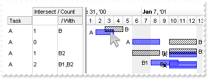
The following screen shot shows the intersection of the bars of type TaskA:
(Safe array of variant expression)
(String expression)
(Long expression)
The following VB/NET sample displays the bars being grouped with selected bar(s):
With Exg2antt1.Items
    Dim sSelected As List(Of exontrol.EXG2ANTTLib.Items.SelectedBar) = .get_SelectedBars()
    If Not sSelected Is Nothing Then
        Dim s As exontrol.EXG2ANTTLib.Items.SelectedBar
        For Each s In sSelected
            Debug.Print(s.Key & " from " & .get_CellCaption(s.Item, 0))
            Dim sGrouped As List(Of exontrol.EXG2ANTTLib.Items.SelectedBar) = .get_BarsGroup(s.Item, s.Key)
            If Not sGrouped Is Nothing Then
                Dim b As exontrol.EXG2ANTTLib.Items.SelectedBar
                For Each b In sGrouped
                    Debug.Print(vbTab & b.Key & " from " & .get_CellCaption(b.Item, 0))
                Next
            End If
        Next
    End If
End With
(Safe array of variant expression)
The following sample displays all links that starts directly from the bar on the cursor:
With G2antt1.Items
    Dim h As HITEM, c As Long, hit As HitTestInfoEnum
    h = G2antt1.ItemFromPoint(-1, -1, c, hit)
    Dim l As Variant
    For Each l In .ItemBar(h, G2antt1.Chart.BarFromPoint(-1, -1), exBarOutgoingLinks)
        Debug.Print "Link: " & l
    Next
End With
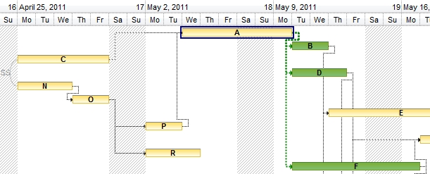
The following sample shows the outgoing bars/links in green ( B, D, F ), when the current bar is A:
(Safe array of variant expression)
The following sample displays the list of links that starts from the bar on the cursor:
With G2antt1.Items
    Dim h As HITEM, c As Long, hit As HitTestInfoEnum
    h = G2antt1.ItemFromPoint(-1, -1, c, hit)
    Debug.Print .ItemBar(h, G2antt1.Chart.BarFromPoint(-1, -1), exBarOutgoingLinksAsString)
End With
(String expression)
The following sample displays all links that starts from the bar on the cursor, including the descendents:
With G2antt1.Items
    Dim h As HITEM, c As Long, hit As HitTestInfoEnum
    h = G2antt1.ItemFromPoint(-1, -1, c, hit)
    Dim l As Variant
    For Each l In .ItemBar(h, G2antt1.Chart.BarFromPoint(-1, -1), exBarOutgoingLinksAll)
        Debug.Print "Link: " & l
    Next
End With
(Safe array of variant expression)
The following sample displays the list of links that starts from the bar on the cursor:
With G2antt1.Items
    Dim h As HITEM, c As Long, hit As HitTestInfoEnum
    h = G2antt1.ItemFromPoint(-1, -1, c, hit)
    Debug.Print .ItemBar(h, G2antt1.Chart.BarFromPoint(-1, -1), exBarOutgoingLinksAllAsString)
End With
(String expression)
The following sample displays the bars that are linked with a FS link from the bar on the cursor:
With G2antt1.Items
    Dim h As HITEM, c As Long, hit As HitTestInfoEnum
    h = G2antt1.ItemFromPoint(-1, -1, c, hit)
    Dim b As Variant
    For Each b In .ItemBar(h, G2antt1.Chart.BarFromPoint(-1, -1), exBarOutgoingBars)
        Debug.Print "Outgoing Bar: " & b
    Next
End With
(Safe array of variant expression)
The following sample displays the list of outgoing bars:
With G2antt1.Items
    Dim h As HITEM, c As Long, hit As HitTestInfoEnum
    h = G2antt1.ItemFromPoint(-1, -1, c, hit)
    Debug.Print .ItemBar(h, G2antt1.Chart.BarFromPoint(-1, -1), exBarOutgoingBarsAsString)
End With
(String expression)
The following sample displays all bars ( including descendents ) that are linked with a FS link from the bar on the cursor:
With G2antt1.Items
    Dim h As HITEM, c As Long, hit As HitTestInfoEnum
    h = G2antt1.ItemFromPoint(-1, -1, c, hit)
    Dim b As Variant
    For Each b In .ItemBar(h, G2antt1.Chart.BarFromPoint(-1, -1), exBarOutgoingBarsAll)
        Debug.Print "Outgoing Bar: " & b
    Next
End With
(Safe array of variant expression)
The following sample displays the list of outgoing bars:
With G2antt1.Items
    Dim h As HITEM, c As Long, hit As HitTestInfoEnum
    h = G2antt1.ItemFromPoint(-1, -1, c, hit)
    Debug.Print .ItemBar(h, G2antt1.Chart.BarFromPoint(-1, -1), exBarOutgoingBarsAllAsString)
End With
(String expression)
The following sample displays the direct outgoing bars, for debugging purpose:
With G2antt1.Items
    Dim h As HITEM, c As Long, hit As HitTestInfoEnum
    h = G2antt1.ItemFromPoint(-1, -1, c, hit)
    Debug.Print .ItemBar(h, G2antt1.Chart.BarFromPoint(-1, -1), exBarOutgoingBarsDebug)
End With
(String expression)
The following sample displays the outgoing bars (including descendents), for debugging purpose:
With G2antt1.Items
    Dim h As HITEM, c As Long, hit As HitTestInfoEnum
    h = G2antt1.ItemFromPoint(-1, -1, c, hit)
    Debug.Print .ItemBar(h, G2antt1.Chart.BarFromPoint(-1, -1), exBarOutgoingBarsAllDebug)
End With
(String expression)
The following sample displays all links that ends directly on the bar from the cursor:
With G2antt1.Items
    Dim h As HITEM, c As Long, hit As HitTestInfoEnum
    h = G2antt1.ItemFromPoint(-1, -1, c, hit)
    Dim l As Variant
    For Each l In .ItemBar(h, G2antt1.Chart.BarFromPoint(-1, -1), exBarIncomingLinks)
        Debug.Print "Incomming Link: " & l
    Next
End With
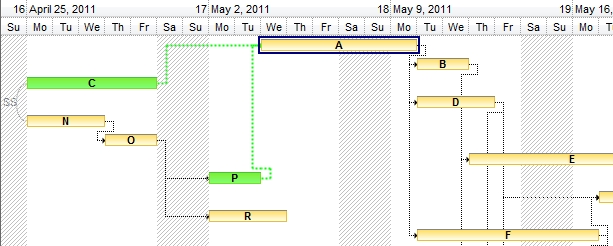
The following sample shows the incoming bars/links in green ( C, P ), when the current bar is A:
(Safe array of variant expression)
The following sample displays the list of links that ends on the bar from the cursor:
With G2antt1.Items
    Dim h As HITEM, c As Long, hit As HitTestInfoEnum
    h = G2antt1.ItemFromPoint(-1, -1, c, hit)
    Debug.Print .ItemBar(h, G2antt1.Chart.BarFromPoint(-1, -1), exBarIncomingLinksAsString)
End With
(String expression)
The following sample displays all links that ends on the bar from the cursor, including the ascendants:
With G2antt1.Items
    Dim h As HITEM, c As Long, hit As HitTestInfoEnum
    h = G2antt1.ItemFromPoint(-1, -1, c, hit)
    Dim l As Variant
    For Each l In .ItemBar(h, G2antt1.Chart.BarFromPoint(-1, -1), exBarIncomingLinksAll)
        Debug.Print "Incomming Link: " & l
    Next
End With
(Safe array of variant expression)
The following sample displays the list of links that ends on the bar from the cursor:
With G2antt1.Items
    Dim h As HITEM, c As Long, hit As HitTestInfoEnum
    h = G2antt1.ItemFromPoint(-1, -1, c, hit)
    Debug.Print .ItemBar(h, G2antt1.Chart.BarFromPoint(-1, -1), exBarIncomingLinksAllAsString)
End With
(String expression)
The following sample displays the bars that are linked with a SF link from the bar on the cursor:
With G2antt1.Items
    Dim h As HITEM, c As Long, hit As HitTestInfoEnum
    h = G2antt1.ItemFromPoint(-1, -1, c, hit)
    Dim b As Variant
    For Each b In .ItemBar(h, G2antt1.Chart.BarFromPoint(-1, -1), exBarIncomingBars)
        Debug.Print "Outgoing Bar: " & b
    Next
End With
(Safe array of variant expression)
The following sample displays the list of incoming bars:
With G2antt1.Items
    Dim h As HITEM, c As Long, hit As HitTestInfoEnum
    h = G2antt1.ItemFromPoint(-1, -1, c, hit)
    Debug.Print .ItemBar(h, G2antt1.Chart.BarFromPoint(-1, -1), exBarIncomingBarsAsString)
End With
(String expression)
The following sample displays all bars ( including descendents ) that are linked with a SF link from the bar on the cursor:
With G2antt1.Items
    Dim h As HITEM, c As Long, hit As HitTestInfoEnum
    h = G2antt1.ItemFromPoint(-1, -1, c, hit)
    Dim b As Variant
    For Each b In .ItemBar(h, G2antt1.Chart.BarFromPoint(-1, -1), exBarIncomingBarsAll)
        Debug.Print "Outgoing Bar: " & b
    Next
End With
(Safe array of variant expression)
The following sample displays the list of incoming bars:
With G2antt1.Items
    Dim h As HITEM, c As Long, hit As HitTestInfoEnum
    h = G2antt1.ItemFromPoint(-1, -1, c, hit)
    Debug.Print .ItemBar(h, G2antt1.Chart.BarFromPoint(-1, -1), exBarIncomingBarsAllAsString)
End With
(String expression)
The following sample displays the direct incoming bars, for debugging purpose:
With G2antt1.Items
    Dim h As HITEM, c As Long, hit As HitTestInfoEnum
    h = G2antt1.ItemFromPoint(-1, -1, c, hit)
    Debug.Print .ItemBar(h, G2antt1.Chart.BarFromPoint(-1, -1), exBarIncomingBarsDebug)
End With
(String expression)
The following sample displays the incoming bars (including ascendants), for debugging purpose:
With G2antt1.Items
    Dim h As HITEM, c As Long, hit As HitTestInfoEnum
    h = G2antt1.ItemFromPoint(-1, -1, c, hit)
    Debug.Print .ItemBar(h, G2antt1.Chart.BarFromPoint(-1, -1), exBarIncomingBarsAllDebug)
End With
(String expression)
The following screen shot shows the values of exBarEnd and exBarEndInclusive displayed on End and EndInclusive columns:
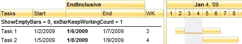
In the previously picture you can notice that the exBarEnd of the Task 1 is 1/7/2009, while the exBarEndInclusive indicates the 1/6/2009.
Using the exBarEndInclusive you can show and edit the finish column like shown in the following picture:

(Date expression)
(Date expression)
(Date expression)
(Date expression)
- MM: This stands for the month part of the date and is represented by two digits. For example, January is "01", February is "02", and so on up to December, which is "12"
- dd: This represents the day of the month, also in two digits. For example, the first day of the month is "01", the second day is "02", and so forth up to the 31st day, which is "31"
- yyyy: This denotes the year part of the date, represented by four digits. For example, the year 2024 is written as "2024"
- HH: This represents the hour of the day in a 24-hour format, also known as military time. This ranges from "00" (midnight) to "23" (11 PM)
- mm: This stands for the minutes part of the time, with two digits ranging from "00" to "59"
- ss: This represents the seconds part of the time, again with two digits ranging from "00" to "59"
If you have a date and time like "07/15/2024 14:30:45", it breaks down as:
- MM: "07" -> July
- dd: "15" -> 15th day of the month
- yyyy: "2024" -> Year 2024
- HH: "14" -> 2 PM (in 24-hour format)
- mm: "30" -> 30 minutes past the hour
- ss: "45" -> 45 seconds past the minute
The exBarStart property retrieves or sets the starting date-time of the bar using a DATE expression.
(String expression)
- MM: This stands for the month part of the date and is represented by two digits. For example, January is "01", February is "02", and so on up to December, which is "12"
- dd: This represents the day of the month, also in two digits. For example, the first day of the month is "01", the second day is "02", and so forth up to the 31st day, which is "31"
- yyyy: This denotes the year part of the date, represented by four digits. For example, the year 2024 is written as "2024"
- HH: This represents the hour of the day in a 24-hour format, also known as military time. This ranges from "00" (midnight) to "23" (11 PM)
- mm: This stands for the minutes part of the time, with two digits ranging from "00" to "59"
- ss: This represents the seconds part of the time, again with two digits ranging from "00" to "59"
If you have a date and time like "07/15/2024 14:30:45", it breaks down as:
- MM: "07" -> July
- dd: "15" -> 15th day of the month
- yyyy: "2024" -> Year 2024
- HH: "14" -> 2 PM (in 24-hour format)
- mm: "30" -> 30 minutes past the hour
- ss: "45" -> 45 seconds past the minute
The exBarEnd property retrieves or sets the ending date-time of the bar using a DATE expression.
(String expression)