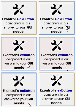
The
exButton control is designed to enhance your Windows®-based programs by
offering the look-and-feel of present GUI design elements. The control provides
predefined button skins for Windows XP, Windows 95/98, and Mac 8.x buttons.
Create your own skins for your buttons in minutes, using a WYSYWG skin builder.
The ability to specify everything that control needs like graphical objects,
transparent skins, HTML caption as simple text makes the exButton one of the
most wanted button control on the market. The exButton control easily replaces
the Standard Windows button by supporting most of the same properties, methods
and events.
How to replace my old VB
buttons with this new button?
The Exontrol's Button object
supports the following properties and methods:
| | Name | Description | |
| | Alignment | Aligns the caption in the control. | |
| | AllowHotState | Specifies whether the control displays the hot state when the cursor is over the control. | |
| | AnchorFromPoint | Retrieves the identifier of the anchor from point. | |
| | AttachTemplate | Attaches a script to the current object, including the events, from a string, file, a safe array of bytes. | |
| | BackColor | Specifies the control's background color. | |
| | BackColorState | Specifies the background color for a specified state. | |
| | BackgroundExt | Indicates additional colors, text, images that can be displayed on the object's background using the EBN string format. | |
| | BackgroundExtValue | Specifies at runtime, the value of the giving property for specified part of the background extension. | |
| | BeginUpdate | Maintains performance when do changes one at a time. This method prevents the control from painting until the EndUpdate method is called. | |
| | BorderHeight | Sets or retrieves a value that indicates the border height of the control. | |
| | BorderWidth | Sets or retrieves a value that indicates the border width of the control. | |
| | Caption | Specifies the button's caption. | |
| | Debug | Specifies whether the control displays debugging information. | |
| | Enabled | Enables or disables the control. | |
| | EndUpdate | Resumes painting the control after painting is suspended by the BeginUpdate method. | |
| | EventParam | Retrieves or sets a value that indicates the current's event parameter. | |
| | ExecuteTemplate | Executes a template and returns the result. | |
| | Focusable | Gets or sets a value that indicates whether the control can receive focus. | |
| | FocusSkin | Specifies the skin file to display the specified state, when control has the focus. | |
| | FocusSkinV | Specifies the skin file to display the specified state, when control has the focus. | |
| | Font | Retrieves or sets the control's font. | |
| | ForeColor | Specifies the control's foreground color. | |
| | ForeColorState | Specifies the foreground color for a specified state. | |
| | FormatAnchor | Specifies the visual effect for anchor elements in HTML captions. | |
| | HFit | Specifies a value that indicates the horizontal offset to fit image with the caption. | |
| | HTMLPicture | Adds or replaces a picture in HTML captions. | |
| | hWnd | Retrieves the control's window handle. | |
| | Image | Specifies the image being displayed. | |
| | ImageAlignment | Specifies the image's alignment. | |
| | Images | Sets at runtime the control's image list. The Handle should be a handle to an Image List Control. | |
| | ImageSize | Retrieves or sets the size of icons the control displays. | |
| | ImageVAlignment | Specifies the image's vertical alignment. | |
| | IncClientState | Adjusts the control's client area for the specified side and state. | |
| | Mode | Specifies the control's mode. | |
| | MouseIcon | Sets or returns a value that determines a custom Icon to be displayed when the pointer moves over the control. | |
| | MousePointer | Sets or returns a value that determines the MousePointer to be displayed when the pointer moves over the control. | |
| | Picture | Retrieves or sets a graphic to be displayed in the control. | |
| | PictureDisplay | Retrieves or sets a value that indicates the way how the graphic is displayed on the control's background | |
| | Refresh | Refreshes the control. | |
| | RenderType | Specifies the way colored EBN objects are displayed on the component. | |
| | ReplaceIcon | Adds a new icon, replaces an icon or clears the control's image list. | |
| | Rotate | Rotates the HTML caption. | |
| | ShowFocusRect | Sets or returns a value that determines whether or not the focus rectangle should be shown. | |
| | Skin | Specifies the skin file to display the specified state. | |
| | SkinV | Specifies the skin file to display the specified state. | |
| | State | Specifies the control's state. | |
| | Style | Specifies the control's style. | |
| | Template | Specifies the control's template. | |
| | TemplateDef | Defines inside variables for the next Template/ExecuteTemplate call. | |
| | TemplatePut | Defines inside variables for the next Template/ExecuteTemplate call. | |
| | ToolTipDelay | Specifies the time in ms that passes before the ToolTip appears. | |
| | ToolTipFont | Retrieves or sets the tooltip's font. | |
| | ToolTipMargin | Defines the size of the control's tooltip margins. | |
| | ToolTipPopDelay | Specifies the period in ms of time the ToolTip remains visible if the mouse pointer is stationary within a control. | |
| | ToolTipText | Specifies the control's tooltip text. | |
| | ToolTipTitle | Specifies the title of the control's tooltip. | |
| | ToolTipWidth | Specifies a value that indicates the width of the tooltip window, in pixels. | |
| | UseFocusSkin | Specifies whether the focus skins are used when control has the focus. | |
| | UserData | Gets or sets the user-definable data for the current object. | |
| | UseTransparency | Specifies whether the control supports transparency. The transparent regions in the control's skin indicates the transparency. | |
| | VAlignment | Specifies the caption's vertical alignment. | |
| | Value | Indicates whether the button is clicked or released. | |
| | Version | Retrieves the control's version. | |
| | VFit | Specifies a value that indicates the vertical offset to fit image with the caption. | |
| | WordWrap | Indicates whether a multiline text automatically wraps words to the beginning of the next line when necessary. | |
 The
exButton control is designed to enhance your Windows®-based programs by
offering the look-and-feel of present GUI design elements. The control provides
predefined button skins for Windows XP, Windows 95/98, and Mac 8.x buttons.
Create your own skins for your buttons in minutes, using a WYSYWG skin builder.
The ability to specify everything that control needs like graphical objects,
transparent skins, HTML caption as simple text makes the exButton one of the
most wanted button control on the market. The exButton control easily replaces
the Standard Windows button by supporting most of the same properties, methods
and events. How to replace my old VB
buttons with this new button?
The
exButton control is designed to enhance your Windows®-based programs by
offering the look-and-feel of present GUI design elements. The control provides
predefined button skins for Windows XP, Windows 95/98, and Mac 8.x buttons.
Create your own skins for your buttons in minutes, using a WYSYWG skin builder.
The ability to specify everything that control needs like graphical objects,
transparent skins, HTML caption as simple text makes the exButton one of the
most wanted button control on the market. The exButton control easily replaces
the Standard Windows button by supporting most of the same properties, methods
and events. How to replace my old VB
buttons with this new button?

