

Sample:
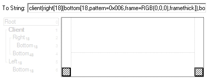
"client(right[18](bottom[18,pattern=6,frame=0,framethick]),bottom[48,align=0x11]),left[18](bottom[18,pattern=6,frame=0,framethick])"
generates the following layout:
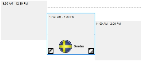
where it is applied to an object it looks as follows:
(String expression, read-only).
(Color/Numeric expression, The last 7 bits in the high significant byte of the color indicate the identifier of the skin being used )
Based on the exAnchorExt value the exClientExt is:
- 0 (none, the object is not anchored to any side), the format of the exClientExt is "left,top,width,height" ( as string ) where (left,top) margin indicates the position where the part starts, and the (width,height) pair specifies its size. The left, top, width or height could be any expression (+,-,/ or * ) that can include numbers associated with pixels or percents. For instance: "25%,25%,50%,50%" indicates the middle of the parent object, and so when the parent is resized the client is resized accordingly. The "50%-8,50%-8,16,16" value specifies that the size of the object is always 16x16 pixels and positioned on the center of the parent object.
- 1 (left, the object is anchored to left side of the parent), the format of the exClientExt is width ( string or numeric ) where width indicates the width of the object in pixels, percents or a combination of them using +,-,/ or * operators. For instance: "50%" indicates the half of the parent object, and so when the parent is resized the client is resized accordingly. The 16 value specifies that the size of the object is always 16 pixels.
- 2 (right, the object is anchored to right side of the parent object), the format of the exClientExt is width ( string or numeric ) where width indicates the width of the object in pixels, percents or a combination of them using +,-,/ or * operators. For instance: "50%" indicates the half of the parent object, and so when the parent is resized the client is resized accordingly. The 16 value specifies that the size of the object is always 16 pixels.
- 3 (client, the object takes the full available area of the parent), the exClientExt has no effect.
- 4 (top, the object is anchored to the top side of the parent object), the format of the exClientExt is height ( string or numeric ) where height indicates the height of the object in pixels, percents or a combination of them using +,-,/ or * operators. For instance: "50%" indicates the half of the parent object, and so when the parent is resized the client is resized accordingly. The 16 value specifies that the size of the object is always 16 pixels.
- 5 (bottom, the object is anchored to bottom side of the parent object), the format of the exClientExt is height ( string or numeric ) where height indicates the height of the object in pixels, percents or a combination of them using +,-,/ or * operators. For instance: "50%" indicates the half of the parent object, and so when the parent is resized the client is resized accordingly. The 16 value specifies that the size of the object is always 16 pixels.
Sample: 50% indicates half of the parent, 25 indicates 25 pixels, or 50%-8 indicates 8-pixels left from the center of the parent.
(String/Numeric expression)
The valid values for exAnchorExt are:
- 0 (none), the object is not anchored to any side,
- 1 (left), the object is anchored to left side of the parent,
- 2 (right), the object is anchored to right side of the parent object,
- 3 (client), the object takes the full available area of the parent,
- 4 (top), the object is anchored to the top side of the parent object,
- 5 (bottom), the object is anchored to bottom side of the parent object
(Numeric expression)
The exTextExt supports the following built-in HTML tags:
- <b> ... </b> displays the text in bold
- <i> ... </i> displays the text in italics
- <u> ... </u> underlines the text
-
<s> ... </s>
Strike-through text - <a id;options> ... </a> displays an anchor element that can be clicked. An anchor is a piece of text or some other object (for example an image) which marks the beginning and/or the end of a hypertext link.The <a> element is used to mark that piece of text (or inline image), and to give its hypertextual relationship to other documents. The control fires the AnchorClick(AnchorID, Options) event when the user clicks the anchor element. The FormatAnchor property customizes the visual effect for anchor elements.
- <font face;size> ... </font> displays portions of text with a different font and/or different size. For instance, the <font Tahoma;12>bit</font> draws the bit text using the Tahoma font, on size 12 pt. If the name of the font is missing, and instead size is present, the current font is used with a different size. For instance, <font ;12>bit</font> displays the bit text using the current font, but with a different size.
- <fgcolor rrggbb> ... </fgcolor> or <fgcolor=rrggbb> ... </fgcolor> displays text with a specified foreground color. The rr/gg/bb represents the red/green/blue values of the color in hexa values.
- <bgcolor rrggbb> ... </bgcolor> or <bgcolor=rrggbb> ... </bgcolor> displays text with a specified background color. The rr/gg/bb represents the red/green/blue values of the color in hexa values.
- <solidline rrggbb> ... </solidline> or <solidline=rrggbb> ... </solidline> draws a solid-line on the bottom side of the current text-line, of specified RGB color. The <solidline> ... </solidline> draws a black solid-line on the bottom side of the current text-line. The rr/gg/bb represents the red/green/blue values of the color in hexa values.
- <dotline rrggbb> ... </dotline> or <dotline=rrggbb> ... </dotline> draws a dot-line on the bottom side of the current text-line, of specified RGB color. The <dotline> ... </dotline> draws a black dot-line on the bottom side of the current text-line. The rr/gg/bb represents the red/green/blue values of the color in hexa values.
- <upline> ... </upline> draws the line on the top side of the current text-line (requires <solidline> or <dotline>).
- <r> right aligns the text
- <c> centers the text
- <br> forces a line-break
- <img>number[:width]</img> inserts an icon inside the text. The number indicates the index of the icon being inserted. Use the Images method to assign a list of icons to your chart. The last 7 bits in the high significant byte of the number expression indicates the identifier of the skin being used to paint the object. Use the Add method to add new skins to the control. If you need to remove the skin appearance from a part of the control you need to reset the last 7 bits in the high significant byte of the color being applied to the part. The width is optional and indicates the width of the icon being inserted. Using the width option you can overwrite multiple icons getting a nice effect. By default, if the width field is missing, the width is 18 pixels.
- <img>key[:width]</img> inserts a custom size picture into the text being previously loaded using the HTMLPicture property. The Key parameter indicates the key of the picture being displayed. The Width parameter indicates a custom size, if you require to stretch the picture, else the original size of the picture is used.
- & glyph characters as & ( & ), < ( < ), > ( > ), &qout; ( " ) and &#number; ( the character with specified code ), For instance, the € displays the EUR character. The & ampersand is only recognized as markup when it is followed by a known letter or a #character and a digit. For instance if you want to display <b>bold</b> in HTML caption you can use <b>bold</b>
- <off offset> ... </off> defines the vertical offset to display the text/element. The offset parameter defines the offset to display the element. This tag is inheritable, so the offset is keep while the associated </off> tag is found. You can use the <off offset> HTML tag in combination with the <font face;size> to define a smaller or a larger font to be displayed. For instance: Text with <font ;7><off 6>subscript displays the text such as: Text with subscript The Text with <font ;7><off -6>superscript displays the text such as: Text with subscript
- <gra rrggbb;mode;blend> ... </gra> defines a gradient text.
The text color or <fgcolor> defines the starting gradient color, while
the rr/gg/bb represents the red/green/blue values of the ending color, 808080 if missing as
gray. The mode is a value between 0 and 4, 1 if missing, and blend could be 0 or 1, 0 if missing.
The <font> HTML tag can be used to define the height of the font. Any
of the rrggbb, mode or blend field may not be specified. The <gra>
with no fields, shows a vertical gradient color from the current text color
to gray (808080). For
instance the <font ;18><gra FFFFFF;1;1>gradient-center</gra></font>
generates the following picture:

- <out rrggbb;width> ... </out> shows the text with outlined characters,
where rr/gg/bb represents the red/green/blue values of the outline color, 808080 if missing as gray, width indicates the size of
the outline, 1 if missing. The text color or <fgcolor> defines the
color to show the inside text. The <font> HTML tag can be used to
define the height of the font. For
instance the <font ;31><out 000000><fgcolor=FFFFFF>outlined</fgcolor></out></font>
generates the following picture:

- <sha rrggbb;width;offset> ... </sha> define a text with a shadow,
where rr/gg/bb represents the red/green/blue values of the shadow color, 808080 if missing as gray, width indicates the size of shadow, 4 if missing, and offset indicates the offset from the origin to display the text's shadow, 2 if missing.
The text color or <fgcolor> defines the color to show the inside text.
The <font> HTML tag can be used to define the height of the font.
For
instance the <font ;31><sha>shadow</sha></font>
generates the following picture:

or <font ;31><sha 404040;5;0><fgcolor=FFFFFF>outline anti-aliasing</fgcolor></sha></font> gets:

(String expression)
(Boolean expression)
The valid values for exTextExtAlignment are:
- 0, ( hexa 0x00, Top-Left ), Text is vertically aligned at the top, and horizontally aligned on the left.
- 1, ( hexa 0x01, Top-Center ), Text is vertically aligned at the top, and horizontally aligned at the center.
- 2, ( hexa 0x02, Top-Right ), Text is vertically aligned at the top, and horizontally aligned on the right.
- 16, ( hexa 0x10, Middle-Left ), Text is vertically aligned in the middle, and horizontally aligned on the left.
- 17, ( hexa 0x11, Middle-Center ), Text is vertically aligned in the middle, and horizontally aligned at the center.
- 18, ( hexa 0x12, Middle-Right ), Text is vertically aligned in the middle, and horizontally aligned on the right.
- 32, ( hexa 0x20, Bottom-Left ), Text is vertically aligned at the bottom, and horizontally aligned on the left.
- 33, ( hexa 0x21, Bottom-Center ), Text is vertically aligned at the bottom, and horizontally aligned at the center.
- 34, ( hexa 0x22, Bottom-Right ), Text is vertically aligned at the bottom, and horizontally aligned on the right.
(Numeric expression)
The valid values for exPatternExt are:
- 0, ( hexa 0x000, Empty ), The pattern is not visible
- 1, ( hexa 0x001,
Solid ),

- 2, ( hexa 0x002,
Dot ),

- 3, ( hexa 0x003,
Shadow ),

- 4, ( hexa 0x004,
NDot ),

- 5, ( hexa 0x005,
FDiagonal ),

- 6, ( hexa 0x006,
BDiagonal ),

- 7, ( hexa 0x007,
DiagCross ),

- 8, ( hexa 0x008,
Vertical ),

- 9, ( hexa 0x009,
Horizontal ),

- 10, ( hexa 0x00A,
Cross ),

- 11, ( hexa 0x00B,
Brick ),

- 12, ( hexa 0x00C,
Yard ),

- 256, ( hexa 0x100,
Frame ),
 .
The exFrameColorExt specifies the color to show the frame. The Frame flag
can be combined with any other flags.
.
The exFrameColorExt specifies the color to show the frame. The Frame flag
can be combined with any other flags. - 768, ( hexa 0x300,
FrameThick ),
 .
The exFrameColorExt specifies the color to show the frame. The Frame flag
can be combined with any other flags.
.
The exFrameColorExt specifies the color to show the frame. The Frame flag
can be combined with any other flags.
(Numeric expression)
(Color expression)
(Color expression)
(Boolean expression)
(Variant expression)