Add an enhanced exTree component to your application. exTree provides the entire range of capabilities you would expect to see in a state-of-the-art tree component. The exTree control simulates a simple tree, a multi-column tree, a list or a listview control.
The ItemFromPoint property requires the X and Y coordinates in control client
coordinates. The coordinates also should be pixels coordinates. The VB
environment uses twips instead pixels and therefore the coordinates passed to
ItemFromPoint property should be converted from twips to pixels. The VB provides
an object Screen, that exports properties like TwipsPerPixelX and TwipsPerPixelY.
Use these properties to convert the twips coordinates to pixels coordinates. So,
X becomes X / Screen.TwipsPerPixelX, and Y becomes Y /
Screen.TwipsPerPixelY. The Access environment doesn't provide any Screen object,
and you need to use the function that's provided in our free page. Anyway, how
to make sure that the ItemFromPoint property is working? Simple. Hides the
HeaderBar using the HeaderVisible property and print the ItemFromPoint(2,2,c).
The property retrieves the handle for the first visible item. If you give right
coordinates to the ItemFromPoint property you get the properly item's handle.
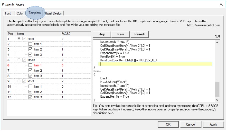
The control provides a WYSWYG template editor that helps you to
create template files. A template file is a collection of instructions that
control loads at runtime. In other words the template file holds a collection of
properties and their values, methods and objects, into a TEXT file. The template
file combines XML style with something close to VBScript. We call it X-Script.
It is important to specify that the editor and the X-Script DO NOT USE any
external VB script engine, Active script engine, XML parser or DOM. The X-Script
was implemented from scratch as lite as possible to let users customize the
control in design mode no matter what programming languages they are using. The
template files are the same for any programming language, and do the same thing
for all! For instance, you can copy and paste the template file from a VFP
control to a C++ control!
The editor automatically updates the control's look and feel
while you are editing the template file. This way you can learn easy how a
property or a method reacts! Also, the editor provides a type library context
menu that helps you to find quickly a property ( CTRL + SPACE invokes it ).
Here's a screen shot of control's template editor:
To check the following samples open the control's template page and paste
them to the editor. The X-Script supports variables using the sequence like
Dim v1, v2, v3, supports RGB function like RGB(0,255,255).
The following sample shows how to add 3 columns, and how to change few
properties for them:
The version 1.0.3.5 includes the HTML formatting inside cell. The
CellCaptionFormat property specifies how the cell's caption ( CellCaption
property ) is displayed. If the CellCaptionFormat property is exText no HTML
formatting is applied. Else, if the CellCaptionFormat property is exHTML the
CellCaption is formatted using HTML tags. The list of valid tags are:
<b> tag - draws a text bolded until </b> is reached.
<br> tag - breaks the line.
<i> tag - draws the text using italic font attribute until </i> is reached.
<s> tag - draws the text using strikeout font attribute until </s> is reached.
<u> tag - draws the text using underline font attribute until </u> is reached.
<fgcolor=RRGGBB> tag - draws the text using the
RGB(RR,GG,BB) foreground color. </u>, until </fgcolor> is reached. RR, GG and BB should be hexa values.
<bgcolor=RRGGBB> tag - draws the text using the
RGB(RR,GG,BB) background color. </u>, until </bgcolor> is reached. RR, GG and BB should be hexa values.
< dotline > - draws a dotted line.
< solidline > - draws a dotted line
< upline > - draws up the line
< r > - right aligns the line
For instance: the HTML formatting "<b>Inbox</b> <fgcolor=0000FF>(78)</fgcolor>" draws the Inbox using bold font attributes, and (78) using the blue foreground
color, like: Inbox (78)
The control provides a Columns property that helps you to add, remove or
changes the columns of the control. By default, the control has no columns. The
following code shows you how to add two columns to the control:
With Tree1
    .BeginUpdate
        With .Columns
            With .Add("Column 1")
                .Width = 164
                .HTMLCaption = "<b>Column</b> <fgcolor=FF0000>1</fgcolor>"
            End With
            With .Add("Column 2")
                .HeaderImage = 1
            End With
        End With
    .EndUpdate
End With
When many changes are made to the control, you should invoke the BeginUpdate method to temporarily freeze the drawing of the control. This results in less distraction to the user, and a performance gain. After all updates have been made, invoke the
EndUpdate method to resume drawing of the control.
The control provides an Items property that helps you to add, remove or
changes the items in the control. Before adding any new item to the control make
sure that your control has at least one column. There are 4 methods to load
items to the control.
You can call PutItems method if you have an array of elements.
Using the DataSource property ( binding the control to an ADO, DAO
recordset )
Using the IUnboundHandler interface ( unbound mode ).
( Design Mode only ) Template Editor
Because control can load a list as well as a hierarchy each item is specified
by a handle HITEM not by index. Each property that refers a cell requires a
handle and an index to a column.
By default, the control has no columns, so before
adding new items you need to add columns like in the following sample
With Tree1.Columns
        .Add "Column 1"
        With .Add("Column 2")
            .HTMLCaption = "Column <b>2</b>"
        End With
End With
The following sample uses the first method to add few items to the Items
collection.
With Tree1.Items
    Dim h As HITEM, hChild As HITEM
    h = .AddItem("Group 1")
    .CellCaption(h, 1) = "Information about Group 1"
    hChild = .InsertItem(h, , "Child 1")
    .CellCaption(hChild, 1) = "Information about Child 1"
    hChild = .InsertItem(h, , "Child 2")
    .CellCaption(hChild, 1) = "Information about Child 2"

    h = .AddItem("Group 2")
    .CellCaption(h, 1) = "Information about Group 2"
    hChild = .InsertItem(h, , "Child 1")
    .CellCaption(hChild, 1) = "Information about Child 1"
    hChild = .InsertItem(h, , "Child 2")
    .CellCaption(hChild, 1) = "Information about Child 2"
End With
When many changes are made to the control, you should invoke the BeginUpdate method to temporarily freeze the drawing of the control. This results in less distraction to the user, and a performance gain. After all updates have been made, invoke the EndUpdate method to resume drawing of the control
like in the following sample:
With Tree1
        .BeginUpdate
            With .Columns
                .Add "Column 1"
            End With
            With .Items
                For i = 0 To 20000
                    .AddItem i
                Next
            End With
        .EndUpdate
End With
For instance, the following VB sample shows how to insert items when
control has multiple columns:
With Tree1
    .BeginUpdate

        .LinesAtRoot = exLinesAtRoot
        .Columns.Add "Column 1"
        .Columns.Add "Column 2"
        .Columns.Add "Column 3"

        With .Items
            h = .AddItem(Array("Item 1.1", "Item 1.2", "Item 1.3"))
            .InsertItem h, , Array("Item 2.1", "Item 2.2", "Item 2.3")
        End With

    .EndUpdate
End With
The control provides a property ShowImageList that shows or hides that images
list. By default, the property is True, to let new customers know that they can
drag images without using an ImageList control. If you are going to add icons at
runtime the control provides Images and
ReplaceIcon methods. The Images method
takes the handle to an ImageList control. The ReplaceIcon method works like
follows:
ReplaceIcon( Icon, -1) method. Adds a new icon to control's image list, and retrieves the index of the image. Sample: .ReplaceIcon Image1.Picture.Handle, adds a new icon to the end of the control's image list, .ReplaceIcon LoadPicture("D:\Icons\help.ico").Handle adds a new icon, loads the icon from a file, and adds it to control's image list
ReplaceIcon( Icon, n ) ( where n >= 0 ) method. Replaces an icon to control's image list. Sample: .ReplaceIcon Image1.Picture.Handle, 0 replaces the first icon in the control's image list
ReplaceIcon( 0, n ) (where n>= 0 ) method. Removes an icon given its index. Sample: .ReplaceIcon 0, 0 removes the first icon in the control's image list
ReplaceIcon( 0, -1) method. Clears the images collection. Sample: .ReplaceIcon, clears the entire image list.
You can delete an icon from the images list window in design mode by
selecting the icon and pressing the BackSpace key. You can delete the icon using
the Delete key but some containers delete the object when Delete key is used.
The Items object provides properties like: Items.SelectCount,
Items.SelectItem,
Items.SelectedItem that helps you to access the selected
items. The control fires SelectionChanged event when user changes the selection.
The following sample uses the FindItem method to looks for an item that contains
in the column "Column 1" the value "Child 2"
The following sample displays the selected items. Only the caption on the first
column are displayed. If you want to display more columns you have to change the
0 with index of column being displayed.
With Tree1.Items
        Dim i As Long
        For i = 0 To .SelectCount - 1
            Debug.Print .CellCaption(.SelectedItem(i), 0)
        Next
End With
There Items object provides few methods like FindItem,
FindPath,
FindItemData
in order to
find an item. The FindItem method looks for the first item that has in a column
the giving value. For instance the following sample gets the handle of the item
that contains in the first column ( "Column 1" ) the value
"Child 2":
If the FindItem method fails to locate the item the 0 is returned. If a non 0
value is returned that means that the control was able to locate the item.
The FindPath method looks for a path in the control's hierarchy using the
SearchColumnIndex property as being the column searched . The method requires
the full path separated by the "/"
Once that we have found the searched item all that we need to call
EnsureVisibleItem method in order to ensure that the item is visible. If the
item was a child of an item that was collapsed the EnsureVisibleItem method
expands that item too.
The control provides multiple ways to do that. If you only need to alternate
the background color for items you should use the BackColorAlternate property.
If only a particular item needs to be colorized, you have to use properties
like: ItemForeColor,
ItemBackColor,
CellForeColor or
CellBackColor. Remember
that control fires the AddItem
event when a new item is inserted to the Items
collection. You can use the AddItem event to apply different colors for the
newly added items. Also, the control supports built- in HTML
format.
The Def(exCellBackColor)
property specifies the background color for all cells in the column. Another option that you have to color a column is if you are using the
CountLockedColumns property. The CountLockedColumn property specifies the number
of visible columns that are frozen on the left side. A frozen column is not
scrollable. The control provides in that case a property called BackColorLock
that specifies the background color for frozen area of the control. The same
thing is for ForeColorLock property except that it specifies the foreground
color for the frozen area. In case that CountLockedColumn > 0 the BackColor
and ForeColor properties are applicable to the scrollable area of the control.
The control automatically sorts a column when the user clicks the column's
header. The SortOnClick =
False disables sorting the items when user clicks the column's header. There are
two methods to get the items sorted like follows:
The SortOrder property adds the sorting icon to the column's header, if the DisplaySortIcon
property is True.
Using the SortChildren
method of the Items
collection. The SortChildren sorts the items.
The SortChildren method sorts the child items of the given parent item in the control. SortChildren will not
recourse through the tree, only the immediate children of the item will be sorted.
The following sample sort descending the list of root items on the "Column
1"( if your control displays a list, all items are considered being root
items ).
Yes. The following function displays all child items ( recursively )
Sub RecItem(ByVal c As EXTreeLibCtl.Tree, ByVal h As HITEM)
If Not (h = 0) Then
Dim hChild As HITEM
With c.Items
Debug.Print .CellCaption(h, 0)
hChild = .ItemChild(h)
While Not (hChild = 0)
RecItem c, hChild
hChild = .NextSiblingItem(hChild)
Wend
End With
End If
end sub
The
ColumnAutoResize property is what you are looking for. If the control's
ColumnAutoResize property is True, the control arranges all visible columns to
fit the control's client area. In this case no horizontal scroll bar is
displayed. If the ColumnAutoResize property if False, control displays a
horizontal scroll bar if the width of visible columns doesn't fit the width of
the client area.
Changing the Name property of the Font object doesn't notify the control that the used font has been changed, so calling Tree1.Font.Name = "Arial Unicode MS" has effect only for the control's drop-down window, but it doesn't change the font for control inside text editors. Remember that Font is a system object, and it is not implemented by the control, so that's the
reason why the control is not notified that the user has changed the font's name.
The following sample changes the font used by inside text editors as well for the drop-down window:
Dim f As New StdFont
f.Name = "Arial Unicode MS"
Tree1.Font = f
When you expect performance you have to be carefully to each line of code in
your project. Here's few hints about improving performance when you are using
the control:
The Items property performs a QueryInterface each time when it is called.
It is recommended using a variable that holds the Items property
instead calling the property itself. For instance call set its =
Tree1.Items when form is loaded, and use 'its' variable each time when
you need to access the Items collection.
Use With .. End With statements each time you can. It avoids calling too
many times a QueryInterface by the control.
Holds a column to a variable instead calling Item property. For instance,
the Item property of the Columns object looks for a column. The
Add method
of Columns object retrieves the added Column object. For instance use code
like follows to add and initialize a column:
With Tree1.Columns
With .Add("Column 1")
.Width = 128
.AllowSizing = False
.AllowDragging = False
.DisplaySortIcon = False
End With
End With
or
With Tree1.Columns
Dim c As EXTreeLibCtl.Column
Set c = .Add("Column 1")
c.Width = 128
c.AllowSizing = False
c.AllowDragging = False
c.DisplaySortIcon = False
End With
Use BeginUpdate and
EndUpdate methods when multiple operations require
changing the control.
Whenever you want to access an column use its index instead its name. For
instance if the "Column 1" is the first column in the control use
the .Items.CellCaption( Handle, 0 ) instead .Items.CellCaption( Handle,
"Column 1"). or .Columns(0) instead .Columns("Column 1")
If you are using the control using the unbound mode make sure that the
ReadItem method is light and easy. The ReadItem method is called each time
when the control requires an item. Obviously, once that an item was
retrieved when control requires the same item, it was already cached so no
ReadItem method is called. Also an improvement to ReadItem method could be
using a variable its ( that holds the control's Items property ) instead
Source.Items.
If you are using the unbound mode, but you still get data from a recordset
make sure that you are using an index on the table instead using FindItem
method. You can use also hash tables. The Select property uses the FindItem
method that does a linear search.
The CellPicture property of the Items object helps you to attach a picture
file ( bmp, gif, whatever ) to a cell. The following sample shows how to attach a
picture to the first visible cell of the control:
With Tree1.Items
.CellPicture(.FirstVisibleItem, 0) = LoadPicture("c:\winnt\Zapotec.bmp")
End With
If the picture's height is larger than item's height
you can use the ItemHeight property to let picture fits the item's client area.
The .CellPicture accepts objects of IPictureDisp type. The LoadPicture function
retrieves an IPictureDisp object
The control's Version property needs to contain UNICODE string, if you have
the UNICODE version installed. If the Version property doesn't contain the
UNICODE string, you have installed the ANSI version.
The control requires a runtime license key before calling Add method of
Controls collection. The VB environment provides a Licenses collection that
holds runtime license keys. So, your sample should look like following:
Private Sub Form_Load()
Dim obj As Object
Licenses.Add "Exontrol.Tree", "xxxxxxxx"
Set obj = Controls.Add("Exontrol.Tree", "tree", Me)
obj.Visible = True
End Sub
The value "xxxxxxxx" is NOT a valid runtime license key. Please
contact us if you require the control's runtime license key.
The 'License' optional parameter of the InsertControlItem method needs to
provide the control's runtime license key. For instance, if you have something
like:
.InsertControlItem(,"Exontrol.Tree")
it should look like:
.InsertControlItem(,"Exontrol.Tree", "xxxxxxxx")
Please note that the "xxxxxxxx" is NOT a valid runtime license key.
Please contact us if you require the runtime license key for any of our
components.
If you want to provide different shortcut menus for control depending on
clicked cell, the MouseUp or
MouseDown events should be used. Else, if you want
to provide a general shortcut menu, the RClick event can be used too. The
following sample handles the MouseUp event and displays a shortcut menu when
user right clicks a cell:
Private Sub Tree1_MouseUp(Button As Integer, Shift As Integer, X As Single, Y As Single)
' Checks whether the user right clicks the mouse
If (Button = 2) Then
' Gets the cell from point
Dim h As HITEM, c As Long, i As Long, hit as Long
h = Tree1.ItemFromPoint(X / Screen.TwipsPerPixelX, Y / Screen.TwipsPerPixelY, c, hit)
' Displays a popup menu if the right clicks a cell
If (h <> 0) Then
i = PopupMenu1.ShowAtCursor()
If (i > 0) Then
' Displays the identifier of the context menu item selected
Debug.Print "You have selected the item " & i
End If
End If
End If
End Sub
The sample uses the exPopupMenu that can be downloaded here.
The SHGetFileInfo API function gets the icon associated to a file. The
following sample associates a Windows Explorer icon to a cell.
The sample requires the following declarations:
Private Declare Function SHGetFileInfo Lib "shell32.dll" Alias "SHGetFileInfoA" (ByVal pszPath As String, _
ByVal dwFileAttributes As Long, _
psfi As SHFILEINFO, _
ByVal cbFileInfo As Long, _
ByVal uFlags As Long) As Long
Private Const SHGFI_ICON = &H100
Private Const SHGFI_OPENICON = &H2
Private Const SHGFI_SMALLICON = &H1
Private Type SHFILEINFO
hIcon As Long
iIcon As Long
dwAttributes As Long
szDisplayName As String * 1024
szTypeName As String * 80
End Type
The following sample shows how to associate a Windows Explorer icon to a
cell.
Dim s As SHFILEINFO
SHGetFileInfo "c:\winnt\system32\sndrec32.exe", 0, s, 0, SHGFI_SMALLICON Or SHGFI_ICON Or SHGFI_OPENICON
Tree1.ReplaceIcon s.hIcon, 0
Tree1.Items.CellImage(Tree1.Items.FirstVisibleItem, 0) = 1
The ColumnFromPoint property gets the index of the column from the cursor.
The ColumnFromPoint property retrieves -1, if no column was found over the
cursor. The following sample displays the column's caption using the MouseMove
event:
Private Sub Tree1_MouseMove(Button As Integer, Shift As Integer, X As Single, Y As Single)
With Tree1
Dim i As Long
i = .ColumnFromPoint(X / Screen.TwipsPerPixelX, Y / Screen.TwipsPerPixelY)
If (i >= 0) Then
Debug.Print .Columns(i).Caption
End If
End With
End Sub
If you are loading a HTML page to an item using InsertControlItem method,
the control creates a "Microsoft Web Browser Control". The "Microsoft Web Browser Control"
provides the BeforeNavigate2 event that's fired just before navigation occurs.
The following sample cancels any navigation whether the user clicks a link in
the page:
Private Sub Form_Load()
With Tree1.Items
.InsertControlItem , App.Path + "\stub.htm"
End With
End Sub
Private Sub Tree1_ItemOleEvent(ByVal Item As EXTREELibCtl.HITEM, ByVal Ev As EXTREELibCtl.IOleEvent)
If ("BeforeNavigate2" = Ev.Name) Then
Ev("Cancel").Value = True
End If
End Sub
The sample assumes that you have already a column inserted. You can use the
control's Template property page to add a default column before running the
code.
The CellImage property assign a single icon to the cell. Instead if multiple
icons need to be assigned to a single cell you have to use the CellImages
property. The CellImages property takes a list of additional icons and display
them in the cell. The list is separated by ',' and should contain numbers
that represent indexes to Images list collection. The following sample assign
first and third icon to the cell:
With Tree1.Items
.CellImages(.ItemByIndex(0), 1) = "1,3"
End With
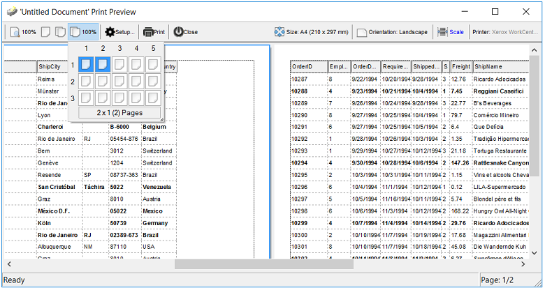
Yes, the Exontrol ExPrint component ( exprint.dll ) provides Print and Print
Preview capabilities for the exTree component. Once that you can have the
exPrint component in your Components list, insert a new instance of "ExPrint
1.0 Control Library" to your form and add the following code:
Private Sub Command1_Click()
With Print1
Set .PrintExt = Tree1.Object
.Preview
End With
End Sub
The Exontrol Print Preview mainframe looks like follows:
The exPrint component is free
of charge, if you are registered user of the exTree component.
The following VB sample opens the Print Preview frame:
With Print1
Set .PrintExt = Tree1.Object
.Preview
End With
The following C++ sample opens the Print Preview frame:
The following sample adds an item that hosts a read-only Word Document:
With Tree1
.BeginUpdate
If .Columns.Count > 0 Then
Dim hx As HITEM
hx = .Items.InsertControlItem(, "D:\Program Files\Microsoft Visual Studio .NET\Vc7\migration_guide.doc")
With .Items.ItemObject(hx)
.Document.Protect 2
End With
End If
.EndUpdate
End With
The whole idea is to call Protect method of object returned by the Document
property.
Here's few hints that should be followed in order to get information about
returned object ( ItemObject property ).
We would suggest using the following snippet of code ( the sample requires an
Exontrol ExPropertiesList
control on the form ).
where XXX is the handle of the item that hosts an ActiveX control.
PropertiesList1 is the name of the ExPropertiesList control into your form. The
above snippet displays the list of interfaces implemented by the object passed
to Interfaces property of the ExPropertiesList control. Once that we got the
interfaces list, we should look for any interface that object implements. For
instance, if we are using a WebBrowser control the result of Interfaces property
will include interfaces like: IWebBrowser and IWebBrowser2.
Of course, you need to read more about each implemented interface depends on
what are you trying to do with the hosted object. In our case, we have a
Microsoft Web Browser control that hosts a Word document. Calling any property
of IWebBrowser2 will affect only the WebBrowser control without affecting the
inside document, so we need to go forward by looking at what Document property
exposes using the following snippet of code:
In this case the result is the list of interfaces exported by Document
object. We will observe that it includes the _Document interface ( the main
interface for Word automation ). Now how can I see the properties and methods
that _Document interface exposes? There are plenty of tools that can browses the
COM objects type libraries, we prefer using the OLE/COM Object Viewer ( OLEVIEW.EXE
) tools. Usually it is located in the C:\Program Files\Microsoft Visual
Studio\Common\Tools folder, it depends how you installed the MSDEV. So, in order
to find out properties and methods that an IDispatch interface exposes you have
to open the "Interfaces" item, and to look for the interface name.
Once that we locate the interface we have to display its type library ( right
click\View\View Type Info).
The control provides partial check feature for each column. The Column object
exports the PartialCheck property that enables or disables the partial check
feature on the column. The CellHasCheckBox property assigns a checkbox to a
cell.
The following sample shows how to assign check boxes to all cells in the
first column:
With Tree1
.Columns(0).Def(exCellHasCheckBox) = True
End With
The following sample shows how to add checkboxes to the first column by
enumerating the cells in the column:
With Tree1
Dim i As Variant
For Each i In .Items
.Items.CellHasCheckBox(i, 0) = True
Next
End With
Another option to turn on the cell's check box is using the AddItem event
like in the following sample:
Private Sub Tree1_AddItem(ByVal Item As EXTREELibCtl.HITEM)
Tree1.Items.CellHasCheckBox(Item, 0) = True
End Sub
If a cell is checked, the CellState property gets 1, if the cell is
unchecked, the CellState property gets 0. If a cell is partially checked, the
CellState gets 2. The CellStateChanged event is fired when user clicks the
cell's checkbox.
The following sample enumerates all visible items as they are displayed:
Private Sub enumVisibleItems(ByVal tree As EXTREELibCtl.tree)
With tree.Items
Dim h As HITEM
h = .RootItem(0)
While h <> 0
Debug.Print .CellCaption(h, 0)
h = .NextVisibleItem(h)
Wend
End With
End Sub
The SingleSel property specifies whether the control supports single or multiple
selected items. If the SingleSel property is True ( by default ), the user can
select a single item/row only. The Items.FocusItem property indicates the handle
of the item that has the focus. The
control fires the SelectionChanged event when the control's selection is
changed. The
SelectCount property specifies the count of selected items/rows. If the
SingleSel property is True, the SelectCount property can be 0 or 1.
The following code displays the selected values:
Private Sub enumSelection(ByVal g As Object)
With g.Items
For i = 1 To .SelectCount
Debug.Print .CellCaption(.SelectedItem(i - 1), 0)
Next
End With
End Sub
Private Sub Grid1_SelectionChanged()
enumSelection Grid1
End Sub
As the control supports multiple columns, the following code displays the
selected values for all columns:
Private Sub enumSelection(ByVal g As Object)
With g.Items
Dim nColumns As Long
nColumns = g.Columns.Count
For i = 1 To .SelectCount
Dim h As HITEM
h = .SelectedItem(i - 1)
For j = 1 To nColumns
Debug.Print .CellCaption(h, j - 1)
Next
Next
End With
End Sub
Private Sub Grid1_SelectionChanged()
enumSelection Grid1
End Sub
The SortType property of the
Column object specifies the way how a column
gets sorted. By default, a column gets sorted as string. If you need to sort
your dates, the following snippet of code should be used:
With Tree1
With .Columns(0)
.SortType = SortDate
End With
End With
If you need to sort a column using your special way you may want to use the
SortType = SortUserData that sorts the column using CellData property for each
cell in the column. In this case, the CellData property holds numeric values
only.
The following snippet of code show how to assign images for your inside
extree control:
With Tree1.Items
Dim hx As HITEM
hx = .InsertControlItem(, "Exontrol.Tree")
With .ItemObject(hx)
.Images ImageList1.hImageList
With .Columns
.Add("Column 1").HeaderImage = 1
End With
End With
End With
The extree control fires the ItemOleEvent event when an inside ActiveX
control fires an event. The following sample shows how to handle events from
contained components:
Private Sub Tree1_ItemOleEvent(ByVal Item As EXTREELibCtl.HITEM, ByVal Ev As EXTREELibCtl.IOleEvent)
On Error Resume Next
With Ev
Debug.Print .Name
Dim i As Long
For i = 0 To .CountParam - 1
Debug.Print .Param(i).Name & " = " & .Param(i).Value
Next
End With
End Sub
There is no public property to set the default so that all items appear
initially expanded, but we would suggest you an alternative using the AddItem
event like follows:
Private Sub Tree1_AddItem(ByVal Item As EXTREELibCtl.HITEM)
With Tree1
.BeginUpdate
With .Items
Dim h As HITEM
h = .ItemParent(Item)
While h <> 0
.ExpandItem(h) = True
h = .ItemParent(h)
Wend
End With
.EndUpdate
End With
End Sub
The Items.ItemHasChildren property adds an expand
button to the left side of the cell, no matter if the item contains child items.
It is useful to build your virtual tree.
The InsertControlItem method inserts an item that hosts an ActiveX control. The
"Shell.Explorer" instantiates a Windows Explorer as a component. The
Windows Explorer is able to display a Word Document like in the following
sample:
With Tree1.Items
Dim hx As HITEM
hx = .InsertControlItem(, "Shell.Explorer")
With .ItemObject(hx)
.Navigate2 "D:\Program Files\Microsoft Visual Studio .NET\Vc7\migration_guide.doc"
.Document.Protect 2
End With
End With
The following sample shows how to get the count of visible items when a
filter was applied:
Private Declare Function GetScrollRange Lib "user32" (ByVal hwnd As Long, ByVal nBar As Long, lpMinPos As Long, lpMaxPos As Long) As Long
Private Const SB_VERT = 1
Private Sub Command1_Click()
Dim l As Long, r As Long
GetScrollRange Tree1.hwnd, SB_VERT, l, r
Debug.Print r - l + 1
End Sub
The Column.Alignment property aligns the whole column. The problem you have
encountered is that the column that paints the hierarchy ( the TreeColumnIndex
property specifies the index of the column where the hierarchy is painted )
can't be centered, so you need to call:
With Tree1
.TreeColumnIndex = -1
End With
in case you are using the control to load a flat table. By default, the
TreeColumnIndex is 0, and it points to the first column of the control.
By default, the Column.Caption property describes the title of the cell's
tooltip. If you don't need to show the column's name in the cell's tooltip, you
have to set the Caption property to an empty string, and to use the HTMLCaption
property to assign the column's caption. This way, the cell's tooltip will not
include the column's name.
Yes. Starting with the version 1.0.5.9 the exTree is able to display the
hierarchy lines aligned to the right side of the column. The following sample
shows how to align the hierarchy lines to the right side of the column:
With Tree1
.BeginUpdate
.LinesAtRoot = exLinesAtRoot
With .Columns.Add("Column 1")
.Alignment = RightAlignment
End With
With .Items
Dim h As HITEM
h = .AddItem("Item 1")
.InsertItem h, , "SubItem 1"
.InsertItem h, , "SubItem 2"
.ExpandItem(h) = True
End With
.EndUpdate
End With
The SortOrder
property of the Column
object specifies the column's sort order. The following function retrieves the
index of the column that's sorted, and gets -1 if no column is sorted:
Private Function getSortingColumn(ByVal g As EXTREELibCtl.Tree) As Long
Dim c As EXTREELibCtl.Column
For Each c In g.Columns
If Not c.SortOrder = EXTREELibCtl.SortNone Then
getSortingColumn = c.Index
Exit Function
End If
Next
getSortingColumn = -1
End Function
When user clicks the + or - buttons to expand or collapse an item, the control
doesn't select the item.
For instance, you can use the BeforeExpandItem
event to select the item being expanded or collapsed.
Private Sub Tree1_BeforeExpandItem(ByVal Item As EXTREELibCtl.HITEM, Cancel As Variant)
Tree1.Items.SelectItem(Item) = True
End Sub
The control doesn't select the item if the user clicks a check box in the
item. The following sample uses the CellStateChanged
event to select the item whose state is changed:
Private Sub Tree1_CellStateChanged(ByVal Item As EXTREELibCtl.HITEM, ByVal ColIndex As Long)
Tree1.Items.SelectItem(Item) = True
End Sub
Yes. You can use the DisplayFilterDate
property to include a date selector button to the "Date" field of the
drop down filter window. The exDate
type specifies that the control filters items between dates.
Yes. Use the HasButtons
property to change the appearance for the +/- buttons on the parent items. Use
the HasButtonsCustom
property to assign a custom icon for +/- signs, when HasButtons property is
exCustom.
The control supports OLE drag and drop, by setting the OLEDropMode
property on exOLEDropManual. The ItemPosition
property specifies the position of the item in the sibling items collection. In
order to let user moves the items in your control by drag and drop please follow
the steps:
Change the control's OLEDropMode property to exOLEDropMode
type
Private Sub Tree1_OLEStartDrag(ByVal Data As EXTREELibCtl.IExDataObject, AllowedEffects As Long)
With Tree1.Items
If Not (.FocusItem = 0) Then
AllowedEffects = 2
Data.SetData .FocusItem, exCFText
End If
End With
End Sub
Private Sub Tree1_OLEDragDrop(ByVal Data As EXTREELibCtl.IExDataObject, Effect As Long, ByVal Button As Integer, ByVal Shift As Integer, ByVal X As Single, ByVal Y As Single)
If (Data.GetFormat(exCFText)) Then
With Tree1
Dim hNew As HITEM, c As Long, h As HITEM
hNew = .ItemFromPoint(X / Screen.TwipsPerPixelX, Y / Screen.TwipsPerPixelY, c)
If Not hNew = 0 Then
h = Data.GetData(exCFText)
With .Items
If .ItemParent(h) = .ItemParent(hNew) Then
' Moves the item in the sibling items collection only
.ItemPosition(h) = .ItemPosition(hNew)
End If
End With
End If
End With
End If
End Sub
If you need to change the cursor during drag and drop operation
you have to handle the OLEGiveFeedback
event and OLECompleteDrag
event like follows:
Private Sub Tree1_OLECompleteDrag(ByVal Effect As Long)
Screen.MousePointer = 0
End Sub
Private Sub Tree1_OLEGiveFeedback(ByVal Effect As Long, DefaultCursors As Boolean)
DefaultCursors = False
Screen.MousePointer = vbSizeNS
End Sub
You need to add the WS_THICKFRAME window style to the control's window like in
the following sample:
Private Declare Function SetWindowLong Lib "user32" Alias "SetWindowLongA" _
(ByVal hwnd As Long, ByVal nIndex As Long, ByVal dwNewLong As Long) As Long
Private Const GWL_STYLE = (-16)
Private Const WS_THICKFRAME = &H40000
Private Sub Form_Load()
Dim f As Long
With Tree1
f = SetWindowLong(.hwnd, GWL_STYLE, 0)
SetWindowLong .hwnd, GWL_STYLE, f Or WS_THICKFRAME
End With
End Sub
int item = axTree1.Items.AddItem("Hepatitis A");
int arbolID = axTree1.Items.InsertControlItem(item,"Exontrol.Tree","xxxxx");
AxEXTREELib.AxTree arbolDosis = (AxEXTREELib.AxTree) axTree1.Items.get_ItemObject(arbolID);
The code should be:
int item = axTree1.Items.AddItem("Hepatitis A");
int arbolID = axTree1.Items.InsertControlItem(item,"Exontrol.Tree","xxxxx");
EXTREELib.Tree arbolDosis = (EXTREELib.Tree) axTree1.Items.get_ItemObject(arbolID);
The first sample casts the ItemObject to a wrapper class instead control's
objects. Also, when using a registered version of the product, the "xxxxx"
sequence should be the runtime license key of the control. Please contact
us in order to get your runtime license key.
Use the CellImages
property to assign multiple icons to a cell. Use the following handler to
display the index of icon being clicked:
Private Sub Tree1_MouseUp(Button As Integer, Shift As Integer, X As Single, Y As Single)
Dim i As HITEM, h As HitTestInfoEnum, c As Long
With Tree1
i = .ItemFromPoint(-1, -1, c, h)
End With
If (i <> 0) Then
If exHTCellIcon = (h And exHTCellIcon) Then
Debug.Print "The index of icon being clicked is: " & (h And &HFFFF0000) / 65536
End If
End If
End Sub
Yes. You have to use the LockedItemCount
property of the Items object. The LockedItemCount property specifies the number
of items locked to the top or bottom side of the control.
Use the CellState
property to check a radio button. A radio group should always contain a checked
cell. In case you need to have an empty radio group, you can reset the checked
cell by using a snippet of code like follows:
Dim h As HITEM
With Tree1.Items
h = .CellItem(.CellChecked(1234))
.CellHasCheckBox(h, 0) = True
.CellState(h, 0) = 0
.CellHasCheckBox(h, 0) = False
End With
or
Dim h As HCELL
With Tree1.Items
h = .CellChecked(1234)
.CellHasCheckBox(, h) = True
.CellState(, h) = 0
.CellHasCheckBox(, h) = False
End With
The MergeCells method combines two or more cells into one
cell. The data in the first specified cell is displayed in the new larger cell.
All the other cells' data is not lost. Use the CellMerge
property to merge or unmerge a cell with another cell in the same item. Use the
ItemDivider
property to display a single cell in the entire item. Use the UnmergeCells
method to unmerge the merged cells.
The component supports skinning parts of the control,
including the selected item. Please check the control's help
file for the Add method of the Appearance object. There you
will find almost everything you need to change the visual
appearance for most of the UI parts of the control. Shortly,
the idea is that identifier of the skin being added to the
Appearance collection is stored in the first significant
byte of property of the color type. In our case, we know
that the SelBackColor property changes the background color
for the selected item. This is what we need to change. In
other words, we need to
change the visual appearance for the selected item, and that
means changing the background color of the selected item.
So, the following code ( blue code ) changes the appearance
for the selected item:
With Tree1
.VisualAppearance.Add &H34, App.Path + "\aqua.ebn"
.SelBackColor = &H34000000
End With
Please notice that the 34 hexa value is arbitrary chosen,
it is not a predefined value. Shortly, we have added a skin
with the identifier 34, and we specified that the SelBackColor
property should use that skin, in order to change the visual
appearance for the selected item. Also, please notice that
the 34 value is stored in the first significant byte, not in other position. For instance, the following sample
doesn't use any skin when displaying the selected item:
With Tree1
.VisualAppearance.Add &H34, App.Path + "\aqua.ebn"
.SelBackColor = &H34
End With
This code ( red code ) DOESN'T use any skin, because the
34 value is not stored in the higher byte of the color
value. The sample just changes the background color for the
selected item to some black color ( RGB(0,0,34 ) ). So,
please pay attention when you want to use a skin and when to
use a color. Simple, if you are calling &H34000000,
you have 34 followed by 6 ( six ) zeros, and that means the
first significant byte of the color expression. Now, back to
the problem. The next step is how we are creating skins? or
EBN files? The Exontrol's exbutton
component includes a builder tool that saves skins to EBN
files. So, if you want to create new skin files, you need to
download and install the exbutton component from our web
site. Once that the exbutton component is installed, please
follow the steps.
Let's say that we have a BMP file, that we want to
stretch on the selected item's background.
Open the VB\Builder or VC\Builder sample
Click the New File button ( on the left side in
the toolbar ), an empty skin is created.
Locate the Background tool window and select
the Picture\Add New item in the menu, the Open
file dialog is opened.
Select the picture file ( GIF, BMP, JPG, JPEG ). You
will notice that the visual appearance of the focused
object in the skin is changed, actually the picture you
have selected is tiled on the object's background.
Select the None item, in the Background tool
window, so the focused object in the skin is not
displaying anymore the picture being added.
Select the Root item in the skin builder window
( in the left side you can find the hierarchy of the
objects that composes the skin ), so the Root item is
selected, and so focused.
Select the picture file you have added at the step 4,
so the Root object is filled with the picture you have
chosen.
Resize the picture in the Background tool
window, until you reach the view you want to have, no
black area, or change the CX and CY fields in the
Background tool window, so no black area is displayed.
Select Stretch button in the Background tool
window, so the Root object stretches the picture you
have selected.
Click the Save a file button, and select a name
for the new skin, click the Save button after you typed
the name of the skin file. Add the .ebn extension.
Close the builder
You can always open the skin with the builder and change
it later, in case you want to change it.
Now, create a new project, and insert the component where
you want to use the skin, and add the skin file to the
Appearance collection of the object, using blue code, by
changing the name of the file or the path where you have
selected the skin. Once that you have added the skin file to the
Appearance collection,
you can change the visual appearance for parts of the
controls that supports skinning. Usually the properties
that changes the background color for a part of the control
supports skinning as well.
The control provides the following options to define the visual effect when drag
and drop items:
Background(exDragDropBefore),
Specifies the visual appearance for the drag and drop cursor before showing
the items. This option can be used to apply a background to the dragging
items, before painting the items. By default, the control doesn't draw any
background for the items being dragged. For instance, use the Background(exDragDropBefore)
= SelBackColor property to specify the same background color/skin for items
being dragged as they are selected.
Background(exDragDropAfter), Specifies the visual appearance for the
drag and drop cursor after showing the items. This option can be used to
apply a semi-transparent/opaque background to the dragging items, after
painting the items. Use this option to apply a transparent/opaque skin,
after the items are painted. For instance, using an color or an opaque skin
you can show something else when dragging the items.
Background(exDragDropListTop), Specifies the graphic feedback of the item
from the drag and drop cursor if the cursor is in the top half of the row.
Use this option to indicate the graphic to be displayed on the item, when
the cursor is in the top half row. By default, nothing is displayed.
Background(exDragDropListBottom), Specifies the graphic feedback of the
item from the drag and drop cursor if the cursor is in the bottom half of
the row. Use this option to indicate the graphic to be displayed on the
item, when the cursor is in the bottom half row. By default, nothing is
displayed. Use the HitTestInfoEnum.exHTBottomHalf flag to check whether the
user drags the items in the top half or bottom half of the row.
Background(exDragDropForeColor), Specifies the foreground color for the
items being dragged. By default, the foreground color is black.
All options, excepts the exDragDropForeColor option accept skins. Use the Appearance.Add
method to define new skins in the control.
Please check the ScrollOrderParts
property that changes the order of the buttons in the control's scroll bar. Use
the ScrollBars
property to specify whether the control displays the scroll bars.
Use the <a> anchor element inside the HTML text in order to insert
hyperlinks to the cell's caption. Use the FormatAnchor
property to specify the visual effect for anchor elements. The AnchorClick
event notifies your application that the user clicks an anchor element. For
instance, if the user clicks the anchor <a1>anchor</a>, the
control fires the AnchorClick event, where the AnchorID parameter is 1, and the
Options parameter is empty.
The HitTestInfoEnum.exHTBetween
value indicates whether the cursor is between two items. For instance, you can
provide a visual effect for the item while performing OLE drag and drop
operations, when the cursor is in the top half of the item, using the exDragDropListTop,
or in the second half using the exDragDropListBottom value. In the same way you
can provide a visual effect when the cursor is over or between two items, using
the exDragDropListOver and exDragDropListBetween values. The ItemFromPoint
property retrieves the handle of the item from the cursor, and retrieves also a
code (HitTestInfo parameter), to indicate the part in the item where the cursor
is. So, the exHTBetween value indicates whether the cursor is between items. The
exHTBetween is an OR combination with other predefined values, so you must call HitTestInfo
AND 0x1000 to check if the cursor is between rows/items as in the following
samples:
The following VB sample displays a message when the cursor is between two
items:
Private Sub Tree1_MouseMove(Button As Integer, Shift As Integer, X As Single, Y As Single)
Dim i As HITEM, c As Long, h As HitTestInfoEnum
i = Tree1.ItemFromPoint(-1, -1, c, h)
If Not (i = 0) Then
If (h And exHTBetween) Then
Debug.Print "The cursor is between two items."
Else
Debug.Print "The cursor is over the item."
End If
End If
End Sub
The following VB.NET sample displays a message when the cursor is between two
items:
Private Sub AxTree1_MouseMoveEvent(ByVal sender As System.Object, ByVal e As AxEXTREELib._ITreeEvents_MouseMoveEvent) Handles AxTree1.MouseMoveEvent
With AxTree1
Dim c As Integer, h As EXTREELib.HitTestInfoEnum
Dim i As Integer = .get_ItemFromPoint(-1, -1, c, h)
If Not i = 0 Then
If (h And EXTREELib.HitTestInfoEnum.exHTBetween) Then
Debug.Print("The cursor is between items.")
Else
Debug.Print("The cursor is over the item.")
End If
End If
End With
End Sub
The following C# sample displays a message when the cursor is between two
items:
private void axTree1_MouseMoveEvent(object sender, AxEXTREELib._ITreeEvents_MouseMoveEvent e)
{
int c = 0;
EXTREELib.HitTestInfoEnum h;
int i = axTree1.get_ItemFromPoint(-1, -1, out c, out h);
if (i != 0)
if ( (h & EXTREELib.HitTestInfoEnum.exHTBetween) == EXTREELib.HitTestInfoEnum.exHTBetween )
System.Diagnostics.Debug.Print("The cursor is between items.");
else
System.Diagnostics.Debug.Print("The cursor is over the item.");
}
The following C++ sample displays a message when the cursor is between two
items:
void OnMouseMoveTree1(short Button, short Shift, long X, long Y)
{
long c = 0, h = 0;
long i = m_tree.GetItemFromPoint( -1, -1, &c, &h );
if ( i != 0 )
if ( h & 0x1000 /*exHTBetween*/ )
OutputDebugString( "The cursor is between items.\n" );
else
OutputDebugString( "The cursor is over the item.\n" );
}
The following VFP sample displays a message when the cursor is between two
items:
*** ActiveX Control Event ***
LPARAMETERS button, shift, x, y
local c, hit
c = 0
hit = 0
with thisform.Tree1
.Items.DefaultItem = .ItemFromPoint( x, y, @c, @hit )
if ( .Items.DefaultItem <> 0 )
if bitand(hit,0x1000) = 0x1000
wait window nowait "The cursor is between items."
else
wait window nowait "The cursor is over the item."
endif
endif
endwith
There are several options in order to display a different content for the
column. By default, the Items.CellCaption property indicates the value being shown
in the cell.
Column.FormatColumn property specifies a formula to display the column's
new content, using predefined functions for numbers, strings, dates and so
on.
Change the Value parameter of the FormatColumn event which is fired if the
Column.FireFormatColumn property is True. For instance the following sample
displays the second column using current currency format with 2
decimals. The Item parameter of the FormatColumn event indicates the item
where the cell is hosted, the ColIndex indicates the column where the cell
belongs, while the Value parameter indicates the cell's value before
formatting and after. In case you need formatting multiple columns, you
can distingue them using the ColIndex parameter.
Private Sub Form_Load()
With Tree1
.BeginUpdate
.Columns.Add "A"
.Columns.Add("B").FireFormatColumn = True ' Index of it is 1
With .Items
.AddItem Array("One", 1)
.AddItem Array("Two", 2)
End With
.EndUpdate
End With
End Sub
Private Sub Tree1_FormatColumn(ByVal Item As EXTREELibCtl.HITEM, ByVal ColIndex As Long, Value As Variant)
Value = FormatCurrency(Value, 2, vbUseDefault)
End Sub
The OLEDropMode
property of the control must be set on exOLEDropManual (1). If this property is
set, the control fires the OLEDragDrop
event which notifies that the user drags data to the control. The Files
collection holds a collection of files being dragged.
The following VB sample copies the original icon being displayed in
Windows Explorer and displays it on the control:
Private Declare Function SHGetFileInfo Lib "shell32.dll" Alias "SHGetFileInfoA" (ByVal pszPath As String, ByVal dwFileAttributes As Long, psfi As SHFILEINFO, ByVal cbFileInfo As Long, ByVal uFlags As Long) As Long
Private Const SHGFI_OPENICON = &H2 ' get open icon
Private Const SHGFI_SMALLICON = &H1 ' get small icon
Private Const SHGFI_SYSICONINDEX = &H4000
Private Const SHGFI_ICON = &H100 ' get icon
Private Const MAX_PATH = 260
Private Type SHFILEINFO
hIcon As Long ' out: icon
iIcon As Long ' out: icon index
dwAttributes As Long ' out: SFGAO_ flags
szDisplayName As String * MAX_PATH ' out: display name (or path)
szTypeName As String * 80 ' out: type name
End Type
Private iIcon As Long
Private Sub Form_Load()
iIcon = 1
With Tree1
.BeginUpdate
.OLEDropMode = exOLEDropManual
.FullRowSelect = False
.DefaultItemHeight = 18
.Columns.Add "Icons"
.EndUpdate
End With
End Sub
Private Sub Tree1_OLEDragDrop(ByVal Data As EXTREELibCtl.IExDataObject, Effect As Long, ByVal Button As Integer, ByVal Shift As Integer, ByVal X As Single, ByVal Y As Single)
With Data.Files
If (.Count > 0) Then
For i = 0 To .Count - 1
With Tree1
Dim g As SHFILEINFO
.BeginUpdate
SHGetFileInfo Data.Files.Item(i), 0, g, Len(g), SHGFI_ICON Or SHGFI_SMALLICON
.ReplaceIcon g.hIcon
.Items.CellImage(Tree1.Items.AddItem(Data.Files.Item(i)), 0) = iIcon
iIcon = iIcon + 1
.EndUpdate
End With
Next
End If
End With
End Sub
Private Sub Tree1_OLEDragOver(ByVal Data As EXTREELibCtl.IExDataObject, Effect As Long, ByVal Button As Integer, ByVal Shift As Integer, ByVal X As Single, ByVal Y As Single, ByVal State As Integer)
If (Data.Files.Count = 0) Then
Effect = 0
End If
End Sub
The sample uses the SHGetFileInfo API function to retrieve the handle of the
icon ( HICON ) to be copied and displayed in the control.
Here are a few options to remove the selected items in the control:
Use the RemoveSelection method of the Items object
to remove the selected items (including the descendents) (available starting from version 20.0)
Collects the items to be removed, using the Items.SelectCount and
Items.SelectedItem properties. Once the collection is completed, you can
call the Items.RemoveItem for each element being found (method 1)
While the Items.SelectCount property is greater than 0, call the
Items.RemoveItem( Items.SelectedItem(0) ), so removes the first selected
item until all all released (method 2)
The following VB sample shows the method 1:
Private Sub removeSelection1()
Dim i As Long, h As Variant
Dim cItems As New Collection
Tree1.BeginUpdate
With Tree1.Items
For i = 0 To .SelectCount - 1
cItems.Add .SelectedItem(i)
Next
For Each h In cItems
.RemoveItem h
Next
End With
Tree1.EndUpdate
End Sub
The following VB sample shows the method 2:
Private Sub removeSelection2()
Tree1.BeginUpdate
With Tree1.Items
While .SelectCount > 0
.RemoveItem .SelectedItem(0)
Wend
End With
Tree1.EndUpdate
End Sub
You should call the DoEvents method before calling the EnsureVisibleItem method.
For /NET you should use the Application.DoEvents method. For Delphi, you should
use the Application.ProcessMessages.
The Background(exCursorHoverColumn) property specifies the column's visual
appearance when the cursor hovers the column's header bar. The idea is to
provide an empty or transparent EBN to be displayed when the cursor hovers the
column as in the following VB sample:
With Grid1
.VisualAppearance.Add 1,"gBFLBCJwBAEHhEJAEGg4BI0IQAAYAQGKIYBkAKBQAGaAoDDUOQzQwAAxDKKUEwsACEIrjKCYVgOHYYRrIMYgBCMJhLEoaZLhEZRQiqDYtRDFQBSDDcPw/EaRZohGaYJgEgI="
.Background(exCursorHoverColumn) = &H1000000
End With
Newer versions, allows you to call the Background(exCursorHoverColumn) on -1.
There are the several ways of enumerating the
items/cells in the control. The following samples
are in VB, but they can be easily converted to any other
programming language. This samples shows you an idea how
easily you can enumerate through the items.
A). Using the GetItems method of the control. The
GetItems method gets the items as they are displayed,
sorted and filtered to an array or vector. Also, the GetItems method collect
the child items as well, no matter if the parent item is
collapsed. The GetItems method returns an array. For
instance, if your control contains 1 column, the
GetItems will retrieves a one-dimensional
array. A 2 columns will get a two-dimensional
array, an so on. You can use the PutItems method to
insert the array to the control.
B). Using the for each statement for Items
property of the control. The Items property gets a
collection of items as they were added. This method lists
the items by index not by their positions. The items is represented
by handles, so the handle can be used in the Cell properties
to refer the cell. For instance,
Items.CellCaption(Handle,Column) gets the cell from the Item
with the specified handle on specified column. The following
sample displays the cells in the first column as they were
added:
With Tree1
        Dim h As Variant
        For Each h In .Items
            Debug.Print .Items.CellCaption(h, 0)
        Next
End With
If you need to access multiple columns add the Debug.Print
.Items.CellCaption(h, 1), Debug.Print .Items.CellCaption(h,
2) ... for each column you require.
C). A similar approach to B is using the
Items.ItemCount and Items.ItemByIndex properties. This method
lists the items by index not by their positions.
With Tree1
    Dim i As Long
    With .Items
        For i = 0 To .ItemCount - 1
            Debug.Print .CellCaption(.ItemByIndex(i), 0)
        Next
    End With
End With
The Items. ItemByIndex retrieves the handle of the item
giving its index. For instance, the first added item has the
index 0, the second added item has the index 1, and so on.
D). Using the Items.NextVisibleItem property. This
method gets the items as they are displayed, sorted and
filtered.
With Tree1
    With .Items
        Dim h As Long
        h = .RootItem(0)
        While Not h = 0
            Debug.Print .CellCaption(h, 0)
            h = .NextVisibleItem(h)
        Wend
    End With
End With
E). Using the Items.ItemChild and
Items.NextSiblingItem property. This method enumerates recursively
the items and its children. This
method gets the items as they are displayed, sorted and
filtered, including the children items that are not visible
aka parent item is collapsed.
With Tree1
    With .Items
        For i = 0 To .RootCount - 1
            RecItem Tree1, .RootItem(i)
        Next
    End With
End With
Sub RecItem(ByVal c As Object, ByVal h As Long)
If Not(h = 0) Then
Dim hChild As Long
With c.Items
Debug.Print .CellCaption(h, 0)
hChild = .ItemChild(h)
While Not (hChild = 0)
RecItem c, hChild
hChild = .NextSiblingItem(hChild)
Wend
End With
End If
End Sub
Here's some ideas on how you can use arrays with the
control.
A). Using the GetItems/PutItems to get or put the
items/cells using arrays. The GetItems method gets the
items/cells of the control to a safe array. The PutItems
inserts the array of values to the control. For instance the
following sample adds 3 columns and 1001 items from an
array:
/COM version
With Tree1
    .Columns.Add "C1"
    .Columns.Add "C2"
    .Columns.Add "C3"
    Dim v(2, 1000) As String
    v(1, 10) = "zece"
    .PutItems v
End With
In VB the arrays is zero-based, so 2 indicates actually
0, 1 and 2 ( 3 columns ).
/NET or /WPF version
With Extree1
    .Columns.Add("C1")
    .Columns.Add("C2")
    .Columns.Add("C3")
    Dim v(2, 1000) As String
    v(1, 10) = "zece"
    .PutItems(v)
End With
B1). You can use the PutItems method to insert a
hierarchy, for single-column control. The following sample
adds a hierarchy as Root\Child 1, Child 2\SubChild 1,
SubChild 2
/COM version
With Tree1
    .LinesAtRoot = exLinesAtRoot
    .Columns.Add "Nodes"
    .PutItems Array("Root", Array("Child 1", "Child 2", Array("SubChild 1", "SubChild 2")))
End With
/NET or /WPF version
With Extree1
    .LinesAtRoot = exontrol.EXTREELib.LinesAtRootEnum.exLinesAtRoot
    .Columns.Add("Nodes")
    .PutItems(New Object() {"Root", New Object() {"Child 1", "Child 2", New Object() {"SubChild 1", "SubChild 2"}}})
End With
B2). You can use the PutItems method to insert a
hierarchy, for single-column control, as child items. The following sample
adds an item New, and a sub-hierarchy Root\Child 1, Child 2\SubChild 1,
SubChild 2
/COM version
With Tree1
    .LinesAtRoot = exLinesAtRoot
    .Columns.Add "Nodes"
    .PutItems Array("Root", Array("Child 1", "Child 2", Array("SubChild 1", "SubChild 2"))), .Items.AddItem("new")
End With
/NET or /WPF version
With Extree1
    .LinesAtRoot = exontrol.EXTREELib.LinesAtRootEnum.exLinesAtRoot
    .Columns.Add("Nodes")
    .PutItems(New Object() {"Root", New Object() {"Child 1", "Child 2", New Object() {"SubChild 1", "SubChild 2"}}}, .Items.AddItem("new"))
End With
C). You can use the arrays to fill a
multiple-columns control in Items.AddItem/Items.InsertItem
methods as in the following sample:
/COM version
With Tree1
    .Columns.Add "C1"
    .Columns.Add "C2"
    .Columns.Add "C3"
    With .Items
        .AddItem Array("Cell 1.1", "Cell 1.2", "Cell 1.3")
        .AddItem Array("Cell 2.1", "Cell 2.2", "Cell 2.3")
    End With
End With
/NET or /WPF version
With Extree1
    .Columns.Add("C1")
    .Columns.Add("C2")
    .Columns.Add("C3")
    With .Items
        .AddItem(New Object() {"Cell 1.1", "Cell 1.2", "Cell 1.3"})
        .AddItem(New Object() {"Cell 2.1", "Cell 2.2", "Cell 2.3"})
    End With
End With
The control provides the Print and Print Preview using the Exontrol's ExPrint
component. Please check
the printing FAQ for
adding Print and Print Preview support in your programming language.
In order to prevent updating the control during Print and PrintPreview you
need to call the BeginUpdate of the control during the Refreshing
event of the eXPrint, and call the EndUpdate once the Refresh
event of the eXPrint occurs, like in the following sample.
Private Sub Print1_Refreshing()
    Tree1.BeginUpdate
End Sub

Private Sub Print1_Refresh()
    Tree1.EndUpdate
End Sub
The ItemFromPoint(-1,-1) property gets the handle if the item, index of the
column and the hit-test position from the cursor position. Usually, the you
think that the ItemFromPoint(-1,-1) is not working in debug mode, because you
have set the breakpoint on the property itself, and you are moving the cursor
position by the time the ItemFromPoint property is called. What you can do, is
to set the break-point after calling the ItemFromPoint property is called, so
the correct position of the cursor is taken when the property is invoked. In
other words, please add the following code, and see that the handle of the item
being clicked is displayed correctly, like in the following VB sample:
Private Sub Tree1_Click()
    Dim c As Long, hit As EXTREELibCtl.HitTestInfoEnum
    Debug.Print Tree1.ItemFromPoint(-1, -1, c, hit)
End Sub
The BeforeExpandItem event is fired when an item is about to be expanded, by code or using the control's user interface ( such as
clicking the +/- expanding button ). Also, the BeforeExpandItem event may occur
for items with the ItemHasChildren property set on True, when the user clicks
the filter drop down button. This is by design, to include not-loaded items in
the drop down filter window. Usually, the BeforeExpandItem event is used to load
virtually a hierarchy, for instance, when the user clicks the +/- expanding
button.
The following methods, can be used to prevent firing the BeforeExpandItem event when
the user clicks the drop down filter button:
Use no ItemHasChildren property on True, in other words you
can load on init time, the entire hierarchy collection
Set the FilterList property of the Column object to exRootItems value (4), so no child items are collected in the drop down filter
list
Use a counter that's increased when MouseDown event occurs
and it is decreased when MouseUp event is fired. You can use the ColumnFromPoint property to check if the user clicks the headers.
During the BeforeExpandItem event you can prevent adding a sub-child if the
counter is not zero.
The control's ClearFilter method ( or clicking the X button in the filter bar )
does the following:
set the Column.Filter property on empty, IF the Column.FilterType property
is exNumeric, exCheck or exImage, else
set the Column.FilterType property on exAll. IF the Column.FilterOnType
property is True, the Column.Filter is set on empty too, else the
Column.Filter property remains.
The FilterType property of the Column object indicates the type of the filter
to be applied on the column. Generally, you can check for exAll on FiterType
unless you are not using the exNumeric, exCheck or exImage type of column's
filters.
The following VB function returns False, if no filter is applied, or True,
if any filter is applied. This sample works ok, if no using any of exNumeric,
exCheck or exImage types
Private Function hasFilter(ByVal g As Object) As Boolean
    Dim c As Object
    For Each c In g.Columns
        If Not (c.FilterType = 0) Then
            hasFilter = True
            Exit Function
        End If
    Next
    hasFilter = False
End Function
The following VB function returns False, if no filter is applied, or True,
if any filter is applied. This sample works for all type of filters:
Private Function hasFilter(ByVal g As Object) As Boolean
    Dim c As Object
    For Each c In g.Columns
        Select Case c.FilterType
            Case 5, 6, 10                           ' exNumeric, exCheck, exImage
                hasFilter = Not (c.Filter.Length = 0)
            Case Else
                hasFilter = Not (c.FilterType = 0)  ' exAll
        End Select
        If (hasFilter) Then
            Exit Function
        End If
    Next
    hasFilter = False
End Function
The DataSource property assigns a ADO or DAO recordset to the control. The
AutoEdit property specifies whether the cell's caption can be edited once the
user clicks it. The control fires the AfterCellEdit event once the user hits the
ENTER key to a cell. The CancelCellEdit event occurs when user leaves the cell
like clicking outside the cell.
The following VB sample updates the associated field in the DataSource and
the cell's caption, once the user hits the ENTER key:
Private Sub Tree1_AfterCellEdit(ByVal Item As EXTREELibCtl.HITEM, ByVal ColIndex As Long, ByVal NewCaption As String)
    With Tree1
        With .DataSource
            .Fields(ColIndex) = NewCaption
            .Update
        End With
        .Items.CellCaption(Item, ColIndex) = .DataSource.Fields(ColIndex).Value
    End With
End Sub
In case, you need to update the cell's caption when user leaves the cell too,
like clicking outside the cell, you need to handle the CancelCellEdit as
follows:
Private Sub Tree1_CancelCellEdit(ByVal Item As EXTREELibCtl.HITEM, ByVal ColIndex As Long, ByVal Reserved As Variant)
    With Tree1.Items
        Dim PrevItem As EXTREELibCtl.HITEM
        PrevItem = .FocusItem
        .UnselectAll
        .SelectItem(Item) = True
            Tree1_AfterCellEdit Item, ColIndex, Reserved
        .UnselectAll
        .SelectItem(PrevItem) = True
    End With
End Sub
This way, the associated field in the recordset and the cell's caption is updated
if the user presses the ENTER or leaves the cell.
The Items.ItemByIndex(index) property gets the handle of the item/row giving its
index.
If you can not locate the ItemByIndex property in the Items collection you
should look for Items.get_ItemByIndex(index), Items[index]
or Items(index) instead.
The tooltip is automatically hidden when user moves the mouse or a key is
pressed. In case a message box or a form is shown, none of them is happen, so
the tooltip may still be shown. For that, you can call the PostMessage .hwnd,
512, 0, 0 before showing your message or dialog like in the following sample.
The hWnd indicates the handle of the control ( hWnd property ).
Private Sub Tree1_MouseUp(Button As Integer, Shift As Integer, X As Single, Y As Single)
    If (Button = 2) Then
        With Tree1
            Dim i As Long, c As Long, hit As HitTestInfoEnum
            i = .ItemFromPoint(-1, -1, c, hit)
            If Not i = 0 Then
                PostMessage .hwnd, &H200, 0, 0
                MsgBox .Items.CellCaption(i, c)
            End If
        End With
    End If
End Sub
The ScrollPos property changes the control's scroll position ( horizontal or
vertical scroll position ). The OffsetChanged event occurs when the control's
scroll horizontal or vertical position is changed, in other words all it is
required is calling the ScrollPos during the OffsetChanged like in the following
sample. Because the ScrollPos property invokes the OffsetChanged, you must use a
member flag ( iSyncing ) to prevent recursive calls:
Private iSyncing As Long

Private Sub Tree1_OffsetChanged(ByVal Horizontal As Boolean, ByVal NewVal As Long)
    If (iSyncing = 0) Then
        iSyncing = iSyncing + 1
            Tree2.ScrollPos(Not Horizontal) = NewVal
        iSyncing = iSyncing - 1
    End If
End Sub

Private Sub Tree2_OffsetChanged(ByVal Horizontal As Boolean, ByVal NewVal As Long)
    If (iSyncing = 0) Then
        iSyncing = iSyncing + 1
            Tree1.ScrollPos(Not Horizontal) = NewVal
        iSyncing = iSyncing - 1
    End If
End Sub
This sample synchronizes the vertical / horizontal scroll bars of both
controls, so when the user scrolls one of the control's content, the other
component is syncing as well.
The KeyPress event notifies your application once the user presses the SPACE
key, or any other character. In other words, you can disable handing the space
key by setting the KeyAscii parameter on 0 as in the following sample:
Private Sub Tree1_KeyPress(KeyAscii As Integer)
    With Tree1
        If (KeyAscii = vbKeySpace) Then ' vbKeySpace is 32
            KeyAscii = 0
        End If
    End With
End Sub
The control fires the FilterChanging event just about applying the new filter on
the control, so the idea is to change the column's Filter property to include
the "*" characters.
The following sample shows how you can update the Filter property to include
* characters, so a Contains clause is applied when filtering:
Private Sub Tree1_MouseDown(Button As Integer, Shift As Integer, X As Single, Y As Single)
    With Tree1
        Dim iFilterColumnIndex As Long
        iFilterColumnIndex = .ColumnFromPoint(-1, -1)
        If (iFilterColumnIndex >= 0) Then
            .SearchColumnIndex = iFilterColumnIndex
            With Tree1.Columns(iFilterColumnIndex)
                If (.FilterType = exPattern) Then
                    .Filter = Replace(.Filter, "*", "")
                End If
            End With
        End If
    End With
End Sub

Private Sub Tree1_FilterChanging()
    With Tree1
        If (.SearchColumnIndex >= 0) Then
            With .Columns(.SearchColumnIndex)
                If (.FilterType = exPattern) Then
                    If (Len(.Filter) > 0) Then
                        .Filter = "*" & .Filter & "*"
                    End If
                End If
            End With
        End If
    End With
End Sub
The FilterChanging event adds the * characters for a column ( with the
exPattern set ) while the MouseDown handler removes any * characters in the
Filter property, so no * characters will be displayed when Filter For prompt is
shown.
The Exontrol ExPrint component ( exprint.dll ) provides Print and Print
Preview capabilities for the Exontrol ExList component.
The requirements for the FitToPage option:
Exontrol.ExPrint version 5.2 ( or greater )
Exontrol.ExTree version 13.0 ( or greater )
If these are not meet, the Options("FitToPage") property has NO
effect.
The FitToPage option could be one of the following:
On, (Fit-To-Page) the control's content is printed to a single page
( version 6.3 )
p%, (Adjust-To) where p is a positive number that indicates the
percent from normal size to adjust to. For instance, the "FitToPage =
50%" adjusts the control's content to 50% from normal size.
w x, (Fit-To Wide) where w is a positive number that indicates that the control's content fits w pages wide by
how many pages tall are required. For instance,
"FitToPage = 3 x" fits the control's content to 3 pages wide by
how many pages tall is are required.
x t, (Fit-To Tall) where t is a positive number that specifies
that the control's content fits t pages tall by how many pages wide are
required. For instance,
"FitToPage = x 2" fits the control's content to 2 pages tall by
how many pages wide are required.
w x t, (Fit-To) where w and t are positive numbers that specifies
that the control's content fits w pages wide by t pages tall. For instance,
"FitToPage = 3 x 2" fits the control's content to 3 pages wide by
2 pages tall.
The following VB6 sample shows how to show the eXTree/COM's content to one page
when print or print preview the component:
Private Sub Command1_Click()
    With Print1
        .Options = "FitToPage = On"
        Set .PrintExt = Tree1.Object
        .Preview
    End With
End Sub
The following VB/NET sample shows how to show the eXTree/NET or /WPF's content to one page
when print or print preview the component:
Private Sub Button1_Click(ByVal sender As System.Object, ByVal e As System.EventArgs) Handles Button1.Click
    With Exprint1
        .Options = "FitToPage = On"
        .PrintExt = Extree1
        .Preview()
    End With
End Sub
The AllowAutoDrag event triggers contiguously while the user drags / hovers the focus/selection of items over the control. The GetAsyncKeyState API method can be used to detect whether the mouse button has been released, and so the drop action occurs.
The following VB sample displays "Drag" while user dragging the items, and displays "Drop", when drop operation starts.
Private Sub Tree1_AllowAutoDrag(ByVal Item As EXTREELibCtl.HITEM, ByVal NewParent As EXTREELibCtl.HITEM, ByVal InsertA As EXTREELibCtl.HITEM, ByVal InsertB As EXTREELibCtl.HITEM, Cancel As Boolean)
    With Tree1
        Debug.Print "Drag"
        If (GetAsyncKeyState(VK_LBUTTON) = 0) Then
            Debug.Print "Drop"
        End If
    End With
End Sub
where declarations for GetAsyncKeyState API used is:
Private Const VK_LBUTTON = &H1
Private Declare Function GetAsyncKeyState Lib "user32" (ByVal vKey As Long) As Integer
Once you run the code, you will notice that the AllowAutoDrag event "Drop" may be fired multiple times, so we suggest to postpone any of your actions ( like displaying a message box ), by posting a window message or use a timer event, to let the control handles / completes the event as in the following sample:
Private Sub Tree1_AllowAutoDrag(ByVal Item As EXTREELibCtl.HITEM, ByVal NewParent As EXTREELibCtl.HITEM, ByVal InsertA As EXTREELibCtl.HITEM, ByVal InsertB As EXTREELibCtl.HITEM, Cancel As Boolean)
    With Tree1
        Debug.Print "Drag"
        If (GetAsyncKeyState(VK_LBUTTON) = 0) Then
            mctlTimerDrop.Enabled = True
        End If
    End With
End Sub
where mctlTimerDrop is defined as follows:
Dim WithEvents mctlTimerDrop As VB.Timer

Private Sub mctlTimerDrop_Timer()
    mctlTimerDrop.Enabled = False
    MsgBox "Drop."
End Sub


Private Sub Form_Load()
    Set mctlTimerDrop = Me.Controls.Add("VB.Timer", "DropTimer1")
    With mctlTimerDrop
        .Enabled = False
        .Interval = 100
    End With
End Sub
Usually it is happen when you load data from a record set. When you call
CellCaption() = rs("Field") the CellCaption property holds a reference to a Field
object not to the field's value. In order to fix that you have to pass the
rs("Field").Value to the CellCaption property as shown in the following sample:
The following code enumerates the records within a recordset, and adds a new item for each record found:
rs.MoveFirst
While Not rs.EOF()
    .AddItem rs(0)
rs.MoveNext
Wend
The list shows nothing, so you need to use a code as follows:
rs.MoveFirst
While Not rs.EOF()
    .AddItem rs(0).Value
rs.MoveNext
Wend
In conclusion, the rs("Field") returns a reference to an object of Field type, while rs("Field").Value returns the value of the field itself.
