method Appearance.Add (ID as Long, Skin as Variant)
Adds or replaces a skin object to the control.

TypeDescription
ID as Long A Long expression that indicates the index of the skin being added or replaced. The value must be between 1 and 126, so Appearance collection should holds no more than 126 elements.
Skin as Variant The Skin parameter of the Add method can a STRING as explained bellow, a BYTE[] / safe arrays of VT_I1 or VT_UI1 expression that indicates the content of the EBN file. You can use the BYTE[] / safe arrays of VT_I1 or VT_UI1 option when using the EBN file directly in the resources of the project. For instance, the VB6 provides the LoadResData to get the safe array o bytes for specified resource, while in VB/NET or C# the internal class Resources provides definitions for all files being inserted. ( ResourceManager.GetObject("ebn", resourceCulture) )

If the Skin parameter points to a string expression, it can be one of the following:

  • A path to the skin file ( *.EBN ). The ExButton component  or ExEBN tool can be used to create, view or edit EBN files. For instance, "C:\Program Files\Exontrol\ExButton\Sample\EBN\MSOffice-Ribbon\msor_frameh.ebn"
  • A BASE64 encoded string that holds the skin file ( *.EBN ). Use the ExImages tool to build BASE 64 encoded strings of the skin file ( *.EBN ). The BASE64 encoded string starts with "gBFLBCJw..."
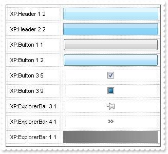
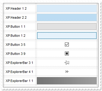
  • An Windows XP theme part, if the Skin parameter starts with "XP:". Use this option, to display any UI element of the Current Windows XP Theme, on any part of the control. In this case, the syntax of the Skin parameter is: "XP:ClassName Part State" where the ClassName defines the window/control class name in the Windows XP Theme, the Part indicates a long expression that defines the part, and the State indicates the state of the part to be shown. All known values for window/class, part and start are defined at the end of this document. For instance the "XP:Header 1 2" indicates the part 1 of the Header class in the state 2, in the current Windows XP theme.

The following screen shots show a few Windows XP Theme Elements, running on Windows Vista and Windows 10, using the XP options:


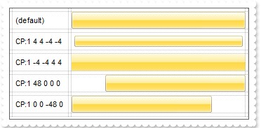
  • A copy of another skin with different coordinates ( position, size ), if the Skin parameter starts with "CP:". Use this option, to display the EBN, using different coordinates ( position, size ). By default, the EBN skin object is rendered on the part's client area. Using this option, you can display the same EBN, on a different position / size. In this case, the syntax of the Skin parameter is: "CP:ID Left Top Right Bottom" where the ID is the identifier of the EBN to be used ( it is a number that specifies the ID parameter of the Add method ), Left, Top, Right and Bottom parameters/numbers specifies the relative position to the part's client area, where the EBN should be rendered. The Left, Top, Right and Bottom parameters are numbers ( negative, zero or positive values, with no decimal ), that can be followed by the D character which indicates the value according to the current DPI settings. For instance, "CP:1 -2 -2 2 2", uses the EBN with the identifier 1, and displays it on a 2-pixels wider rectangle no matter of the DPI settings, while "CP:1 -2D -2D 2D 2D" displays it on a 2-pixels wider rectangle if DPI settings is 100%, and on on a 3-pixels wider rectangle if DPI settings is 150%.

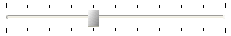
The following screen shot shows the same EBN being displayed, using different CP options:

ReturnDescription
BooleanA Boolean expression that indicates whether the new skin was added or replaced.
Use the Add method to add or replace skins to the control. Use the Background property to assign a skin or a color to any part of the control in a specified state. 

For instance, the Background(exVSThumbP) = RGB(255,0,0) defines the thumb in a red color, when it is pressed. The skin method, in it's simplest form, uses a single graphic file (*.ebn) assigned to a part of the control, when the "XP:" prefix is not specified in the Skin parameter ( available for Windows XP systems ). By using a collection of objects laid over the graphic, it is possible to define which sections of the graphic will be used as borders, corners and other possible elements, fixing them to their proper position regardless of the size of the part. Use the Remove method to remove a specific skin from the control. Use the Clear method to remove all skins in the control. Use the BeginUpdate and EndUpdate methods to maintain performance while do multiple changes to the control.

The identifier you choose for the skin is very important to be used in the background properties like explained bellow. Shortly, the color properties ( Background property ) uses 4 bytes ( DWORD, double WORD, and so on ) to hold a RGB value. More than that, the first byte ( most significant byte in the color ) is used only to specify system color. if the first bit in the byte is 1, the rest of bits indicates the index of the system color being used. So, we use the last 7 bits in the high significant byte of the color to indicates the identifier of the skin being used. So, since the 7 bits can cover 127 values, excluding 0, we have 126 possibilities to store an identifier in that byte. This way, a DWORD expression indicates the background color stored in RRGGBB format and the index of the skin ( ID parameter ) in the last 7 bits in the high significant byte of the color. For instance, the Background(exThumbPart) = Background(exThumbPart) Or &H2000000 indicates that we apply the skin with the index 2 using the old color, to the thumb part.

In the following samples, we have used the following skin file:  , and we get a slider like follows:

The following VB sample changes the visual appearance of the thumb, in the vertical slider:

With Slider1
    .VisualAppearance.Add 1, "D:\Exontrol\ExSlider\sample\VB\Gauge\Vertical 2\thumb.ebn"
    .Background(exVSThumb) = &H1000000
End With

The following VB sample changes the visual appearance of the thumb ( when it is pressed ), in the vertical slider:

With Slider1
    .VisualAppearance.Add 1, "D:\Exontrol\ExSlider\sample\VB\Gauge\Vertical 2\thumb.ebn"
    .Background(exVSThumbP) = &H1000000
End With

The following C++ sample changes the visual appearance of the thumb, in the vertical slider:

m_slider.GetVisualAppearance().Add( 1, COleVariant( _T("D:\\Exontrol\\ExSlider\\sample\\VB\\Gauge\\Vertical 2\\thumb.ebn") ) );
m_slider.SetBackground( 260 /*exVSThumb*/, 0x01000000 );

The following C++ sample changes the visual appearance of the thumb ( when it is pressed ), in the vertical slider:

m_slider.GetVisualAppearance().Add( 1, COleVariant( _T("D:\\Exontrol\\ExSlider\\sample\\VB\\Gauge\\Vertical 2\\thumb.ebn") ) );
m_slider.SetBackground( 261 /*exVSThumbP*/, 0x01000000 );

The following VB.NET sample changes the visual appearance of the thumb, in the vertical slider:

With AxSlider1
    .VisualAppearance.Add(1, "D:\Exontrol\ExSlider\sample\VB\Gauge\Vertical 2\thumb.ebn")
    .set_Background(EXSLIDERLib.BackgroundPartEnum.exVSThumb, &H1000000)
End With

The following VB.NET sample changes the visual appearance of the thumb ( when it is pressed ), in the vertical slider:

With AxSlider1
    .VisualAppearance.Add(1, "D:\Exontrol\ExSlider\sample\VB\Gauge\Vertical 2\thumb.ebn")
    .set_Background(EXSLIDERLib.BackgroundPartEnum.exVSThumbP, &H1000000)
End With

The following C# sample changes the visual appearance of the thumb, in the vertical slider:

axSlider1.VisualAppearance.Add(1, "D:\\Exontrol\\ExSlider\\sample\\VB\\Gauge\\Vertical 2\\thumb.ebn");
axSlider1.set_Background(EXSLIDERLib.BackgroundPartEnum.exVSThumb, 0x1000000);

The following C# sample changes the visual appearance of the thumb ( when it is pressed ), in the vertical slider:

axSlider1.VisualAppearance.Add(1, "D:\\Exontrol\\ExSlider\\sample\\VB\\Gauge\\Vertical 2\\thumb.ebn");
axSlider1.set_Background(EXSLIDERLib.BackgroundPartEnum.exVSThumbP, 0x1000000);

The following VFP sample changes the visual appearance of the thumb, in the vertical slider:

with thisform.Slider1
    .VisualAppearance.Add(1, "D:\Exontrol\ExSlider\sample\VB\Gauge\Vertical 2\thumb.ebn")
    .Background(260) = 0x1000000
endwith

The following VFP sample changes the visual appearance of the thumb ( when it is pressed ), in the vertical slider:

with thisform.Slider1
    .VisualAppearance.Add(1, "D:\Exontrol\ExSlider\sample\VB\Gauge\Vertical 2\thumb.ebn")
    .Background(261) = 0x1000000
endwith