How to build my own skin file?
The Exontrol ExSkin library installs the ExSkinBuilder component (
"Exontrol.ExSkinBuilder" is the control's identifier ) that helps you to build
new skin files for your forms. Before showing how you can build your own skin
file, we have to review for a bit how the ExSkinBuilder can be used. If you
already know how to use the ExSkinBuilder component click here
to see how to start your own skin file ( a skin file defines the
window's visual apparance ).
-
If you are a VB developer, click the 'Toolbox' panel, and choose the
'Components' from the panel's context menu. Once that you check and apply
the 'ExSkin 1.0 Control Library' from the opened dialog, your 'Toolbox' panel
includes two new components: ExSkin
 and ExSkinBuilder
  .
.
-
If you are a VC developer, select the dialog where you want to insert the
component, select 'Insert ActiveX Control' from its context menu, and dbl click
the 'ExSkinForm ActiveX Control' ( ExSkinBuilder ActiveX
Control ) item in the opened dialog.
Once that you have inserted a ExSkinBuilder component to a form or dialog, you
are ready to build new skin files for your forms. Of course, you can use the
ExSkinBuilder component to load and change already saved skin files. When the
form that contains a ExSkinBuilder component is opened, the ExSkinBuilder
component automatically shows the 'Zoom' and 'Properties' panels. The 'Zoom'
panel helps user to magnify different portions of the screen. The 'Properties'
panel contains information like, background color, background picture for the
selected object.
By default, the builder adds all objects you need to
build a window, including buttons, client area and so on.
The ExSkinBuilder's toolbox contains the following buttons:
| |
 |
Action |
Description |
|
|
 |
Open a file |
Opens a file. The file should be saved previously using the Save button. By
default, the builder loads *.esk file. Keep the CTRL
key down to create a new skin file.
|
|
|
 |
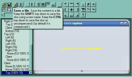
Save a file |
Saves the skin to a file. The builder saves everything that's required for the
skin. Save As , if you are pressing the SHIFT key while clicking the
'Save' button you can choose a new file where to save the skin. By default, the
builder compresses the files. Press CTRL key to save files uncompressed ( the
message ' Save (uncompressed) as 'should appear on the save file dialog
).
|
|
|

|
Insert Object |
Creates a new child object. The newly created object is child of
the selected object. By default, the newly created object has no picture or
color associated to it. You have to define the object's background using the
'Properties' panel. You can also, insert a new child object
while ExSkinBuilder is focused by pressing the 'Insert' key.
|
|
|

|
Remove Object |
Removes the selected object. Also, you can remove the selected object by
pressing the 'Delete' key.
|
|
|


|
Alignment |
A set of six radio buttons that indicates the object's alignment relative to
its parent. The list of radio buttons in their listed order is: None,
Left, Right, Client, Top and Bottom. For instance, if an object has the Left
Alignment, it means that the object shares the left area of the parent with
itself. The object's coordinates are defined in the edit controls labeled: X,
Y, CX and CY. The edit controls that handle coordinates are enabled based on
the object's alignment. For instance, if the object's alignment is left, only
the CX coordinate will be enabled, or if the object's alignment is None, then
all coordinates are enabled. The coordinates are relative to the parent object,
and they may contain arithmetic expressions, and % sign ( percent
indicates that the object is % from the size of its parent ) as well. For
instance, 50% means half of parent's size.
|
|
|
 |
Properties |
A check button that indicates whether the 'Properties' panel is visible or
hidden. The 'Properties' panel holds information about background of the
selected object. Also, the the 'Properties' panel contains the list of pictures
used by the skin. Details here.
|
|
|
 |
Zoom |
A check button that specifies whether the 'Zoom' panel is visible or hidden.
You can use the 'Zoom' panel to magnify different portions of screen. In order
to visualize a specified portion of the screen you can press "CTRL" key while
moving the mouse, or you can click into the 'Zoom' window and drag the focused
rectangle to the area being magnified. You can magnify the are by keeping the
(SHIFT + )CTRL key and clicking the Zoom Window.
|
|
|
 |
Draw grid lines |
A check button that indicates whether the ExSkinBuilder draws the grid lines
around the objects in the skin. The grid lines are not painted in the Test
window.
|
|
|
 |
Test |
Shows a test window that applies the current skin.
|
|
In case you are not familiar with the objects that
defines a window the following picture points each object in the
window:
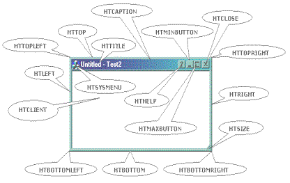
A picture that shows how hit test values are
arranged on a standard window
The object in the skin can have a hit test code. The window uses the
hit test code to identify the action that will take when user clicks the
mouse button. The builder handles the followings hit test codes:
| |
|
Action |
Description |
|
|
 |
HTNOWHERE |
On the screen background or on a dividing line between
windows
|
|
|
 |
HTCLIENT |
In a client area. Specifies the client are of the container
window. The container window uses the client area to display
its children windows.
|
|
|
 |
HTOBJECT |
You can use this hit test code to specify your own area. At
runtime this type of object has no effect.
|
|
|
 |
HTTOPLEFT |
In the upper-left corner of a window border.
|
|
|
 |
HTTOP |
In the upper-horizontal border of a window.
|
|
|
 |
HTTOPRIGHT |
In the upper-right corner of a window border.
|
|
|
 |
HTLEFT |
In the left border of a window.
|
|
|
 |
HTSIZE |
In a size box.
|
|
|
 |
HTRIGHT |
In the right border of a window.
|
|
|
 |
HTBOTTOMLEFT |
In the lower-left corner of a window border.
|
|
|
 |
HTBOTTOM |
In the lower-horizontal border of a window.
|
|
|
 |
HTBOTTOMRIGHT |
In the lower-right corner of a window border.
|
|
|
 |
HTMINBUTTON |
In a Minimize button.
|
|
|
 |
HTMAXBUTTON |
In a Maximize button.
|
|
|
 |
HTCLOSE |
In a Close button. You can close the window by clicking the
mouse in this area.
|
|
|
 |
HTHELP |
In a Help button. Changes the cursor to a help cursor when
the user clicks in this skin object.
|
|
|
 |
HTCAPTION |
In a caption bar. For instance you can move the window by
clicking the caption area and then dragging the mouse
|
|
|
 |
HTSYSMENU |
In a System menu or in a Close button in a child window.
|
|
|
 |
HTTITLE |
In title bar. The HTTITLE area displays the caption of the
window. For instance you can move the window by clicking the
caption area and then dragging the mouse
|
|
Notes:
-
the selected object is always marked using markers.
-
any change in the 'Properties' panel will be reflected in the selected object.
-
use 'Up' key to select the parent of the selected object, while the ExSkinBuilder
is focused.
-
use the 'Down' key to select the first child of the selected object, while the
ExSkinBuilder is focused.
-
use the 'Left' or 'Right' key to move through the objects that have the same
parent as selected object.
-
you can change the order of the objects ( that have the same parent ) using
combination of CTRL + PgUp or CTRL + PgDn key.
The 'Properties' panel is a resizable window that's
visible only if the
button is pressed. The caption of its window is 'Background'. The 'Properties'
panel is always updated when the selected object is changed. The 'Properties'
panel defines the list of pictures used by the skin. The 'Properties' panel
looks like follows:
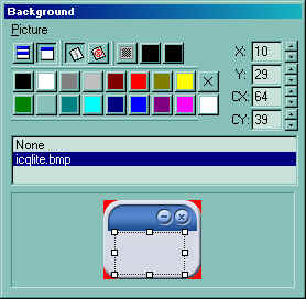
Use the Picture menu to insert, delete a picture object from the
skin file. Note that all picture files are saved to the skin file (
ebn file ),
no matter if they are used or not. The ExSkinBuilder compresses the file, so
even if you are using a bitmap file or a gif file, the file of the
skin will be compressed ( use the CTRL key to save the file as
uncompressed ). The 'Properties''s toolbox contains the following buttons (
in their order ):
| |
|
Action |
Description |
|
| |
 |
Tile, Stretch
|
A set of two radio buttons that defines the way how the picture is
displayed on the selected object: tiled or stretched.
|
|
|
 |
Transparent
|
A set of three radio buttons that defines the picture's
transparency. If the first button is pressed, the picture is opaque, so no
transparent colors are used. If the second button is pressed, the picture is
transparent. No picture or background is applied to the selected object. If the
third button is pressed, the last two buttons ( the black
buttons ) define the transparent color
from and transparent color to. In order to select a new transparent
color, you have to click on the one of the last two buttons and drag to the
desired color. Once that you have selected a transparency color, you have
to presses the button again to apply the transparent color to the selected
object.
|
|
|
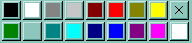 |
Colors
|
Defines a set of predefined colors. The X button clears the
background color of the selected object. The bottom-right button ( bellow to
X
button ), helps user to add a custom color. How? Click the button and drag to
desired color. Once that you have selected a custom color, you can
press the
button again and the builder will apply the selected color
to the selected object.
|
|
|
 |
Picture coordinates
|
The X, Y, CX, CY edit controls define the coordinates of the
picture on the background of the selected object.
|
|
Now, that we are ready to go, we can start building
the skin for your form. If you have already a skin file check the How
to assign a skin file to my button? Between steps you can save the
skin file using the Save button .
- Choosing the picture files that we are using to build our
form. You can have a BMP file, a GIF file or a JPEG file ( or any
picture file that your Windows recognize ), though we prefer the BMP
file since it holds information about the picture without losing
colors by compressing. In our case we choose this one
 ( you can save it as a BMP file ).
- Loading the picture file using the Background panel,
by choosing the Picture\ Add New item menu. You can assign the
picture to the selected object by selecting a picture in the
pictures list. The None item in the pictures list erases the
picture from the selected object. Use the picture coordinates to
select the area in the picture that is displayed on the selected
object. You can tile, stretch the picture or to choose transparent
colors. If we choose to get a picture transparent on the selected
object, it will define also the region for the window as being non
rectangular. In case you are not obtaining the non rectangular area
that you expect you have to push the Opaque button
 for all parents for the selected object.
- Defining the objects that composes our window. By
default, the builder adds all objects that composes a standard
window. It doesn't mean that you can't redesign how they are
arranged. By default, the size of the borders is 4 pixels ( it
depends on the border size of your system as defined in the monitor
properties ). In
our case if we take a closer look using the Zoom window, at
the picture we have chosen we will see that we need a bit larger
margins, or to define better the object as they will be displayed.
- Defining the look and feel for each object in the skin. For
instance, we will define the left-top corner ( the one with a red
pixel ), but the same thing can be done for all objects in the skin.
So, first we have to select the object by clicking inside the object
until builder marks the selected object. If your object is too small
press the CTRL key and the area will be zoomed in the Zoom window (
also the cursor will be marked by a cross ), or use the arrow keys
until you get the desired object. After you selected the object the
Zoom window automatically magnifies the object in the Zoom window
for a better view. You can hide the grid lines that's painted to
mark the objects in the skin, by pressing the Draw grid lines button .
Go to Background panel and click the icqlite.bmp item. This way you
assign a picture to the selected object. Choose the way how the
picture is displayed: tile, stretch, transparent and adjusts the
picture coordinates until you get the desired image in the selected
object. If your object require transparent areas you need to press
the Transparency button
 and choose the transparent color "from" and
"two" using the two buttons right to the Transparency
button ( click and drag the cursor over the color you want to
select, you can drag the cursor directly to the zoom window where
the screen is magnified). After you select the transparency colors
the builder considers the colors being the range of transparency
used. Click once again one of these two buttons, and the
transparency will be applied to the selected object. Please note,
that if you want to get a non rectangular form, all objects that
define the window count. If you suspect that the region of the form
you defined is not like you expected please check carefully all
parent items of the area that's not properly defined. Select the
object by clicking inside it, and use 'Up' arrow to select the
parent skin area and so on.
and choose the transparent color "from" and
"two" using the two buttons right to the Transparency
button ( click and drag the cursor over the color you want to
select, you can drag the cursor directly to the zoom window where
the screen is magnified). After you select the transparency colors
the builder considers the colors being the range of transparency
used. Click once again one of these two buttons, and the
transparency will be applied to the selected object. Please note,
that if you want to get a non rectangular form, all objects that
define the window count. If you suspect that the region of the form
you defined is not like you expected please check carefully all
parent items of the area that's not properly defined. Select the
object by clicking inside it, and use 'Up' arrow to select the
parent skin area and so on.
- After all objects were defined click the Save button
and your skin is ready to be used. At this point you can
download the skin file here.
- How
to assign a skin file to my form?

