How to build my own skin file?
The Exontrol ExButton library installs the ButtonBuilder component (
"Exontrol.ButtonBuilder" is the control's identifier ) that helps you to build
new skin files for your buttons. Before showing how you can build your own skin
file, we have to review for a bit how the ButtonBuilder can be used. If you
already know how to use the ButtonBuilder component click here
to see how to start your own skin file ( visual appearance for a specified
state of the button ).
-
If you are a VB developer, click the 'Toolbox' panel, and choose the
'Components' from the panel's context menu. Once that you check and apply
the 'ExButton 1.0 Control Library' from the opened dialog, your 'Toolbox' panel
includes two new components: Button
 and ButtonBuilder
  .
.
-
If you are a VC developer, select the dialog where you want to insert the
component, select 'Insert ActiveX Control' from its context menu, and dbl click
the 'ExButton ActiveX Control' item in the opened dialog.
Once that you have inserted a ButtonBuilder component to a form or dialog, you
are ready to build new skin files for your buttons. Of course, you can use the
ButtonBuilder component to load and change already saved skin files. When the
form that contains a ButtonBuilder component is opened, the ButtonBuilder
component automatically shows the 'Zoom' and 'Properties' panels. The 'Zoom'
panel helps user to magnify different portions of the screen. The 'Properties'
panel contains information like, background color, background picture for the
selected object.
The skin method, in it's simplest form, uses a single graphic
file assigned to the client area of the button. By using a
collection of objects laid over the graphic, it is possible to
define which sections of the graphic will be used as borders,
corners and other possible elements, fixing them to their proper
position regardless of the size of the button. The skin file is
organized as a hierarchical list of objects. Each object can display
a portion of picture with attributes like tile, stretch or
transparent or a background color. The position for each child
object is relative to its parent, and can be aligned to any side of
the parent's client area. Important to notice is that the position
of the objects can use simple arithmetic operation like 10 + 50%
that means 10 pixels plus a half of parent's size, or 100% that
means 100% of the parent size.
| |
 |
Action |
Description |
|
| |
 |
New file |
Creates an empty skin file. The builder automatically shares the skin area in
multiple pieces that identifies the client area of the skin and the
corners.
|
|
|
 |
Open a file |
Opens a file. The file should be saved previously using the Save button. By
default, the builder loads *.ebn files.
|
|
|
 |
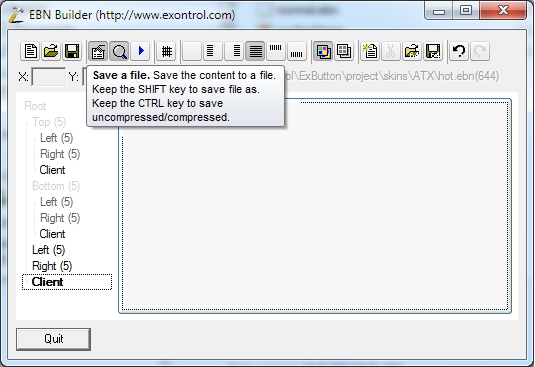
Save a file |
Saves the skin to a file. The builder saves everything that's required for the
skin. Save As , if you are pressing the SHIFT key while clicking the
'Save' button you can choose a new file where to save the skin.
By default, the
builder compresses the files, so you can press CTRL key to save files uncompressed ( the
message ' Save (uncompressed) as 'should appear on the save file dialog
).
|
|
|
 |
Properties |
A check button that indicates whether the 'Properties' panel is visible or
hidden. The 'Properties' panel holds information about background of the
selected object. Also, the the 'Properties' panel contains the list of pictures
used by the skin. Details here.
|
|
|
 |
Zoom |
A check button that specifies whether the 'Zoom' panel is visible or hidden.
You can use the 'Zoom' panel to magnify different portions of screen. In order
to visualize a specified portion of the screen you can press "CTRL" key while
moving the mouse, or you can click into the 'Zoom' window and drag the focused
rectangle to the area being magnified. You can magnify the are by keeping the
(SHIFT + )CTRL key and clicking the Zoom Window.
|
|
|
 |
Test |
Shows the current EBN object to a separate window. Opens a new window where you can see running the exButton using the State
exNormal as defined by the skin. Keep the CTRL key to assign a new skin for the
exPushed state.
|
|
|
 |
Draw grid lines |
A check button that indicates whether the ButtonBuilder draws the grid lines
around the objects in the skin. The grid lines are not painted in the Test
window.
|
|
|


|
Alignment |
A set of six radio buttons that indicates the object's alignment relative to
its parent. The list of radio buttons in their listed order is: None,
Left, Right, Client, Top and Bottom. For instance, if an object has the Left
Alignment, it means that the object shares the left area of the parent with
itself. The object's coordinates are defined in the edit controls labeled: X,
Y, CX and CY. The edit controls that handle coordinates are enabled based on
the object's alignment. For instance, if the object's alignment is left, only
the CX coordinate will be enabled, or if the object's alignment is None, then
all coordinates are enabled. The coordinates are relative to the parent object,
and they may contain arithmetic expressions, and % sign ( percent
indicates that the object is % from the size of its parent ) as well.
|
|
|

|
Colorable Object |
The object is colorable, which means that the EBN color is applied to this part when the color is applied to the entire EBN object. For instance, at runtime the identifier 0x1FF0000 applies blue color to all parts that compose the EBN object, including the selected object.
|
|
|

|
Not-Colorable Object |
The object is not-colorable, which means that the EBN color is not applied to this part when the color is applied to the entire EBN object. For instance, at runtime the identifier 0x1FF0000 applies blue color to all parts that compose the EBN object, excluding the selected object.
|
|
|

|
Insert Object |
Creates a new child object. The newly created object is child of
the selected object. By default, the newly created object has no picture or
color associated to it. You have to define the object's background using the
'Properties' panel. You can also, insert a new child object
while ButtonBuilder
is focused by pressing the 'Insert' key.
|
|
|

|
Remove Object |
Removes the selected object. Also, you can remove the selected object by
pressing the 'Delete' key. Note, that the client area of the
skin ( the area that displays the 'Caption' string ) is not allowed to be
removed.
|
|
|

|
Load BASE64 |
Loads from the clipboard a BASE64 string that encodes an EBN object.
|
|
|

|
Save BASE64 |
Generates the BASE64 string that encodes the current EBN object, and copies it in the clipboard as text.
|
|
|

|
Undo |
Restores the last operation.
|
|
|

|
Redo |
Reverse of the Undo operation.
|
|
Use the Picture menu to insert, delete a picture object from the
skin file. Note that all picture files are saved to the skin file (
ebn file ),
no matter if they are used or not. The ButtonBuilder compresses the file, so
even if you are using a bitmap file or a gif file, the file of the
skin will be compressed ( use the CTRL key to save the file as
uncompressed ). The 'Properties''s toolbox contains the following buttons (
in their order ):
| |
|
Action |
Description |
|
| |
 |
Tile, Stretch, Horizontal or Vertical Stretch
|
A set of two radio buttons that defines the way how the picture is
displayed on the selected object: tiled, stretch, horizontal
stretch or vertical stretch.
|
|
|
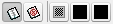 |
Transparent
|
A set of three radio buttons that defines the picture's
transparency. If the first button is pressed, the picture is opaque, so no
transparent colors are used. If the second button is pressed, the picture is
transparent. No picture or background is applied to the selected object. If the
third button is pressed, the last two buttons ( the black
buttons ) define the transparent color
from and transparent color to. In order to select a new transparent
color, you have to click on the one of the last two buttons and drag to the
desired color. Once that you have selected a transparency color, you have
to presses the button again to apply the transparent color to the selected
object.
|
|
|
 |
Colors
|
Defines a set of predefined colors. The X button clears the
background color of the selected object. The bottom-right button ( bellow to
X
button ), helps user to add a custom color. How? Click the button and drag to
desired color. Once that you have selected a custom color, you can
press the
button again and the builder will apply the selected color
to the selected object.
|
|
|
 |
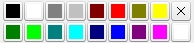
Picture coordinates
|
The X, Y, CX, CY edit controls define the coordinates of the
picture on the background of the selected object.
|
|
 ( you can save it as a BMP file ). Here's the same picture but this
time it is zoomed:
( you can save it as a BMP file ). Here's the same picture but this
time it is zoomed: 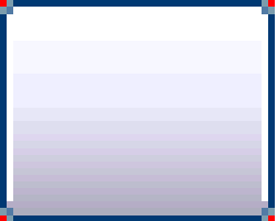
 .
In this case, the skin's client area have a picture associated but
it is not painted. At this point you can download the skin file
.
In this case, the skin's client area have a picture associated but
it is not painted. At this point you can download the skin file  and choose the taransparent color "from" and
"two" using the two buttons right to the Transparency
button ( click and drag the cursor over the color you want to
select, you can drag the cursor directly to the zoom window where
the screen is magnified). After you select the transparency colors
the builder considers the colors being the range of transparency
used. Click once again one of these two buttons, and the
transparency will be applied to the selected object. At this point
you can download the skin file
and choose the taransparent color "from" and
"two" using the two buttons right to the Transparency
button ( click and drag the cursor over the color you want to
select, you can drag the cursor directly to the zoom window where
the screen is magnified). After you select the transparency colors
the builder considers the colors being the range of transparency
used. Click once again one of these two buttons, and the
transparency will be applied to the selected object. At this point
you can download the skin file 
